Anthony Bryant values process over aesthetic in his clever and playful graphic design
The NYC-based designer has made some “surprising turns” from commercial to branding to editorial. Below, he talks to us through his newfound creative process.
Share
“I find my work to be thoughtful and clever,” says Anthony Bryant, “but that’s just me.” Even if he’s not given too much thought as to what his design ethos may be, the Chicago-born and NYC-based graphic designer knows one thing: he prefers to champion process over aesthetics. “That way, my approach can be driven by something with more meaning, even if it’s not quite understood at a surface level.”
Over time, Anthony has steered further away from commercial work and more towards editorial. His career, as a whole, has taken a few “surprising turns” – which he’s utterly grateful for – having first started out in digital luxury, working with fashion brands for digital agencies like Code & Theory and Wednesday Agency. A few years down the line he moved to Portland to join Nike, taking on several roles (like concept designer and art director) in his tenure there: “It’s one of the joys of working at the swoosh,” he adds. Lots of making, thinking and creativity later, and Anthony left Nike in 2020 to go freelance, working on commissions for the likes of The North Face, Apple and The New York Times Magazine. “And now, I’m working on projects in the editorial world; I find it inspiring to work on projects where there’s no major goal to sell anything.”
Channelling fun and experimentation in everything he puts his mind towards, Anthony’s work has taken a new and exciting direction. He values creativity and evolution with the highest regard and will constantly put the effort in to grow his practice. “For someone new to my work, they may be able to catch that it’s done by the same creative,” he says. “But, I tend to think I don’t have a style, rather an approach to the work.” This critical outlook is something he developed while studying graphic design at university, and from being part of the Black Studies programme. “I never understood why our graphic design education started at the Gutenberg press! There are so many examples of graphic design and visual language in ancient indigenous culture. How might our design practice be shaped if we drew inspiration from those cultures?”
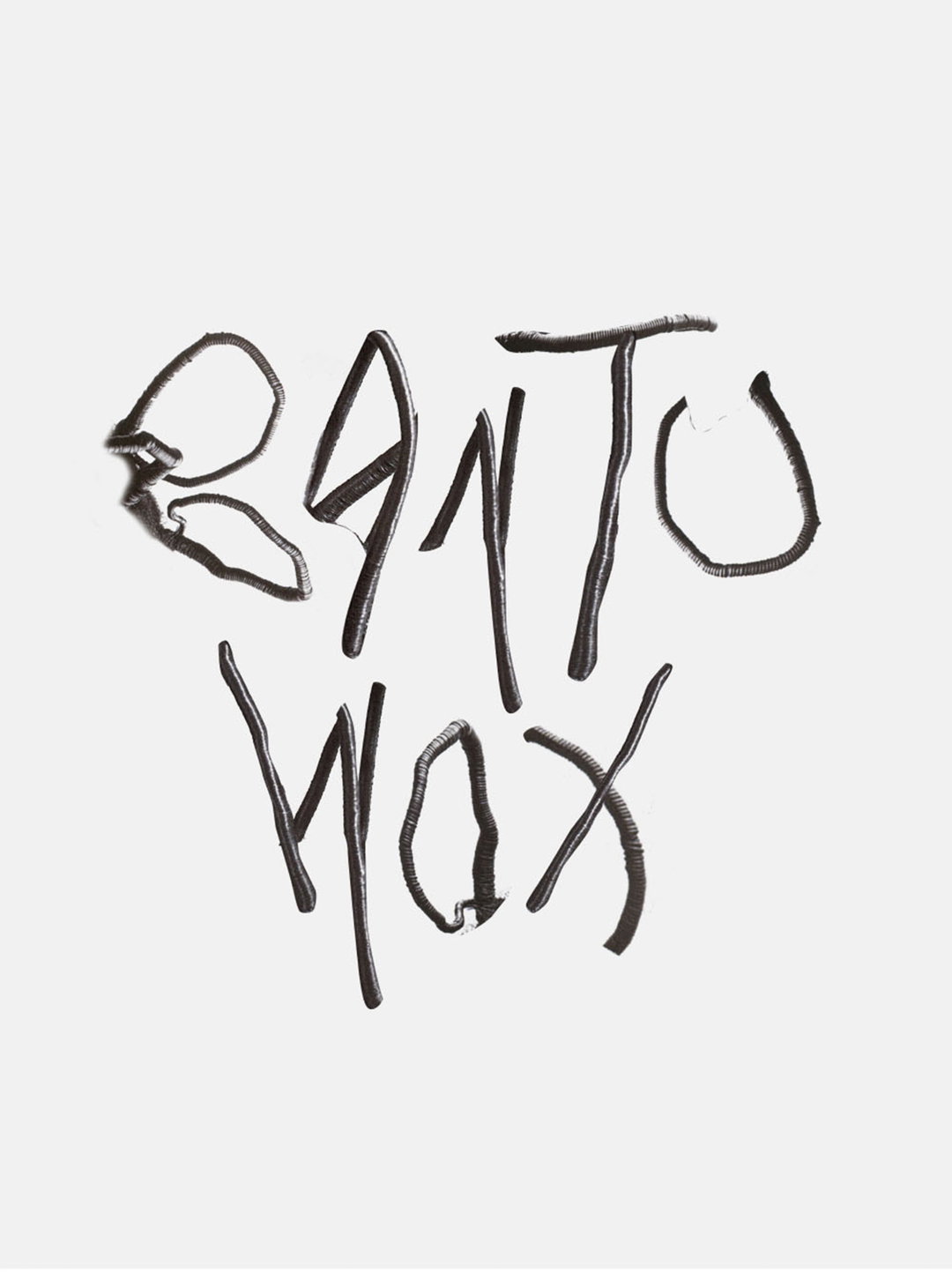
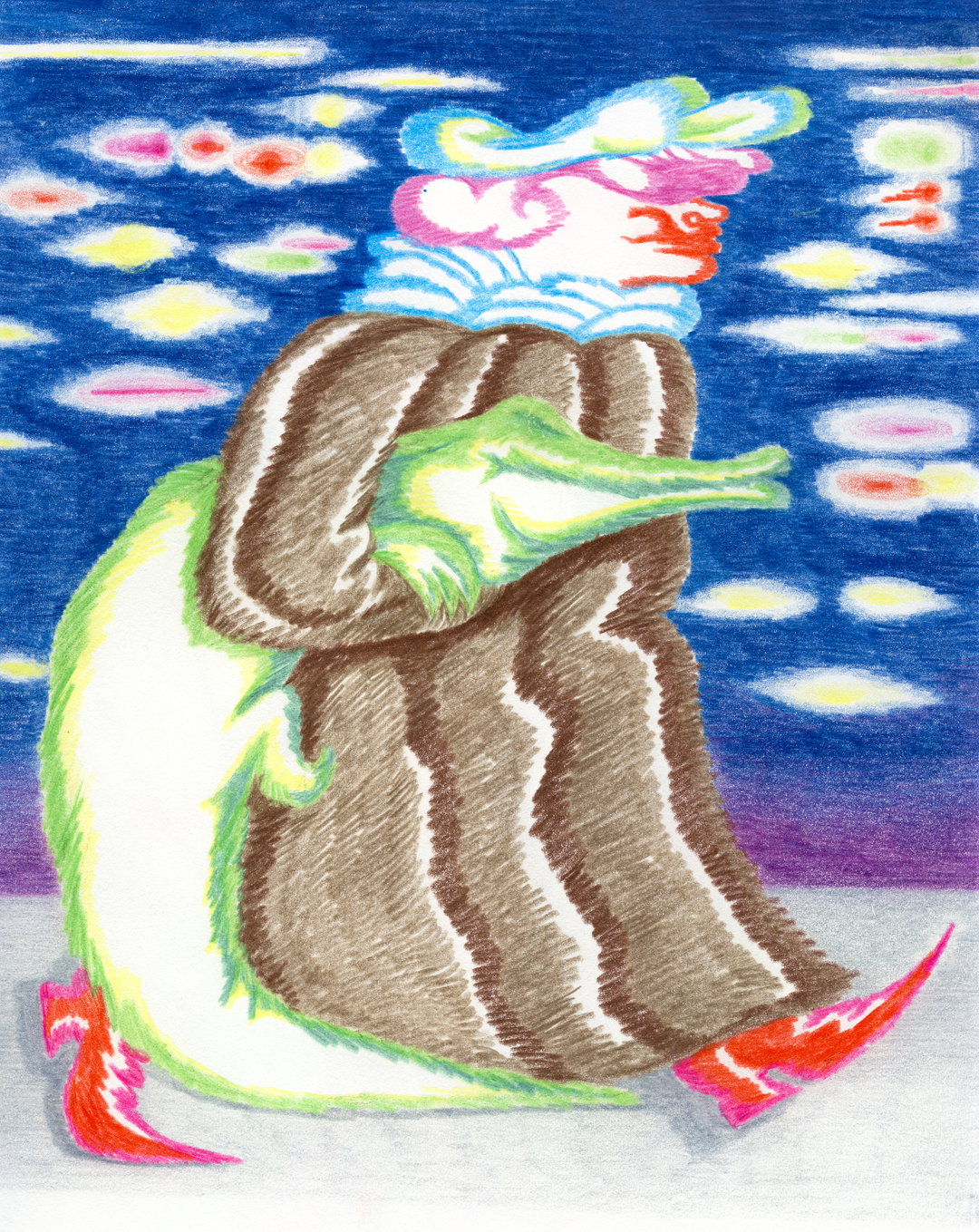
Anthony Bryant: Bantu Wax (Copyright © Anthony Bryant, 2021)
These curiosities have now been infused into his practice. While taking on a brief, Anthony will always kick off the process with writing. He jots down all sorts from key terms, ideas, random thoughts and tangents, “whatever comes, I like to write it down,” he shares. After which he’ll take a dive into the brief and work out how best to shape the project, then scout out any inspiration from the internet. “I have the luxury of living in NYC, and there are so many amazing places to get inspired.” The picture collection at the New York Public Library is a key reference point for Anthony, where before the pandemic he’d spend a day working there at the beginning of every project, “which is way better than my current WFH set-up.” Yet despite the circumstantial changes, Anthony still manages to employ his meticulous, research-heavy and creative approach to any given design project.
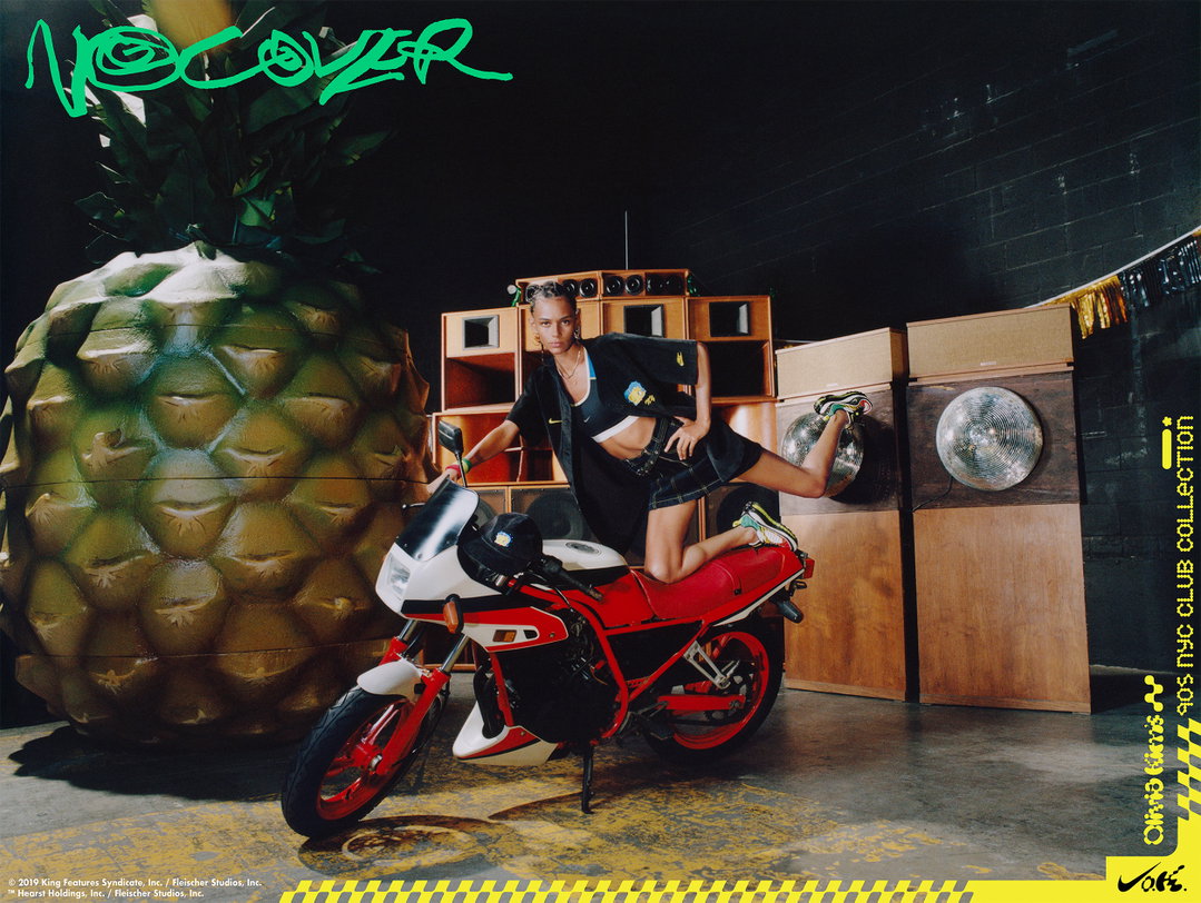
Take his Nike Lab Re:Creation Centre as a good example. Devised in collaboration with Virgil Abloh, the project had two main goals: “community involvement and sustainability.” Incorporating materiality as the central focus, the bulk of the space was crafted from “regrind” – i.e. recycled footwear – and those who visited the space could donate old trainers to be recycled, “with the end goal of collecting enough sneakers to build a basketball court.” He adds: “When I approached the creative team, I really loved the look of regrind and wanted to have the creative reflect the bright and chaotic nature of the material.” Elsewhere, one of his absolute favourites is a collaboration between Nike and Olivia Kim – Olivia had a collection of five shoes inspired by 90s NYC party culture. “Together we developed these worlds further and created a campaign that embraced the textures and look of each of these subcultures. We approached the styling, set design and graphic direction with this in mind to create these fun worlds inspired by that time in NYC.”
Anthony’s portfolio has an addictive simplicity about it; from the crisp editorials right through to his hand-drawn typography. It’s functional, legible and playful all at once, with the odd bit of personality thrown in for good measure. It’s thrilling to think of where Anthony might end up next, but for now, he has a few announcements in the pipeline: this includes the second issue of Justsmile Magazine with Kevin Hunter and Bryce Thomas, and the redesign of Atmos Magazine with friend Rana Toofanian. Clearly, there are many more exciting – and surprising – turns to come for this designer.
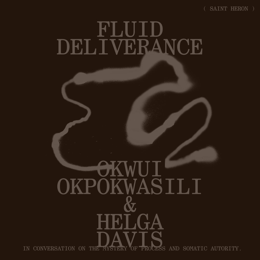
Anthony Bryant: Saint Heron, Dossier (Copyright © Anthony Bryant, 2021)
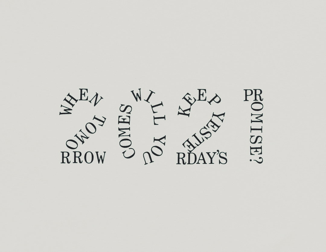
Anthony Bryant: A Message (Copyright © Anthony Bryant, 2021)

Anthony Bryant: Apple Music, Bars (Copyright © Anthony Bryant, 2021)
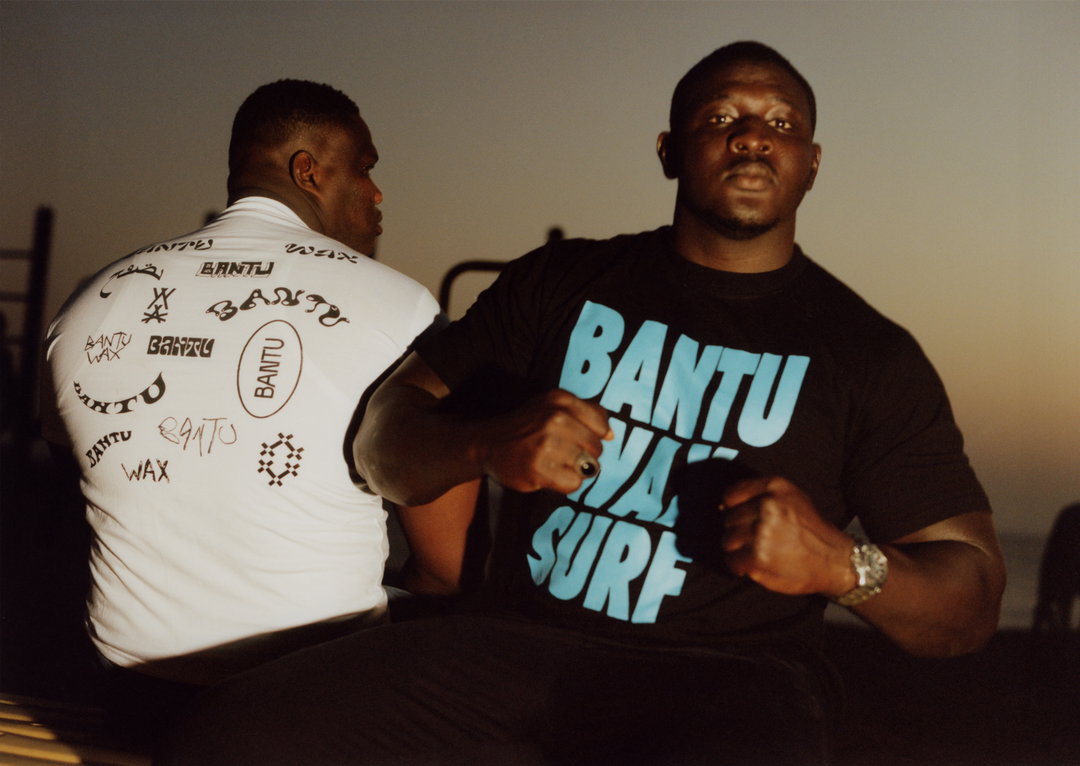
Anthony Bryant: Bantu Wax, Senegal (Copyright © Anthony Bryant, 2021)
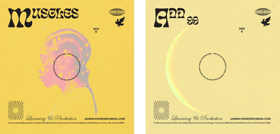
Anthony Bryant: JP Album Artwork (Copyright © Anthony Bryant, 2021)
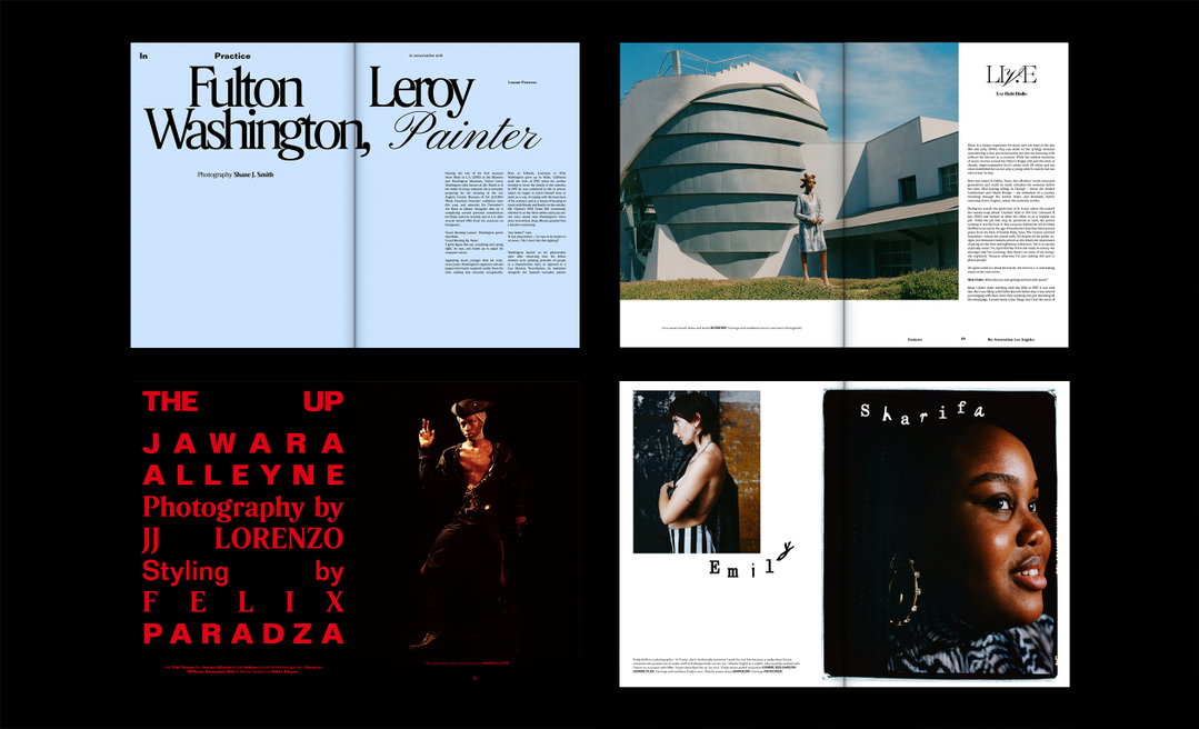
Anthony Bryant: Just Smile (Copyright © Anthony Bryant, 2021)
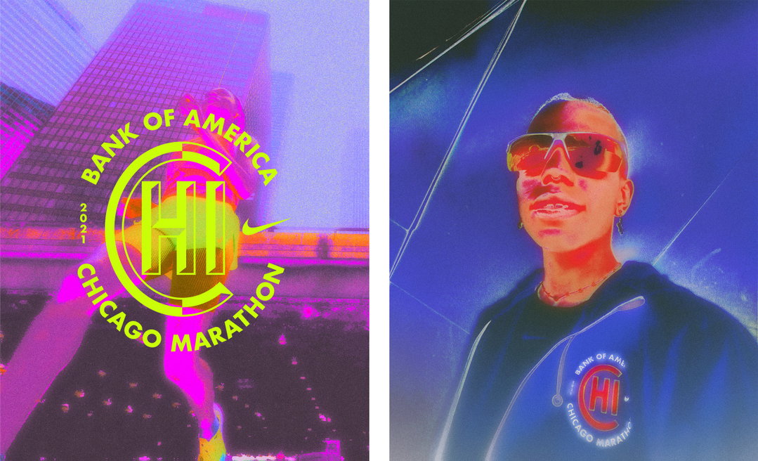
Anthony Bryant: Nike Chicago Marathon (Copyright © Anthony Bryant, 2021)
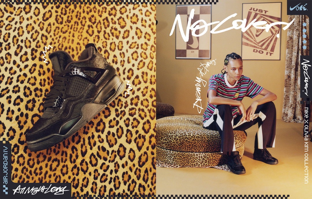
Anthony Bryant: Nike Olivia Kim (Copyright © Anthony Bryant, 2021)
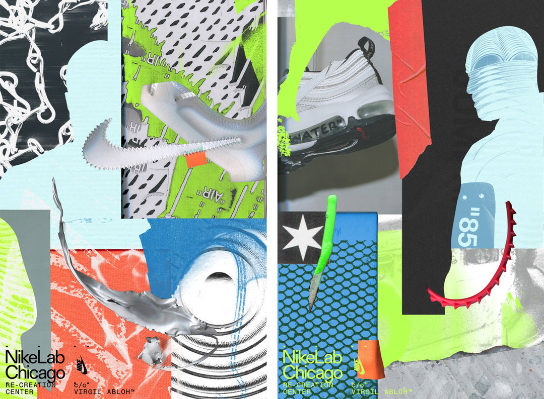
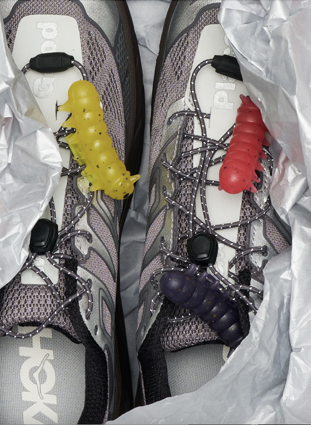
Anthony Bryant: Nike Recreation Centre (Copyright © Anthony Bryant, 2021)
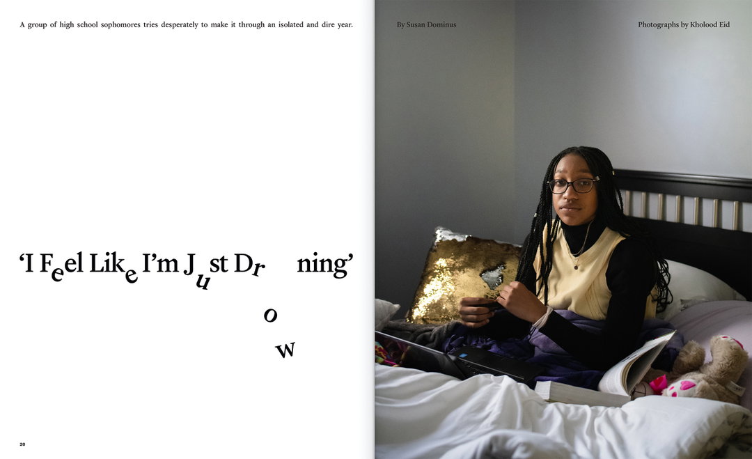
Anthony Bryant: NYT Magazine, Covid Teens (Copyright © Anthony Bryant, 2021)
Hero Header
Anthony Bryant: Nike Olivia Kim, No Cover (Copyright © Anthony Bryant, 2021)
Share Article
Further Info
About the Author
—
Ayla is a London-based freelance writer, editor and consultant specialising in art, photography, design and culture. After joining It’s Nice That in 2017 as editorial assistant, she was interim online editor in 2022/2023 and continues to work with us on a freelance basis. She has written for i-D, Dazed, AnOther, WePresent, Port, Elephant and more, and she is also the managing editor of design magazine Anima.