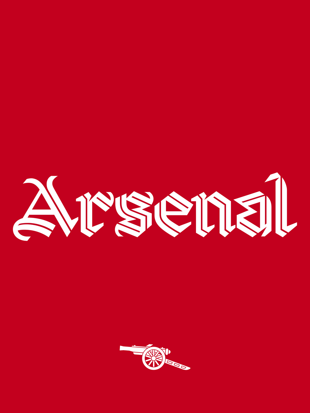
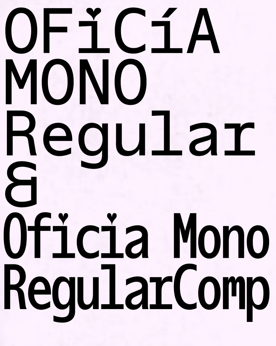
Designer Antoine Elsensohn uses simple graphic elements to allow "fonts to express themselves"
“Over time, I think I can qualify my work as ‘simple’ in shapes, colours or layouts,” Paris-based graphic designer, Antoine Elsensohn tells It’s Nice That. “However, I always give typography the principal role.” With a website that seems to offer an infinite scroll of delectable typefaces, compelling book covers and down-right great designs, Antoine’s work had us sold pretty quickly.
Antoine was born in Paris where he stayed until gaining a place at ÉSAD Amiens in the north of France, where he studied for the following three years. Having just gained his masters in graphic and type design at École Estienne, he is now back in his hometown. Despite his education and a clear aptitude for the medium, Antoine didn’t always seem destined to be a graphic designer.
In his teenage years, Antoine aspired to be a mechanic but “was orientated to an art high school after middle school,” where he began to study graphic design. Even so, he “ was not really interested in [graphic design] at this time. I was totally preoccupied by graffiti,” he recalls. After failing to be accepted into any art schools upon graduating from high school, Antoine spent two years doing odd jobs. “Then friends from graffiti, who were students in art schools advised me to try joining a preparatory class,” which eventually lead to his acceptant at ÉSAD Amiens. Here, he realised how closely the art forms of graffiti and graphic design really are: “In both cases, you need to find the best solution, despite all the constraints.”
The French designer’s roots in lettering and graffiti are clear as typography occupies a major place in his work. “At the beginning of each project, I feel like a kid in a toy store,” he explains. “I’m always excited to work with new fonts and try to never re-use one.” Whether working on a poster or a book, Antoine allows typography to lead the design, using block colours alongside imagery where fonts are allowed to express themselves. “I don’t want to overwhelm them with too many graphic effects,” he adds.
For his diploma project, Antoine allowed his broad knowledge of the type world to initiate a typeface which imagines “an alternative to the typographic hierarchy of a text,” he explains. “I wanted to leave the classical model of ‘roman, italic and bold’ and try to find a new family composition.” After researching into catalogues of foundries from the seventeenth to the twentieth century he noticed that the notion of width hadn’t been explored much in relation to characters with serifs. “There were only condensed versions of some typefaces, but never extended versions. The only broad ones, called Egyptian characters, were not very contrasted,” Antoine remarks.
As a result, Antoine developed Sigma: a display font born from a playground where contrast and width were his focusses. Pushing the ultra-condensed and the ultra-extended, Sigma is a typeface that re-invents the font family. Antoine explains how, for him, “the important part of my project was to see how far it would be possible to go to each extreme, but also to start from a classical model with regular width, weight and shapes and see how far I could bring this model without denaturing it completely.”

Antoine Elsensohn: Sigma Typeface

Antoine Elsensohn: Sigma Typeface

Antoine Elsensohn

Antoine Elsensohn

Antoine Elsensohn

Antoine Elsensohn

Antoine Elsensohn

Antoine Elsensohn

Antoine Elsensohn

Antoine Elsensohn

Antoine Elsensohn

Antoine Elsensohn

Antoine Elsensohn
Share Article
Further Info
About the Author
—
Ruby is Senior Creative at It's Nice That, overseeing our visual output across platforms and projects. Before that, she was associate editor on the editorial team, after joining in September 2017 following graduation from Central Saint Martins.