Discos and design explored in gorgeous new Bedford Press book Nightswimming
“Nowadays discotheques are hardly ever spaces designed by architects; they are rather temporary occupations of spaces dedicated to other functions,” laments Bedford Press in the introduction to its beautiful new publication dedicated to design and discos.
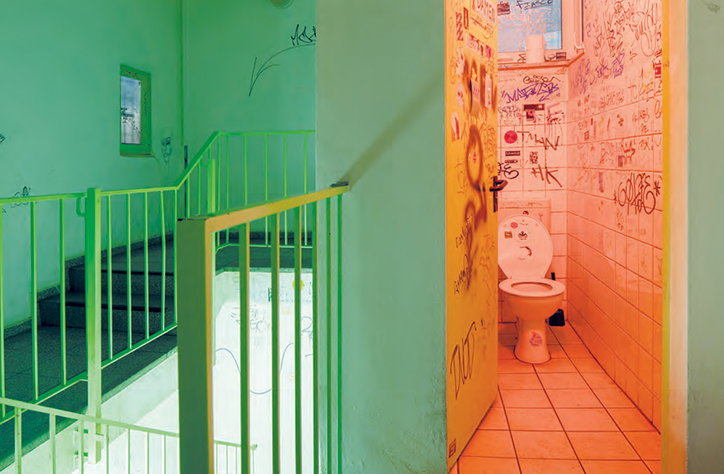
The book, Nightswimming: Discotheques from the 1960s to the Present showcases images by Giovanna Silva that examine the history of dance clubs through an architectural lens. As the publisher puts it, “the history of dance clubs is undoubtedly an anthropological as well as architectural phenomenon,” but whichever way you look at it, human behaviour is forever shaped by spacial considerations.
Alongside the imagery the book, created by Chiara Carpenter & Giovanna Silva, also presents a number of interviews and critical texts around the topic. It was this mixture of rich visual imagery and academia that inspired the design. “That was the starting point for our decision not to include photography on the front cover,” explains Wayne Daly, co-founder of the AA Print Studio imprint Bedford Press. “It would be misleading to suggest it’s purely a photobook, so the cover’s rather plain and we used the back cover to introduce an idea of what the content’s about.”
Wayne and his team got involved in the project having known Giovanna from her work with architectural magazine San Rocco, and worked closely with her and Chiara to determine a layout that worked with the range of photographs. “They had a very clear idea of how to create a rhythm, so we used a mixture of smaller images broken up with double-page spreads showing the clubs being used and occupied. They’re also broken up by critical essays about the history of the architecture.”
The typeface is a neat, clear and stylish sans serif chosen not just for its look, but for its associations with a certain era. “We chose Unica77 from the Lineto Swiss type foundry, it’s a reissued typeface from 1977 that’s been approved and reworked,” says Wayne.
As the quiet, impartial images in the book show, the idea of designing a nightclub space is something that’s become increasingly rare. While clubs of yesteryear were created for the nocturnal, built for dancing and decadence, today the spaces are appropriated and often temporary.
The book is published in January but can be ordered before then from the AA Bookshop or the ICA, which is hosting the Radical Disco: Architecture and Nightlife in Italy, 1965–1975 show from next month. The show’s curators will join Giovanna and Chiara for an evening lecture at the AA on Thursday 25 February.
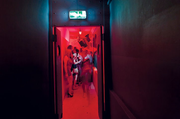
Giovanna Silva: Cocoricò, Riccione
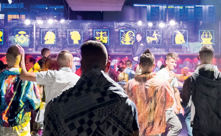
Giovanna Silva: Number One, Cortefranca
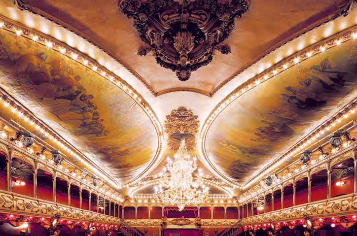
Giovanna Silva: La Paloma, Barcelona
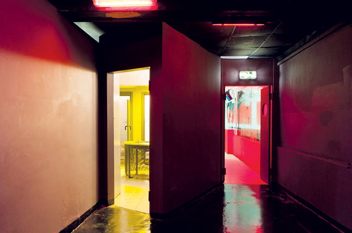
Giovanna Silva: Cocoricò, Riccione
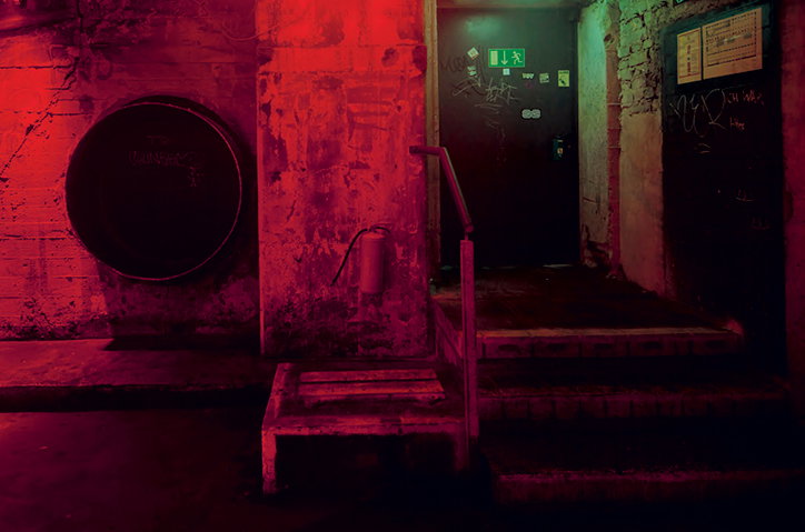
Giovanna Silva: Tresor, Berlin
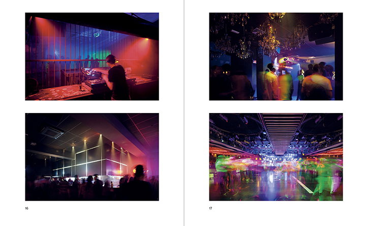
Giovanna Silva: Tresor, Berlin & Sala Apolo, Barcelona/Plastic, Milan & Number One, Cortefranca
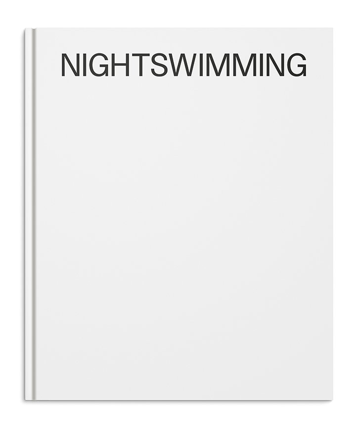
Bedford Press: Nightswimming: Discotheques from the 1960s to the Present cover
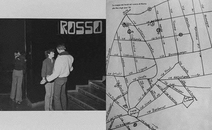
Gabriele Basilico: Dancing in Emilia 1978, Gabriele Basilico, Silvana Editoriale, Milano 2013
Corrado Rizza and Marco Trani: I love the nightlife, Wax Production, Roma 2010, detail

Giovanna Silva:
Share Article
Further Info
About the Author
—
Emily joined It’s Nice That as Online Editor in the summer of 2014 after four years at Design Week. She is particularly interested in graphic design, branding and music. After working It's Nice That as both Online Editor and Deputy Editor, Emily left the company in 2016.