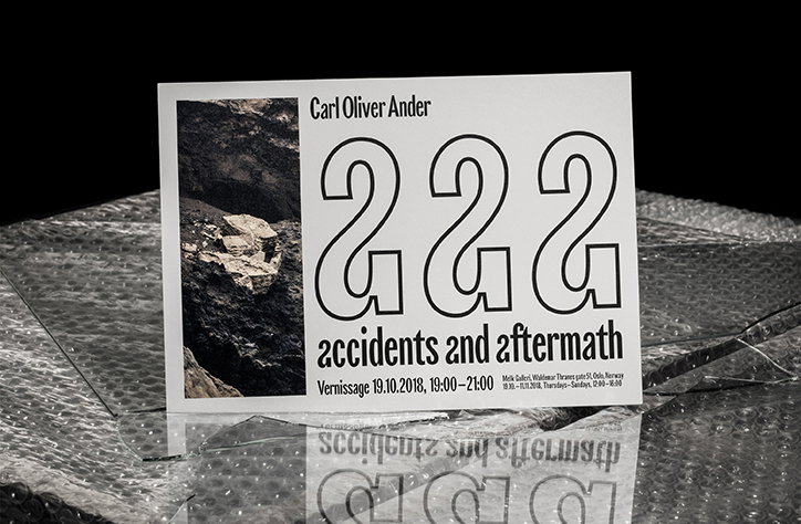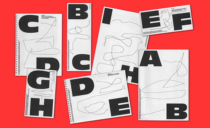
No matter what the output, graphic design studio Choque Le Goff finds the fun in every project
When Donald Choque and Yoann Le Goff met while studying at Ensad Paris six years ago, they began working in a creative partnership the very same day. “We bonded over mutual interests like music, fun, architecture and arts, especially dance,” they tell It’s Nice That. They continued collaborating during their studies, including on their graduation project and so, when it came time to enter the working world, starting a studio together seemed like an obvious choice. And so Atelier Choque Le Goff was born; that was four years ago now.
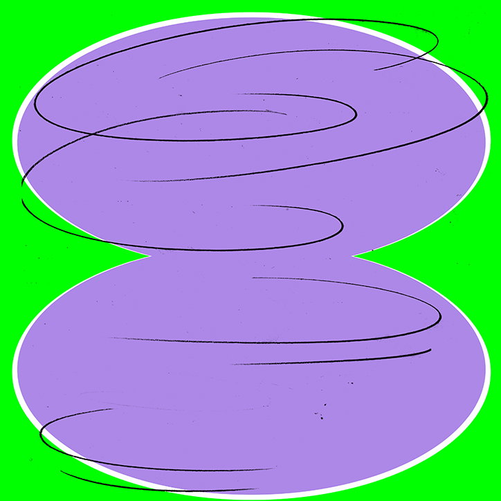
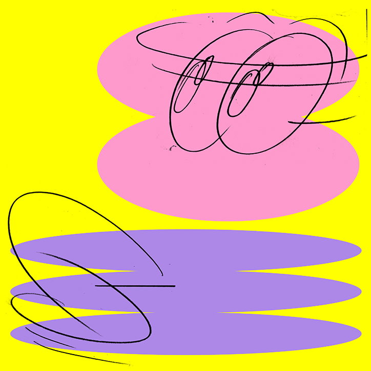
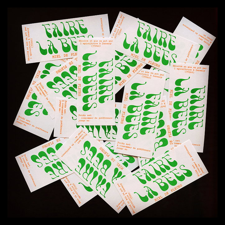
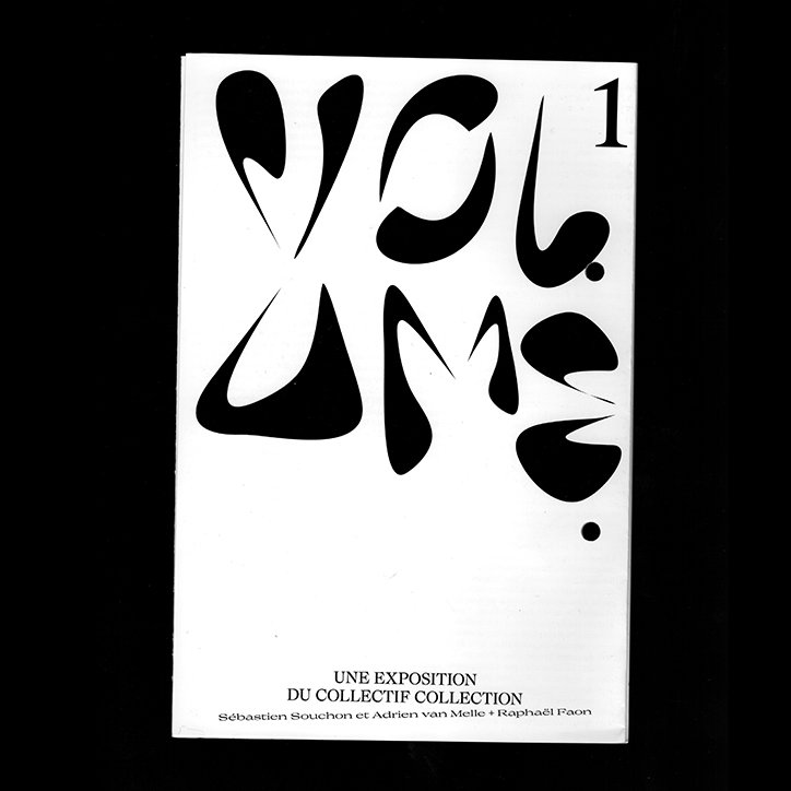
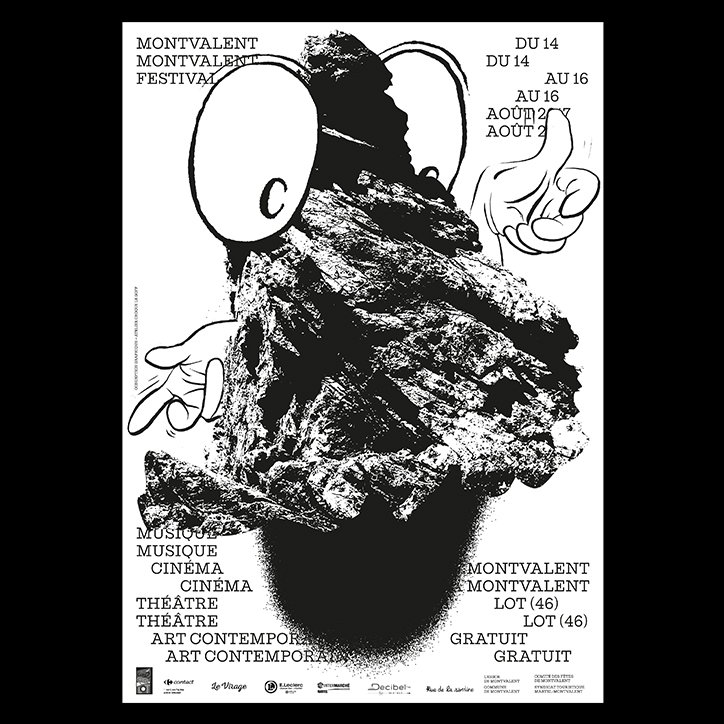
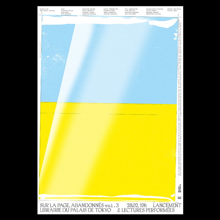
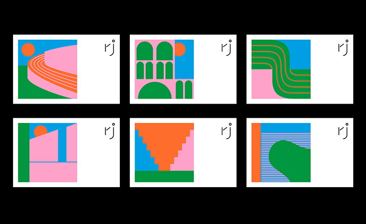
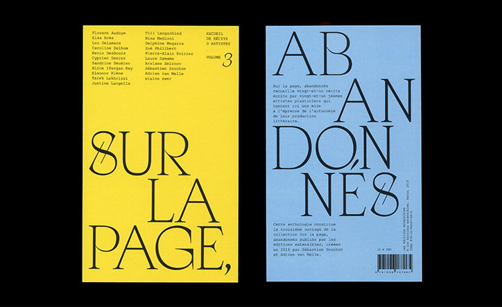
It was through Instagram that we first discovered Donald and Yoann’s work, their colourful and bold work resulting in an intriguing feed. A bit of digging unearthed a multifaceted practice where typography, editorial design and illustration are given equal importance. Bright greens, purples and pinks are rife and there’s a playful energy to each of the studio’s projects. This, the duo explains, is the result of their approach to working: “Our creative practice is mainly focused on sharing knowledge, experimenting, sharing and having fun.”
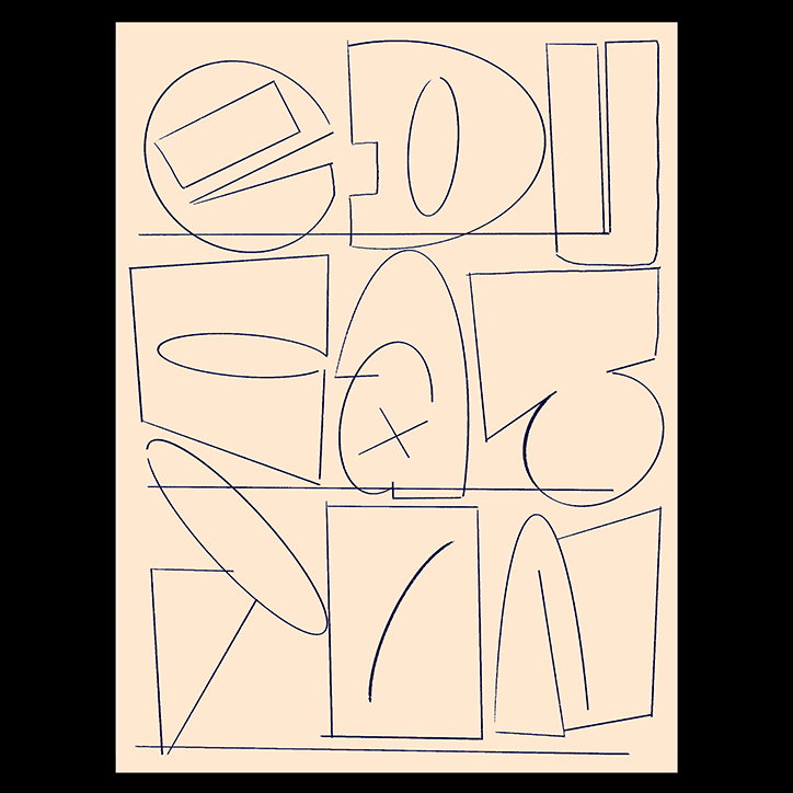
Having worked together for so long now, they describe themselves as a “monster with two heads and four hands in a permanent exchange of our tools, ideas and jokes.” It’s this latter point which is the most important to Donald and Yoann, a duo who don’t take themselves (or their work) too seriously, but who see every project as an opportunity to have fun. “Each project is a new playground and opportunity to create a space where type, colours, drawings and shapes can joyfully coexist,” they explain.
Choque Le Goff
Choque Le Goff
Choque Le Goff
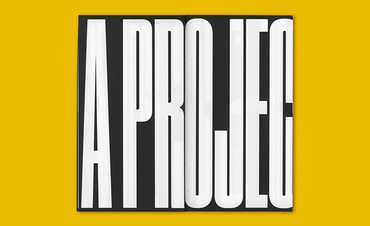
With such a definitive and resolute outlook on how they like to make work, what they make is far less important. “We like any type of project as long as it is challenging and has the potential of freedom,” they tell us. This could result in a website, a poster, a typeface, or publication. They continue: “A commission is a set of constraints that draws the rules of the game, it’s always different but the idea is to have as much fun as possible, it’s a game!”
If there’s a signature to the studio’s work, therefore, it’s this process, rather than any visual language.
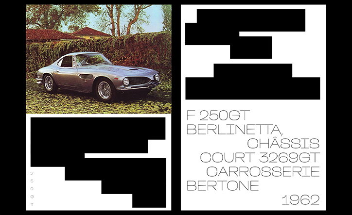
Recently, the pair worked on a type design project with a somewhat unusual brief: a car collector wanted to create a book about a particular car made in the 1960s and so commissioned Donal and Yoann to do so. “The subject became a great source of inspiration for us, so we decided to draw a typeface out of it,” they explain. “The idea was to synthesise the essence of the vehicle, its design, historical context and purpose into letterforms.” With the help of a fellow designer, they “pushed beyond the silhouettes of the letters to programme a special kind of behaviour for the font family. Opentype features modify selected letter combinations or add design elements/letter sets to mimic the dynamic dimension of the subject, to make it move (as fast as possible).”
It’s projects like these – which are brimming with personality and which channel the concept of a project into a well-rounded design – that fill Choque Le Goff’s portfolio. No matter what the result, you can rely on Donald and Yoann to find the fun.
Choque Le Goff
Choque Le Goff
Choque Le Goff
Choque Le Goff
Choque Le Goff
Choque Le Goff
Choque Le Goff
Choque Le Goff
Choque Le Goff
Share Article
Further Info
About the Author
—
Ruby is Senior Creative at It's Nice That, overseeing our visual output across platforms and projects. Before that, she was associate editor on the editorial team, after joining in September 2017 following graduation from Central Saint Martins.