Launch Recite Me assistive technology
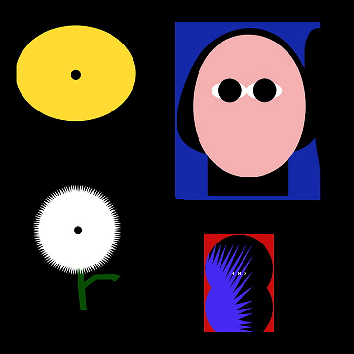
A collage of four minimalist graphic illustrations on a black background. The images include a yellow oval, a pink face with black eyes, a white spiky flower, and a blue abstract shape on a red field.

Chris Harnan blends the handmade with the digital in his abstract images

—
Date
14 December 2016

Berlin and London-based image maker Chris Harnan’s style is process driven and he puts an emphasis on “play and experimentation”, forcing himself to “follow tangents that develop from accidents”. His works are a hybrid of handmade elements with computer created imagery, giving Chris an “archive of materials” to pull from when creating a new work.

Chris’ posters and standalone imagery have that internet art-inspired aesthetic to it, with different figures and shapes laid out onto an array of colourful backgrounds. The artist says his work goes beyond just computer references: “I’m influenced in a more general way by design and artwork made by people who don’t consider themselves artists – particularly children’s art or purely functional design,” he explains.
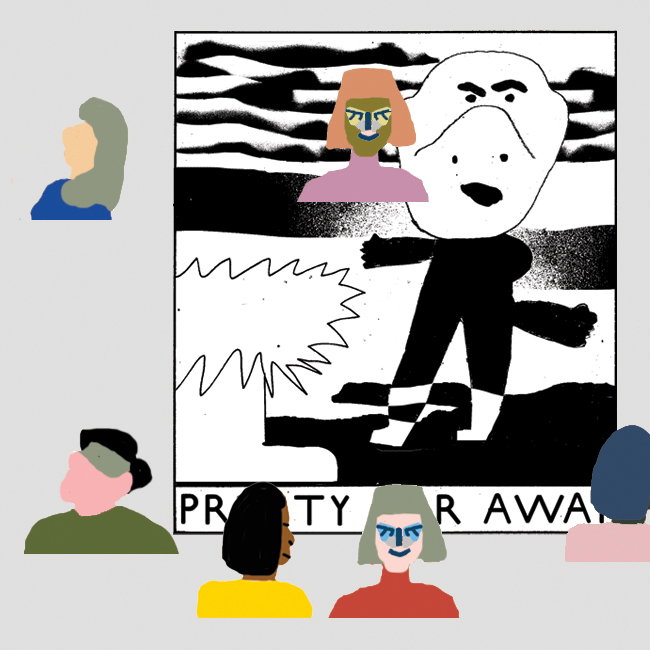
A collage featuring a black and white graphic of a stylized figure standing beside a jagged shape. The image is framed by several simplified, colourful figures who appear to be viewing the artwork. A banner at the bottom contains the fragmented text “PRTY R AWAI”.
Above
Left

Chris Harnan

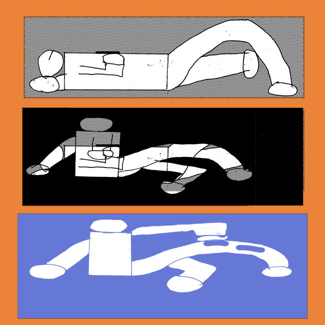
An illustration of three horizontal panels on an orange background. Each panel shows a stylised figure in a different pose and colour palette of grey, black and blue.

For the last six months the creative has been interning for Hort, and where he has spent time developing and refining his approach. “My process has been a key part in developing work that might seem digital at first, but a lot of work has gone into making the materials with my hands and I feel it loses a lot of its strength if I don’t commit to this way of working,” he explains. “To me, what’s key to developing new graphic languages is a far more tactile way of figuring new ways to do things and not getting stuck in the same way of working.”

Composition is a big part of Chris’ work and his affinity for playing with different components on a page is one of the reasons why he prefers simple geometrics and basic imagery. “Playing with sizes and positioning is easier when the elements are somewhat disposable, and creating links between the different elements is easier when the imagery is uncomplicated.”

Through Chris’ experimental approach his ideas also have an organic way of being realised. “I will have certain objectives in the back of my mind and simple solutions to the problem but I try not to get too attached to them,” he says. “The aim of playing is to stumble across things I couldn’t find if I was staring at a blank sketchbook page.”
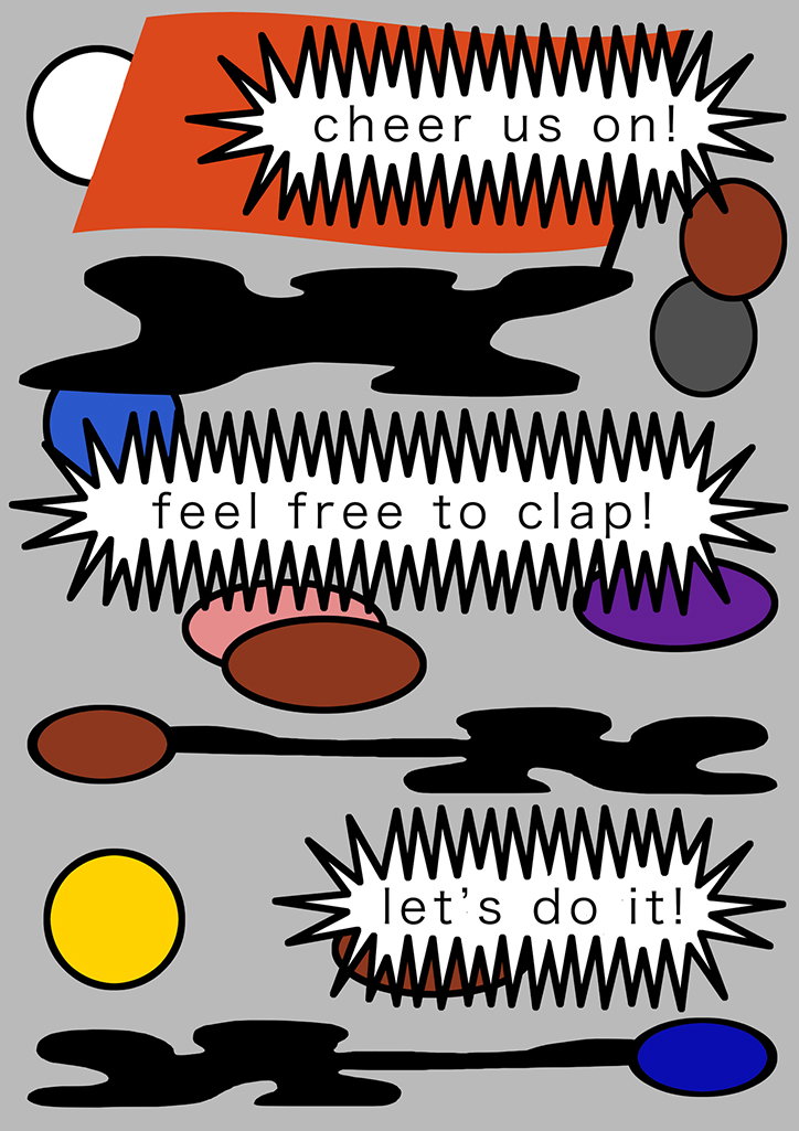
An illustration of three jagged speech bubbles on a grey background, each containing a phrase in lowercase. The bubbles read “cheer us on!”, “feel free to clap!” and “let’s do it!”. Abstract shapes in red, blue, yellow and purple are scattered around the text.
Above

Chris Harnan

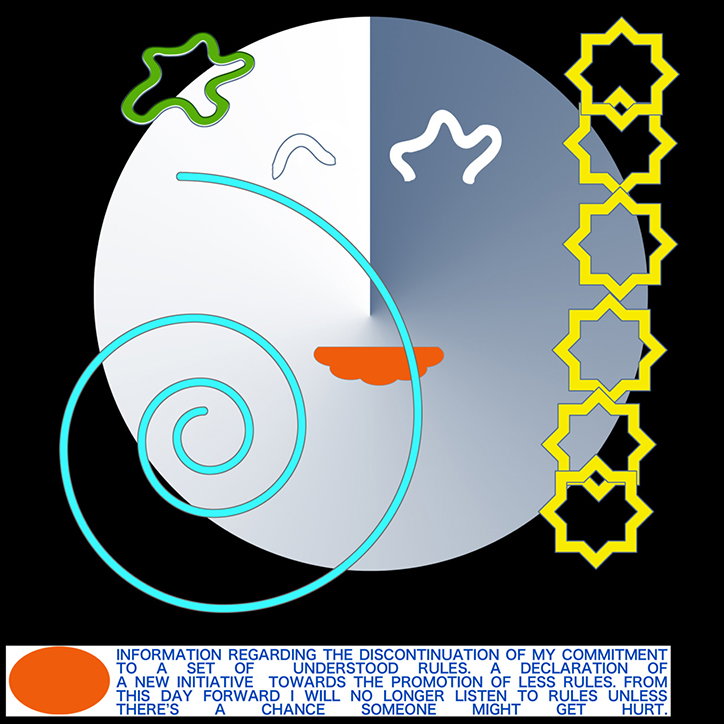
A digital illustration of a pale blue circle on a black background, featuring a light blue spiral and a small orange shape. To the right, a vertical row of yellow eight-pointed stars is aligned. Below the circle, a block of text reads “Information regarding the discontinuation of my commitment to a set of understood rules” and declares a new initiative to promote fewer rules.
Above

Chris Harnan

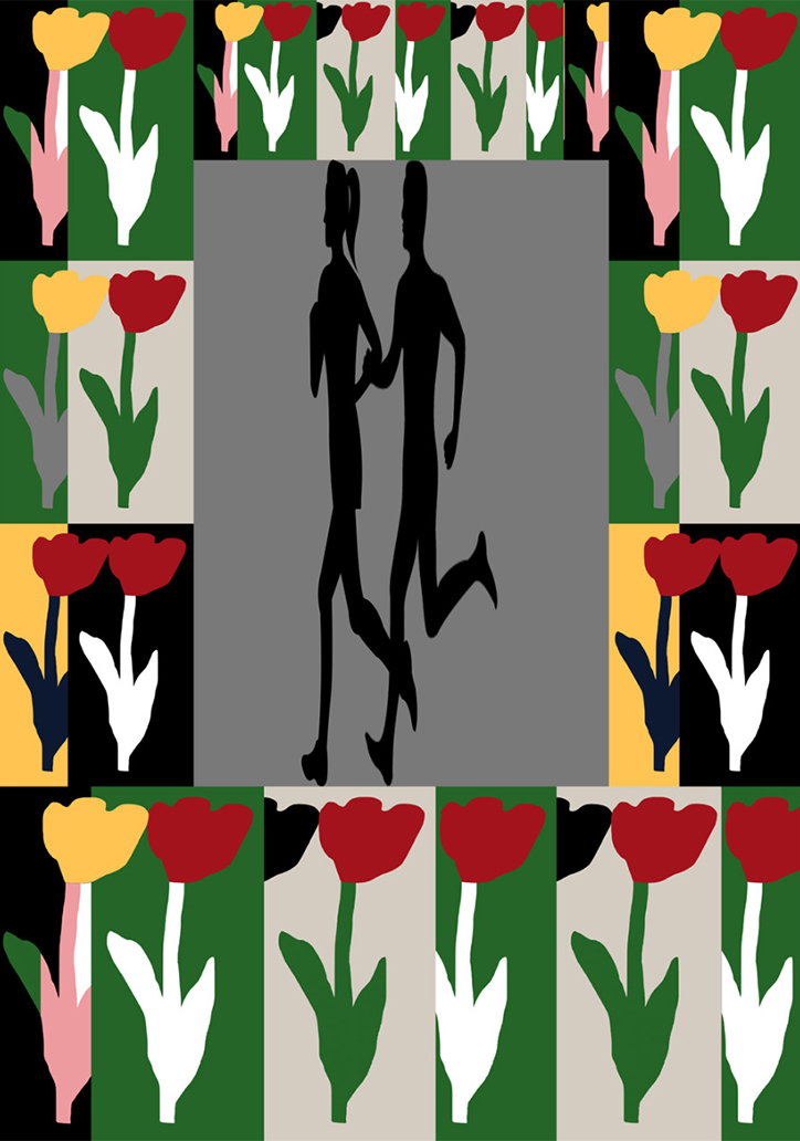
An illustration of two silhouetted figures running hand in hand within a grey central square. The scene is framed by a border of stylised red and yellow tulips against alternating blocks of green, white and grey.
Above

Chris Harnan

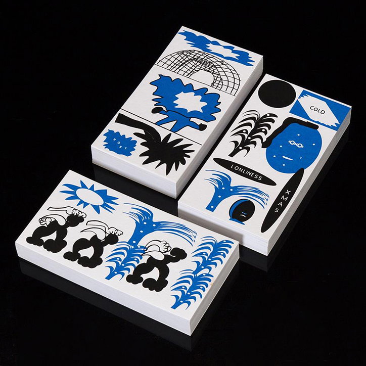
Three stacks of white cards with blue and black illustrations are arranged on a black surface. The cards feature abstract figures and shapes, with legible text including “Cold” and “Lonliness”.
Above

Chris Harnan

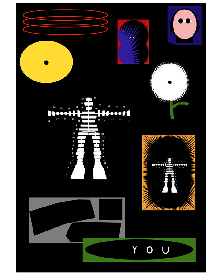
A graphic collage on a black background featuring various abstract shapes and diagrams. A central white figure is depicted as a numbered anatomical chart, mirrored by a smaller version inside an orange frame. At the bottom, a green oval contains the word “YOU”.
Above

Chris Harnan

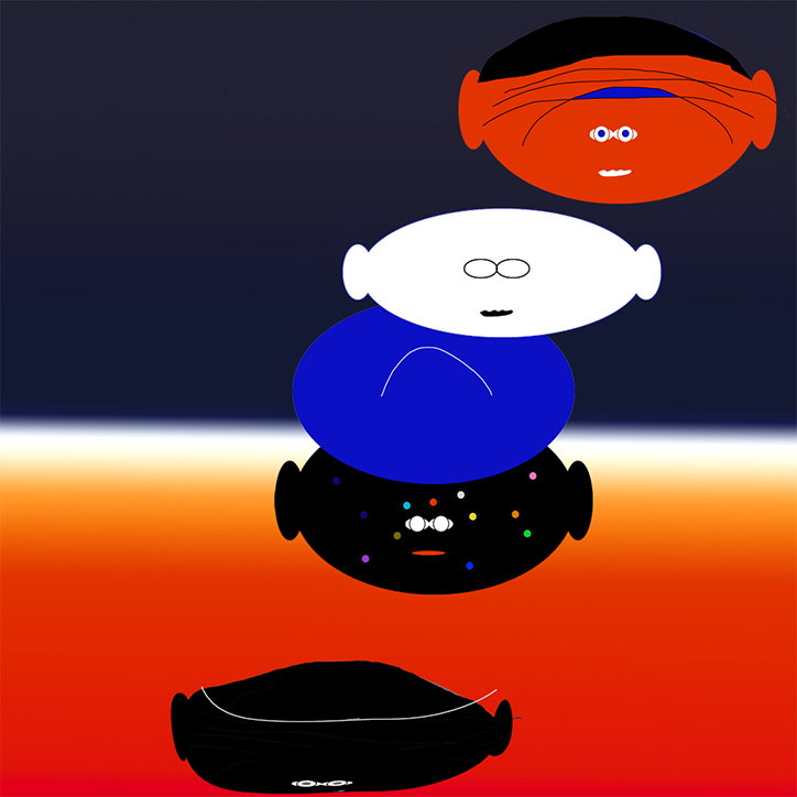
An illustration of five stylised, oval faces stacked vertically against a gradient background of dark blue and orange. The figures are rendered in flat blocks of red, white, blue and black, each with minimal facial features.
Above

Chris Harnan

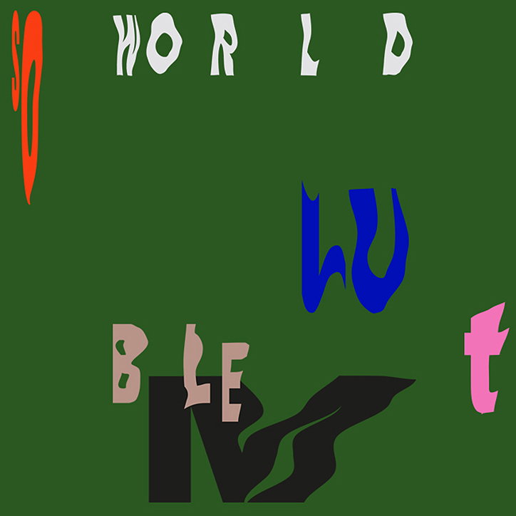
A graphic illustration on a dark green background featuring fragmented, stylised letters in various colours. The word “WORLD” appears in white at the top, while other abstract shapes and letters in orange, blue, pink and beige are scattered below.
Above

Chris Harnan

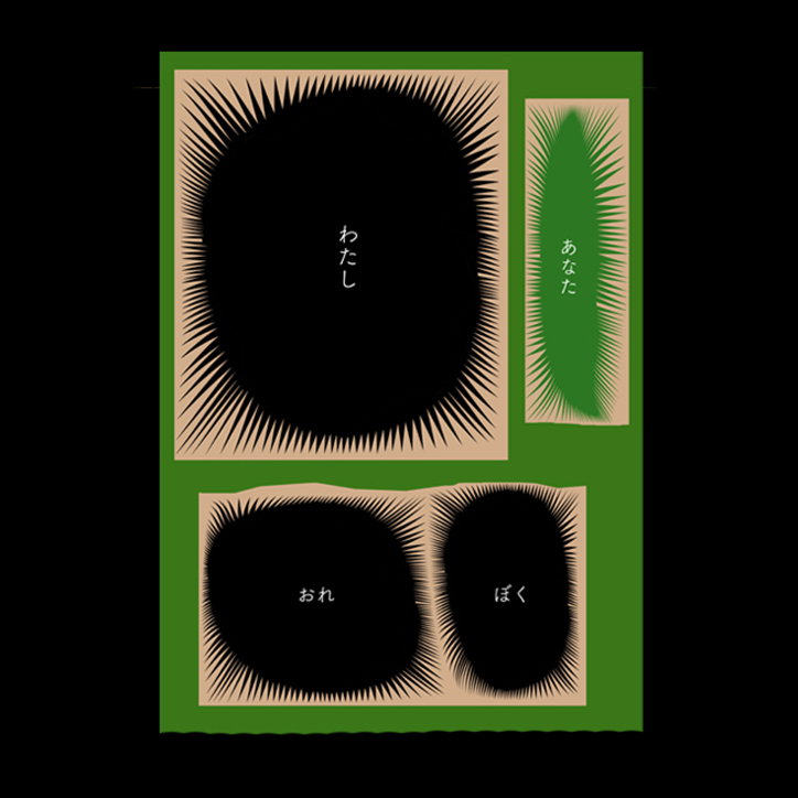
An illustration of four black, organic shapes with spiked edges set against a green background. Each shape contains a Japanese word in white, including “わたし”, “あなた”, “おれ” and “ぼく”.
Above

Chris Harnan

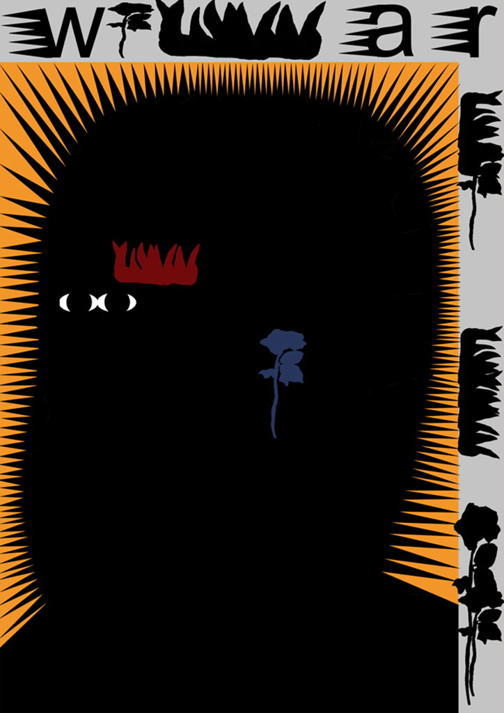
An illustration of a black silhouette of a head against a bright orange background with radiating spikes. The silhouette contains a small red crown, two white circular eyes, and a single blue rose. The word “war” is written in bold, distorted black lettering across the top.
Above

Chris Harnan

Share Article

About the Author

Rebecca Fulleylove

—

Rebecca Fulleylove is a freelance writer and editor specialising in art, design and culture. She is also senior writer at Creative Review, having previously worked at Elephant, Google Arts & Culture, and It’s Nice That.

It's Nice That Newsletters

Fancy a bit of It's Nice That in your inbox? Sign up to our newsletters and we'll keep you in the loop with everything good going on in the creative world.