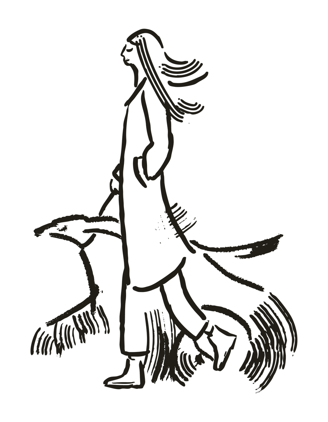
The loveable line drawings of this dog hotel brand identity take cues from The New Yorker’s illustrations
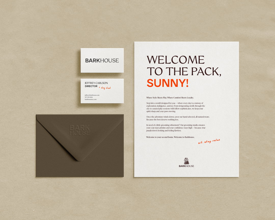
Led by Crown Creative, this premium hotel for pooches uses a sans and serif typeface to represent two voices: the dog and it’s owner.
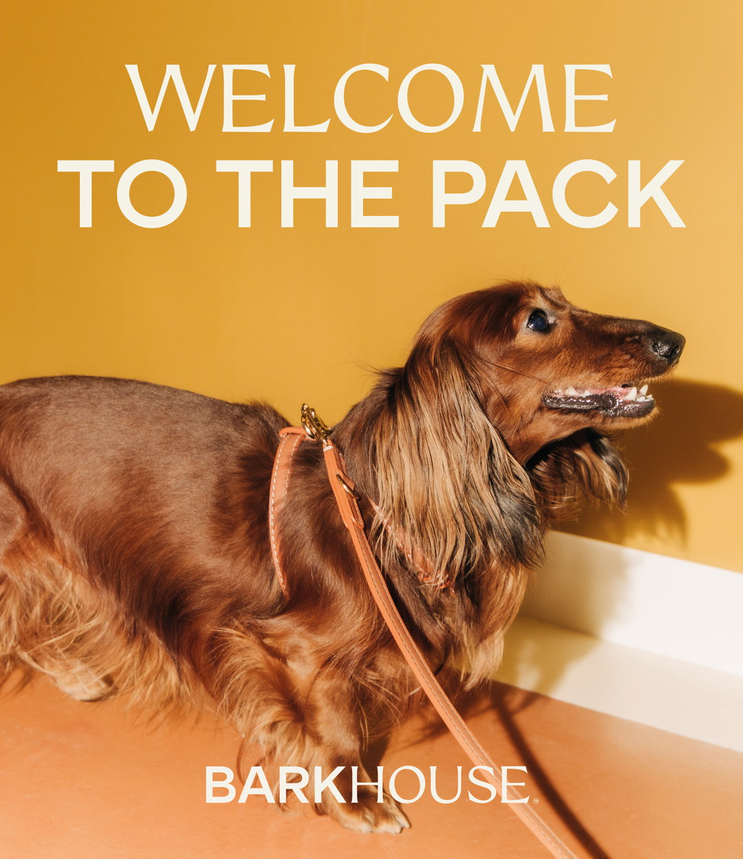
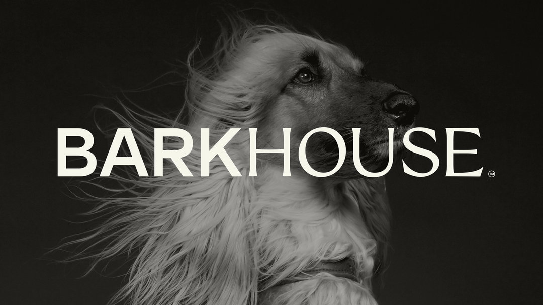
Lois Duncan’s 1971 novel Hotel For Dogs is what an animal-lover’s dreams of made of – a hotel full of stranded dogs looking for love and the humans that care for them. Now, it’s jumping right off the page. There’s plenty of dog hotels in the world, but these paradors for pooches are under-represented in the branding world, until now. Crown Creative, a Belfast-based design studio working across brand strategy, identity and digital, have stepped up to create a wholesome identity for the New York City hotel Barkhouse, the ‘Equinox for dogs’.
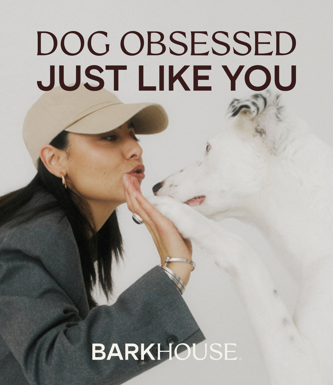
The identity isn’t just about creating a sense of luxury and trust for dog owners, but warmth, personality and joy that represents beloved pets. “It’s not everyday that you get to do a project on a luxury dog hotel,” says Ryan Crown, founder of Crown Creative. “What really stood out is how much that relationship has shifted. For a lot of people, especially in cities like New York, dogs aren’t just pets anymore, they’re family. People are already investing in their own routines, whether that’s wellness, fitness, food and it’s starting to extend to their dogs in the same way.”
Creative Crown: Barkhouse (Copyright © Creative Crown, 2026)
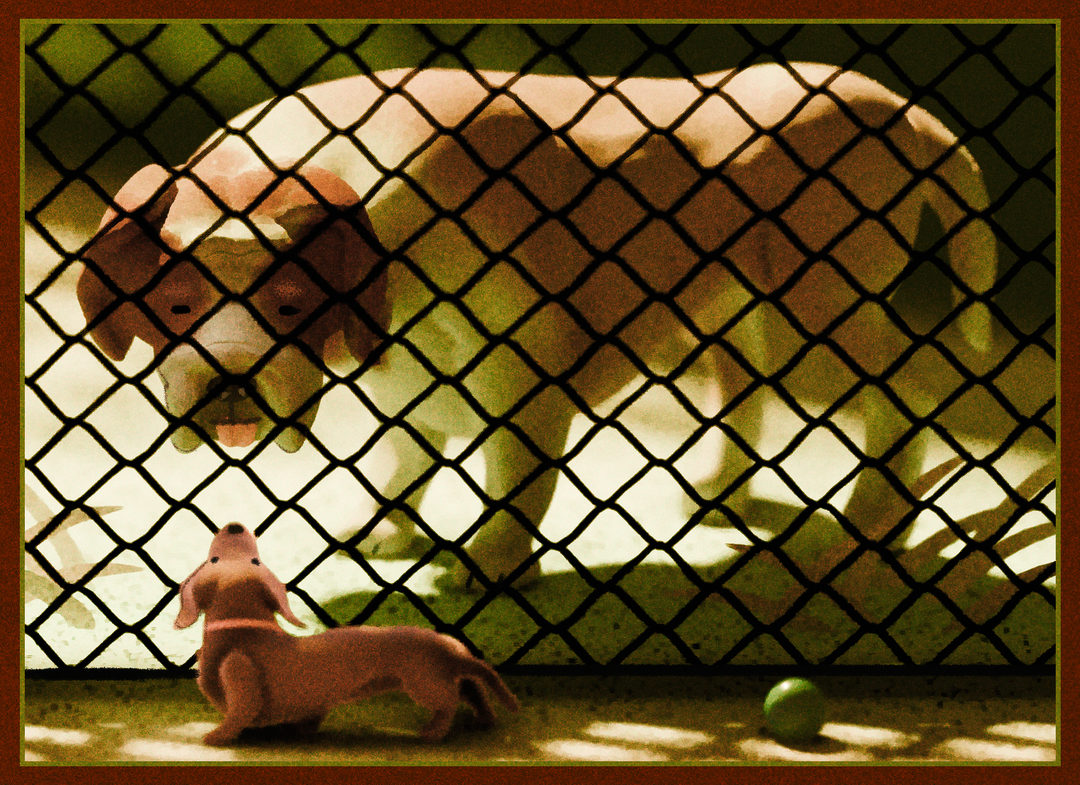
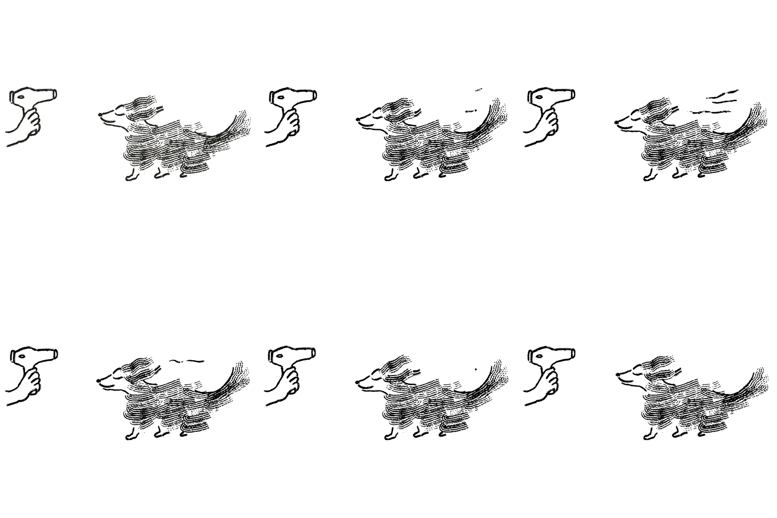
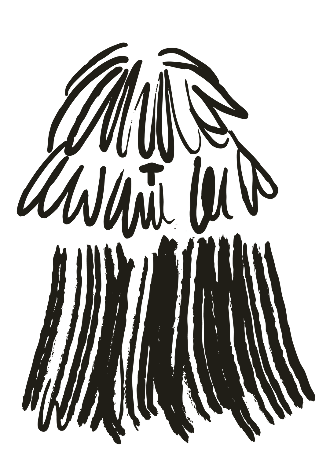
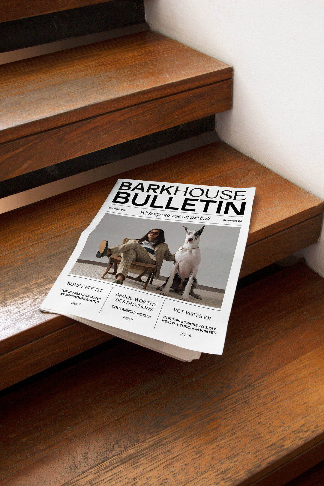
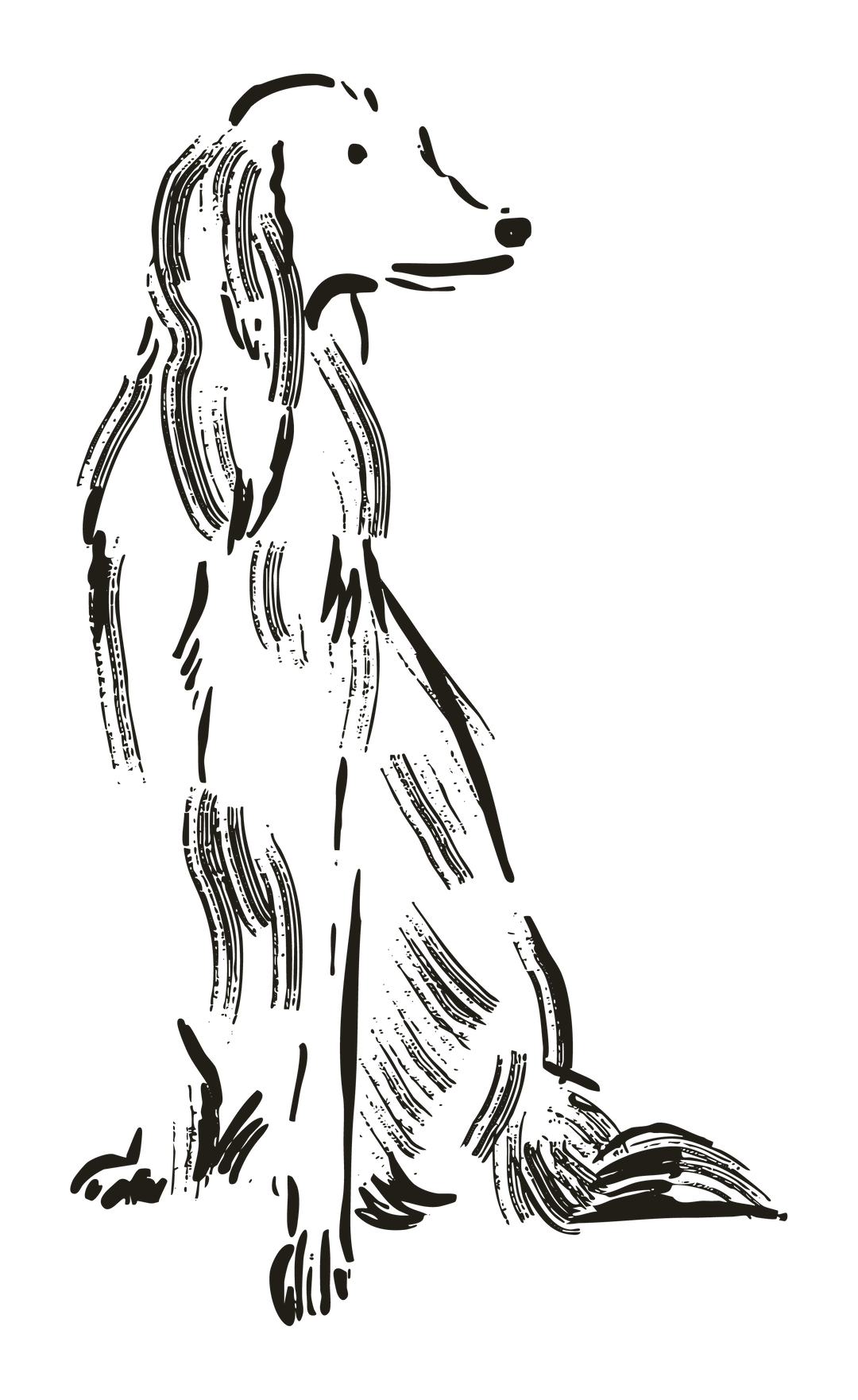
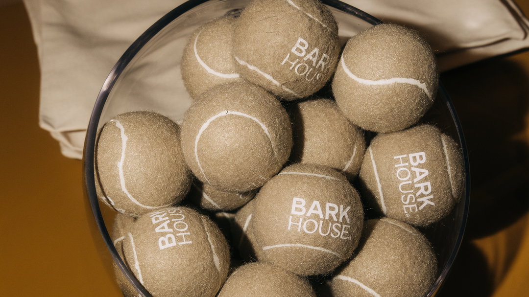
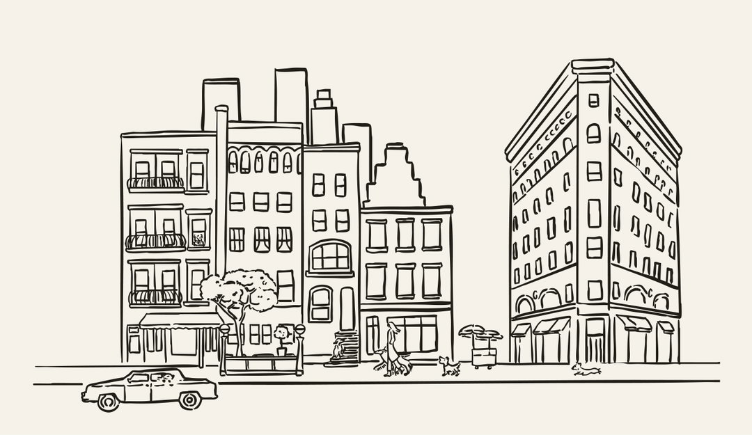
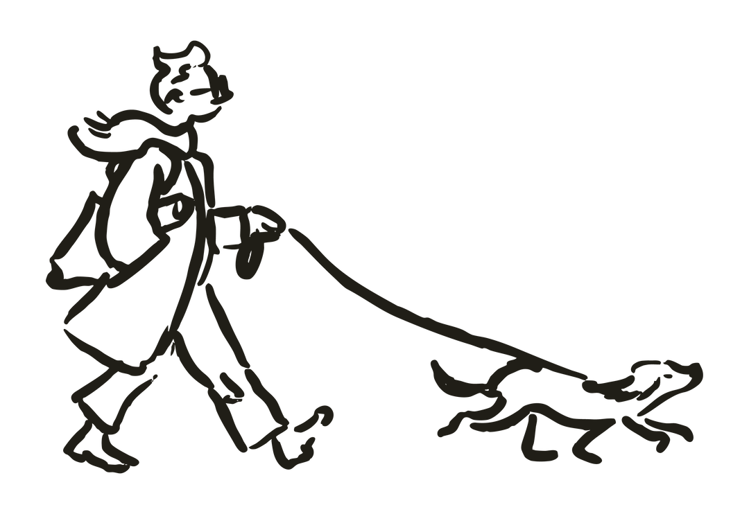
Straying away from dated doggy daycare aesthetics, which are often overly clinical or cutesy, the team at Crown Creative were conscious of creating something considered and elevated, whilst rooting the identity in movement, play and personality. From logos printed onto fetch balls to a Barkhouse Bulletin newspaper, the team drew inspiration from The New Yorker for loose, observational drawing styles for Barkhouse’s whimsical animated illustrations. “Dogs are instinctive and expressive, so we tried to reflect that in the line work, keeping things slightly imperfect, a bit more textured and focused on movement,” says Ryan.
The team elected for both a sans and serif typeface, uses at the same time, to capture two audiences at once: the dog and its owner. The serif gives a sense of “refinement and trust”, whilst the sans brings “warmth and immediacy”, says Ryan. He continues: “We liked the idea that one feels like the owner’s voice and the other feels like the dog’s. Not in a literal way, but in terms of tone.”
Depicting over ten dogs – including ones belonging to the founders and Crown Creative’s own team – the illustrations became less about drawing any old dog and more about drawing the real characters the team had to work from: how that canine sits, moves and carries itself. That’s what makes Barkhouse’s identity so charming – it’s rooted in the lovability of pets. It’s just another innovation in the canine daycare industry, but with a personality that sits between domestication and off-the-collar freedom.
GalleryCreative Crown: Barkhouse (Copyright © Creative Crown, 2026)
Hero Header
Creative Crown: Barkhouse (Copyright © Creative Crown, 2026)
Share Article
Further Info
About the Author
—
Paul M (He/Him) is a Junior Writer at It’s Nice That since May 2025. He has a strong interest in graphic design, digital kitsch, multimedia painting, collage, nostalgia, analogue technology and all matters of strange stuff. pcm@itsnicethat.com
To submit your work to be featured on the site, see our Submissions Guide.