




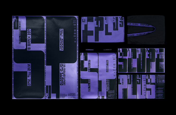
Darius Ou creates dynamic, typographic identity for electronic music festival
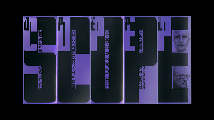
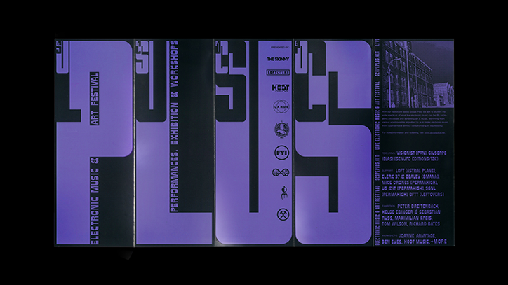
Designer Darius Ou has created an identity for ScopePlus, an electronic music and art festival held in Huddersfield. Set up by record label Mutualism this year, the festival combines live music with an art exhibition and workshops. Darius was brought in by his friend Sebastian Zimmerhackl who is also part of the design team, “he was working in Germany and the client were in the UK, whereas I was in Singapore, so we all communicated through emails, Skype and Facebook,” explains Darius.
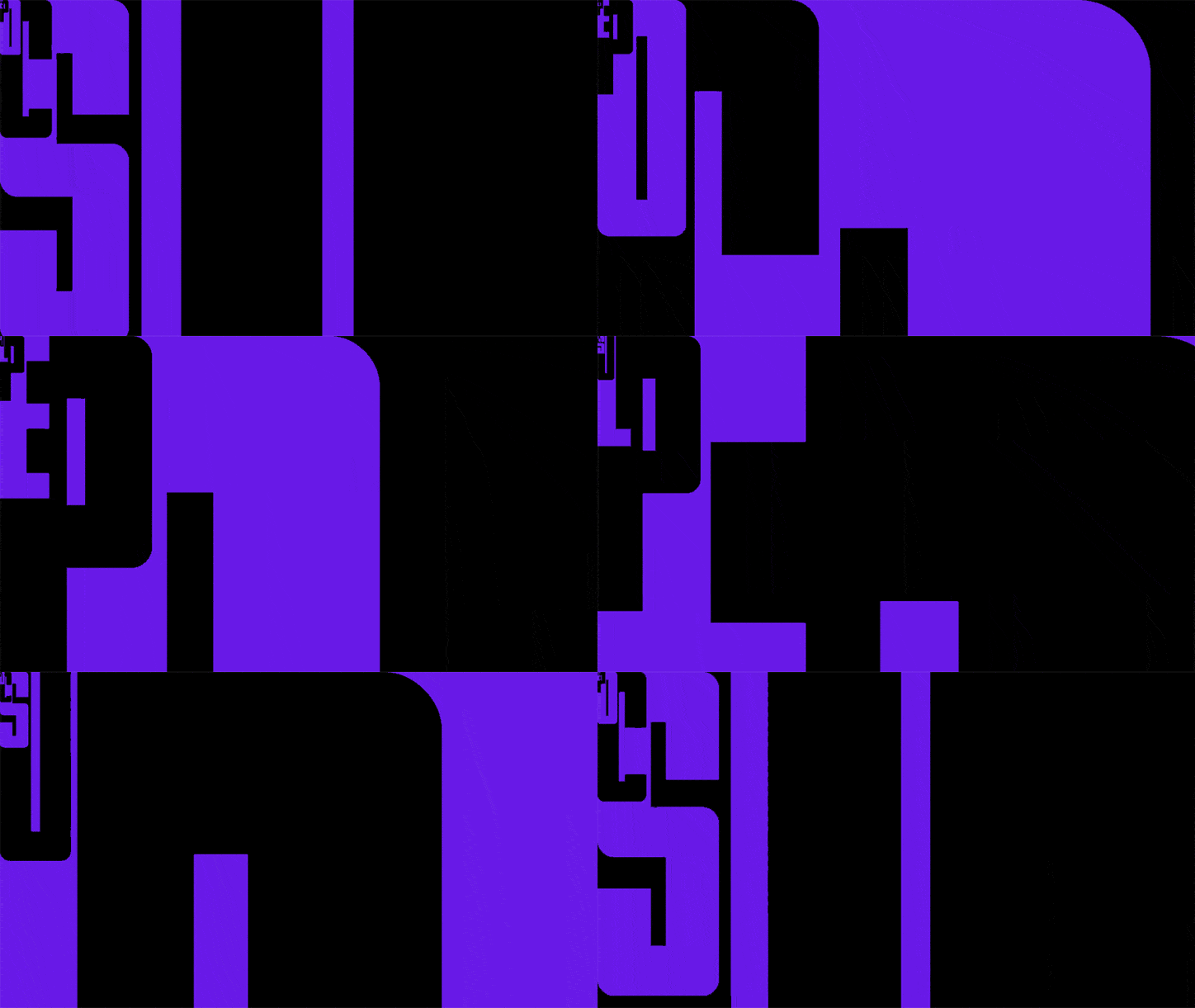
“I wanted to capture this synergy between them and the community, as well as between electronic music and art. Because of this, the first visual that formed in my head was not a static one, but an animated sequence.” The festival explores the wide spectrum of what live electronic music can be and inspiration first came from the name of the festival. “The words ‘scope’ and ‘plus’ form two main ideas, one about the ever-expanding scope of what art and music can be, and the other about the idea of zooming-in. The art direction of ScopePlus takes cues from these ideas and is derived from an animated ‘zoom in’ loop sequence of characters within characters.”
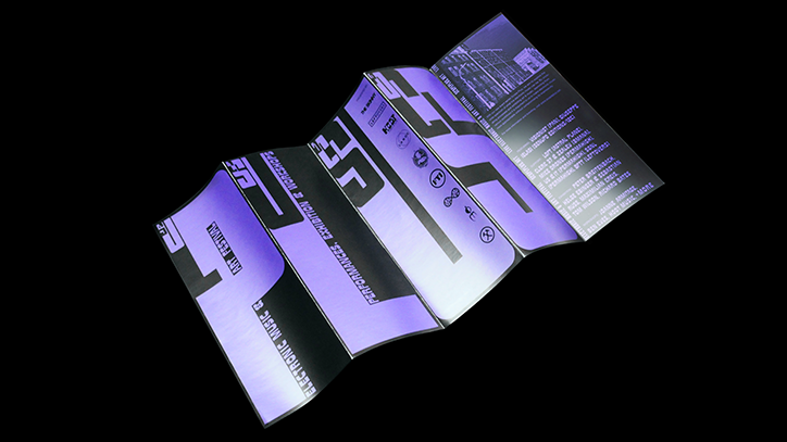
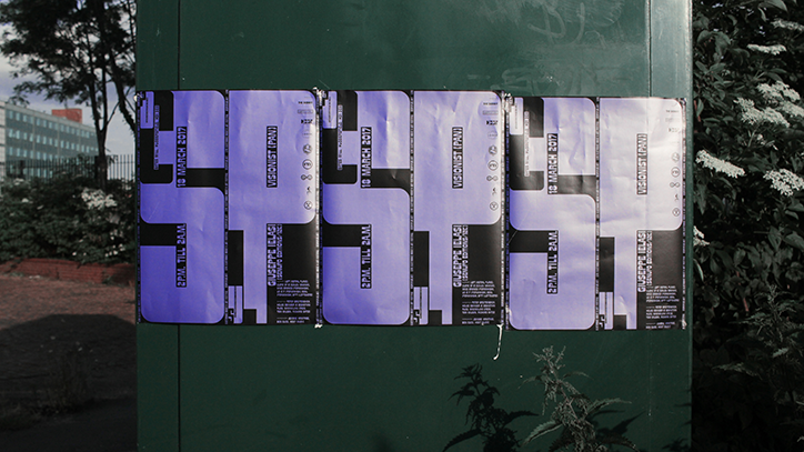
Using thick, bold typography as the main visual, the identity encompasses animated teasers and promo videos as well as posters, programmes and a website, creating a cohesive aesthetic. For the colour palette, Darius and the team experimented with various bold combinations to capture Mutualism’s spirit and its hopes for ScopePlus, settling on metallic purple and cool black for maximum impact. Despite the challenges of working across three cities in three different countries, the identity explores the boundaries between graphic design, motion graphics and audio design. “We hope that the design does the even justice and conveys the festival’s spirit and vibes effectively,” says Darius.
Darius Ou
Darius Ou
Darius Ou
Darius Ou
Darius Ou
Share Article
Further Info
About the Author
—
Rebecca Fulleylove is a freelance writer and editor specialising in art, design and culture. She is also senior writer at Creative Review, having previously worked at Elephant, Google Arts & Culture, and It’s Nice That.



