Creative director David Lane tells us about redesigning frieze and creating campaigns for Hermés and Ally Capellino
Creative director David Lane possesses levels of productivity most of us can only dream of. With business partner Marina Tweed, David runs Lane & Associates, a creative agency and content agency based in east London. From beneath the Lane & Associates umbrella, the work the duo produces spans creative direction, content and curation. They founded and edit The Gourmand and somehow, for the last five months, David has found the time to art direct frieze, where he has just completed an entire redesign. Phew!
We spoke to David and asked him to take us through three of his favourite projects from recent months.
Hermés Mens Ties and scarves SS17 campaign and catalogue
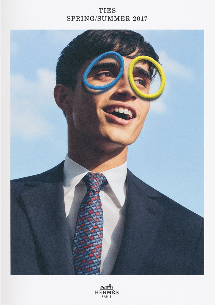
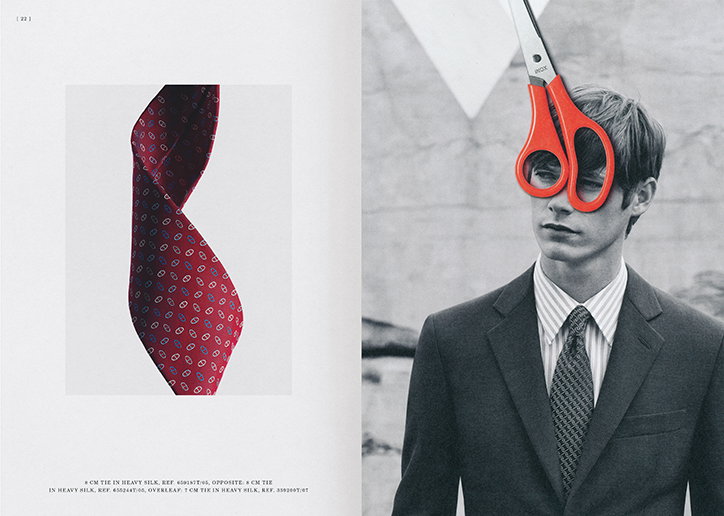
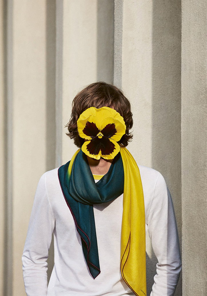
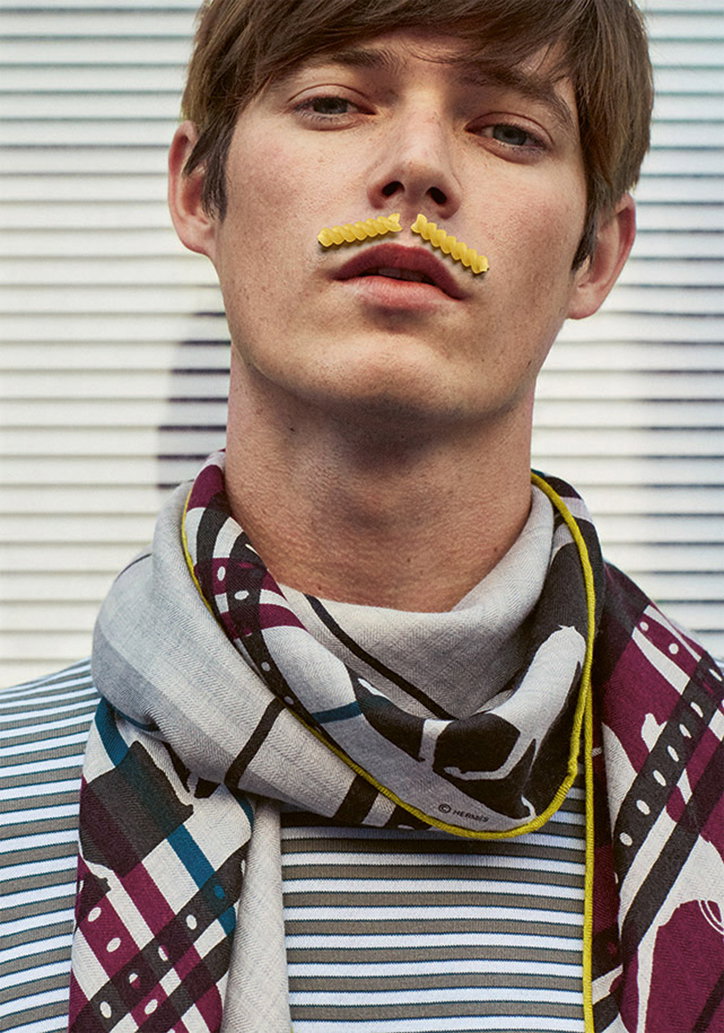
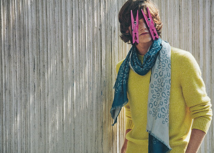
The majority of us agree that the most attractive characteristic is a good sense of humour. As a brand, Hermès has always had a playful approach and a great wit, both in its designs and its promotional material. In a luxury market that is often based solely on beauty and value, this, to me was Hermés most exciting and unique asset.
I wanted to add something simple to otherwise elegant and serious fashion imagery that changed its meaning: an illustration or a collaged element. We found Thomas Lelu’s work and it fitted perfectly. It was so simple and so funny. It was exactly what you would want to do to the images if you had the props in front of you, it was immediate and the contrast of how quick and simple looking it was balanced perfectly with the serious images we were defacing.
The photographer Daniel Riera was totally up for the collaboration and loved Thomas work too. His images are so classically beautiful the collaboration worked perfectly. We didn’t tell the models we were going to do it — I hope they like it! For the still life shots I wanted something incredibly simple that didn’t take away from the bigger concept but showed the quality of the product.
Hermés Mens Ties and scarves SS17 campaign and catalogue
Art Direction: David Lane
Photography: Daniel Riera (fashion) and Carl Kleiner (still life)
Collage artist: Thomas Lelu
Hermés Mens Ties and scarves SS17 campaign and catalogue
Art Direction: David Lane
Photography: Daniel Riera (fashion) and Carl Kleiner (still life)
Collage artist: Thomas Lelu
Hermés Mens Ties and scarves SS17 campaign and catalogue
Art Direction: David Lane
Photography: Daniel Riera (fashion) and Carl Kleiner (still life)
Collage artist: Thomas Lelu
Hermés Mens Ties and scarves SS17 campaign and catalogue
Art Direction: David Lane
Photography: Daniel Riera (fashion) and Carl Kleiner (still life)
Collage artist: Thomas Lelu
Hermés Mens Ties and scarves SS17 campaign and catalogue
Art Direction: David Lane
Photography: Daniel Riera (fashion) and Carl Kleiner (still life)
Collage artist: Thomas Lelu
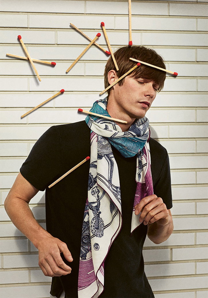
Hermés Mens Ties and scarves SS17 campaign and catalogue
Art Direction: David Lane
Photography: Daniel Riera (fashion) and Carl Kleiner (still life)
Collage artist: Thomas Lelu
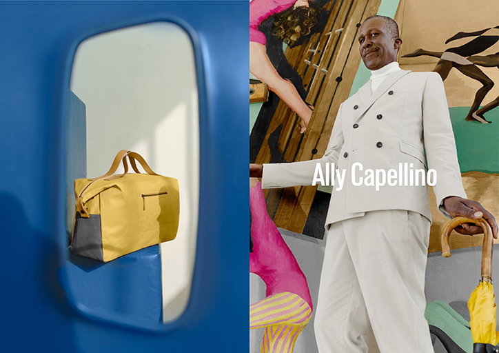
Ally Capellino SS17 campaign
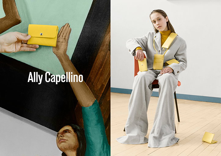
Ally has an Instagram account called Ally Capellino plastic chairs. This was the starting point for the campaign. We decided that a school would be the perfect setting for the shoot: they are always full of plastic chairs and everyone turns up with a bag.
We shot in Haggerston school which was designed by Erno Goldfinger of Trellick Tower fame, and is beautiful. There is also an amazing mural in the gym. We wanted to honour the fact it was in a school with the casting so along side models of different ages we asked the very dapper caretaker if he would be in it.
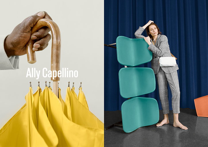
Ally Capellino SS17 campaign
Art Direction: David Lane
Photography: Agnes Lloyd-Platt
Set Design: Georgina Prangell
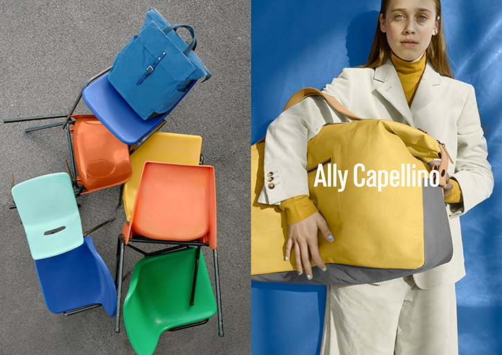
Ally Capellino SS17 campaign
Art Direction: David Lane
Photography: Agnes Lloyd-Platt
Set Design: Georgina Prangell
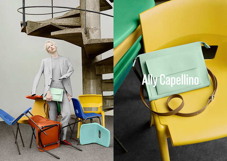
Ally Capellino SS17 campaign
Art Direction: David Lane
Photography: Agnes Lloyd-Platt
Set Design: Georgina Prangell
Ally Capellino SS17 campaign
Art Direction: David Lane
Photography: Agnes Lloyd-Platt
Set Design: Georgina Prangell
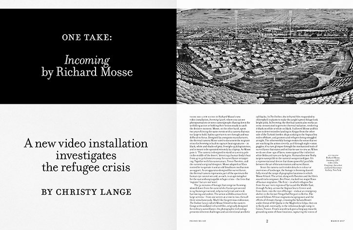
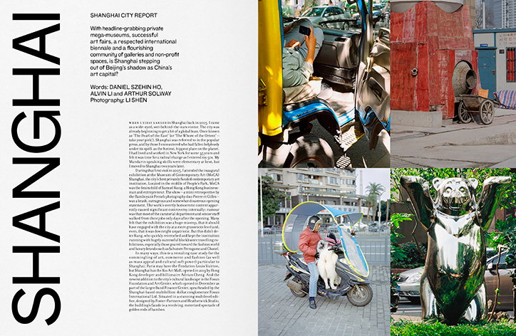
frieze redesign
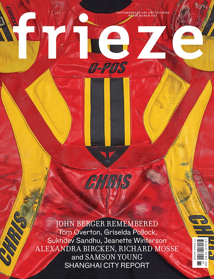
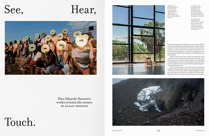
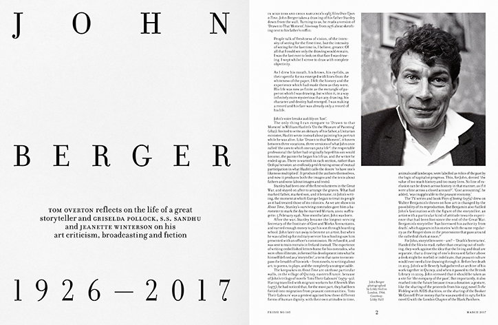
I collaborated with Radim Pesko who is amazing. We developed a new custom typeface, frieze grotesk. It’s not a practical san serif but as you increase the size for titles you see how irregular and interesting some of its forms are. It’s intentionally not beautiful. I chose a typeface that Zuzana Licko designed called Filosofia to use for the columns and features section. It’s based on the smaller type sizes of Bodoni, the metal type he designed.
We think of Bodoni as being the voice of fashion: very contrasty, elegant, and to me, boring. I think this version is much more representative of Bodoni’s original designs. All the other designs look like they have been made on a computer, they are too perfect. Filosofia has much more character and fitted the editorial voice of the magazine really well. Suzana designed the typeface that the original Frieze logo was set in, and the very first issue of the magazine featured Emigre so it was nice to continue the lineage and use a boundary that has been a bit overlooked as type design has moved on.
frieze
frieze
frieze
frieze
frieze
Share Article
Further Info
About the Author
—
Bryony joined It's Nice That as Deputy Editor in August 2016, following roles at Mother, Secret Cinema, LAW, Rollacoaster and Wonderland. She later became Acting Editor at It's Nice That, before leaving in late 2018.