




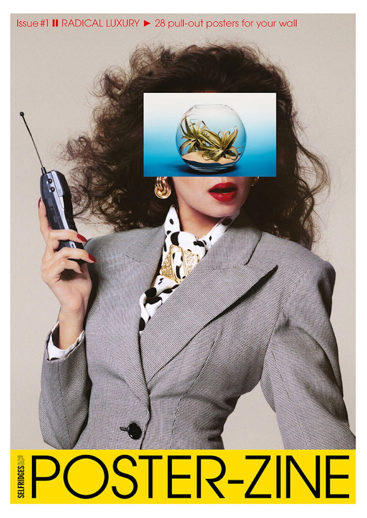
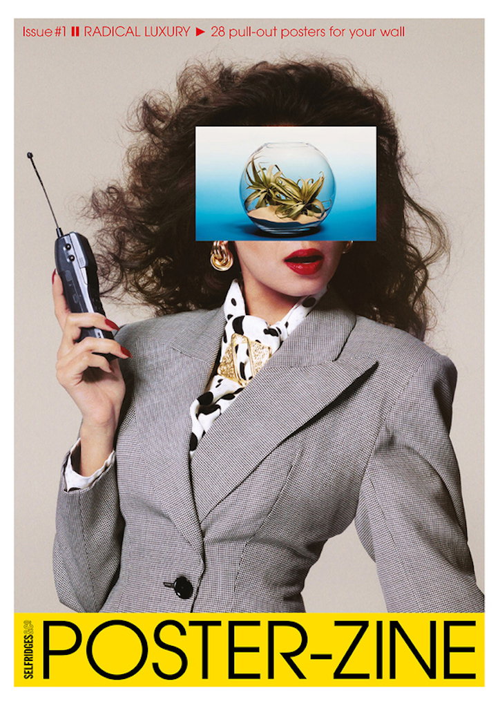
Radical Luxury: David Lane and Richard Gray collaborate on new poster-zine for Selfridges
Since the start of 2018, Selfridges have concentrated their efforts on defining the meaning of modern luxury, be it through exhibitions, pop-ups or capsule collections by the likes of Michele Lamy and Gareth Pugh. The pursuit continues, this time with the launch of a new magazine to coincide with the unveiling of the third phase of the department store’s accessories hall, which features a new art-filled entrance on Duke Street, as well as the first European outpost of Tokyo’s Aoyama Flower Market. And with art direction by David Lane of Lane & Associates and The Gourmand, and edited by Richard Gray, director of November Creative, they’re pulling out all the stops.
Richard – who recently founded agency November Creative, and before which served as Fashion and Creative Director at The Sunday Times Style – describes the initial creative process as “about taking luxury and twisting it and inverting it and questioning it”. He praises Selfridges for the groundwork they put into the project, “[they] did weeks of research speaking with people who set the pulse in the UK to ask what their luxury was, and how they see it, and this fed our imaginations” but, above all, it was the megastore’s open-mindedness that allowed the project to flourish, and their genuine desire to disrupt the current notion of “luxury”.
The zine is unusual in its format, made up of 28 double-sided A2 posters packaged together to create a magazine. Each poster has “an A-side” of “radical artwork” made up of “must-keep pics and collages” and a B-side: intelligently written articles by big names such as Will Self, Alice Rawsthorn and Alex Fury, as well as interviews with Virgil Abloh, Hans-Ulrich Obrist and Norbert Shoerner. The format was inspired by the memory of “how much fun it was to plaster your walls with posters as a teenager” explains art director David Lane, as well as the desire to “create something permanent in a very digital world”.
The visuals, commissioned and art directed by David, come courtesy of a vast array of industry-leading creatives. The list includes stylist Ibrahim Kamara who collaborated with photographer Nadine Ijewere to shoot street-cast dancers; David Uzquiza and Adrian Gonzalez-Cohen from Buffalo Studio (of Buffalo Zine magazine fame) who collaborated on a self-portrait with Yvan Fabing; along with Art School, Charles Jeffrey, Matthieu Lavanchy and Bruno Staub, among many others. The common thread being that each contributor was radical in their own way; they were all fearless, energetic and eager to creatively challenge both themselves and any existing preconceptions of “luxury”.
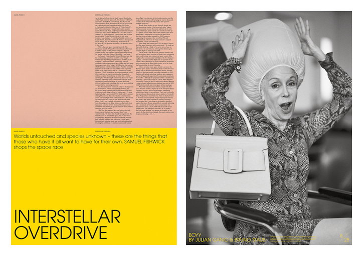
Photography by Bruno Staub, styling by Julian Ganio
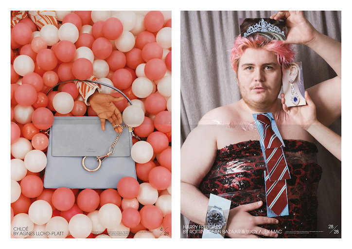
Left-hand image: photography by Agnes Lloyd-Platt
Right-hand image: Harry Freegard by Rottingdean Bazaar and Lucy Alex Mac
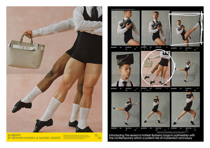
Photography by Nadine Ijewere, styling by Ibrahim Kamara
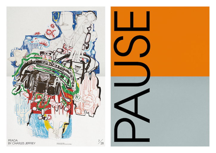
Illustration by Charles Jeffrey
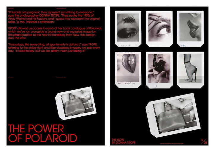
Photography by Donna Trope
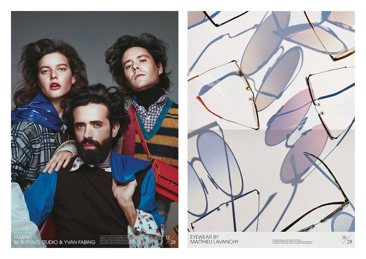
Left-hand image: photography by Yvan Fabing, art direction by Buffalo Studio
Right-hand image: photography by Matthieu Lavanchy
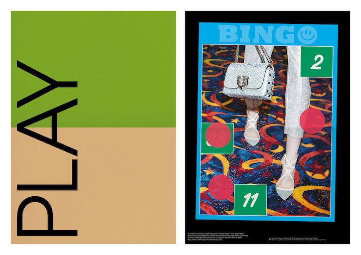
Photography by Charlie Kwai, styling by Matt King
Share Article
Further Info
About the Author
—
Ellie joined It’s Nice That as managing editor from June to September 2018.