Inside the identity for cancer-treatment friendly cosmetics brand, Moksi
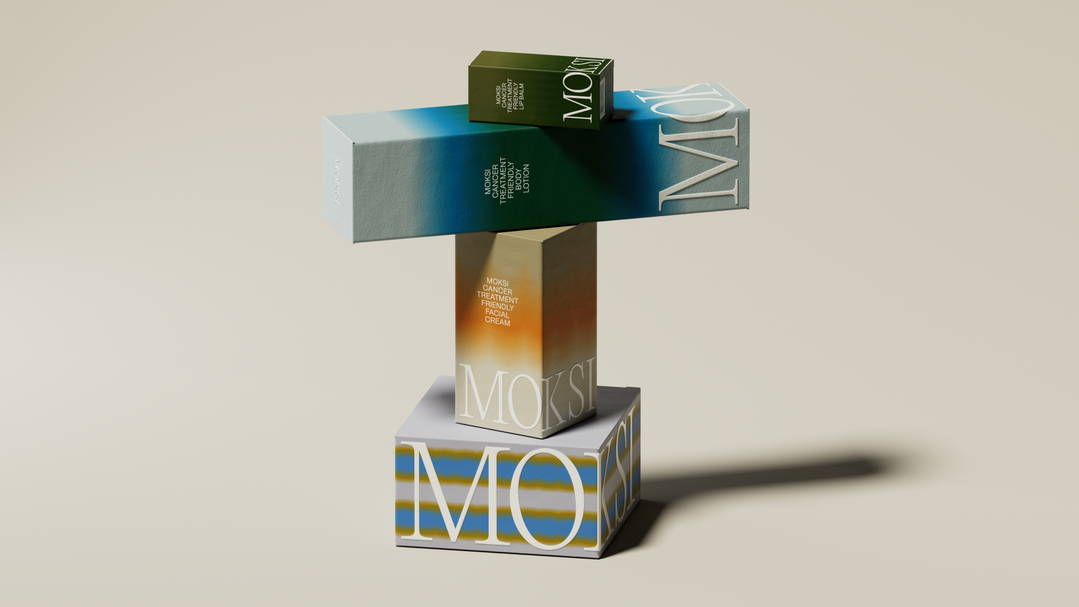
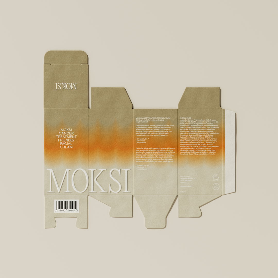
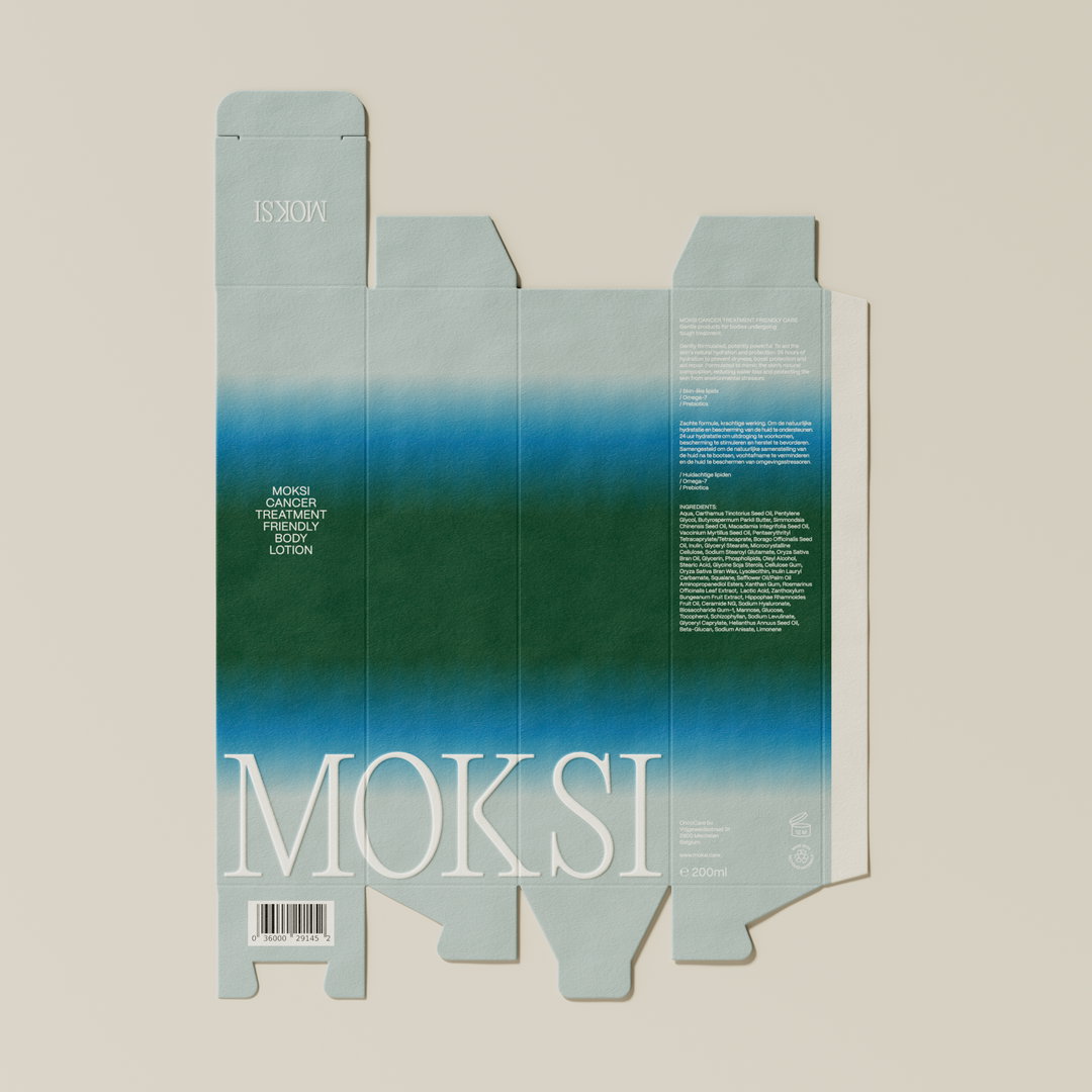
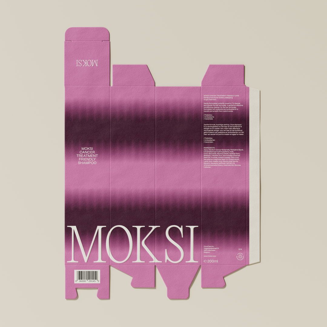
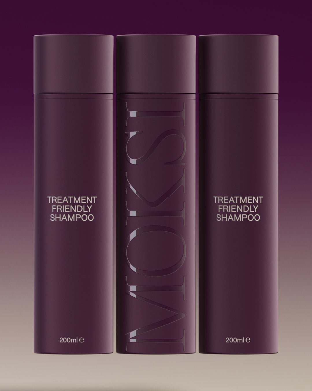
Fcklck Studio focused on the details at every stage, from business cards giving potential investors a tactile experience, to packaging reminiscent of “spread-out cream”.
Share
Fcklck Studio was first introduced to cancer-friendly skincare brand Moksi through the brand’s founder, Lies De Nyn, who started the brand after her own experience undergoing cancer treatment. Back then, Lies was in the process of finding, funding and approaching labs to create formulations. “We’ve been lucky to be by her side from very early on in the process,” says Tarryn Blackwood, co-founder of Fcklck. Drawn to Lies’ passion to create products that centre others undergoing treatment, the team began working on a preliminary identity that would enable her to carry out crowdfunding and approach investors and banks. “Like most people we’ve all had friends or family affected by cancer, so the product and approach resonated with all of us.”
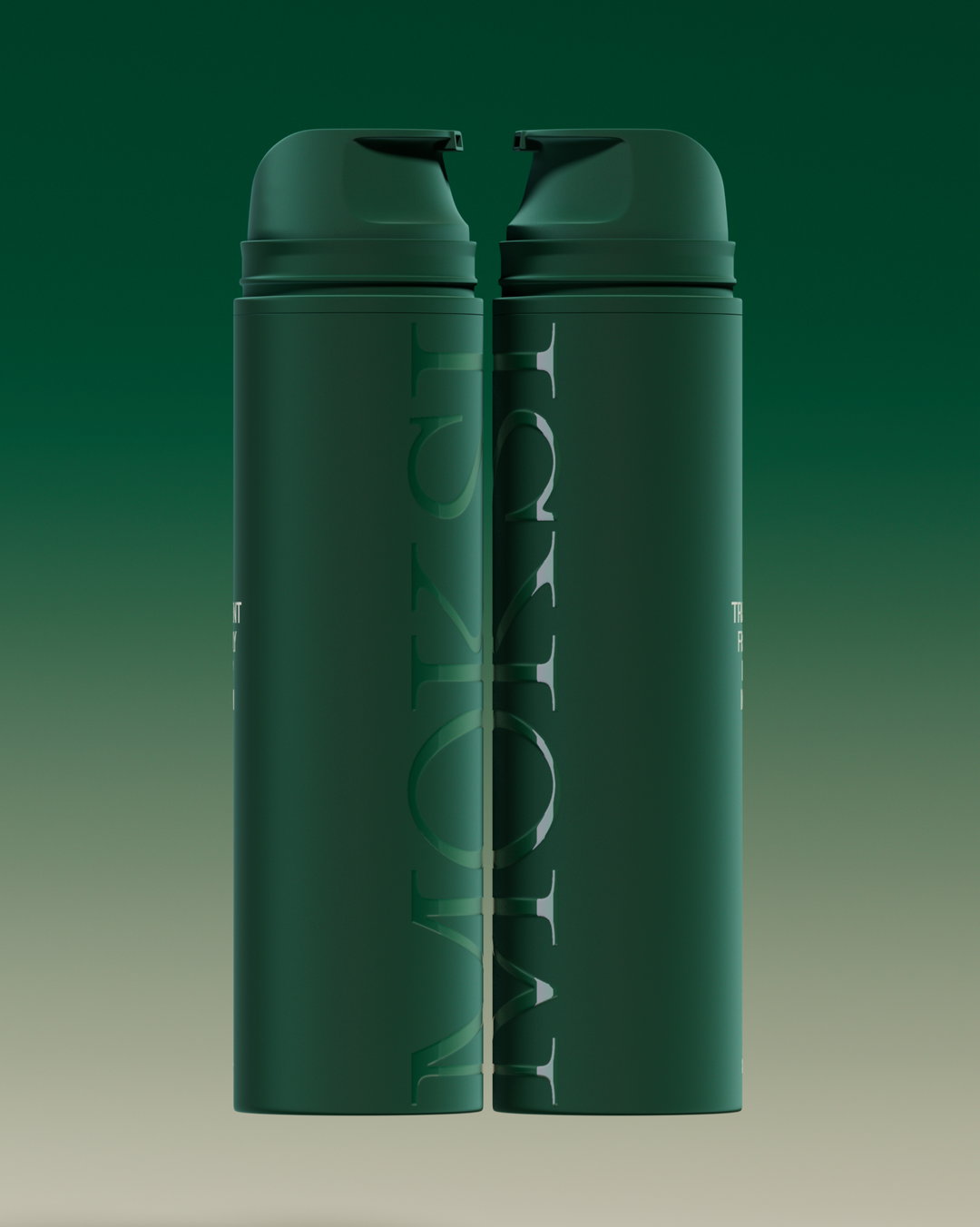
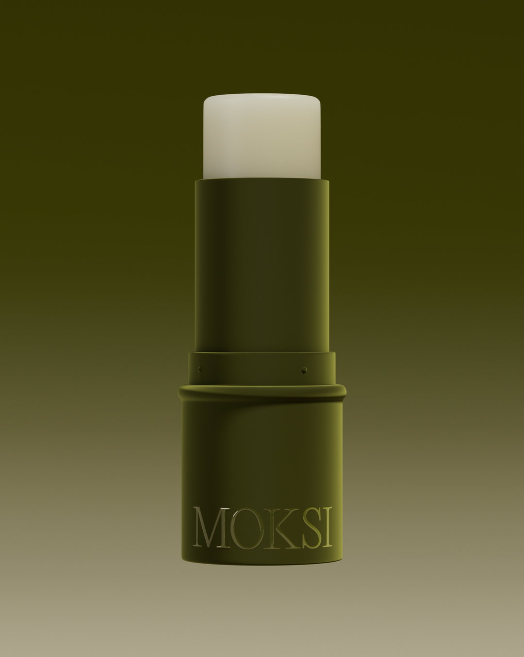
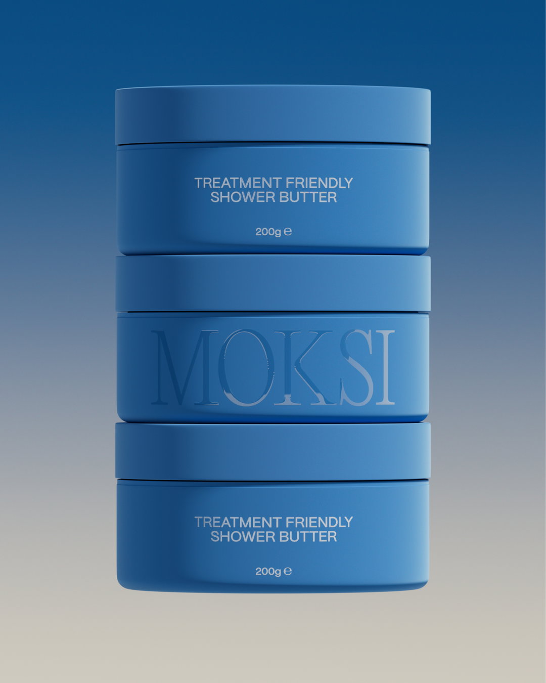
Fcklck very quickly understood Lies aim for the product. While the current market of similar cosmetics “often appeared overly clinical”, says Tarryn, Moksi’s identity would stand completely outside of the medical aesthetic, and instead focus on portraying radiance. “In order to achieve this we employed various strategies. Firstly we developed vibrant and gentle gradients, before amplifying its transitory quality to give the appearance of a colourful spread-out cream.”
Throughout the product packaging there is the feeling of intensity paired with calm, a quiet confidence. The base colours are consistent, while offering a certain flexibility, from subtle to bold. “We wanted to give Moksi a look that embodies both positivity when needed outside and calmness at home.”
Fcklck Studio: Moksi (Copyright © Fcklck Studio, 2023)
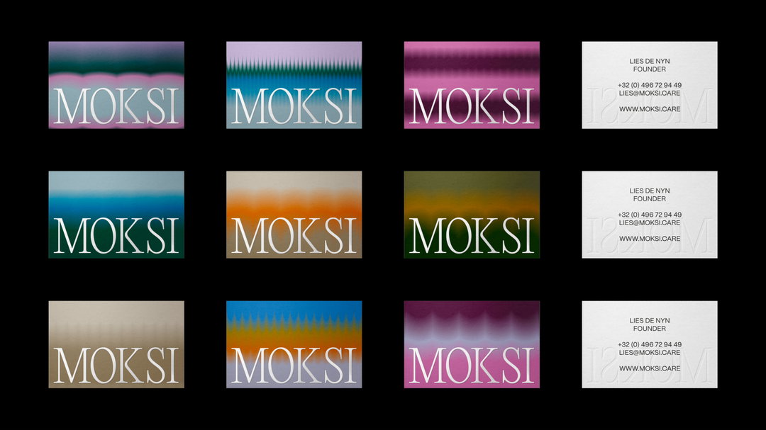
One of the most noticeable and surprising parts of the branding is the business cards, especially for such a forward-thinking brand. At the beginning of the project, Fcklck noticed that Lies was constantly engaged in daily meetings and events, networking and pitching for funding opportunities. “At this time there were no physical products, packaging and no website,” says Tarryn, “so the cards were really a way to provide a first taste of the branding. They were low-cost but so effective and a beautifully tactile way to bring the brand to life”, she adds.
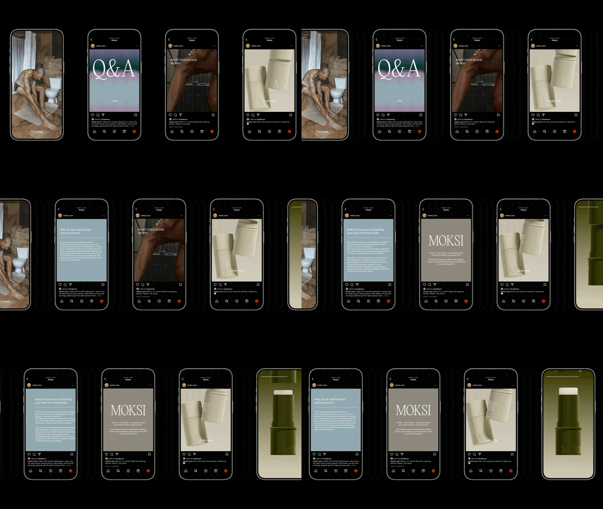
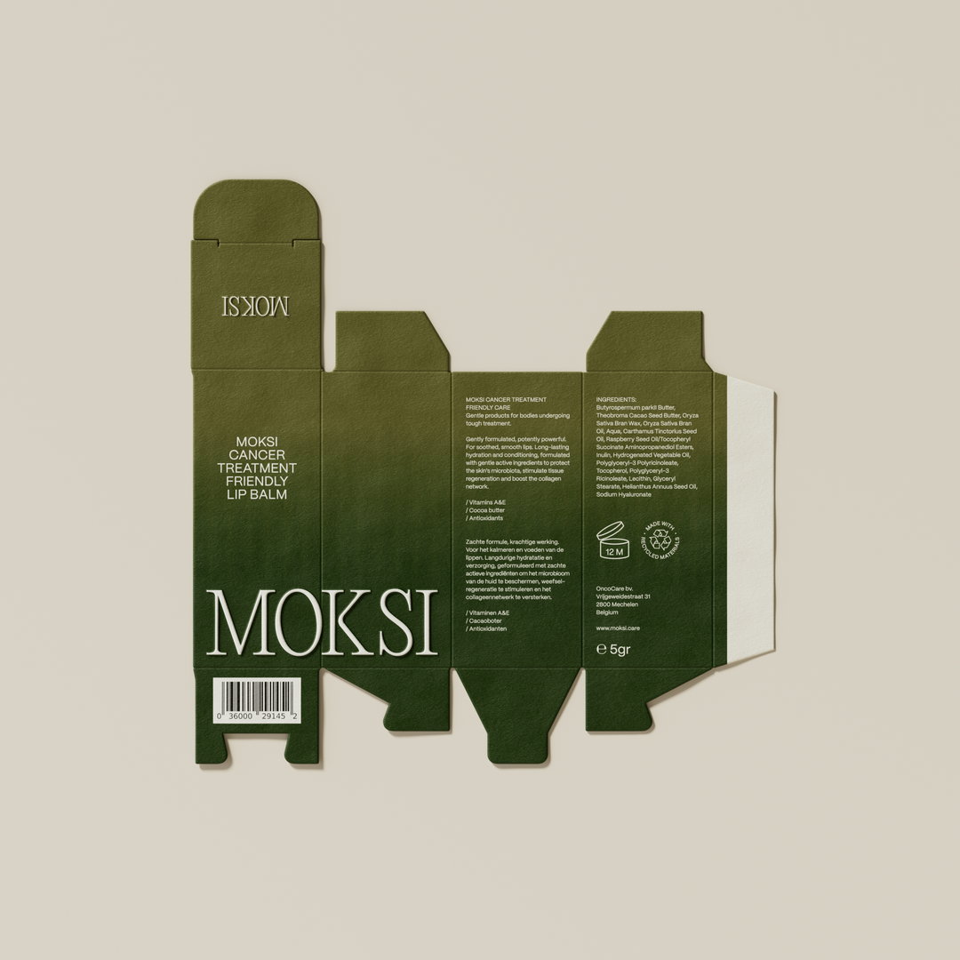
Fcklck also contributed to the tone of voice for Moksi’s branding campaign. During the process, the studio utilised Lies’ network of contacts who had also undergone cancer treatment, who gave feedback on elements of the branding, product beta testing and copy. “For the copy we needed to ensure we were sensitive to how we talked about cancer,” says Tarryn. “Did users want the products to have the word cancer on them? Was that too much?” Simply put, the team wanted to ensure that Moksi could be identified with by the audience, which led to the tagline ‘cancer-treatment friendly’ on the boxes and on the product itself ‘treatment friendly’. “Users didn’t necessarily want guests or even themselves to see ‘cancer’ written on the products when using them on a day-to-day basis.”
In this way, Moksi’s branding centres the experience of those who have experienced cancer, from the talent Fcklck worked with on shoots, through to copy. With the identity, the studio hopes to “influence those supporting people with cancer, by providing them with products that are not only useful but also beautiful”.
GalleryFcklck Studio: Moksi (Copyright © Fcklck Studio, 2023)
Hero Header
Fcklck Studio: Moksi (Copyright © Fcklck Studio, 2023)
Share Article
Further Info
About the Author
—
Yaya (they/them) was previously a staff writer at It’s Nice That. With a particular interest in Black visual culture, they have previously written for publications such as WePresent, alongside work as a researcher and facilitator for Barbican and Dulwich Picture Gallery.