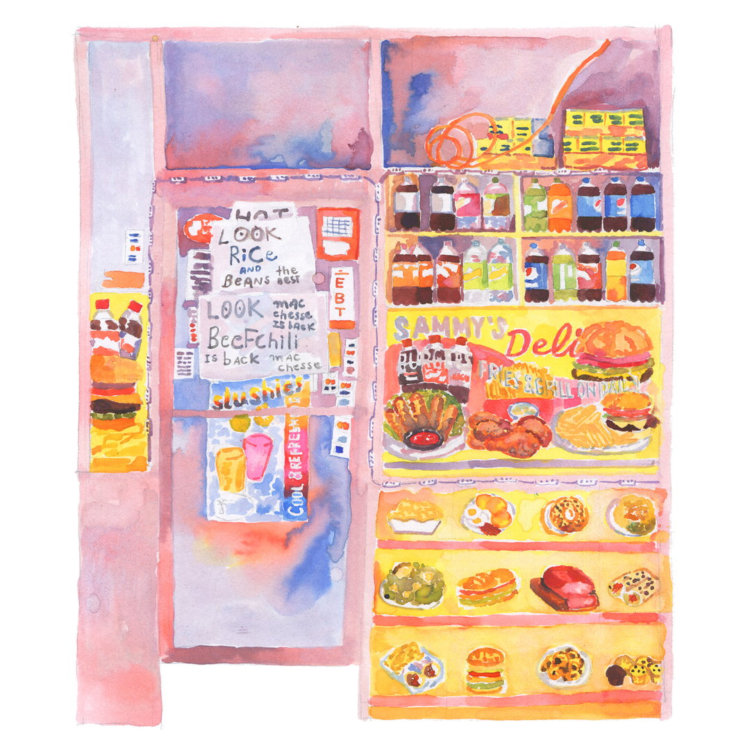
Gabi Lamontagne celebrates New York’s bodegas through vivid watercolour illustrations
The design director at Chobani discusses the importance of personal projects and how they can influence commercial work too.
New York-based Gabi Lamontagne joined Chobani (a Greek yoghurt brand in the US) three years ago as design director, just in time for a major rebrand. Although known for her graphic design skills, in her spare time, Gabi takes to a set of watercolour paints like a duck to water, and it is these beautiful illustrations that we are focussing on today. With a background in both graphic design and illustration, before Chobani, she co-founded a screen printing atelier Charmant & Courtois in Montréal where she developed much of her creative process.
She tells It’s Nice That: “I tend to approach graphic design through illustration. It can be with flare shapes, patterns or watercolours, and sometimes, I still draw by assembling layers like I would when screen printing.” It was a former boss and friend, Lisa Smith, who first encouraged Gabi to take the step from flat illustration to watercolour, and she only really took to the medium a few years ago, once she was working with Chobani on her first wave of packaging for the rebrand.
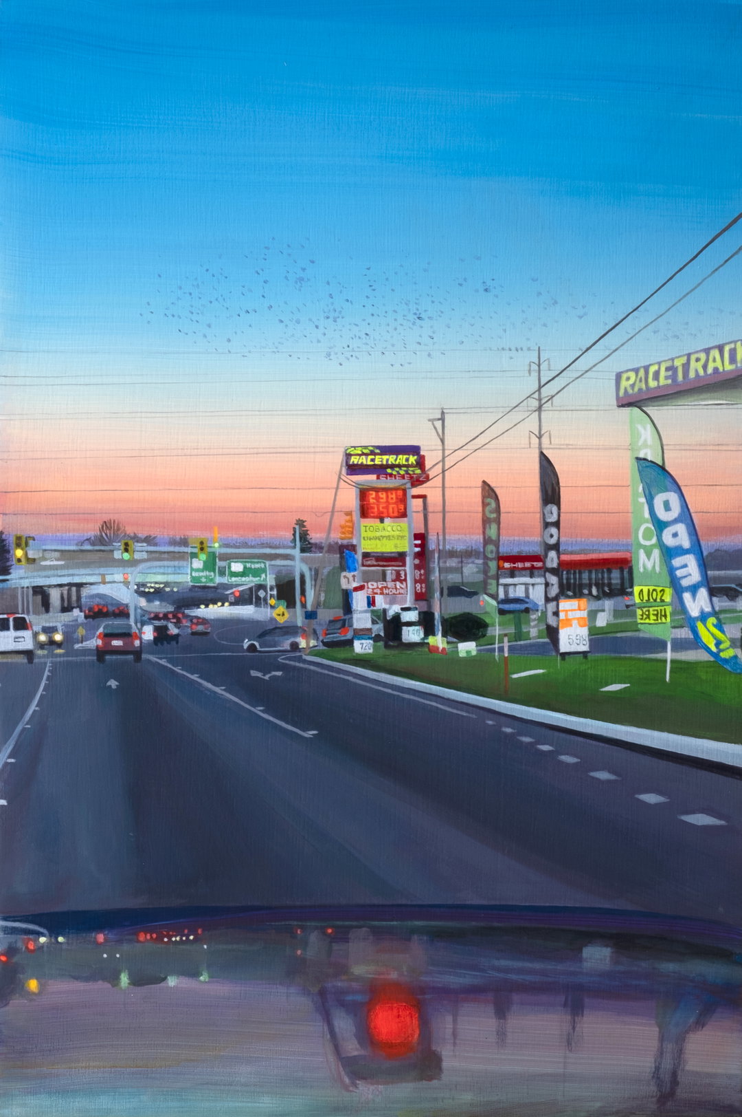
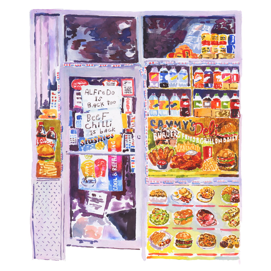
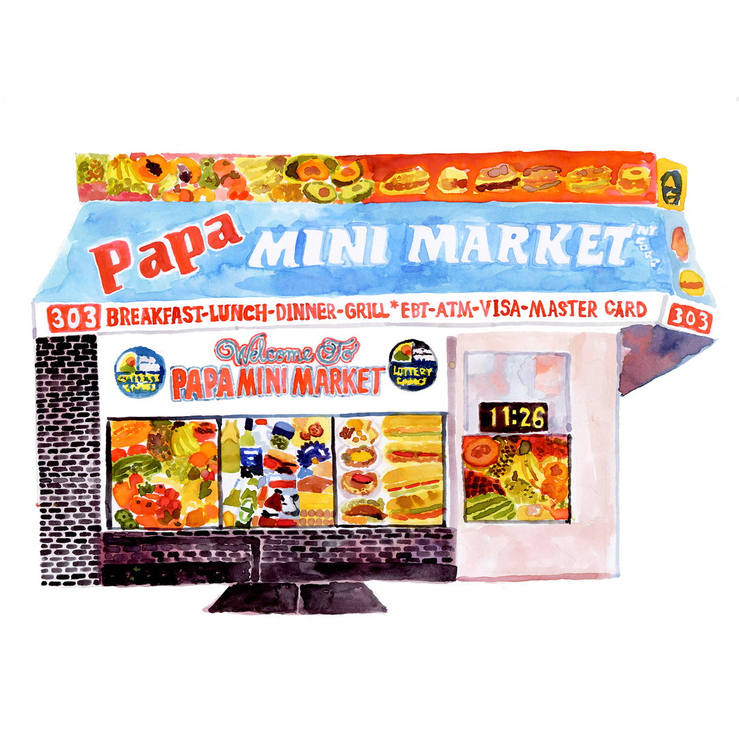
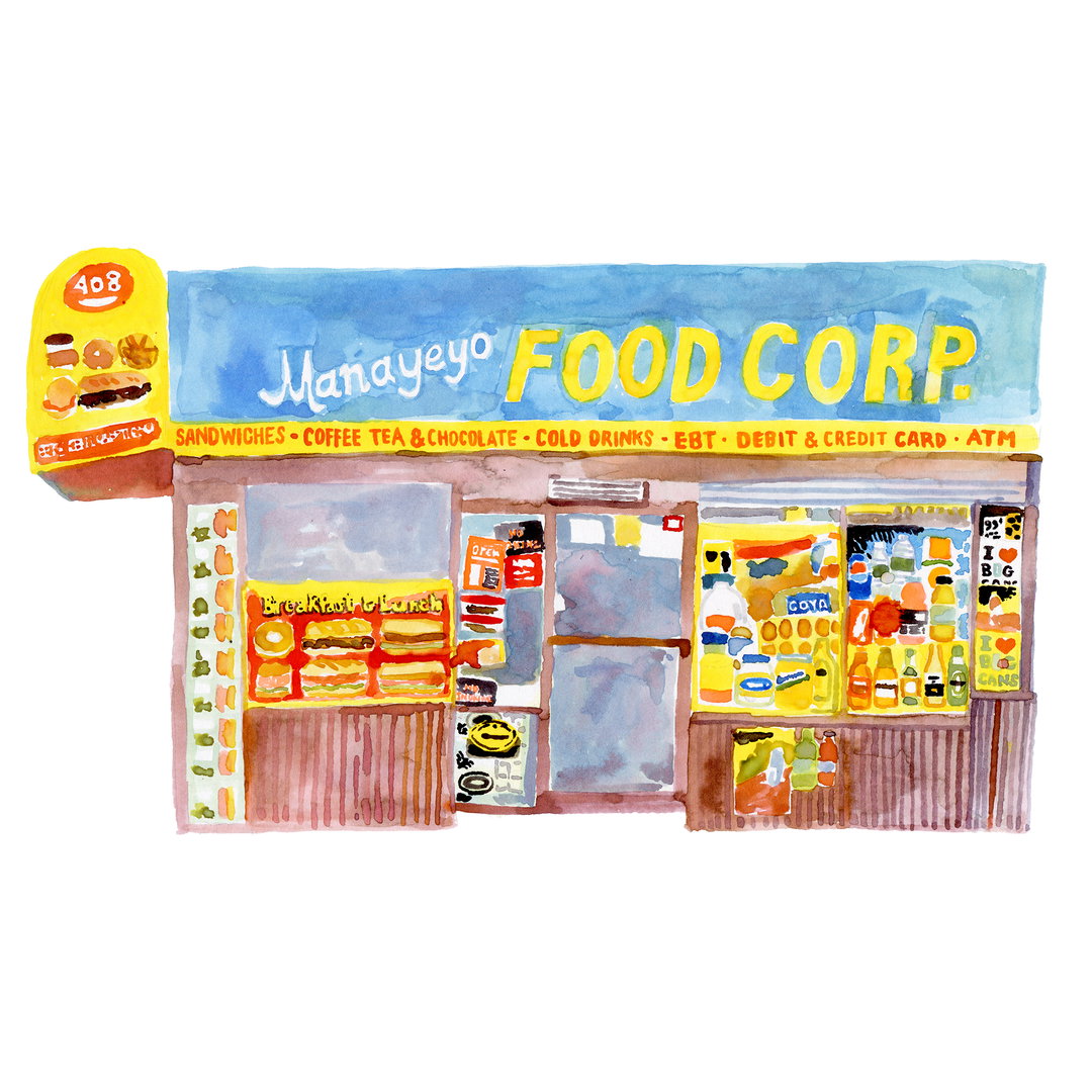
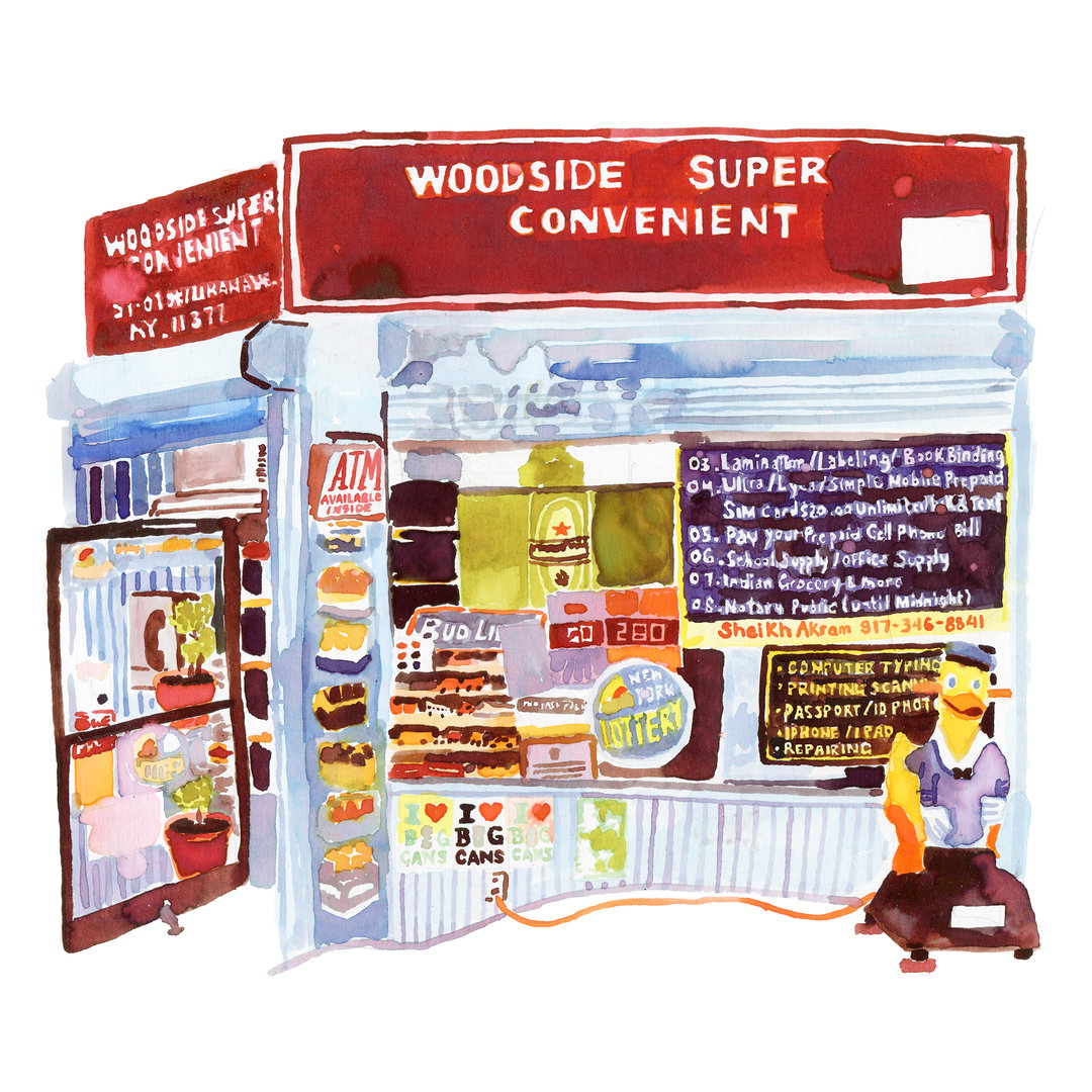
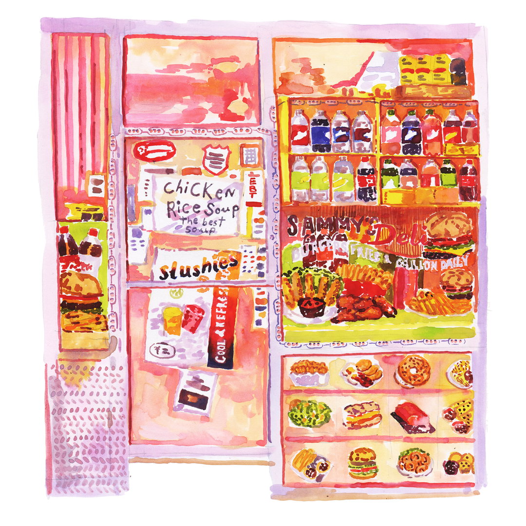
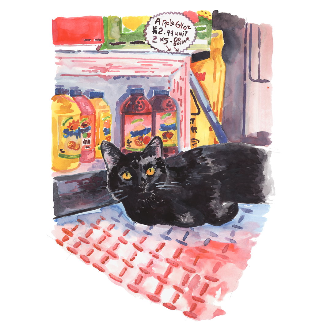
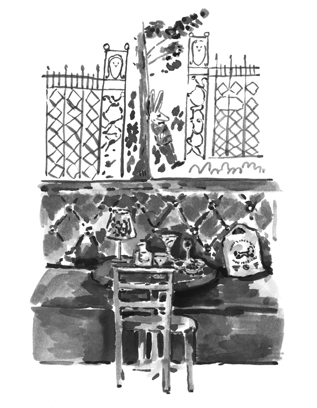
Now, she’s a watercolour aficionado and, in her spare time, captures the bustling beauty of New York’s bodegas. “Bodegas are a fundamental part of the city,” she continues, “I try to capture their arguable beauty and idiosyncrasy by abstracting them just enough through delicate washes and vivid colours. Taking to the streets firstly with her camera, Gabi photographs compositions that grab her attention and later uses them as references for her watercolour illustrations.
Gabi Lamontagne
Her chosen scenes are mostly of bodegas she passes every day. One of her favourites is a store with a handwritten sign hanging on the door announcing its specials. Others feature haphazard lettering across brightly coloured awnings and windows plastered with an amalgamation of tasty foods – from fresh fruit and veg to bursting sandwiches. Capturing the free, anti-design aesthetics of various shop fronts and interiors, Gabi’s higgledy-piggledy watercolours are a delightful ode to this New York’s troupe.
“A great deal of the bodegas I’ve painted have since closed or switched owners and appearances in turn,” says Gabi. And with that in mind, she hopes her illustrations can help viewers really see the places they walk past frequently. But for Gabi, her artworks are not just a way to preserve the ever-changing inhabitants of bodegas’ window displays and signs. The personal project represents a wider intention, saying “being able to maintain a creative practice outside of my daily work is probably what keeps me motivated and creative.”
After a certain amount of time, the two avenues of the project have started to feed into one another. As most of Gabi’s personal projects are sparked by research – be that New York menus, restaurant postcards or picture books – this bank of information also tends to inform her commercial work too. She finds it useful to collate these nuggets of inspiration into one place, here, in this sporadic Instagram feed, which she can refer back to whenever she likes. That being said, she’s currently working on her own picture book on the weekends. “Either way,” she finally goes on to say, “I try to make as much time to research each topic either online, in books or at the New York Public Library. The surprise of finding new materials and information is what keeps me motivated and helps to forge a creative vision.”
GalleryGabi Lamontagne
Share Article
Further Info
About the Author
—
Jynann joined It’s Nice That as an editorial assistant in August 2018 after graduating from The Glasgow School of Art’s Communication Design degree. In March 2019 she became a staff writer and in June 2021, she was made associate editor. She went freelance in 2022.