




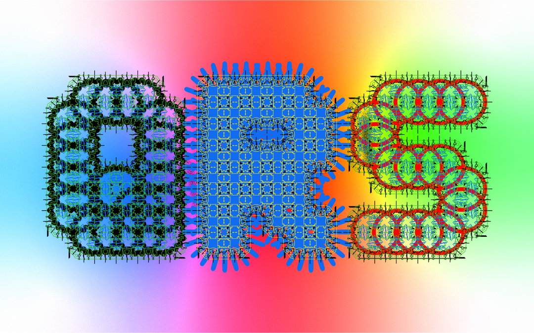
Gang Buron-Yi adds hints of “artificial flavours, sugar, fat and salt” to his highly addictive graphic design practice
The South Korea-born and Paris-based designer talks us through his experimental portfolio, which treads the line between maximalism and simplicity.
Share
At the age of 12, Gang Buron-Yi was given a Yepp MP3 player from his father. It was the first thing he owned and he remembers the feeling all too well – “soaking up every inch of that music player,” he tells It’s Nice That. He recalls the packaging, interfaces, the menu icons and how they changed with animation, and the “cool sound” when he touched the button; it’s a memory that vividly sits in his mind and will continue to do so forever more. “I remember thinking: ‘This is me. When I grow up, I will work at Yepp and design the most beautiful MP3 players’.”
Yepp collapsed not long after this, but Gang’s fascination for this type of work still remained. In fact, it triggered a much wider interest in terms of visual communication and how this interacts with gadgets and technology. As a child who grew up in South Korea, he was accustomed to the release of tech and phones that came out every month: “so many phones!” And Korean mobile phone creators would constantly launch new key features along with K-pop idol groups, featuring catchy music and flashy visuals. “So new phone, new tech, new idol groups with new music; so fascinating. I think this visual culture (more like a visual shock) had a big impact on me growing up.”
It certainly did, as Gang’s interest in the visual arts began to evolve and later, after school, he decided to study in the Netherlands. A long fan of Dutch design, he opted for the Design Academy Eindhoven due to its educational approach and curriculums. A few years later to this day he’s now a graduate from the Man and Communication department and completed his degree last September. A graduate in the midst of the pandemic, thankfully he’s had plenty to work on since entering the industry. This includes designing a concept for an alternative web browser and even LARPing (live action role-playing) on the train. He’s now based in Paris, where he’s currently situated and taking on client projects and runs Podoju studio with his friend Daeun Lim.
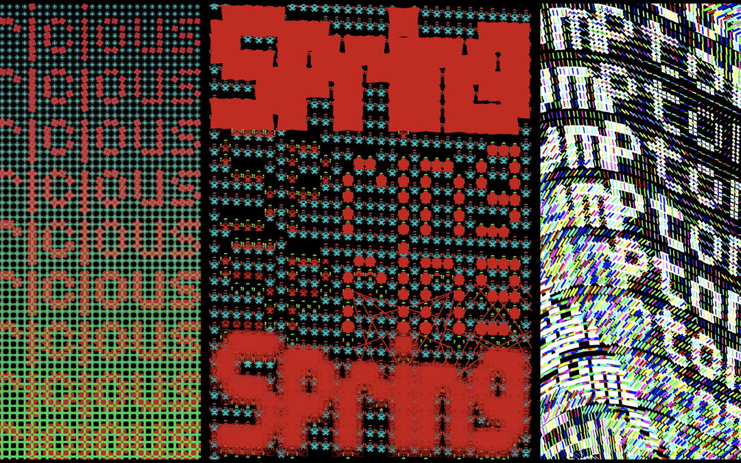
Gang Buron-Yi: Finding A Digital Letterform (FDL) (Copyright © Gang Buron-Yi, 2021)
Gang’s experimental practice treads the line between both maximalism and minimalism. He’s an advocate for all-things whacky, just as such as he is a fan of simplicity. Having grown up with his grandma, she used to always say how “too much is as bad as too little” – a mantra Gang would later adopt in all of his graphic design pursuits. “As many Asian grandmothers would do, she always emphasised the importance of driving for the middle, like being balanced.” As such, Gang takes on most commercial and experimental works with a flexible attitude, following his grandma’s advice and adhering to this quest to create work that sits in the middle of extravagance and functionality.
While making his pieces, if Gang doesn't quite understand something or can't get the ball rolling, he’ll spend hours researching and delving into the brief. “I like to dig,” he says, noting how there have been several occasions where he’s wasted a lot of time “just digging for completely unnecessary things.” Despite this, though, these moments have also given him some exceptionally interesting ideas. After this phase, he’ll begin to sketch in Illustrator, playing with the pixels and designing the letters. “I see a lot of designers drawing beautiful letters first on paper but I just start with the pen tool in the software,” he says.
Gang’s portfolio, in this sense, is an amalgamation of all his interests and goals as a designer. For example, Proportional Code Sans (PCS) came after careful deliberation about his future, which resulted in learning the basics of code. Finding A Digital Letterform (FDL), on the other hand, is a project that continues his questioning of certain concepts, typically his analysis of new technology and how this can be associated with certain visuals. “For example, if you Google ‘digital’ or ‘technology’, you’ll see mainly similar images. A lot of blue colours and thin lines,” he says, citing this as a basis for a greater exploration into the symbiotic meaning of these words. “I started to ask myself: what does it mean to have pixels to display characters? What if I design letters that are reflecting the nature of its medium? While I was trying many different sketches and trials, I came up with a system of designing a character.” The outcome of which is a myriad of letterforms brought to life through a series posters; he created eight posters a day, giving himself one hour per poster for a total of 32 days.
It’s clear, then, that Gang’s work focuses less on making something appeasing and “pretty”, and more so on the process. He puts considered attention on his methodology which, alongside an inherent urge to make something beautiful, amounts to an incredible portfolio of works. “Just like I am running a restaurant, I put a lot of artificial flavours, sugar, fat and salt into my food so that people crave more of my dishes, telling me I am a great chef,” he concludes. “Luckily, making easy visuals is not ruining people’s health. I guess I don’t have to feel guilty about it, right?
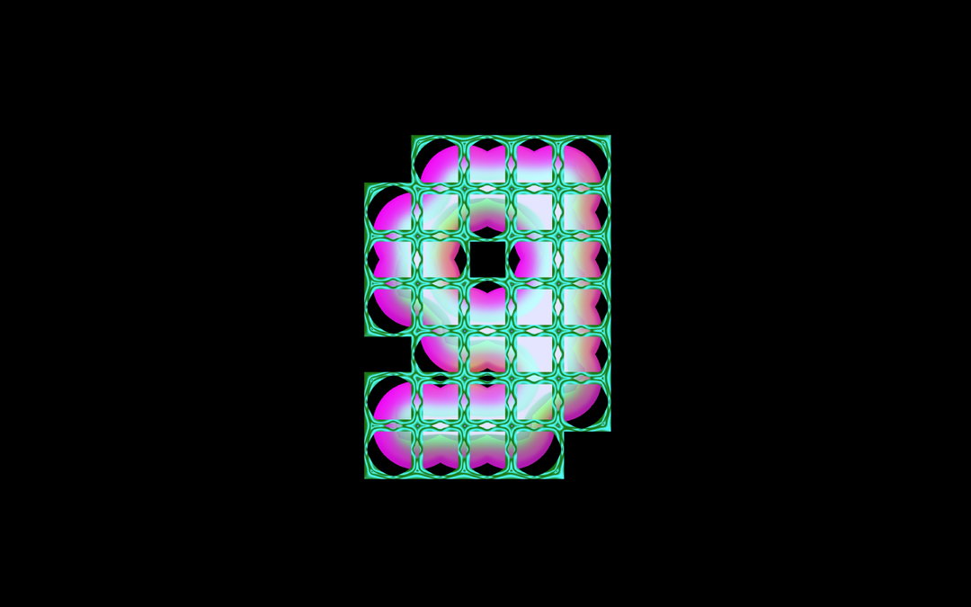
Gang Buron-Yi: Finding A Digital Letterform (FDL) (Copyright © Gang Buron-Yi, 2021)
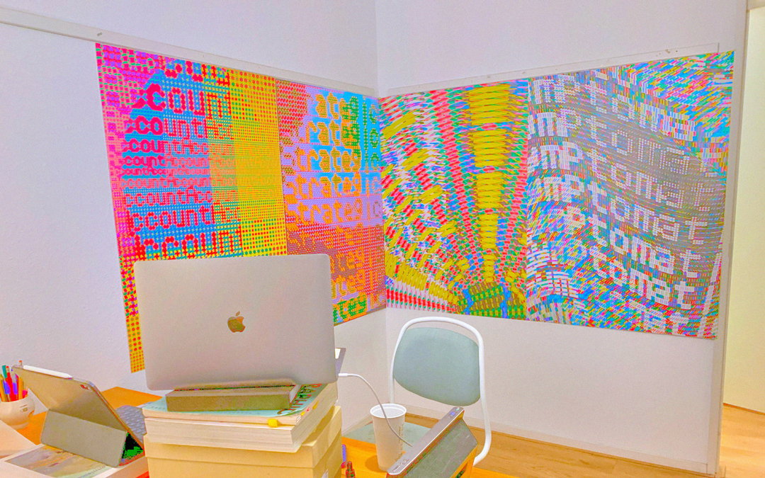
Gang Buron-Yi: Finding A Digital Letterform (FDL) (Copyright © Gang Buron-Yi, 2021)
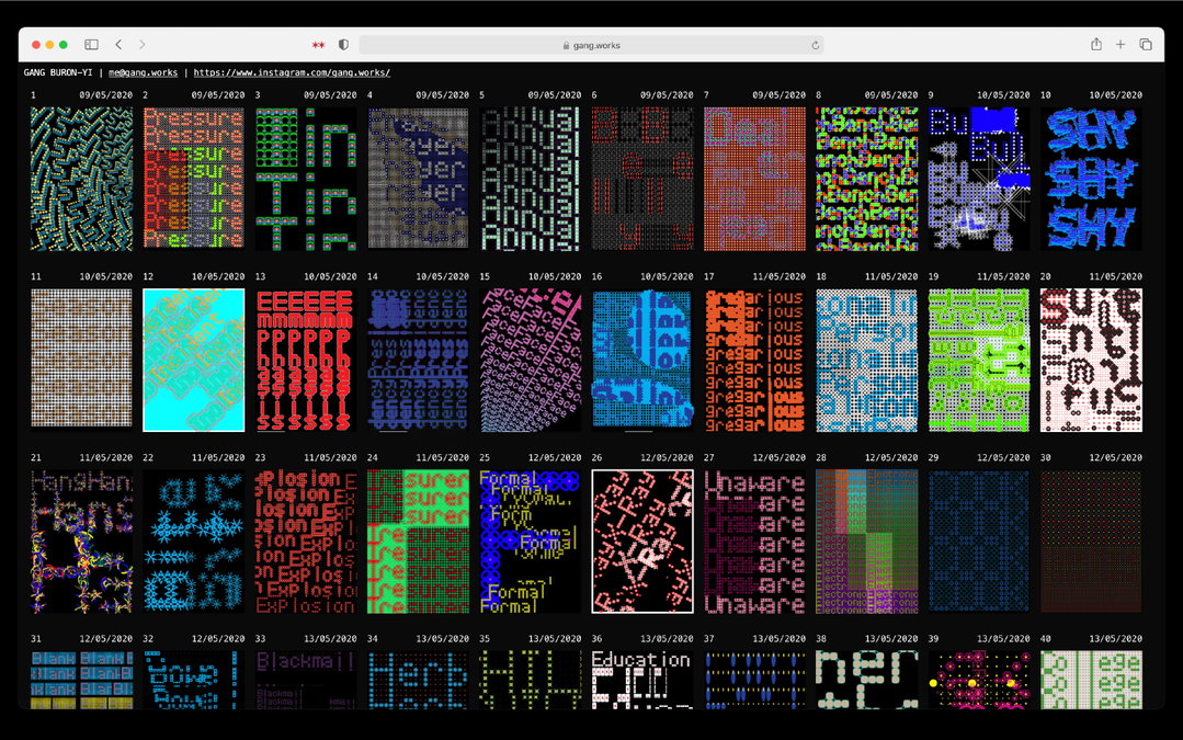
Gang Buron-Yi: Finding A Digital Letterform (FDL) (Copyright © Gang Buron-Yi, 2021)
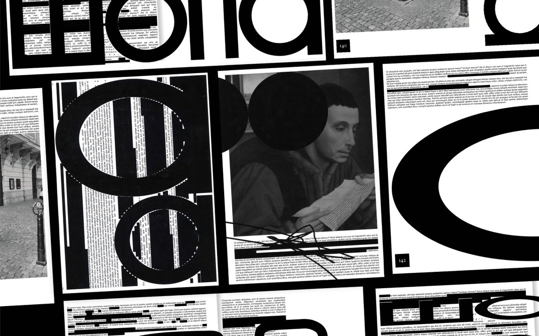
Gang Buron-Yi: Typeface Myth (MYT) (Copyright © Gang Buron-Yi, 2021)
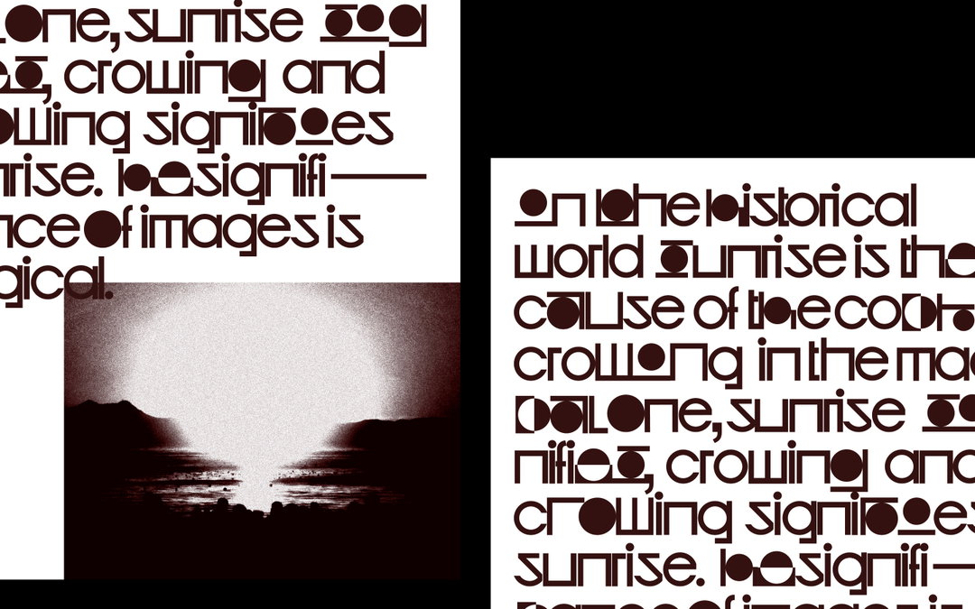
Gang Buron-Yi: Typeface Myth (MYT) (Copyright © Gang Buron-Yi, 2021)
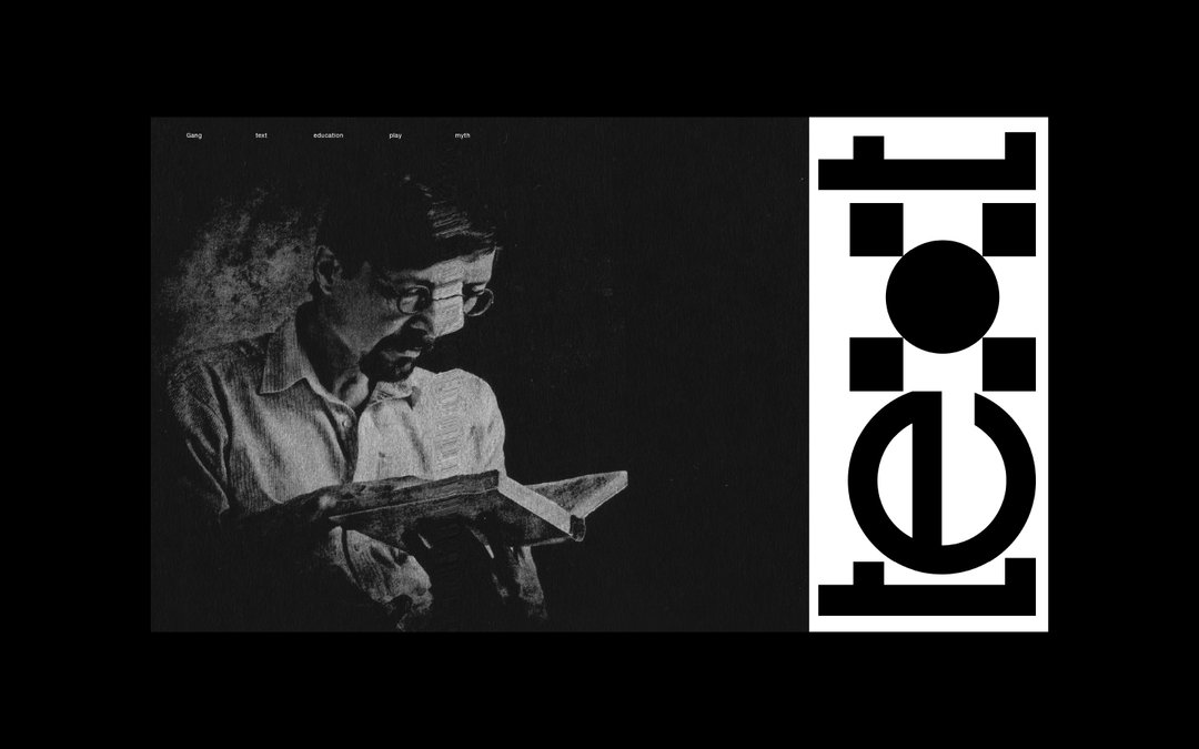
Gang Buron-Yi: Typeface Myth (MYT) (Copyright © Gang Buron-Yi, 2021)
Gang Buron-Yi: Typeface Myth (MYT) (Copyright © Gang Buron-Yi, 2021)
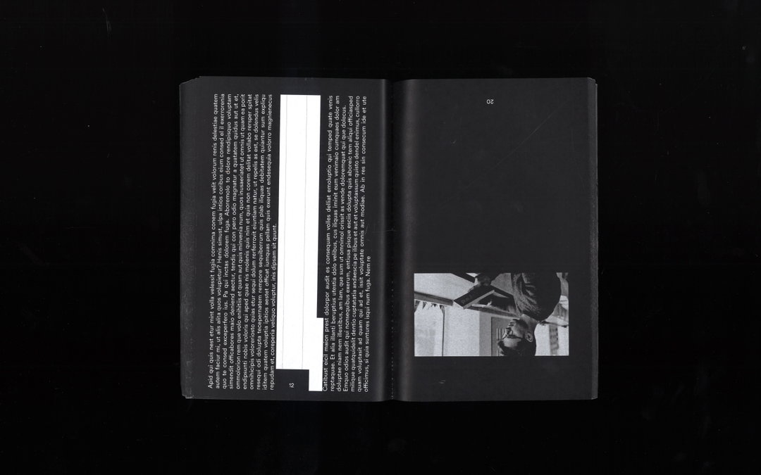
Gang Buron-Yi: Typeface Myth (MYT) (Copyright © Gang Buron-Yi, 2021)
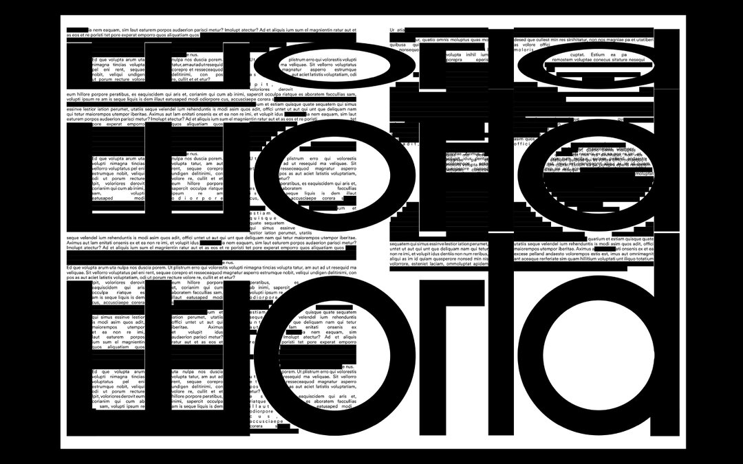
Gang Buron-Yi: Typeface Myth (MYT) (Copyright © Gang Buron-Yi, 2021)
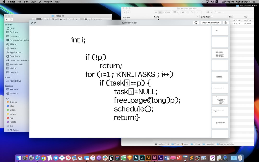
Gang Buron-Yi: Proportional Code Sans (PCS) (Copyright © Gang Buron-Yi, 2021)
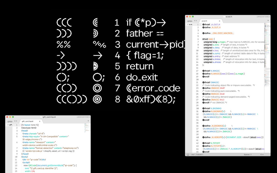
Gang Buron-Yi: Proportional Code Sans (PCS) (Copyright © Gang Buron-Yi, 2021)
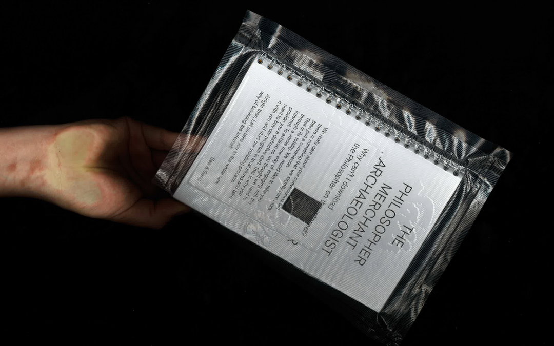
Gang Buron-Yi: PHI (Copyright © Gang Buron-Yi, 2021)
Become an Extra Nice Supporter
Unlock an inspiring new way to explore It’s Nice That, get your hands on exclusive perks, and help bring meaningful creative projects to life.
Share Article
Further Info
About the Author
—
Ayla is a London-based freelance writer, editor and consultant specialising in art, photography, design and culture. After joining It’s Nice That in 2017 as editorial assistant, she was interim online editor in 2022/2023 and continues to work with us on a freelance basis. She has written for i-D, Dazed, AnOther, WePresent, Port, Elephant and more, and she is also the managing editor of design magazine Anima.