Grafis Nusantara uses the nostalgia of crackers to tell stories of Indonesian culture and design
The digital and print archive’s second zine delves into the history of Indonesian design through the adored kerupuk.
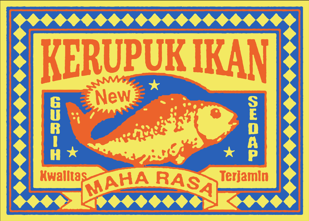
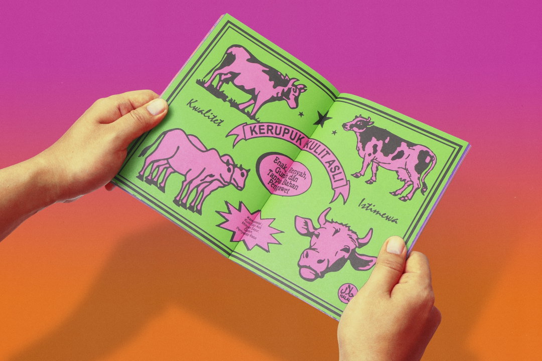
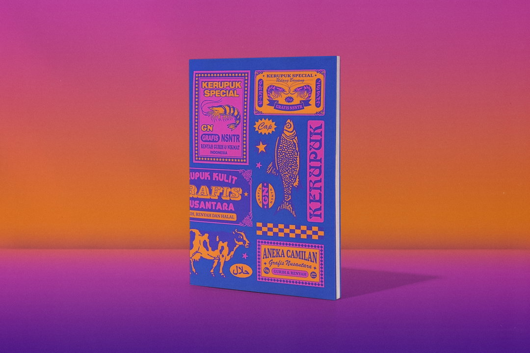
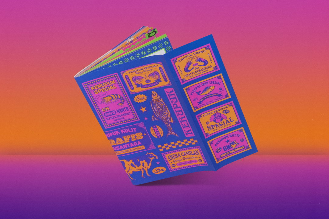
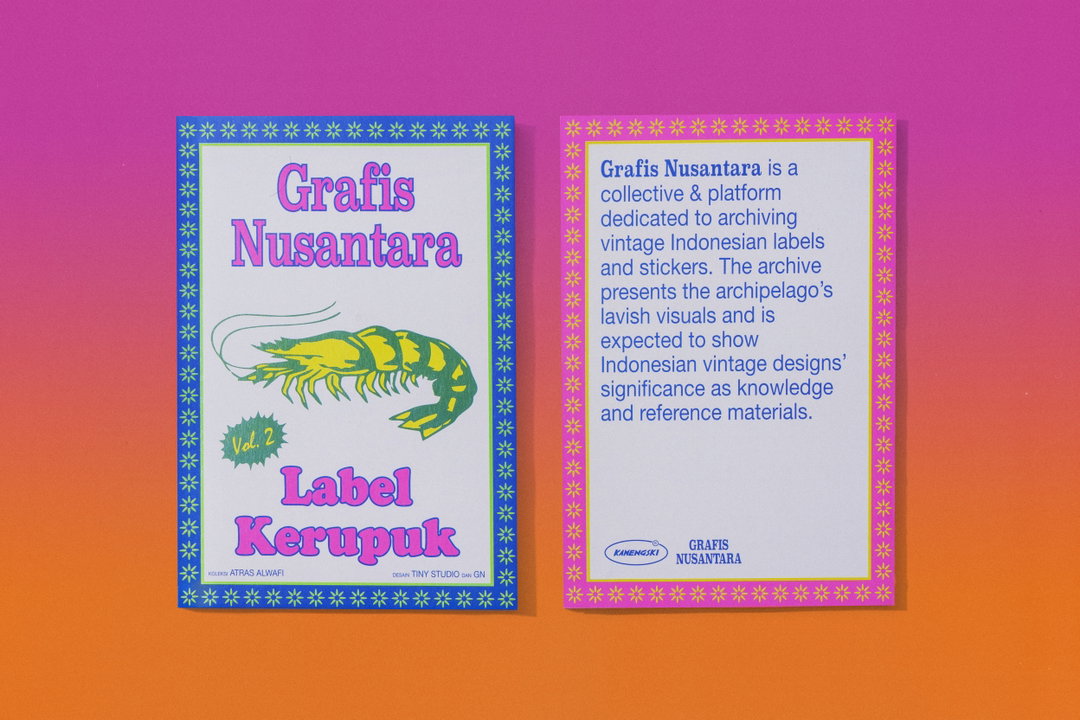
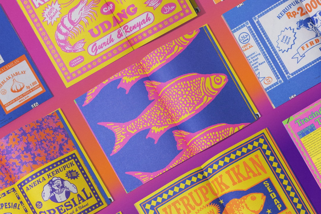
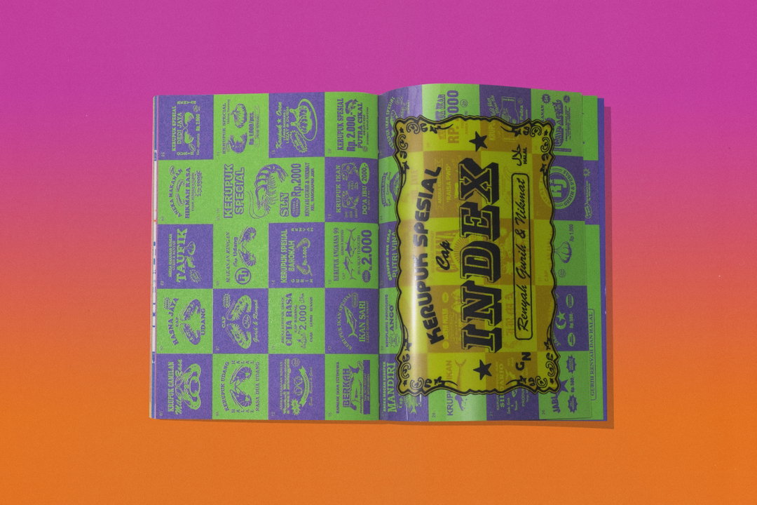
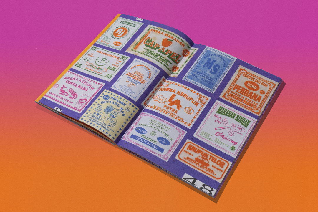
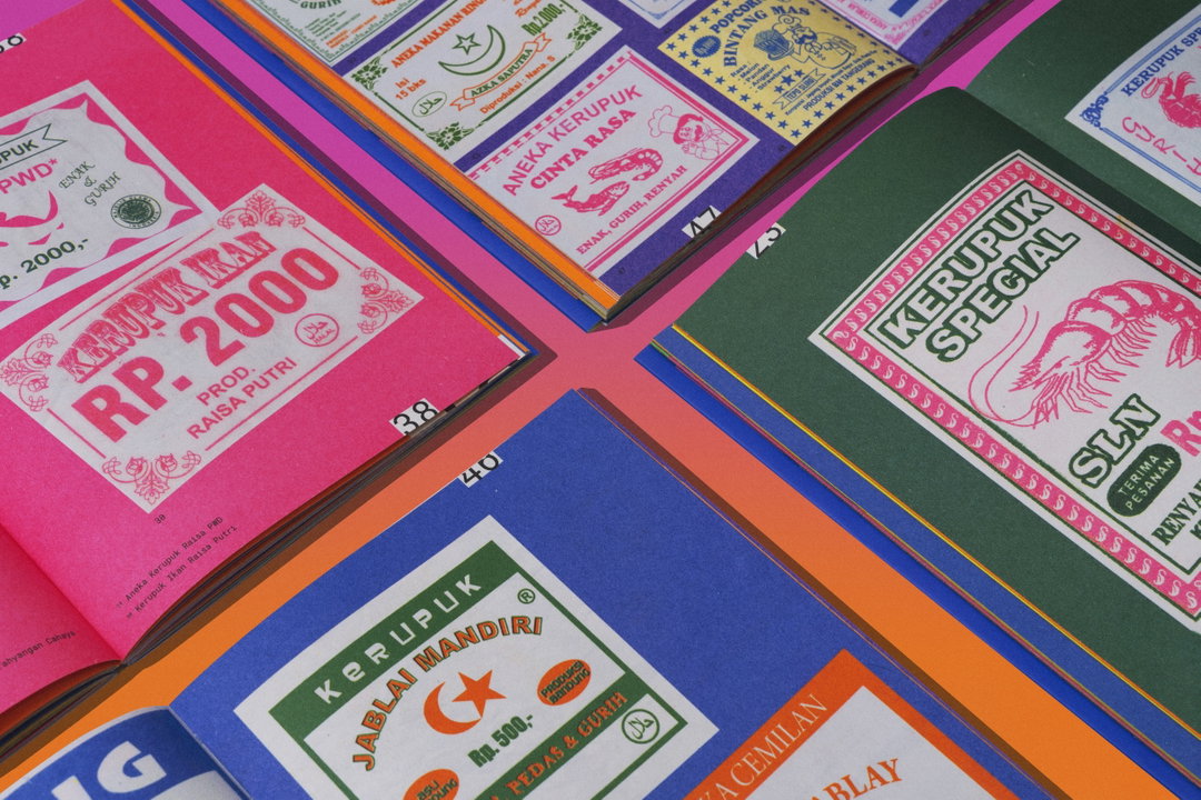
There is much joy in being able to stop and muse on the mundane facets of everyday life. Inspired by this very idea, Indonesian archive Grafis Nusantara lends its awe-inspired appeal to the realm of kerupuk – crackers to be fried and eaten – which features in the zine’s second volume. Featuring 100 labels and stickers, the project is a sum of ephemera collected by the Jakarta-based designer Atras Alwafi since 2013, with design and layout in collaboration with Tiny Studio. As you peruse through the 70-page spread of labels filled with animal illustrations and prices that give us an idea of their everyday nature and value, you’ll be left with a hunger – not only for kerupuk but to also delve deeper into Indonesia’s visual culture.
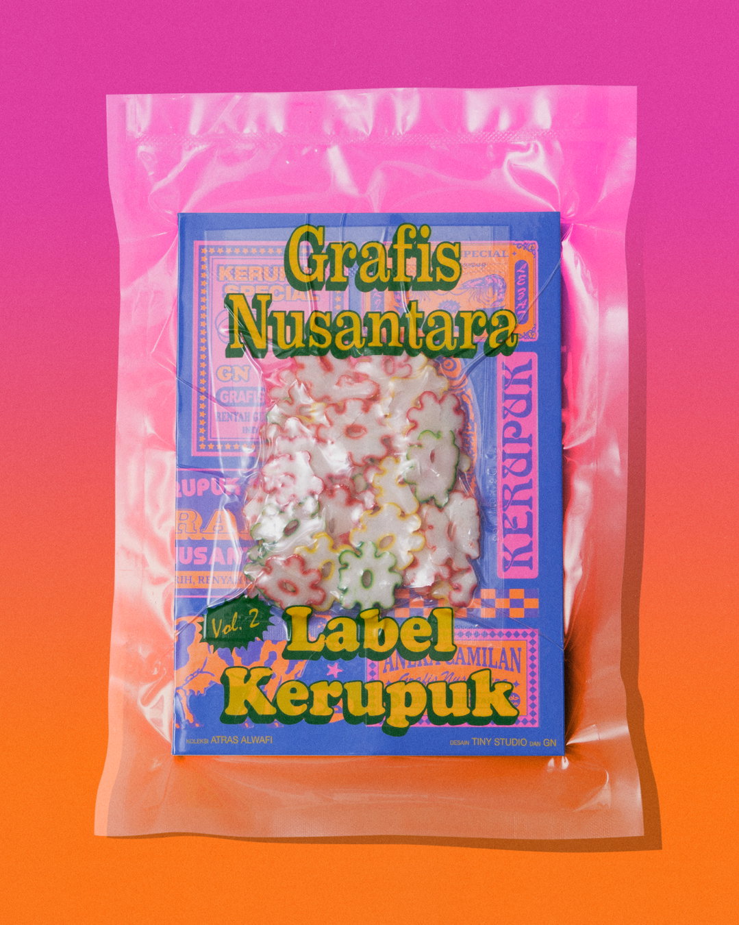
Grafis Nusantara’s approach is one that combines all that is vintage with striking colours and patterns that daringly bring the past into the present. “We’re always eager to demonstrate how something deemed kitschy and outside the realm of conventional design can be a captivating subject or serve as a great inspiration for our future creations,” says co-founder Hendri Simas. In the first zine, the team presented a culmination of textile, health, cigarette, food and tea stickers and labels that give us a look into a wider graphic history of the country. This project is more insular, but still gives us a unique view of history. “To familiarise audiences with kerupuk, we packaged the book like a real kerupuk. Inside there are even dried crackers that anyone can fry at home making it a very practical project,” Hendri adds.
Copyright ©️ Grafis Nusantara, 2023
The sole purpose of kerupuk labels has been to sell the beloved snack to its audience, which is a bittersweet truth for Grafis Nusantara, as that's what makes its history both interesting and complex. “Tracing the origins and creators of the labels is quite the challenge. They usually lack proper documentation, but that’s what makes the process of unravelling their diverse and mysterious origins so fun,” Hendri tells us. Within the collection there is the Jablai label. In Indonesian vernacular slang ‘jablai’ could be considered as profane, but Hendri enjoys it for its provocative use as a brand name. “We speculated that this bold choice aimed to captivate the attention of their customers by simply making it memorable. This distinct Indonesian approach amused us greatly – we couldn’t resist adding it to the zine.” Although these labels may not be perceived as conventional design through the eyes of agencies or brand designers, the zine helps to place Indonesian graphics and designers in the wider conversation.
Just imagine yourself opening the zine, taking your hands to the kerupuk, placing them in an “oval pan”, and peering through the designs as you wait for them to fry. It’s a beautifully immersive thought, isn’t it? By presenting us with a wide range of labels against the a striking background that will surely shoot any person that has ever tasted the cherished snack right back into the moment, Grafis Nusantara allow us to imagine this and so much more.
GalleryCopyright ©️ Grafis Nusantara, 2023
Hero Header
Copyright ©️ Grafis Nusantara, 2023
Share Article
About the Author
—
Yaya (they/them) was previously a staff writer at It’s Nice That. With a particular interest in Black visual culture, they have previously written for publications such as WePresent, alongside work as a researcher and facilitator for Barbican and Dulwich Picture Gallery.