Launch Recite Me assistive technology
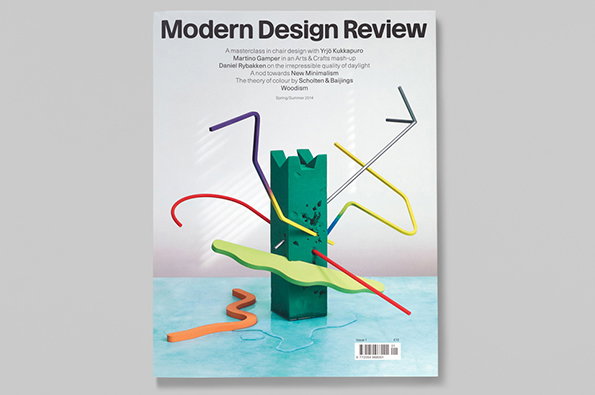
The cover of a magazine titled “Modern Design Review”. It features a 3D render of a green architectural form surrounded by colourful, winding tubes and a lime green plane.

Graphic Design: Graphic Thought Facility art direct brilliant new design magazine

—
Date
1 May 2014

You know that advert where everything that guy touches turns to Skittles? Well Graphic Thought Facility are like that, only that everything they touch turns to design gold rather than delicious fruity confectionery. They have just art directed the inaugural issue of Modern Design Review which is billed as “a considered and curated insight into modern product and furniture design.”

For the striking cover GTF arranged work from Martino Gamper, Yrjö Kukappuro and Muller Van Severen in a carved foam flower arranging block in a reference to the Japanese art of ikebana, all of which features inside as content.

Add in some super engaging layouts, photography from the likes of Osma Harvilahti, Angela Moore and Scheltens & Abbenes and bespoke headline typefaces and you’re looking at the kind of publication that purrs.
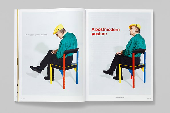
An open book shows two photographs of a person wearing a yellow hard hat and a green shirt. They sit on a colourful, geometric chair against a plain white background. The right page features the red headline “A postmodern posture”.
Above

Graphic Thought Facility: Modern Design Review
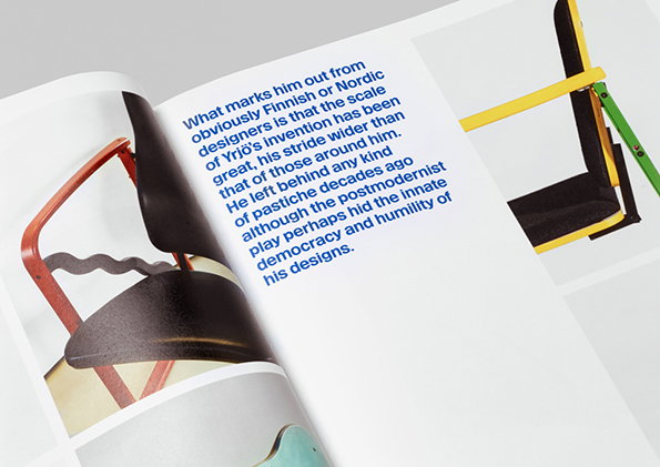
An open book shows a page of blue text alongside images of colourful, geometric furniture. The text discusses the scale and humility of the designs of Yrjö Kukkapuro.
Above

Graphic Thought Facility: Modern Design Review
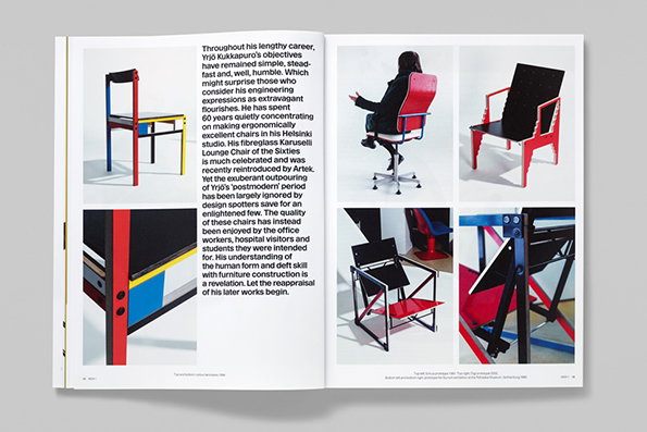
An open book featuring a series of photographs of colourful, geometric chairs. A block of text describes the career and design philosophy of Eero Aalto.
Above

Graphic Thought Facility: Modern Design Review
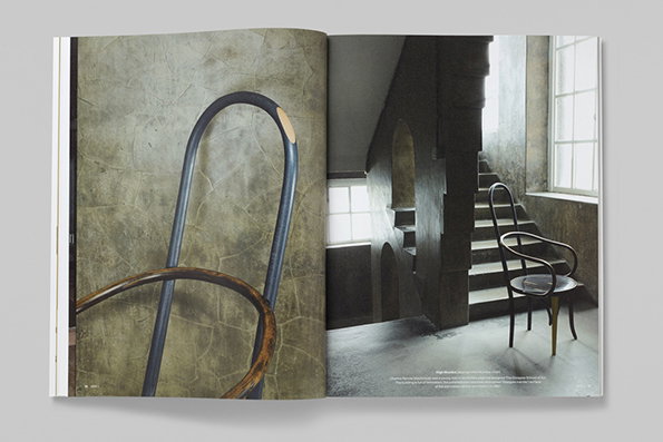
An open book shows two pages of a photography series. The left page is a close-up of a curved wooden and metal chair back, while the right page shows a full chair in a concrete room with a staircase.
Above

Graphic Thought Facility: Modern Design Review
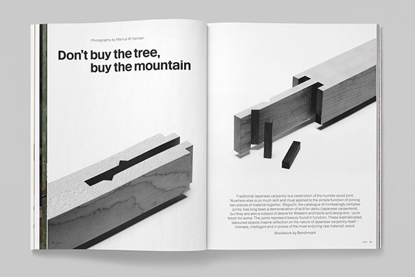
An open magazine spread features two black and white photographs of interlocking wooden joints. The left page displays the headline “Don’t buy the tree, buy the mountain” above a close-up of a carved timber block.
Above

Graphic Thought Facility: Modern Design Review
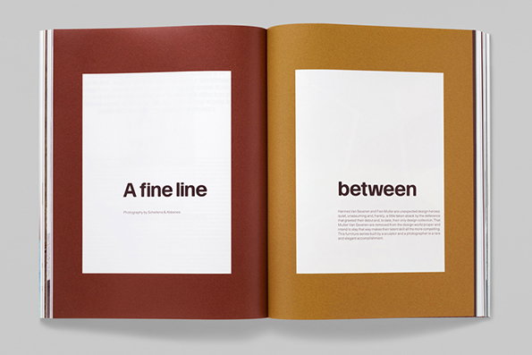
An open book with two pages in contrasting colours, one deep red and one ochre. Centred white squares on each page contain the text “A fine line” and “between”.
Above

Graphic Thought Facility: Modern Design Review
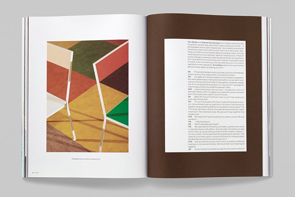
An open book shows a spread with a photograph on the left and a column of text on the right. The photo features two minimalist chairs set against a geometric background of red, yellow and green shapes.
Above

Graphic Thought Facility: Modern Design Review
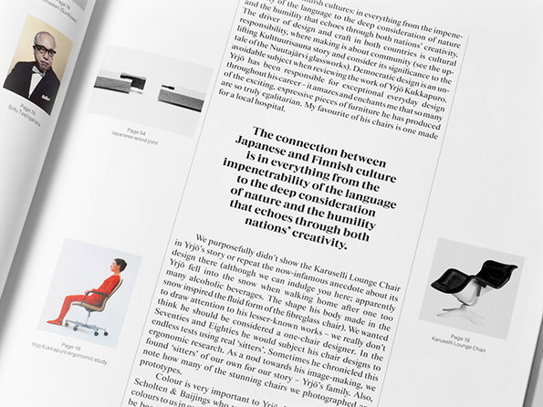
An open magazine spread featuring a layout of text and images. A bold pull quote reads, “The connection between Japanese and Finnish culture is in everything from the impenetrability of the language to the deep consideration of nature and the humility that echoes through both nations’ creativity.”
Above

Graphic Thought Facility: Modern Design Review
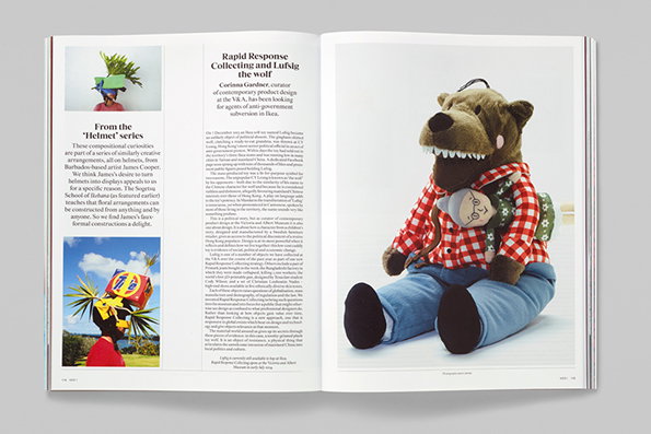
An open magazine spread featuring an article titled “Rapid Response Collecting and Lufsig the wolf”. On the right, a large plush wolf wearing a red checked shirt and blue trousers holds a smaller doll.
Above

Graphic Thought Facility: Modern Design Review

Share Article

About the Author

Rob Alderson

—

Rob Alderson is a freelance writer, editor and strategist. He was previously editor-in-chief of It’s Nice That and WePresent, and editor of Design Week. He publishes the newsletter Undo, which tries to make sense of how AI is changing design work, the design process and the design industry.
It's Nice That Newsletters

Fancy a bit of It's Nice That in your inbox? Sign up to our newsletters and we'll keep you in the loop with everything good going on in the creative world.