InHouse Records launches a weekly magazine for prison inmates during the lockdown
With an aim to inspire and inform current prisoners, the world’s first fully functioning record label that operates inside the prison system has launched a print publication.
Share
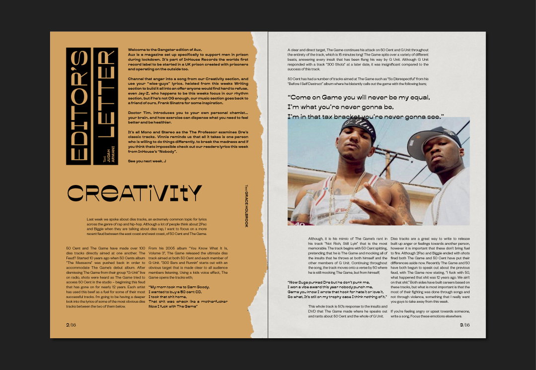
We’ve seen many vital projects being created throughout lockdown, but this one has been made for those who arguably need it most. Hannah Lee, a London-based graphic designer who’s worked with the likes of Rankin, Dazed, Ditto London and Christies, has worked on a zine curated specifically to “increase literacy, develop new skills and entertain” the UK’s prisoners, she tells us. Titled InHouse, the publication aims to provide a platform to alleviate anxieties and inspire current prisoners in the UK, where around 86,000 people are currently remaining in their cells for almost 24 hours a day.
InHouse is currently reaching over 2,500 prisoners across the UK and US through nine separate prisons and correctional facilities, and is an offshoot of the non-profit organisation InHouse Records – the world’s first fully functioning record label operating both inside and outside the UK prison system. Working within nine UK prisons in London, Kent and Sussex, the initiative strives to create “safe and enabling environments for individuals to improve their technical and social skills through music,” Hannah says, “focusing on prisoners’ rehabilitation and employment with dignity and aspiration.” It also creates opportunities for the inmates to learn instruments and production.
Before the lockdown, Hannah tells us how she was working for InHouse, teaching graphic design inside HMP Elmley prison in Kent. It was InHouse Records founder Judah Armani who first decided to introduce a graphic design course alongside the music label. “I constructed a course to cover the basics in typography, logo design, advertising/marketing, poster work and album artwork,” says Hannah, “but I also wanted to have a high focus on the design process itself, encouraging course participants to experiment and test ideas.”
The experience, in her eyes, has been both challenging and rewarding; Hannah sees the design process as a “portal” that provides people with new skills and encourages new ways of thinking. “Even though I was ripped for my ‘battered sneaks’ on a daily basis and the nicest comment I received in three months was, ‘You’re not that shit this’, seeing the students make progress and overcome obstacles was amazing.”
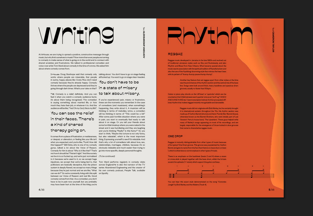
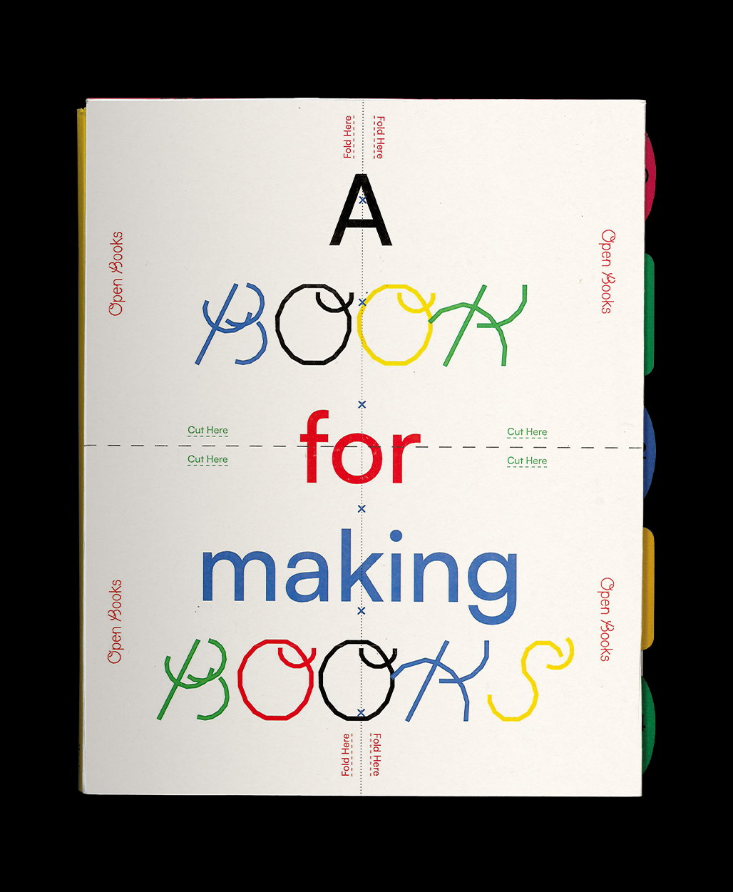
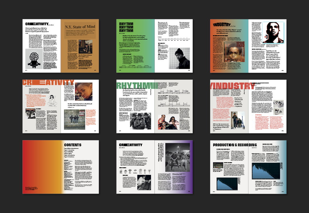
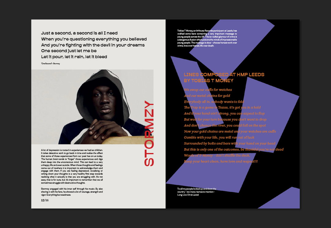
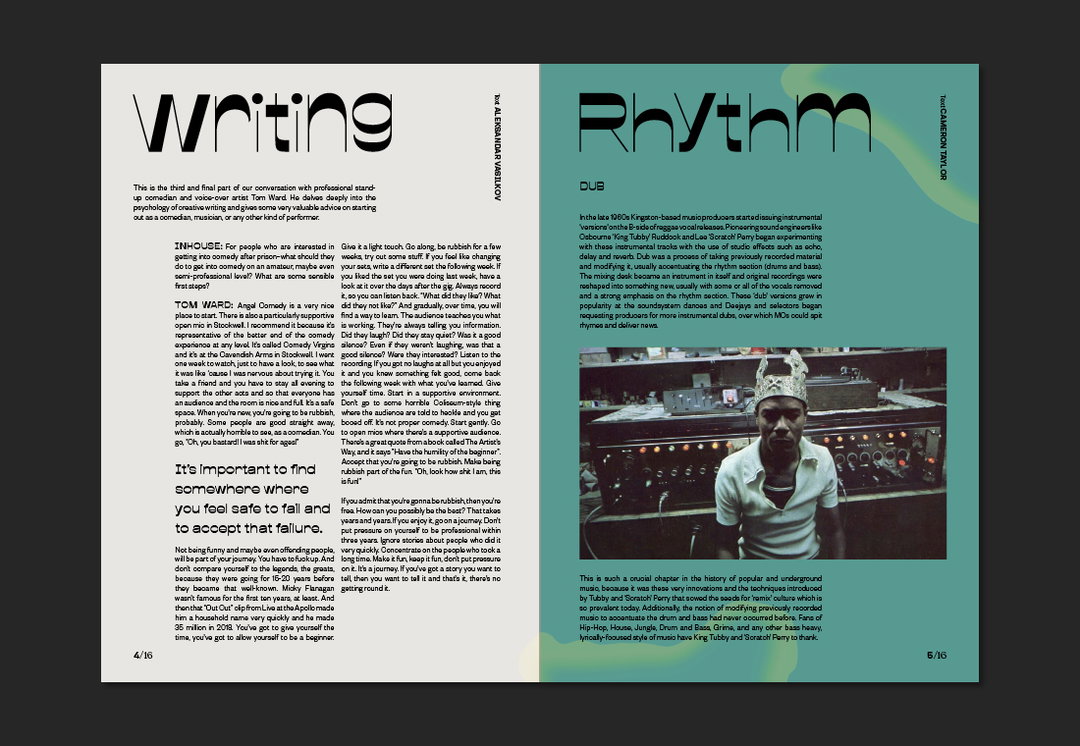
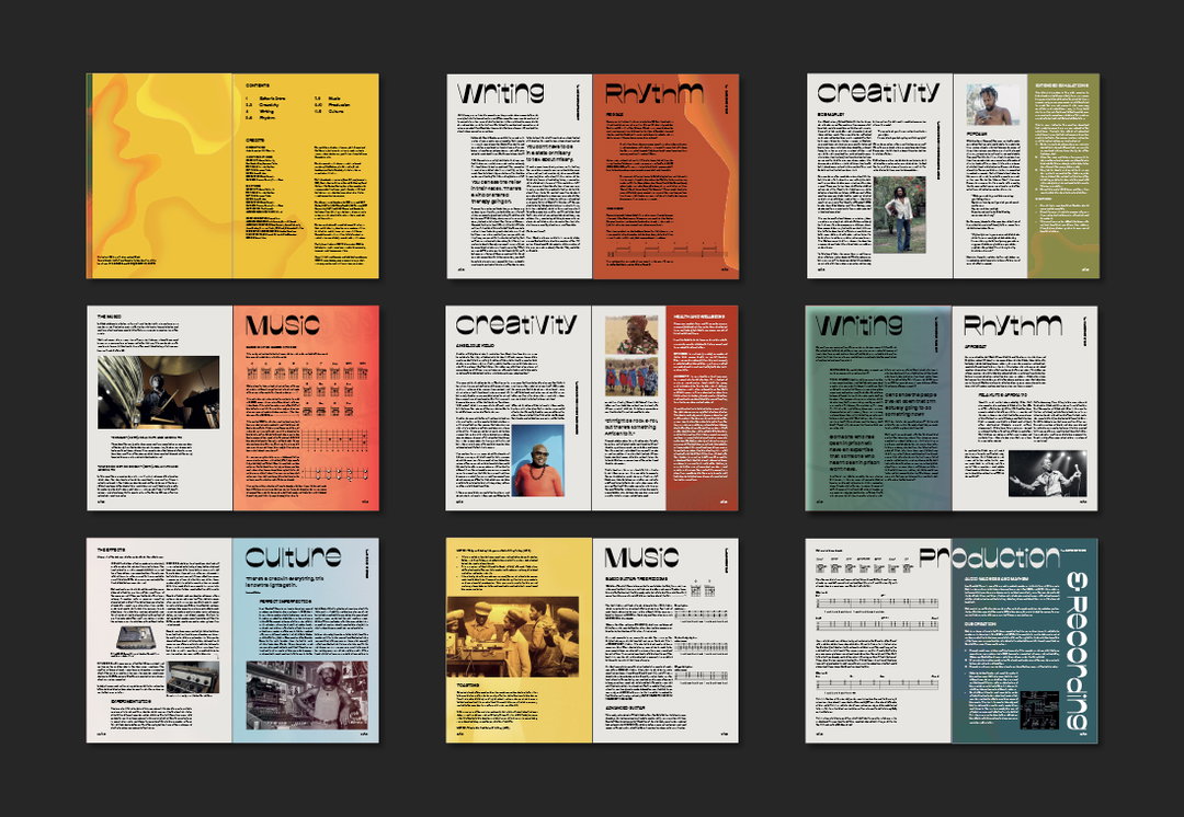
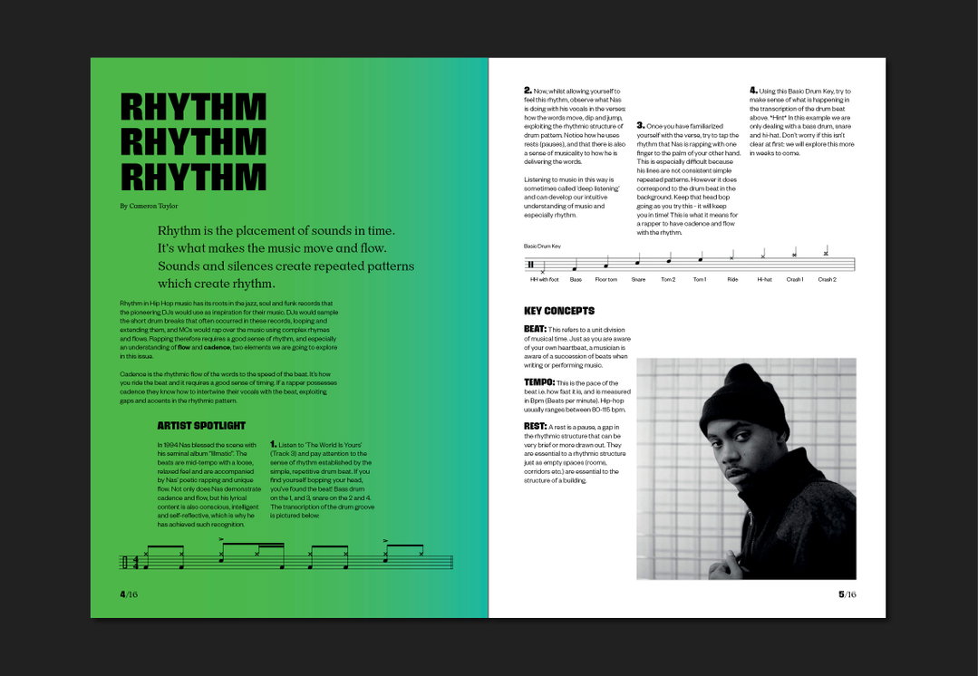
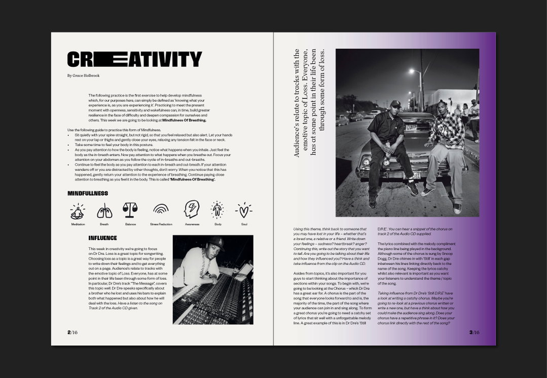
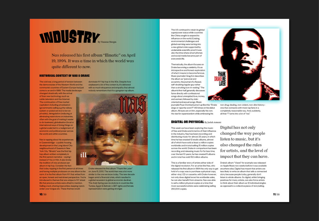
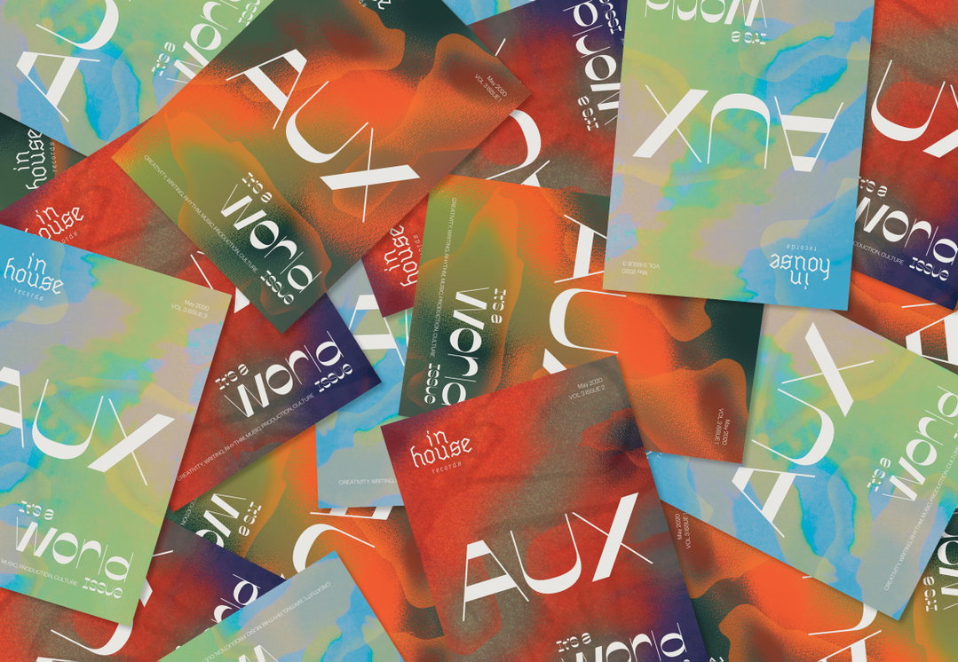
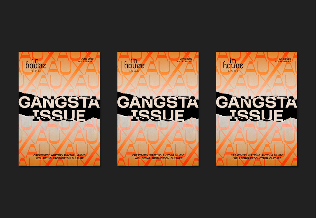
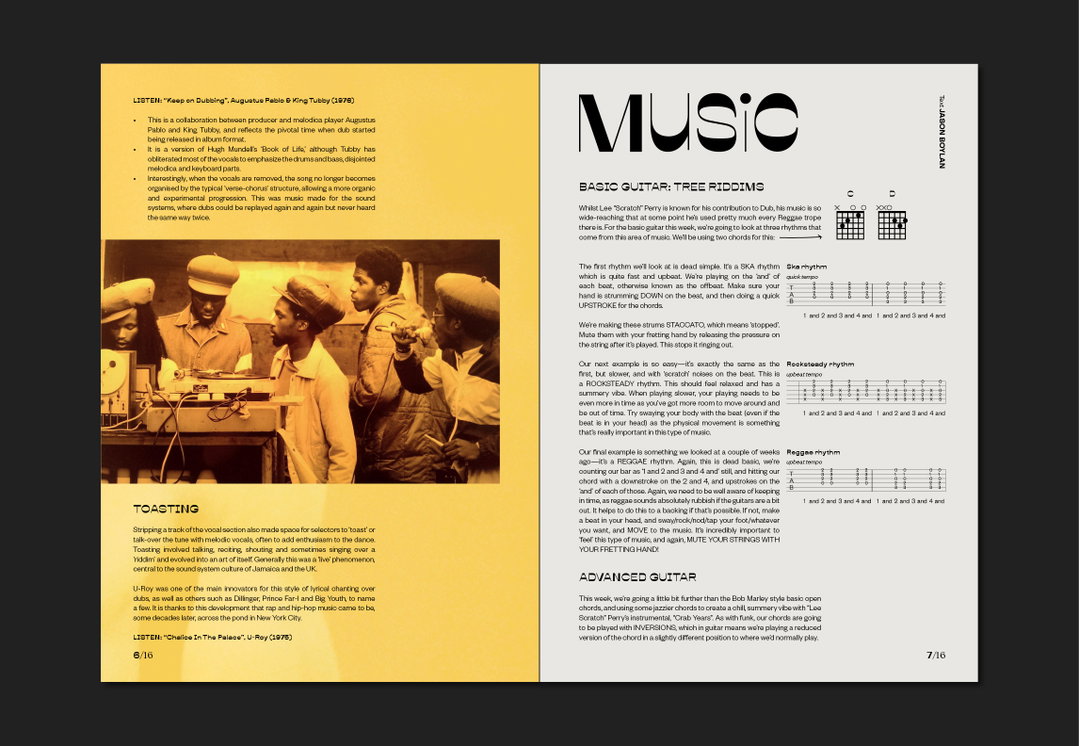
InHouse Magazine: Design by Hannah Lee
Then, right at the start of the UK lockdown in March, the InHouse Records programme was suspended, leaving only essential staff allowed inside the prisons. More than 86,000 prisoners have been in their cells for much of the past four months. The InHouse team saw this huge frustration and consequently the 16-page weekly zine was born, along with Audio Magazine, an accompanying print publication that provides a CD with trailer-like intros to each section, as well as feature interviews and inspirational messages.
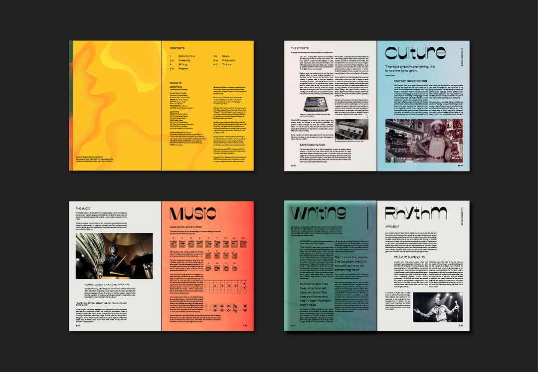
“The beauty of this project was the ability of the staff to pivot their skills as music and label facilitators to educational journalists,” explains Hannah. Adhering to a 12-week plan of which genres and artists to cover, the zine was divided up into sections such as Creativity, Writing, Music, Wellbeing, Rhythm, Production and Recording, and Culture, plus a poem from one of the InHouse graduates each week. With Hannah fronting the design and visuals each week, so far there have been interviews with the Sopranos actor Joe Ganascolli, comedian Tom War, and musician Yazz Ahmed.
Of course there are going to be some hurdles while designing a 16-page zine in the space of just three days. The first thing Hannah does in the process is listen to the tracks of the featured artists, before spending time researching old posters and album covers, which later influence the colour palette and visuals throughout the zine. “For instance,” she says, “with the Garage issues I spent hours trawling through old rave posters (a guilty pleasure of mine). With the World issue, I started by sketching the three countries that the artists we were featuring were from and then experimenting with different spray brushes to create mottled soft borders”. These experiments later became the backgrounds, paired with a three font family supplied by Or Type and Signal Type foundry.
Since launching the first issue of InHouse, Hannah and the team have managed to provide a quick and educational platform for their audience to learn and develop their skills – achieved through music and informative journalism. As the zine's founder Judah Armani puts it: “Learning the skills of maintaining and developing relationships, such as communication, adaptability and accountability are essential to progress in any industry, especially in the music industry, where personal relationships are so key. But more than that, if we have the skills to better maintain relationships, then not only are we potentially stronger employees, but also better employers, fathers, husbands and members of the community.”
GalleryInHouse Magazine: Design by Hannah Lee
Share Article
Further Info
About the Author
—
Ayla is a London-based freelance writer, editor and consultant specialising in art, photography, design and culture. After joining It’s Nice That in 2017 as editorial assistant, she was interim online editor in 2022/2023 and continues to work with us on a freelance basis. She has written for i-D, Dazed, AnOther, WePresent, Port, Elephant and more, and she is also the managing editor of design magazine Anima.