Launch Recite Me assistive technology
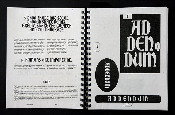
An open spiral-bound booklet with black and white pages. The left page features bold headings that read “5. THOU SHALT NOT STEAL. THOUGH SHALT REMIX. CREDIT SHARE THE WEALTH AND COLLABORATE.” and “6. HUMANS ARE IMPORTANT.” followed by blocks of small text. The right page shows a graphic layout with the word “ADDENDUM” repeated in various bold, stylised typefaces.

Hardworking Goodlooking produce some hard-working, good-looking publications

—
Date
16 January 2015

Hardworking Goodlooking, as well as being the opening line to successful CVs everywhere, is the name for the publishing arm of Philippines-based platform The Office of Culture and Design. The publications it makes are nice and lo-fi, often produced at local Risograph studios and bound in low-cost ways with a balance of skill and immediacy. Referencing vernacular typography, imagery and materials, Hardworking Goodlooking’s books work hard and look really good.

Run by Clara Lobregat Balaguer and Kristian Henson, Hardworking Goodlooking’s work is incredibly well designed, interesting and culturally valuable. The programme of expanded editorial at The Office of Culture and Design runs in tandem with their research initiatives and projects with the wider community. Their work includes films about the impact on tribal communities in assimilating with contemporary culture, a series of workshops inspired by The Guggenheim Effect and a pseudo-scientific publication on sign painting in the Philippines.
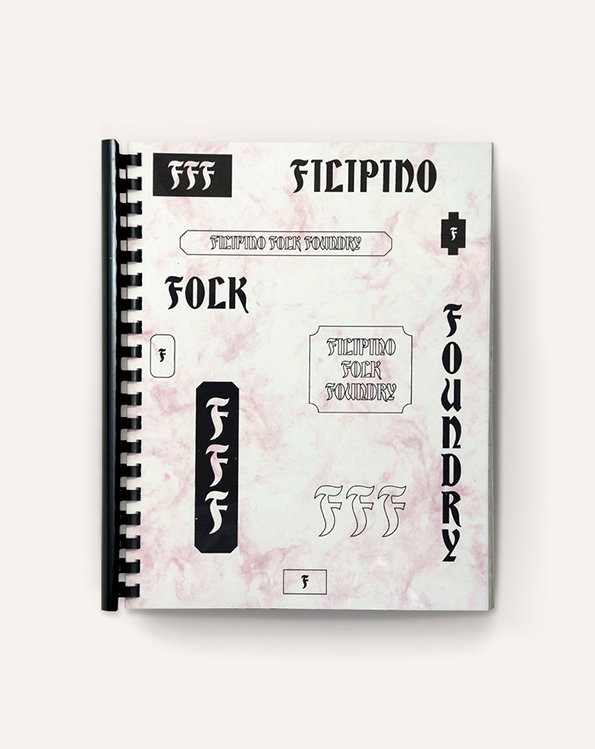
A spiral-bound sketchbook displays various black typographic logos and wordmarks on a pale pink marbled background. The text includes “Filipino Folk Foundry” and the initials “FFF” in several bold, stylised fonts.
Above

Hardworking Goodlooking: Filippino Folk Foundry
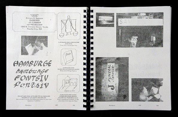
An open spiral-bound notebook with black and white pages. The left page features a mix of handwritten and printed text, including “Hamburge FONTSIV”, alongside small illustrations and a photograph. The right page contains a collage of grainy photographs and a snippet of text that reads “FUNERAL Service”.
Above

Hardworking Goodlooking: Filippino Folk Foundry
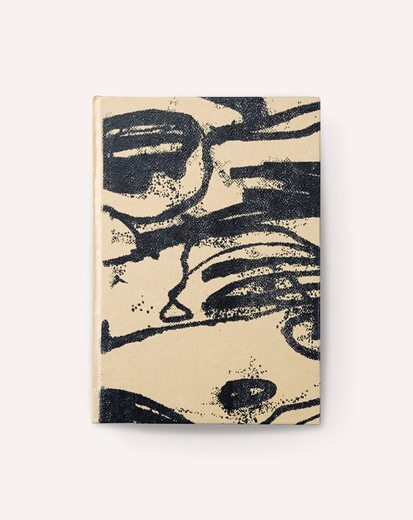
An abstract book cover featuring bold, black ink strokes on a beige fabric background. The expressive marks create a series of overlapping, organic shapes and textured lines.
Above

Hardworking Goodlooking: In Darkness

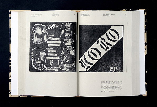
An open book shows two pages of black and white punk zine layouts. The left page features a collage of band members and the word “Krottu”, while the right page displays a bold, diagonal logo reading “Moro EP”.
Above

Hardworking Goodlooking: In Darkness

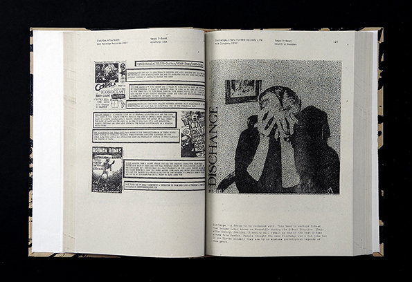
An open book shows two pages of a zine-style publication. The left page contains dense columns of text and small graphics, while the right page features a grainy black and white photograph of a person covering their face with their hands.
Above

Hardworking Goodlooking: In Darkness

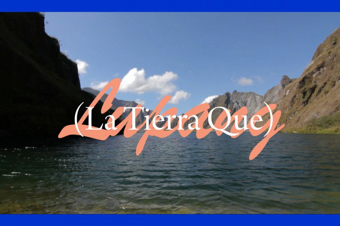
A wide shot of a calm lake surrounded by steep, rocky mountains under a clear blue sky. Pink cursive text and white lettering in brackets read “(La Tierra Que)”.
Above

Hardworking Goodlooking: Film

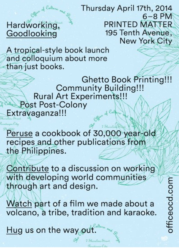
A promotional poster for a book launch and colloquium on 17 April 2014 in New York City. The text reads “Hardworking, Goodlooking” and lists activities including “Ghetto Book Printing!!!” and a discussion on working with developing world communities.
Above

Hardworking Goodlooking: Poster

Share Article

Further Info

About the Author

Billie Muraben

—

Billie studied illustration at Camberwell College of Art before completing an MA in Visual Communication at the Royal College of Art. She joined It’s Nice That as a Freelance Editorial Assistant back in January 2015 and continues to work with us on a freelance basis.
It's Nice That Newsletters

Fancy a bit of It's Nice That in your inbox? Sign up to our newsletters and we'll keep you in the loop with everything good going on in the creative world.