




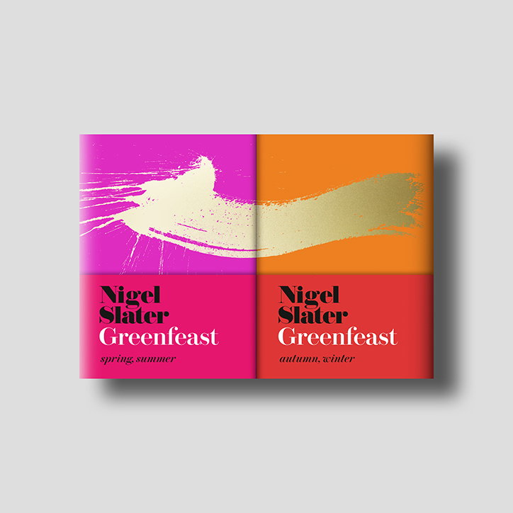
Jack Smyth talks us through what makes a successful book jacket design
Despite the fact that Jack Smyth describes himself as someone who came “a bit late to the design game”, the London-based designer has racked up an impressive amount of book cover designs. Most recently, this includes Nigel Slater’s new book Greenfeast, and previously a collection of Benjamin Zephaniah’s poems and a revamp of Kurt Vonnegut’s works.
After working in the art department of Tower Records in his native Dublin, Jack made the move to London to study an MA in graphic design. During his studies, he entered the Penguin Student Design Award meeting fellow book designer Nick Castle who helped him on his way to forging a career in the discipline. Currently working at 4th Estate & William Collins, Jack has honed his craft over the years, developing an aesthetic full of hand drawn type and gestural marks that befit the title.
In conversation with It’s Nice That, Jack tells us about the three things that makes up a successful book cover design for the designer: “Everyone measures the successful book jacket differently," he begins. “Sales might look at the sales, marketing might look at how well it is engaging on social media, the author will make sure the cover represents their work accurately and other book designers might look at the aesthetic – everyone’s measuring the value of the same thing in a different way.”
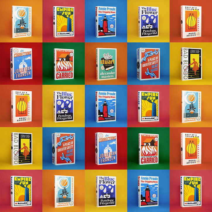
Jack Smyth: Matchbook Classics
Remarking that this is in fact “totally okay!” Jack asserts that this multiplicity of purpose is “one of the good things about book jacket design as different people have varying response to it.” For him, “a successful book jacket is measured differently depending on where you’re standing," adds the designer.
Secondly, Jack importantly cites how in theory, a book jacket design can be anything. “There are infinite identities we can give to any one book,” he says. “One thing I like about jacket design is that we can use anything we see fit to make that jacket right. Whether it’s illustration, type, colours, collage, embroidery, suggestion, humour or any kind of special finishes, we can create all kinds of possibilities.” A book can look and feel any kind of way until you make the jacket and for book designers like Jack, these investigative options never tire.
Lastly, Jack goes on to say how “everyone is absolutely smashing it” and how this, in turn, inspires healthy competition and even envy. “The ABCD awards are testament to this and I challenge anyone to look at the works of say Tom Etherington, Sinem Erkas, Jonathan Pelham, Jo Thompson, Luke Bird, Nico Taylor, Anna Morrison (I could seriously go on and on here) and not be inspired” exerts Jack. For the designer, the art of book design is continuously stimulating because there are many talented people out there, reinventing the medium daily.”
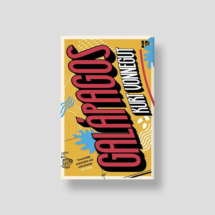
Jack Smyth: Kurt Vonnegut
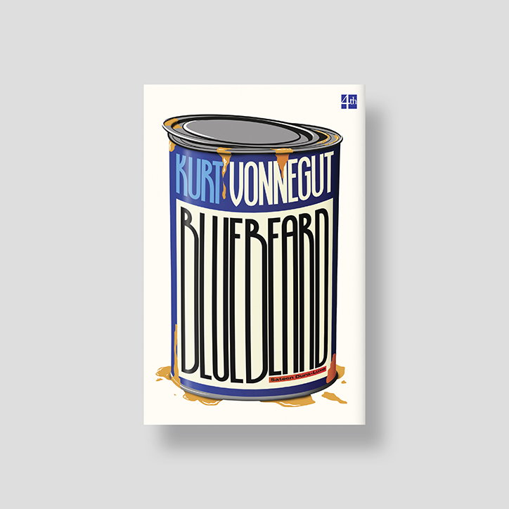
Jack Smyth: Kurt Vonnegut
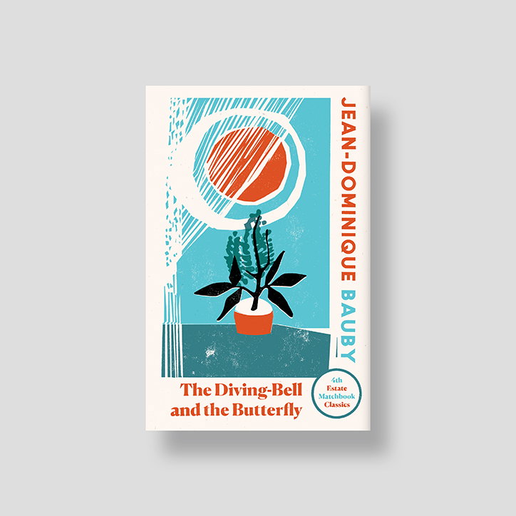
Jack Smyth: Matchbook Classics
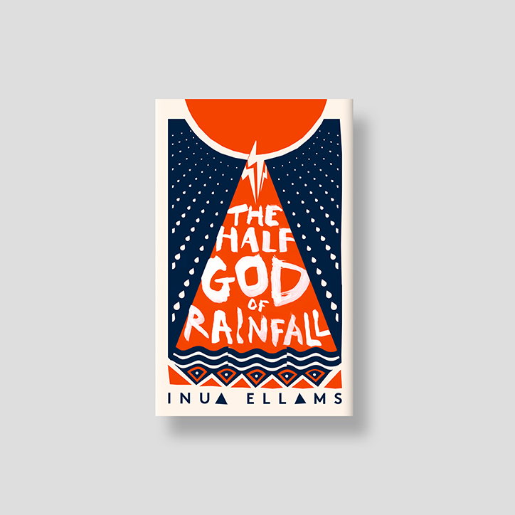
Jack Smyth: The Half God of Rainfall
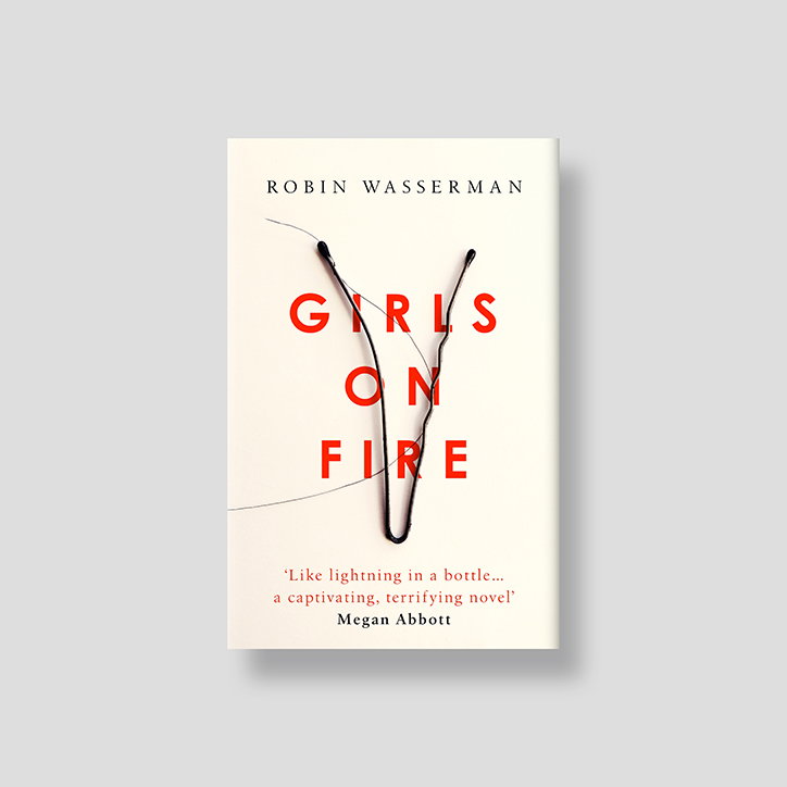
Jack Smyth: Girls on Fire
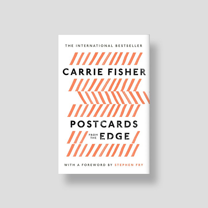
Jack Smyth: Carrie Fisher
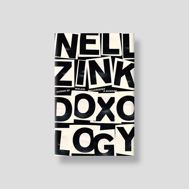
Jack Smyth: Doxology
Share Article
Further Info
About the Author
—
Jynann joined It’s Nice That as an editorial assistant in August 2018 after graduating from The Glasgow School of Art’s Communication Design degree. In March 2019 she became a staff writer and in June 2021, she was made associate editor. She went freelance in 2022.