Jaeyou Chung’s rebrand for Beijing’s X Museum features a type inspired by twisted dimensions and chair legs
Being introduced to typography and design greats Paula Scher and Herb Lubalin at age ten by his father, New York-based Jaeyou Chung was destined to be a designer.
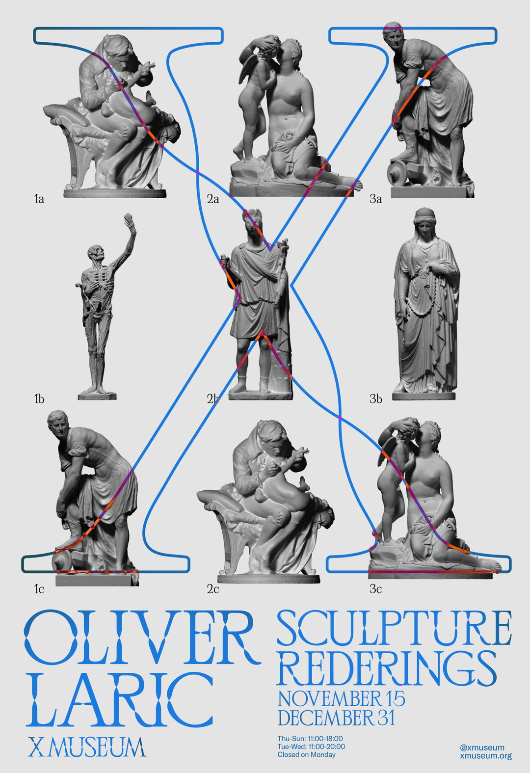
When starting a new project Jaeyou Chung always endeavours to find its “unique core values”. Once he has figured these out, after a period of research, he then “observes and interprets the world through [his] own lens”. When approaching the rebrand for the X Museum in Beijing, Jaeyou discovered that the museum always held exhibitions in two different “spaces” – both physical and virtual. And so, the core value Jaeyou decided to visually develop was “an intersection and coexistence of two dimensions”. Jaeyou’s designs then focused on twisting these two dimensions together, resulting in a typeface and word mark that appears as two disparate parts intertwined to make legible lettering. “In this way, we can see both worlds being aligned,” the designer adds.
To find inspiration for such inventive and theoretical concepts, Jaeyou always keeps his creative eye on the lookout for relevant objects. The twisted element in the X Museum designs came to Jaeyou during a trip to a vintage shop in Williamsburg, where he stumbled across a chair with twisted metal legs. When eventually getting onto the experimentation stage, Jaeyou also attests to never wanting to “limit” himself with flat or static visuals. Trying best to visualise the ideas in his head, he doesn’t hesitate to delve into motion, 3D and illustration.
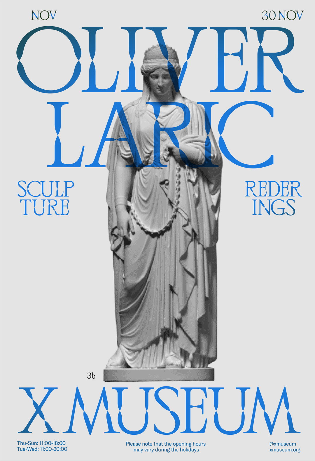
The X Museum concept translated spectacularly when being utilised for the promotional material for the Oliver Laric exhibition in November 2021. An artist who scans and renders his work and other historic sculptures into 3D models, his work quite literally, as Jaeyou explains “brings physical sculptures into a virtual dimension”. The final posters for the exhibition represent this meeting of modernity and history, with imagery of classical statues overlaid with the elegant, digitalised type.
Jaeyou Chung: X Museum (Copyright © Jaeyou Chung, 2022)
Jaeyou is far from a predictable designer, as his conceptual project Beyond Our Utopia (BOU) demonstrates. “I’ve always been into sci-fi movies and dramas like Black Mirror, Gattaca and RoboCop, so I wanted to try and create a futuristic brand,” the designer explains. “In many sci-fi films, people look for and dream of a utopia with high technology, but they end up in a calamitous dystopia.” BOU, therefore, exists as a conceptual company developing wearable robotics. To reflect this storyline of “body enhancement” in the type, Jaeyou added “responsively stretchable” elements and with straight, graphic lines, repeated curves, and jigsaw piece buildable sections, the experimental type exudes the futuristic focus the designer was going for.
Exploring Jaeyou’s upbringing, it really comes as no surprise that he ended up a designer. Growing up in Korea – aside from a two-year stint in Chicago when Jaeyou was two – Jaeyou was raised by his artist mother and designer father. Watching his mother’s printmaking helped his understanding of image-making; meanwhile his father imparted his knowledge of typography. Recalling a particularly formative moment, Jaeyou explains that “as I was always interested in design, my dad called my brother and me and gave a little lecture about design. Even though I was only 10 or 11 years old, I still remember it. It was about Paula Scher and Herb Lubalin.” Showing the young Jaeyou a few of their projects, he “can still lucidly remember my heart palpitating when I first saw Lubalin’s beautiful typography”. Later, Jaeyou moved to New York to pursue graphic design.
Only recently graduating, Jaeyou has already landed a place at Collins. “For now, I want to work with as many clients as possible and produce inspiring works in typography and brand identities,” the designer says. “I'm also interested in going to Yale for further studies in graphic design. We’ll see how it goes.”
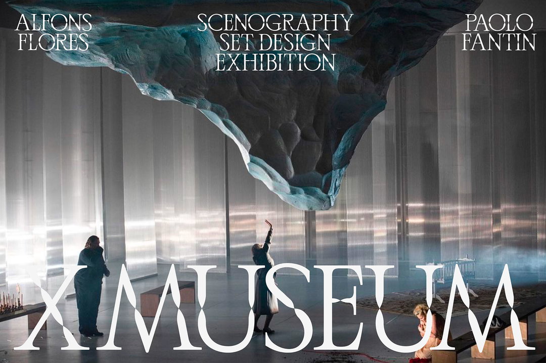
Jaeyou Chung: X Museum (Copyright © Jaeyou Chung, 2022)
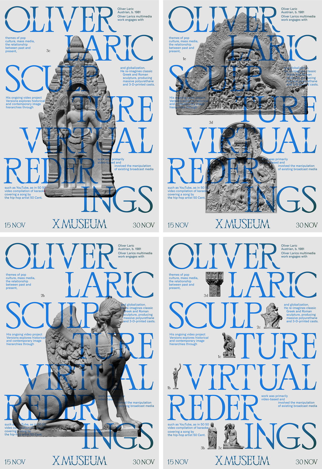
Jaeyou Chung: X Museum (Copyright © Jaeyou Chung, 2022)
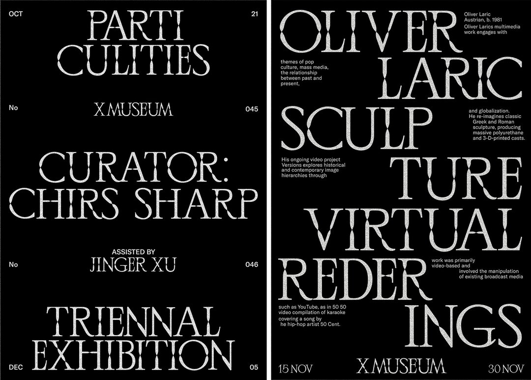
Jaeyou Chung: X Museum (Copyright © Jaeyou Chung, 2022)
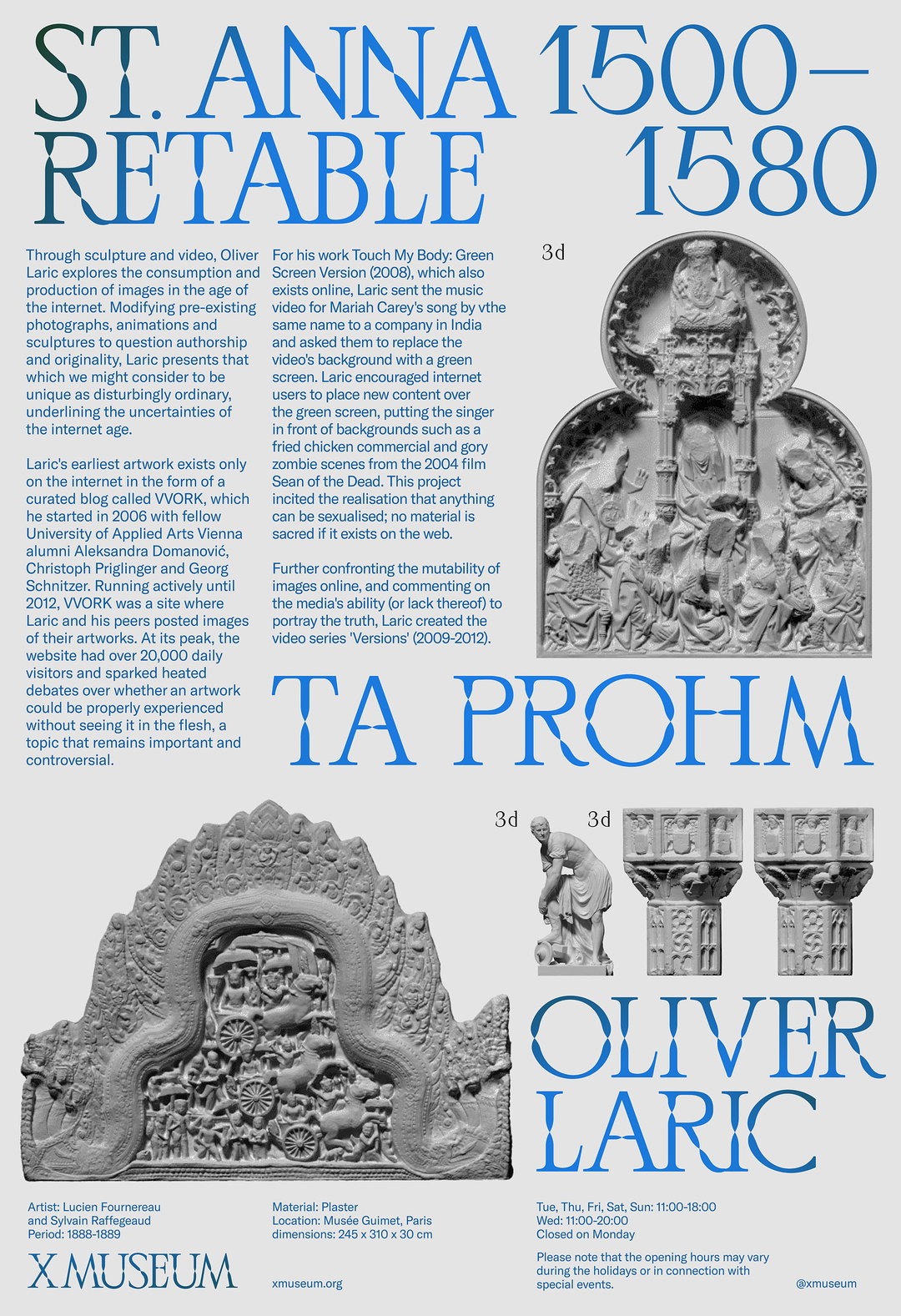
Jaeyou Chung: X Museum (Copyright © Jaeyou Chung, 2022)
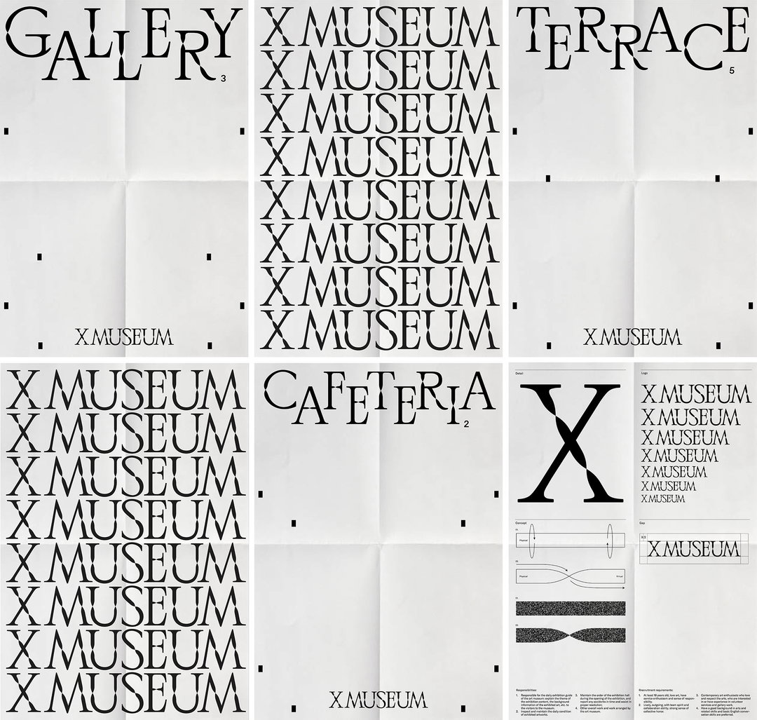
Jaeyou Chung: X Museum (Copyright © Jaeyou Chung, 2022)
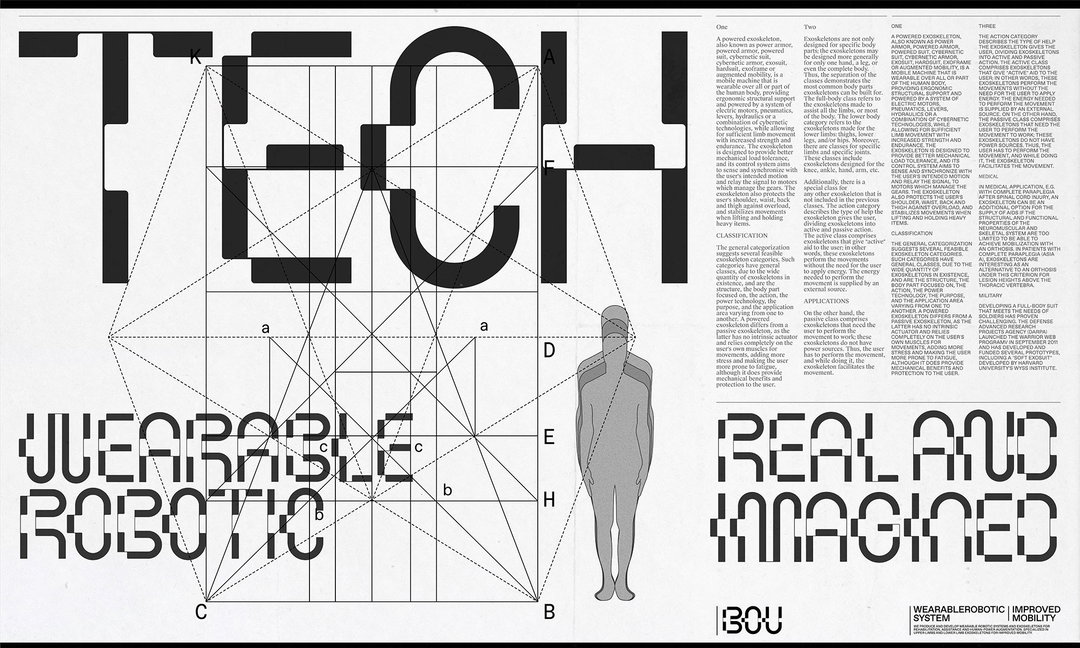
Jaeyou Chung: BOU (Copyright © Jaeyou Chung, 2022)
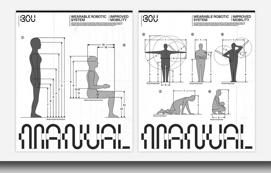
Jaeyou Chung: BOU (Copyright © Jaeyou Chung, 2022)
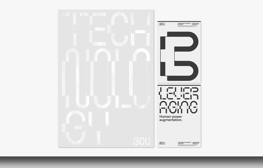
Jaeyou Chung: BOU (Copyright © Jaeyou Chung, 2022)
Hero Header
Jaeyou Chung: X Museum (Copyright © Jaeyou Chung, 2022)
Share Article
Further Info
About the Author
—
Olivia (she/her) is associate editor of the website, overseeing the day-to-day editorial projects as well as Nicer Tuesdays events. She joined the It’s Nice That team in 2021. ofh@itsnicethat.com
To submit your work to be featured on the site, see our Submissions Guide.