




Laura Csocsan's monochromatic portfolio of conceptual yet methodical and logical designs
“Generally, in every project, the use of type is important for me,” states Budapest-based graphic designer Laura Csocsan. “I usually find the best version of something always includes simple forms or an image, combined with type and the smart use of white space.” A quick look through Laura’s portfolio confirms her description of her work, as it’s one packed full of monochromatic, type-heavy projects born from her conceptual, yet methodical and logical approach to design.
It was during her adolescent years that Laura developed this approach. In 2013, she began collating others’ photographs that she admired on a Tumblr, eventually expanding her curation to include typography. “I realised that the combination of type and image attracts me the most,” she explains, “I found the power of arrangement and logic very interesting, with a lot of possibilities.”
During her studies, this rational approach to design only expanded. “I really like to read about other designer’s thoughts, I like books about graphic design rules and practices, and I have learned a great deal from these,” Laura offers. Devoting a lot of her time to studying Swiss graphic design, it was at university that she also stumbled upon the Manifesto of Futurism.
The Manifesto of Futurism, and its resulting movement, was written by Italian poet Filippo Tommaso Marinetti in 1909 and went on to have a large impact on the graphic design world. “I was amazed to see how their work is still modern and visually relevant but was also aware that their views on war and women are outdated and harsh, to say the least,” Laura explains of the beginning of her project Futurist Manifest Now. “It interested me to explore whether the general concept behind the movement could mean something for our society a century later,” she adds.
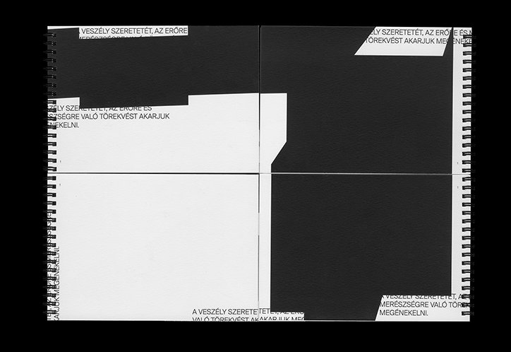
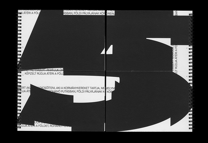
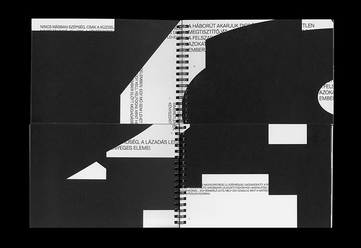
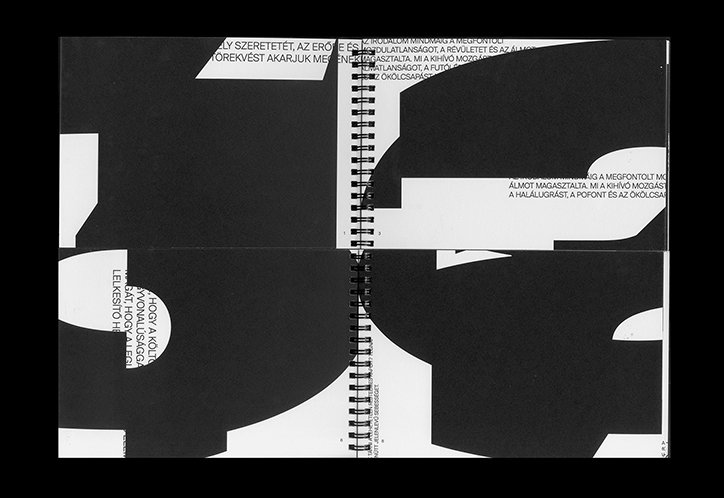
As a result, she created a publication that goes against the traditions of the information society we live in, in a nod to how Futurists “throw away that which connects to the past in any aspect,” often rejecting the norm. By printing the eleven articles of Marinetti’s manifesto but covering them with abstracted forms of the numbers one to 11, Laura created a contemporary demonstration of the Futurist movement both conceptually and visually. Through rearranging the spiral-bound pages of Futurist Manifest Now, users can align the text of the various articles in order to reveal the information in a world where information is usually given to us so freely.
Due to graduate from university next year, Laura recently spent three months as an intern at Studio Mut in Italy and is now taking a year out to work full-time as a graphic designer at a company, while also freelancing and developing some personal projects. In the future, she hopes to continue her recent experiments with type design: “I would like to broaden my knowledge in this field because the chance to work with the symbols of different languages is something I would love to discover in depth, and since I think a particular typeface can determine the tone of communication it is a big possibility to be able to control this factor.”
Laura Csocsan: Futurist Manifest Now
Laura Csocsan: Futurist Manifest Now
Laura Csocsan: Futurist Manifest Now
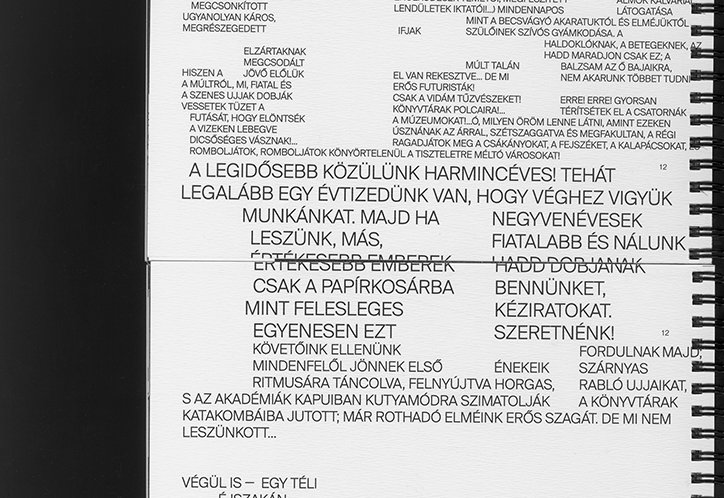
Laura Csocsan: Futurist Manifest Now
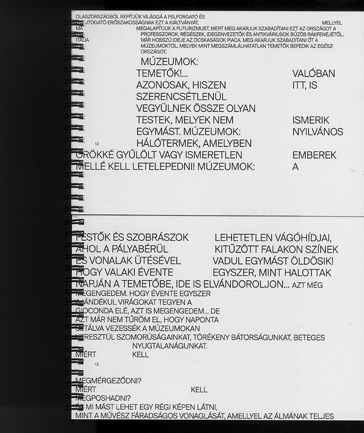
Laura Csocsan: Futurist Manifest Now
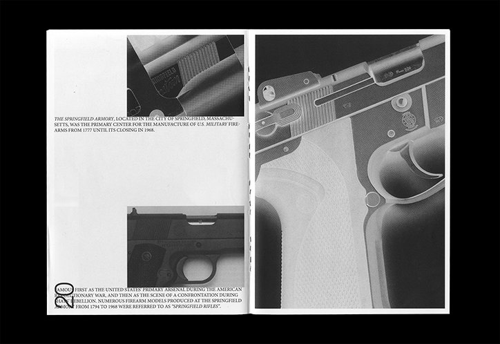
Laura Csocsan: Guns
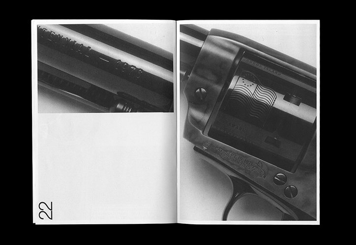
Laura Csocsan: Guns
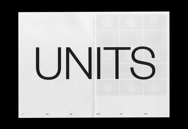
Laura Csocsan: Of Time
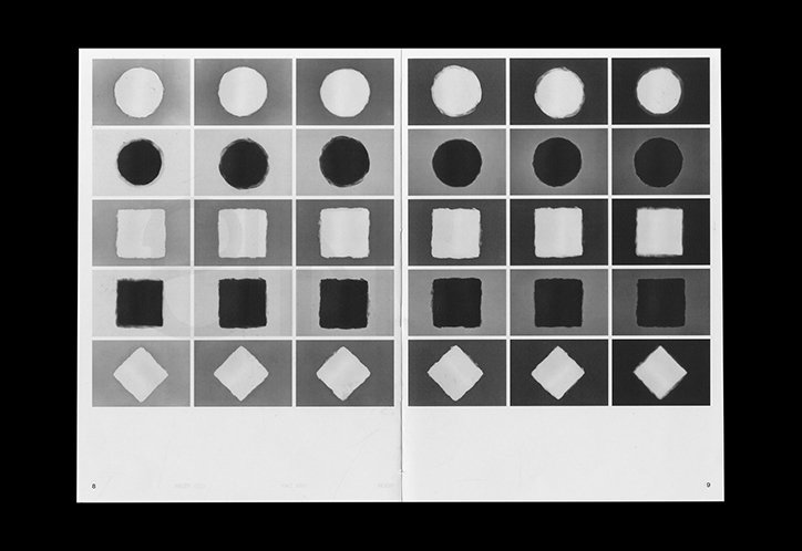
Laura Csocsan: Of Time
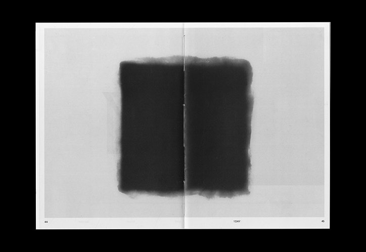
Laura Csocsan: Of Time
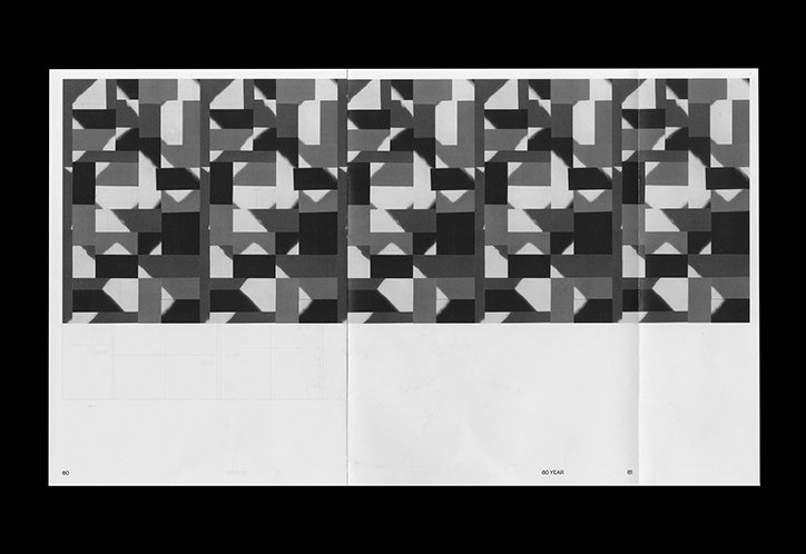
Laura Csocsan: Of Time
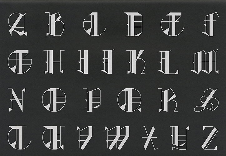
Laura Csocsan: Vitae Typeface
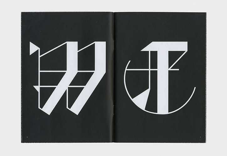
Laura Csocsan: Vitae Typeface
Share Article
Further Info
About the Author
—
Ruby is Senior Creative at It's Nice That, overseeing our visual output across platforms and projects. Before that, she was associate editor on the editorial team, after joining in September 2017 following graduation from Central Saint Martins.


