Lee Kan Kyo’s practice involves taking a selfie a day and a loyalty card club
Lee Kan Kyo is turning Japan’s art scene on its head with his mind-boggling felt tip pen artworks. Born and raised in Taipei, Lee first ventured to Tokyo 12 years ago to studio graphic design, and has stayed there ever since. In these years, the main change in Lee’s work is that he is no longer a graphic designer but an artist. Known for his intricately detailed drawings of commercial flyers, his work continues to “rethink the role and the perspective of the graphic designer” and as a result, his artist practices considers both typography and visual language at the core of his work.
Lee recalls vivid memories of always drawing and doodling as a child. During his summer holidays in Taiwan, he strongly remembers the “summer exercise book” he was given during the two months of holiday that he would fill with his daily endeavours. “I remember I drew this image from a video game I was playing,” says Lee. “If you think about this method of documentation today, it’s almost like a screen shot. I still remember the excitement of illustrating the cover; that’s one thing that still has a deep impression on me.”
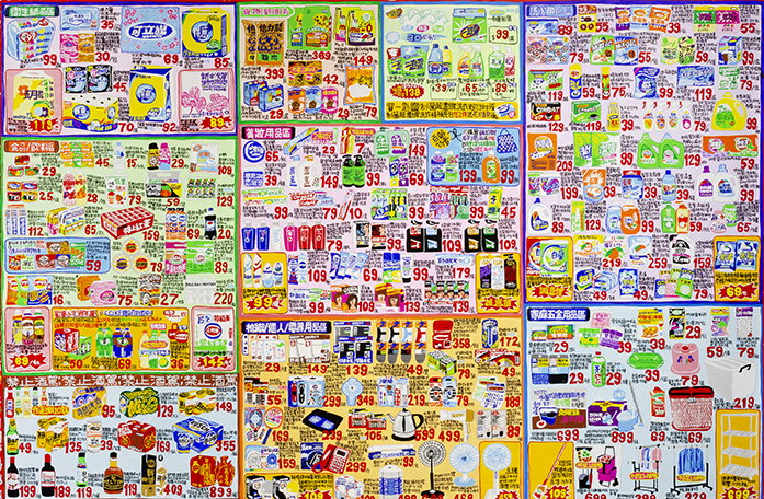
Famously known for his exhaustive work painting flyers from the supermarket, Lee’s playful take on this form of commodity advertising can be found on the covers of magazines, publications and even clothing lines. One day, when the artist was shopping at a supermarket, he suddenly realised how pretty these flyers are and went onto create a series of artworks inspired by the supermarket aesthetic. Since then, this theme has been repeatedly cropping up throughout Lee’s work as an experiment with information and how it can be crammed together in a jigsaw of communication.
“They mainly document my discoveries from my daily life in an urban city” explains Lee. When he first came to Japan, he’d never seen anything like these information-packed flyers which seemed normal to everyone else in Japan. In turn, Lee’s illustrations have come to embody his experiences as a foreigner in Japan. As Japanese is not his mother tongue, he occasionally makes small typos in the compositions of his work, and to someone who understands neither Japanese nor Chinese, there is a further gap of communicating through language. For Lee however, these “misreadings” are not a problem as he welcomes all viewers of his work to appreciate the prettiness of the consumerist compositions and the pictorial elements of the language instead.
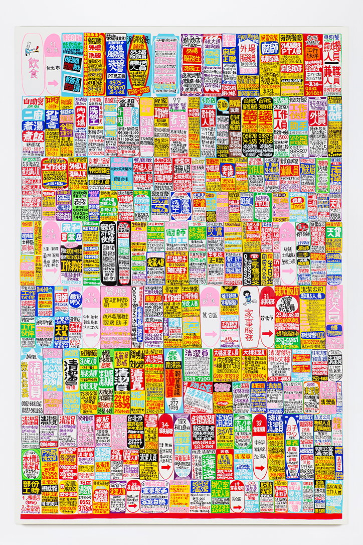
Lee Kan Kyo: Newspaper Job Ads
“I would like to put as much information as possible into one canvas” continues Lee, “even though there is already no room, I still try to squeeze it in.” In his motorcycle series for example, the designer captures the front, back and side view of the motorcycle in one single image. “The motorcycle paintings look distorted and all the details from the differing perspectives can be seen very clearly. I want to have a stereoscopic view on a 2D canvas and masses of information within each composition; I am kind of greedy in this sense but that’s where my aesthetic comes from.”
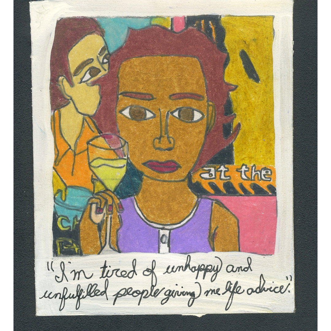
Continuing to pursue two long term projects that have been going on for four years and counting, Lee’s dedication to his light-hearted projects is impressively documented through two different Instagram accounts. His favourite project, recorded through one account is titled Lee Card where he hand draws loyalty cards for his own club.
“The concept came from Japan’s membership card culture,” says Lee. “A Japanese wallet can be filled up with all kinds of different cards. I get asked ‘do you have a loyalty card?’ at least once at every counter I go to, even in the local bakery.” At art book fairs, Lee invites people to come up to his stand and sign up to a Lee Card, he then draws one of their own loyalty cards and they become a member of the increasingly large Lee Card Club. You can view all 409 posts and counting on the Instagram account.
In another project, Lee records pictures of himself drinking from a juice box every day. Juicebox Selfie sees one Instagram post added to the account every day and at the end of the year, he makes a set of playing cards drawn from the best images of the year. So far, he has produced four sets of playing cards as the project has been going on for four years. “Recently, someone told me I look older in the latest playing cards” Lee tell It’s Nice That, “so my future plan is to try and look the same and not age too quickly. I want to be an artist who always looks the same.”
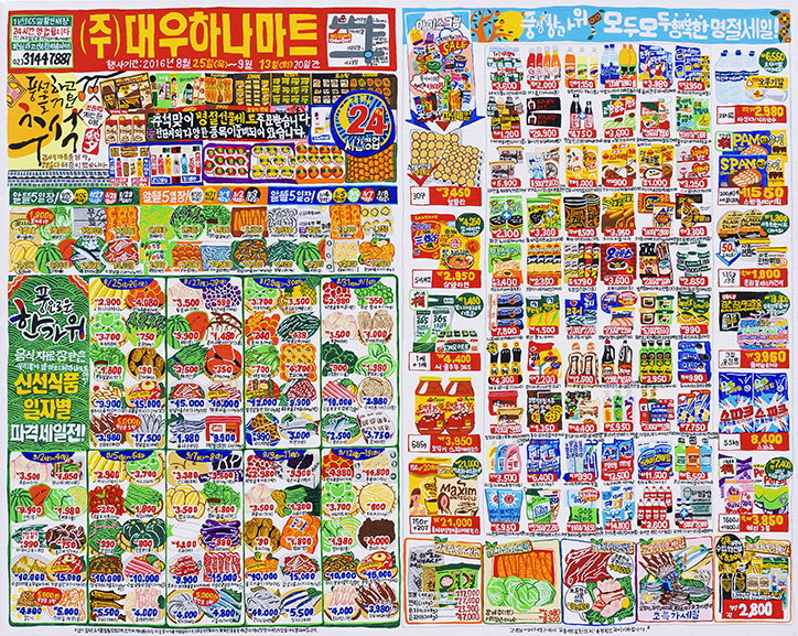
Lee Kan Kyo: Flyer from the Korean supermarket
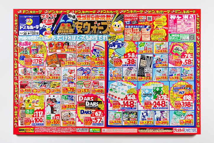
Lee Kan Kyo: Flyer from the Japanese Grocery Store
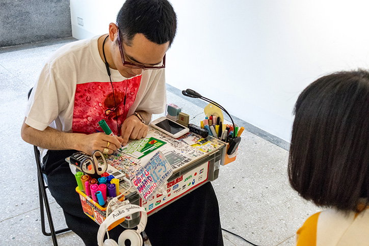
Lee Kan Kyo: Lee Card Club
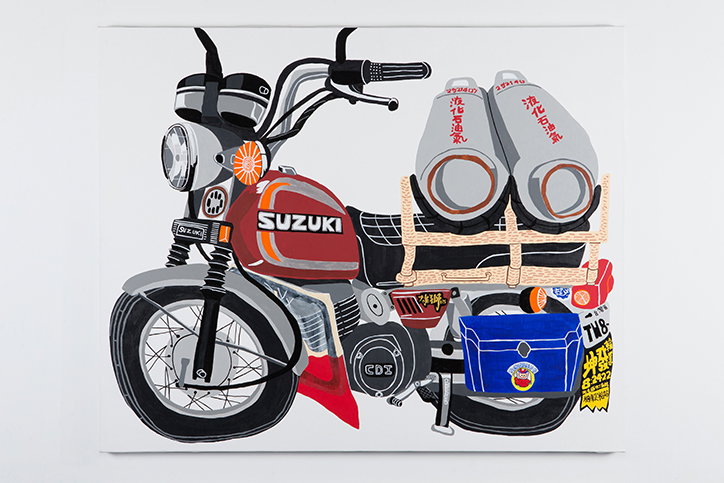
Lee Kan Kyo: Motorcycle
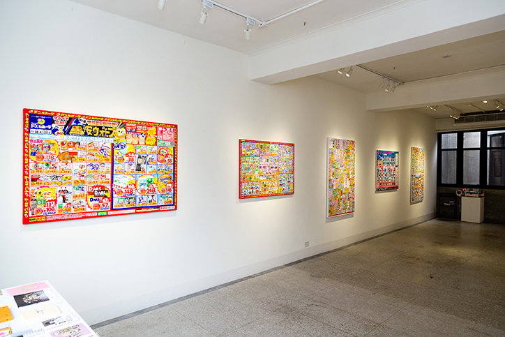
Lee Kan Kyo: Installation view
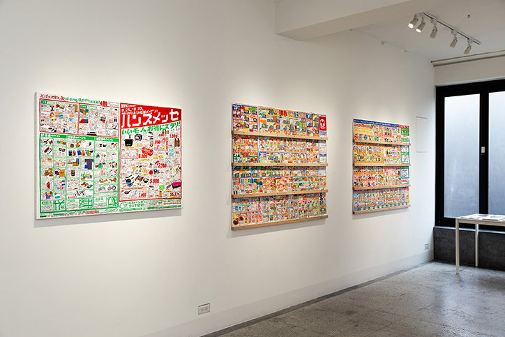
Lee Kan Kyo: Installation view
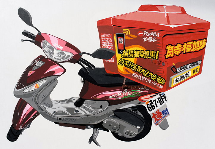
Lee Kan Kyo: Motorcycle
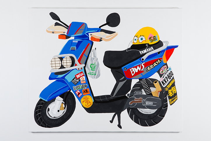
Lee Kan Kyo: Motorcycle
Share Article
Further Info
About the Author
—
Jynann joined It’s Nice That as an editorial assistant in August 2018 after graduating from The Glasgow School of Art’s Communication Design degree. In March 2019 she became a staff writer and in June 2021, she was made associate editor. She went freelance in 2022.