Lena Weber’s animated typeface is a celebration of digital gradients
“Designing a typeface is really just a scavenger hunt for problems, especially if you’re trying to realise something a bit unconventional.”
This article includes moving images.
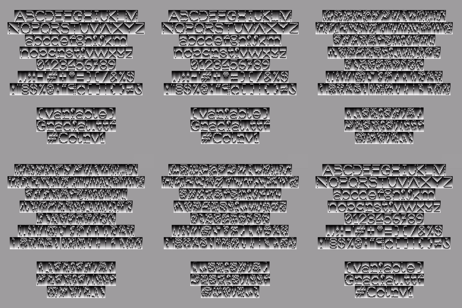
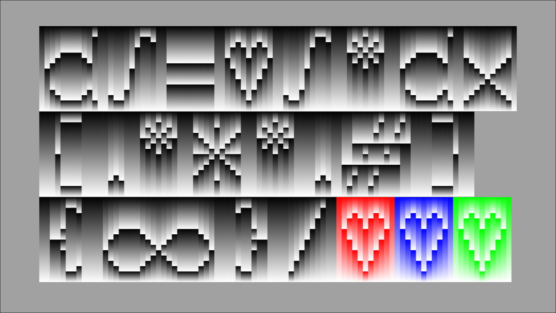
Created as part of her masters project at Bauhaus University, Lena Weber’s Gradial typeface is complex yet deeply satisfying. Composed entirely of coloured gradient components and animated by developing a shifting variable axis, the typeface is a perfect intersection of the designer’s typographic interests of readability, functionality and technology. But, perhaps most importantly, it’s a celebration of gradients. “I love experimenting with gradients,” she says, “they’re a good representation of the digital aesthetic, since they’re so hard to replicate in an analogue context.”
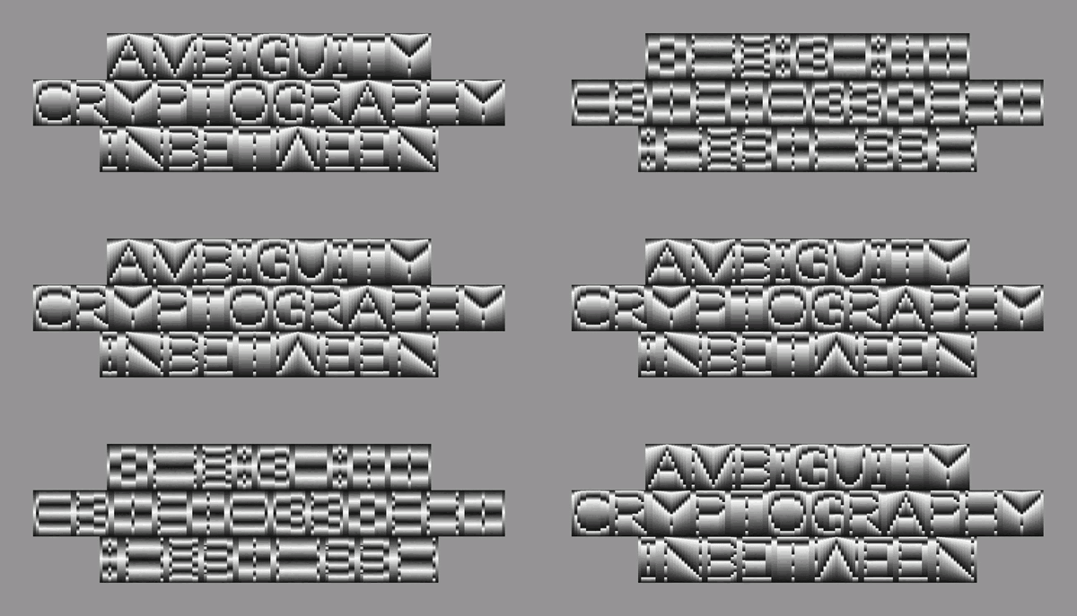
At the core of the project was Lena’s desire to create a typeface that “could encrypt itself visually”. The gradient aspect of the typeface – a system made out of differently coloured rectangular components – allowed Lena to introduce a new way of recognising a glyph, through the use of colour and tone. Essentially, if you were to colour Graidal solid black, it loses all of its readability, leaving you with black boxes alone.
Lena Weber: Gradial (Copyright © Lena Weber, 2022)
Creating such a complex and detailed typeface came with its hurdles; “designing a typeface is really just a scavenger hunt for problems, especially if you’re trying to realise something a bit unconventional,” says Lena. First off, when Lena had the idea for the typeface in 2021, it wasn’t technically achievable; she had no clue that variable gradients were not yet possible to render in a typeface. “I worked my way through the technicalities bit by bit and discovered that a new font format COLRv1 was in development.” But, when Lena first exported her first successful variable COLrv1 file, she soon realised that there was almost no software to preview or render the effect. “It was a wild ride between Glyphs, Github and Colrv1 release updates,” Lena says. “Now it works in Chrome, and I’m thrilled!”
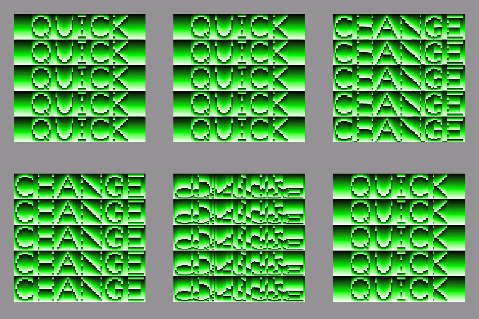
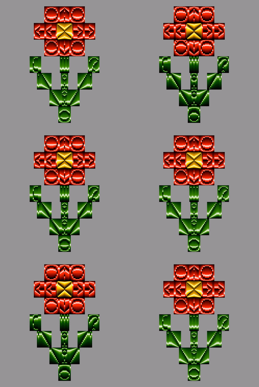
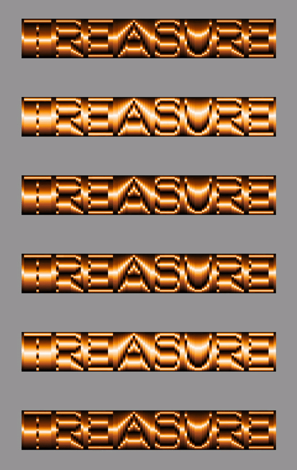
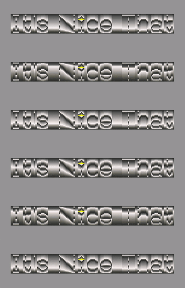
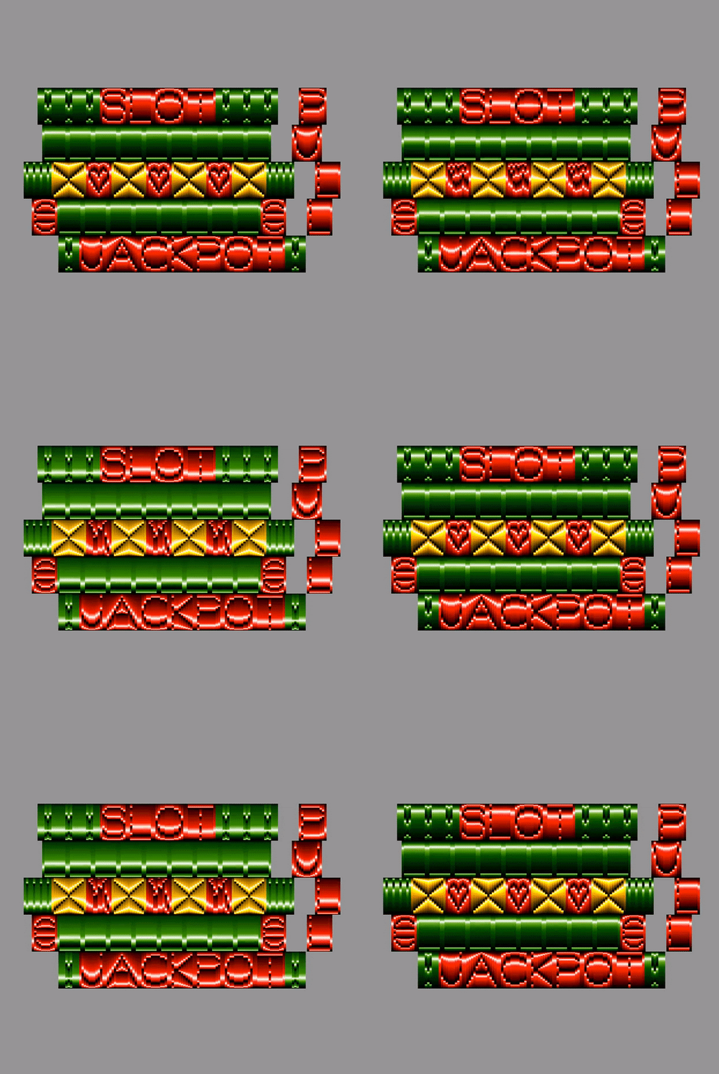
While Lena recognises that Gradial occupies quite a “niche” in the type world, she’s been impressed by how many possibilities and metaphors it can conjure when recoloured. Moreover, the variable axes add intriguing visual elements – “one time it looks like readability is dissolving, other times the colour gradient moves and glyphs look like they’re closing up or blooming”. To test the full possibility Lena has tried a number of experiments, including the font looking like it was a rising or setting sun and creating some ASCII art with it and using it as a tool for illustration: creating a bright red flower composed of glyphs. Moreover, in February, Forbes contacted Lena asking to use Gradial as a header for their Blockchain 50 Article, “which of course was a conceptual home run for Gradial”, Lena adds.
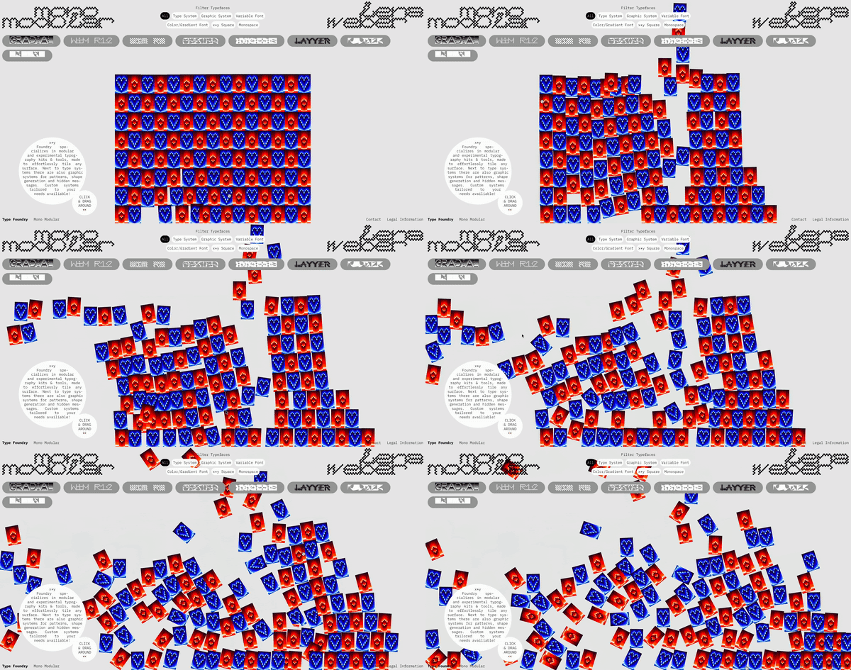
So far, the part of the typeface Lena is proudest of is its variable functionality and the possibilities it brings with it. “I learned so much during the last year that I can’t wait to implement this knowledge for new typefaces,” she says. “I’m really driven by this thought that certain tools have a certain limited scope of aesthetics they can produce.” Since the creation of Gradial, Lena has been motivated to work on an independent foundry website for all of the type projects she’s created over the years. It seems exciting experiments are on the way, so watch this variable, gradial space.
GalleryLena Weber: Gradial (Copyright © Lena Weber, 2022)

Hero Header
Lena Weber: Gradial (Copyright © Lena Weber, 2022)
Share Article
Further Info
About the Author
—
Olivia (she/her) is associate editor of the website, overseeing the day-to-day editorial projects as well as Nicer Tuesdays events. She joined the It’s Nice That team in 2021. ofh@itsnicethat.com
To submit your work to be featured on the site, see our Submissions Guide.