Lucas Hesse draws inspiration from outside the traditional graphic design canon
Lucas Hesse is a Mainz-based graphic designer bringing his experience of studying in Seoul and Germany to inform his culture-focused practice. Under the enlightening supervision of Eike König, at his communication design course in Offenbach, Lucas’ international years as a student made him “curious about how different personalities and people from different cultures approach design.” It taught the designer how some influences can indirectly effect one another, and Lucas brings this principle to a graphic design practice focused on typography, editorial and graphic design.
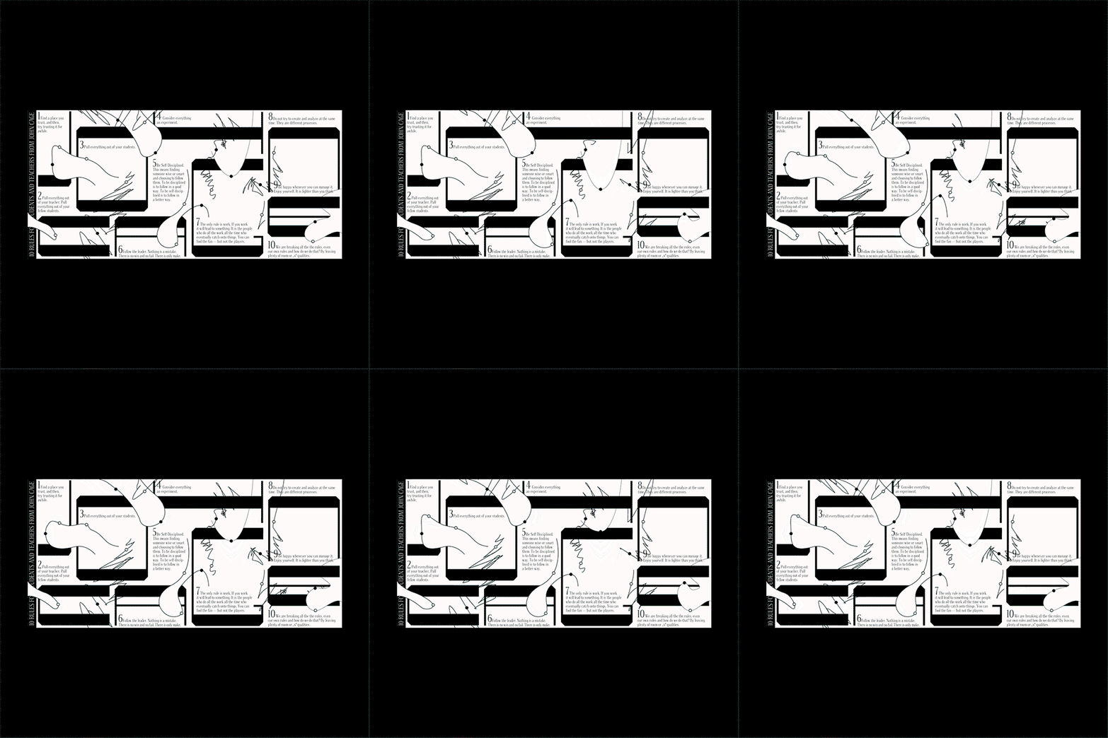
“My work is built very systematically”, Lucas tells It’s Nice That. “I break down the content into its simplest form and put it in a graphic scheme that’s as straightforward as possible.” This is seen in the designer’s Swiss-inspired work that focuses on grid-based simplicity which offers the viewer an obtainable clarity. Lucas’ “reduced graphic” aesthetic also translates through a mainly monochrome colour scheme, amplified by designs that are based on the “graphic environment” such as geometric shapes or contours.
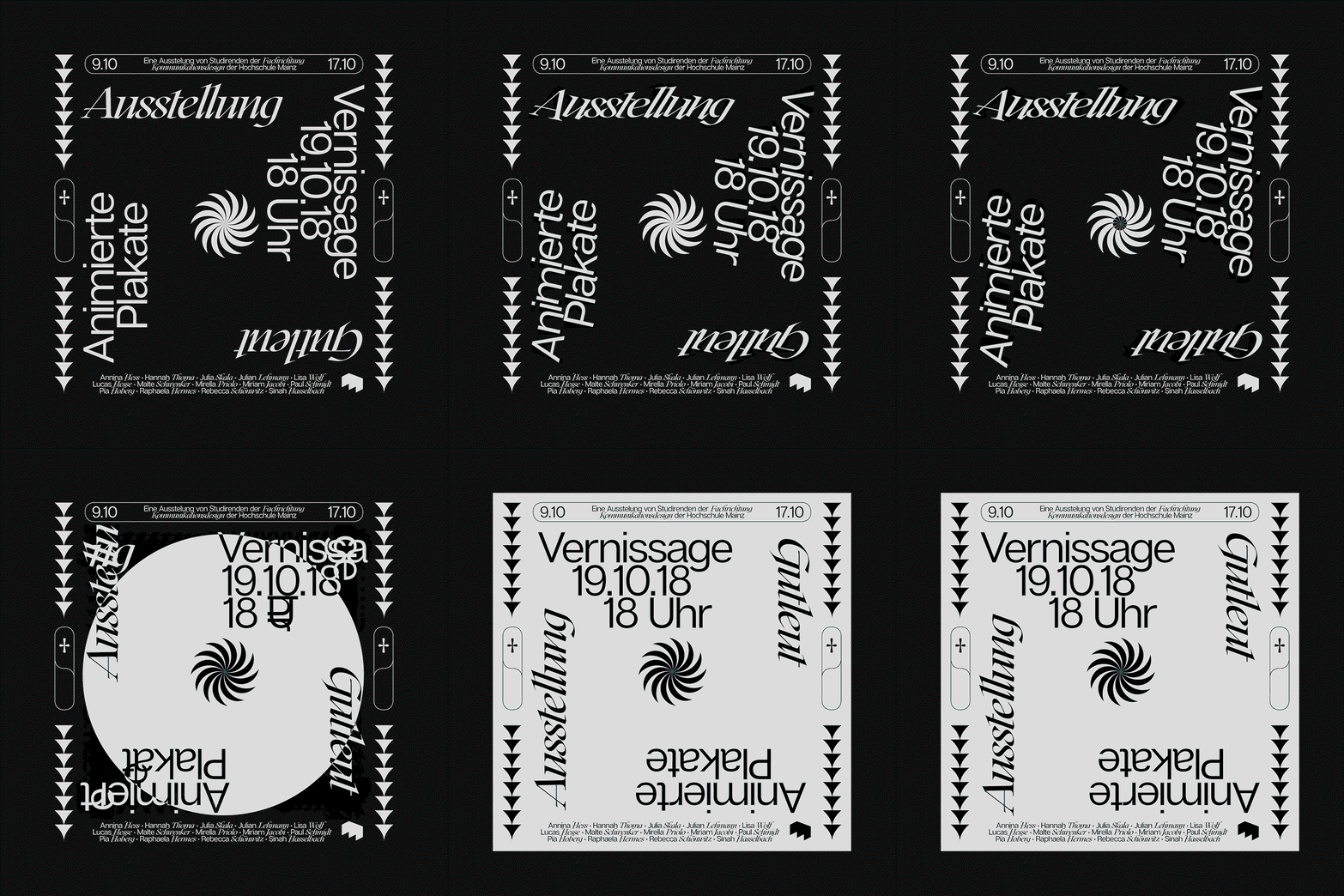
Lucas Hesse: Animierte Plakate
Though the graphic designer’s work may seem particularly rigid with its dedication to the grid, Lucas stays flexible and experimental in his creative process by working almost entirely in the digital workspace, which allows him to play with graphic elements in a digital capacity. For instance, Lucas designed a series of animated posters that use simple modes of movement to elevate the humble poster. The posters are “heavy in concept”, rooted in the “principles behind how an animated poster can work”, juggling the balance between the type’s movement and legibility.
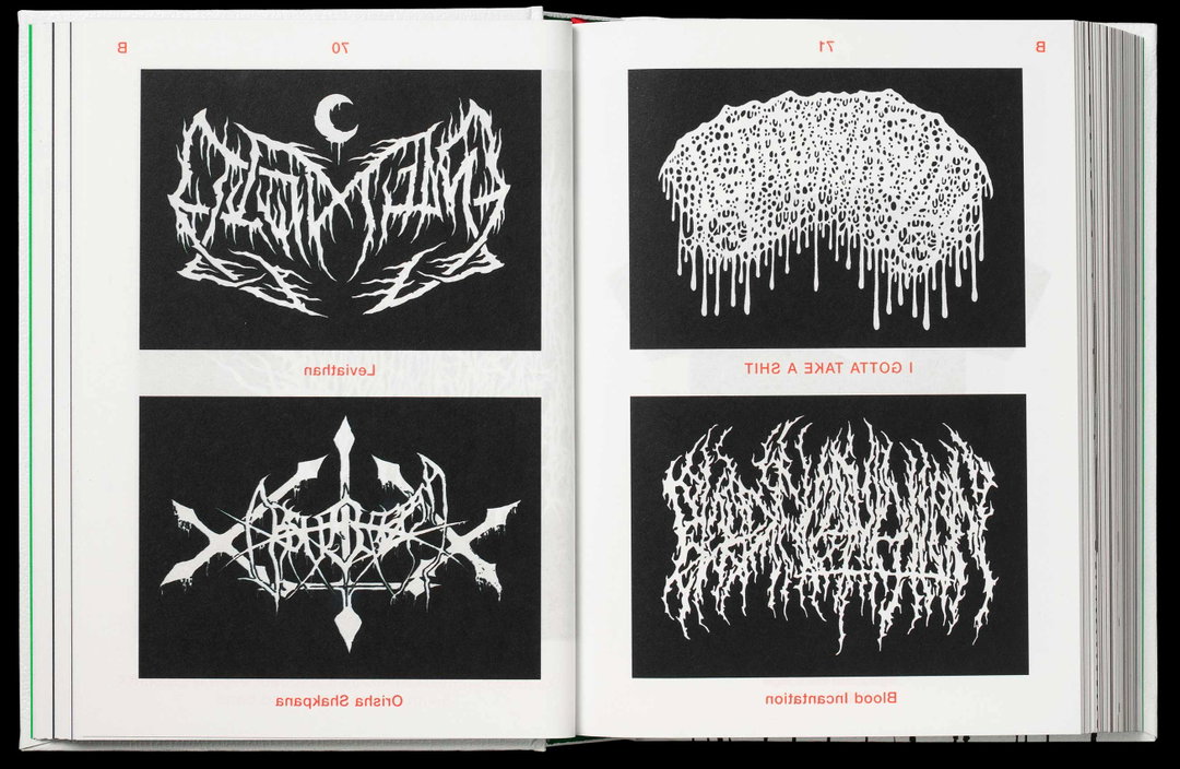
Additionally, Lucas designed the publication, Dilettantische Ästhetik in collaboration with Julian Lehmann which looks into the world of “amateur” graphic design. Translating as Amateurish Aesthetics, the publication invites the viewer to think “outside the box of current trends” as the book’s content focuses on unusual and unexpected design delights. “If you look into the university’s of design you will notice that global trends are copied and modified again and again”, explains Lucas. “And this will happen as long as new trends pop up”, which will always be the case as certain aesthetics find their place in the eternal loop of vintage design coming back into fashion.
However, “to avoid this loop”, Lucas and his collaborators “started looking for new aesthetics that were not generated by professional graphic designers”, collecting and documenting various works designed by non-professionals. These found pieces were then “analysed to find new design concepts for individual chapters.” Each new segment starts with a found piece of design and picks up individual design elements that offer something different to world of the graphic design professionals. With a well-informed practice that shows an understanding of cultural design differences and design history, Lucas’ blossoming design career is off to a good start, bringing design that is well-executed and appreciative of alternative sources of creativity.
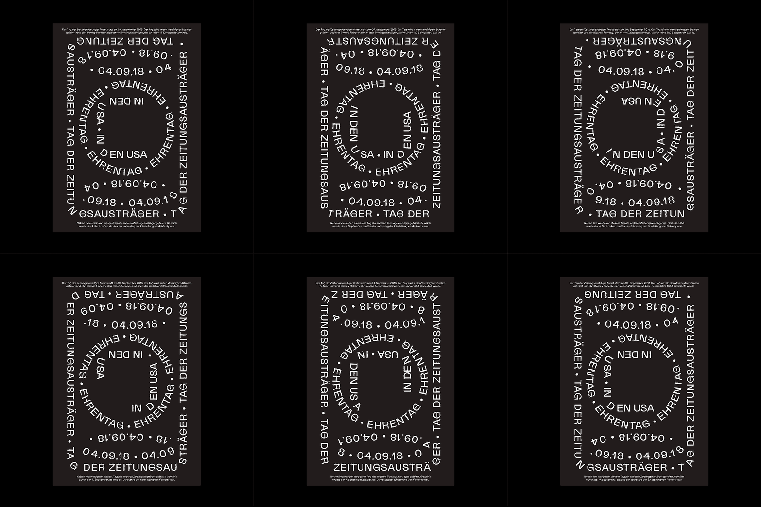
Lucas Hesse: Animierte Plakate
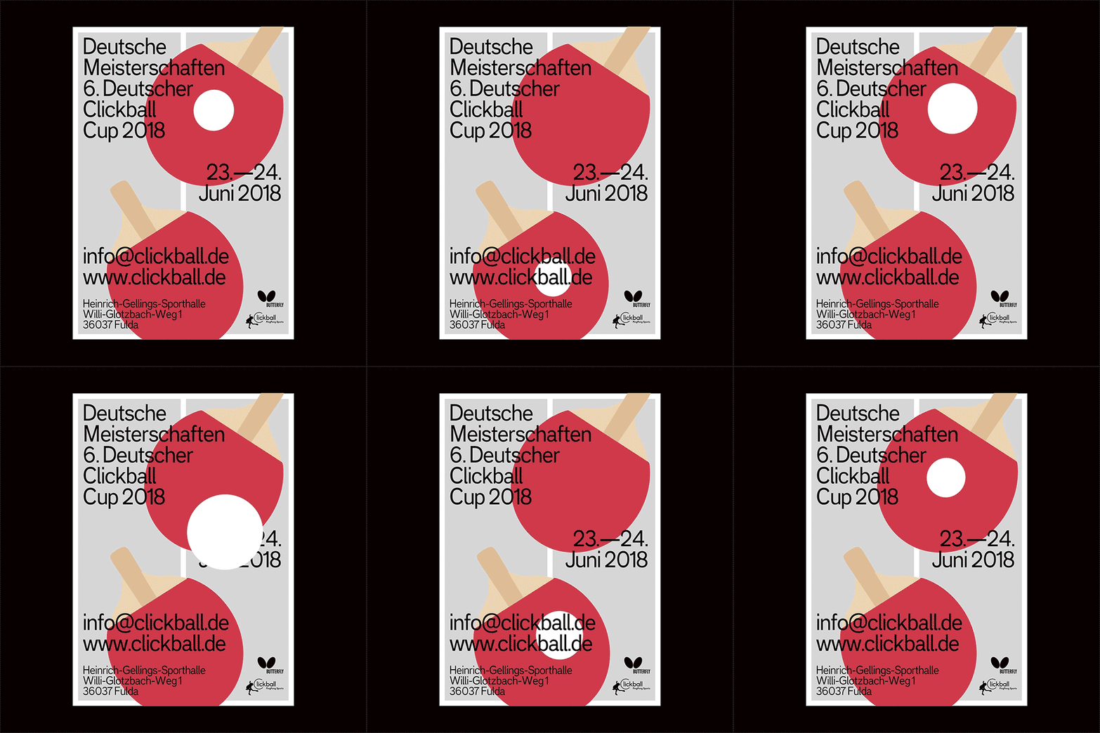
Lucas Hesse: Animierte Plakate
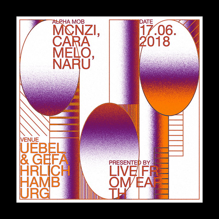
Lucas Hesse: LFE Artwork
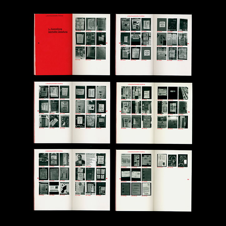
Lucas Hesse: Dilletantische Ästhethik
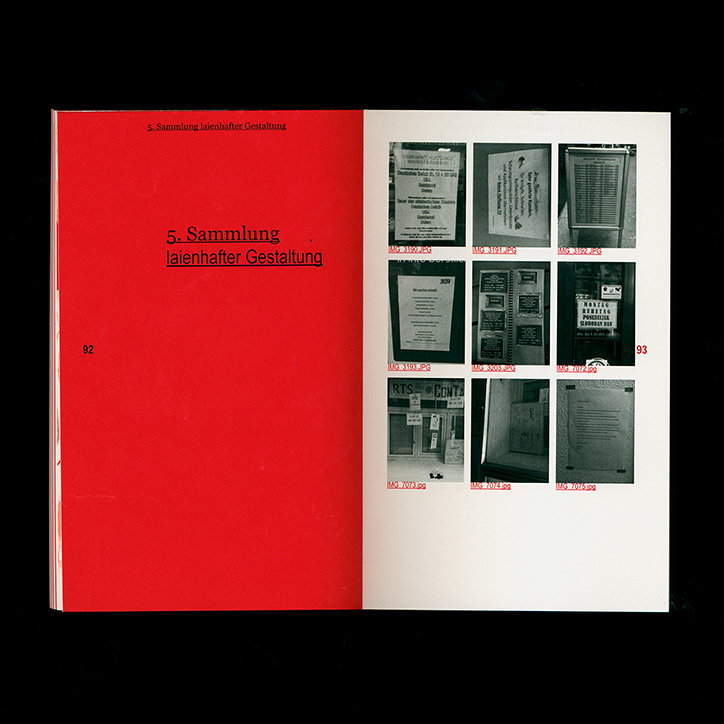
Lucas Hesse: Dilletantische Ästhethik
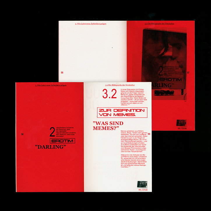
Lucas Hesse: Dilletantische Ästhethik
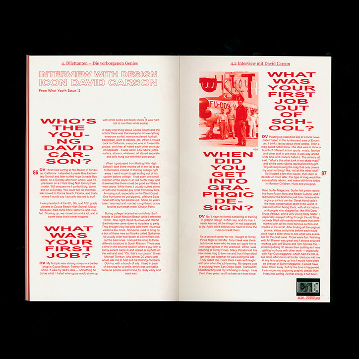
Lucas Hesse: Dilletantische Ästhethik
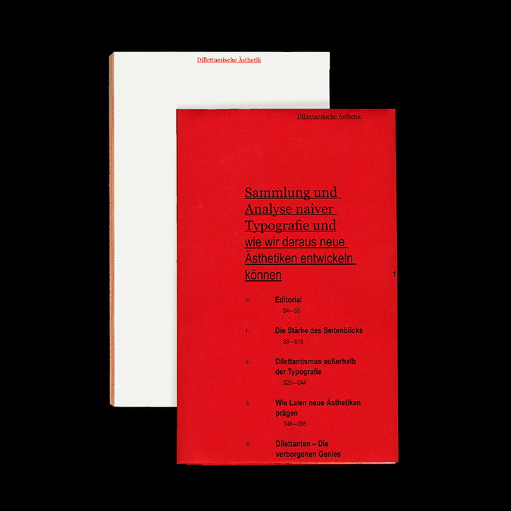
Lucas Hesse: Dilletantische Ästhethik
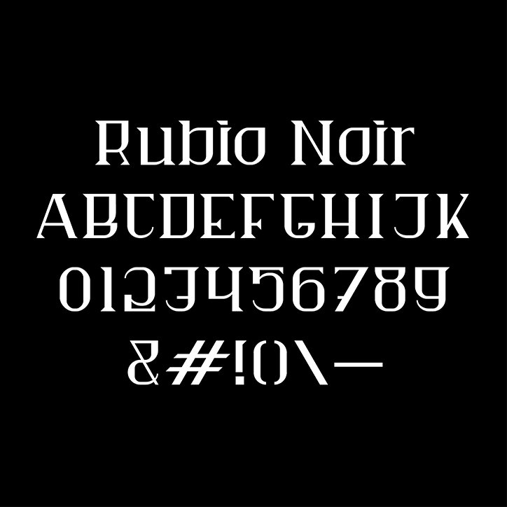
Lucas Hesse: Rubio Noir
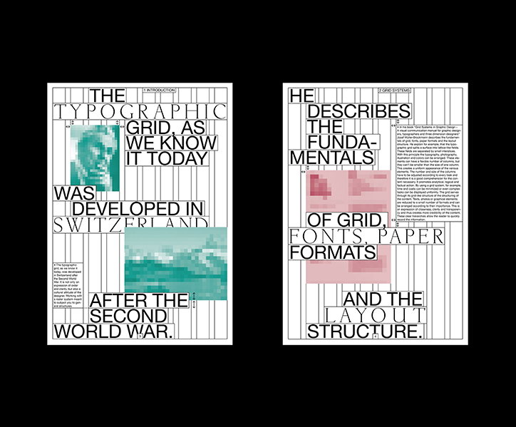
Lucas Hesse
Share Article
Further Info
About the Author
—
Jynann joined It’s Nice That as an editorial assistant in August 2018 after graduating from The Glasgow School of Art’s Communication Design degree. In March 2019 she became a staff writer and in June 2021, she was made associate editor. She went freelance in 2022.