Marvin Kim on exhibitions, identities, plus founding his studio and publishing house Spine Press
Over the course of two years, the Seoul-based graphic designer has achieved a fair few accomplishments. Below, he shares his journey and what it’s been like setting up on his own studio.
Marvin Kim is a designer-publisher polymath. In the two years since we last heard from him, he’s built an enviable portfolio replete with works across identities, exhibition design, web, print, branding and more. Last year, for instance, he designed an impressive identity for the exhibition and fair Grimdosi, and this year he’s been tasked to take the lead again. Besides this, he designed the branding for the virtual gallery desk desk, “a unique and fresh experience because I mainly dealt with flat surfaces,” he tells It’s Nice That. It was through this commission that he learnt a new skillset across tech and collaboration, which has ultimately helped him to reach his goals today. And last but not least, he’s also founded his own graphic design studio and publisher, Spine Press, which is where he’s able to expand on his broad range of activities across both design and publishing.
Setting up your own studio is by no means an easy ride, but nor does it change your design direction or ethos as a creative. “Rather,” adds Marvin, “I continue to insist on what I think is right.” This means that clients often propose ideas to Marvin and book him for the work he now excels at – that of which is expressive, diverse and riddled with references. In turn, his portfolio is now littered with projects in the realms of exhibitions and music. “But I don’t mind any genre if it’s a project that can produce interesting results.”
While tackling a brief, project or publication idea, Marvin likes to combine the subjective and the objective as much as he possibly can. So much so that he describes his process as “making bones and putting flesh on them; it’s like making an avatar in a game.” With this in mind, Marvin’s work is both formulaic and free, composed from a set of variables that he then produces multiple results from. “I think the most important step is to analyse the subject rather than the expressive and stylistic parts, such as ‘inspiration and style’,” he notes. Although, he does think of this part as being important too. Being systems-based, however, means there will be more than one outcome, which is what Marvin hopes to achieve throughout all of the projects he takes on.
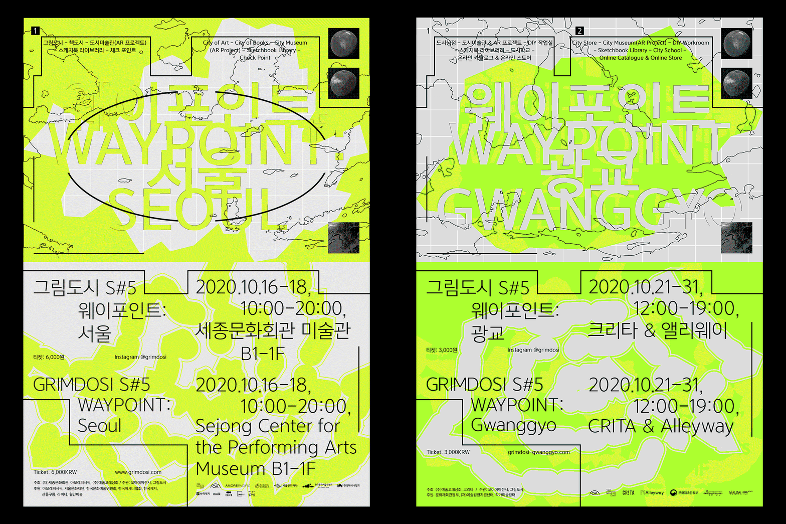
Marvin Kim: Spine Press. Poster design for GrimdosiS#5 Waypoint (Copyright © Marvin Kim, 2021)
Recently, Marvin created the Grimdosi S#5 Waypoint (above)– a poster project devised in response to Covid-19. Splashed in lime green and presenting Marvin’s signature language of carefully articulated systems, it’s a technical design that looks at the component we’ve all missed the most: connectivity. “We tried to narrow the physical and psychological distance by planning AR applications and overseas pop-up links with the keyword ‘connection (scalability)’, and many domestic and foreign artists,” he says. Marvin played with the exhibition name, using “Grim” (which means picture) and “dose” (which means picture city), to then construct a symbolic rectangle. “As this can be associated with a rectangular framed canvas or an endlessly lined building. A rectangle has a corner of 90 degrees that is different from other geometric figures, and this was used to create a unique exhibition logo.”
In another project – a collaboration with artist Miki Kim – Marvin worked on the artist’s book design, which sees an archive of Miki’s work collated from 2017 up until now. By contemplating humanity and a world full of production and consumption, Miki’s latest artworks toy with the idea of a person who takes off a mask, which is something we’re all too familiar with these days. There’s one image in particular that caught Marvin’s eye, which sees a character removing an eye mask with large eyes on it, only to reveal a smaller set of eyes underneath. “As soon as I saw this picture, I decided on ‘reversal’ as the concept of the book.” This includes a transparent PVC cover where, once the cover is removed, a set of eyes is revealed on the “real” cover. “In addition, the front and back covers of the book are reversed. And when you turn over the cover, another blue page appears completely different from the front cover. Finally, since there is information about every book on the back of the transparent cover, when you remove it, the only thing left on the book is the artist’s name and barcode.”
On any given project, rest assured that Marvin is paying utmost attention to its systems. The underlying processes are of much greater importance than the end goal, meaning that the time spent actually working is a lot shorter than the preparation stage – he focuses on idea generation and research. But clearly, and especially after the launch of his own publishing arm and studio, he’s doing something right.
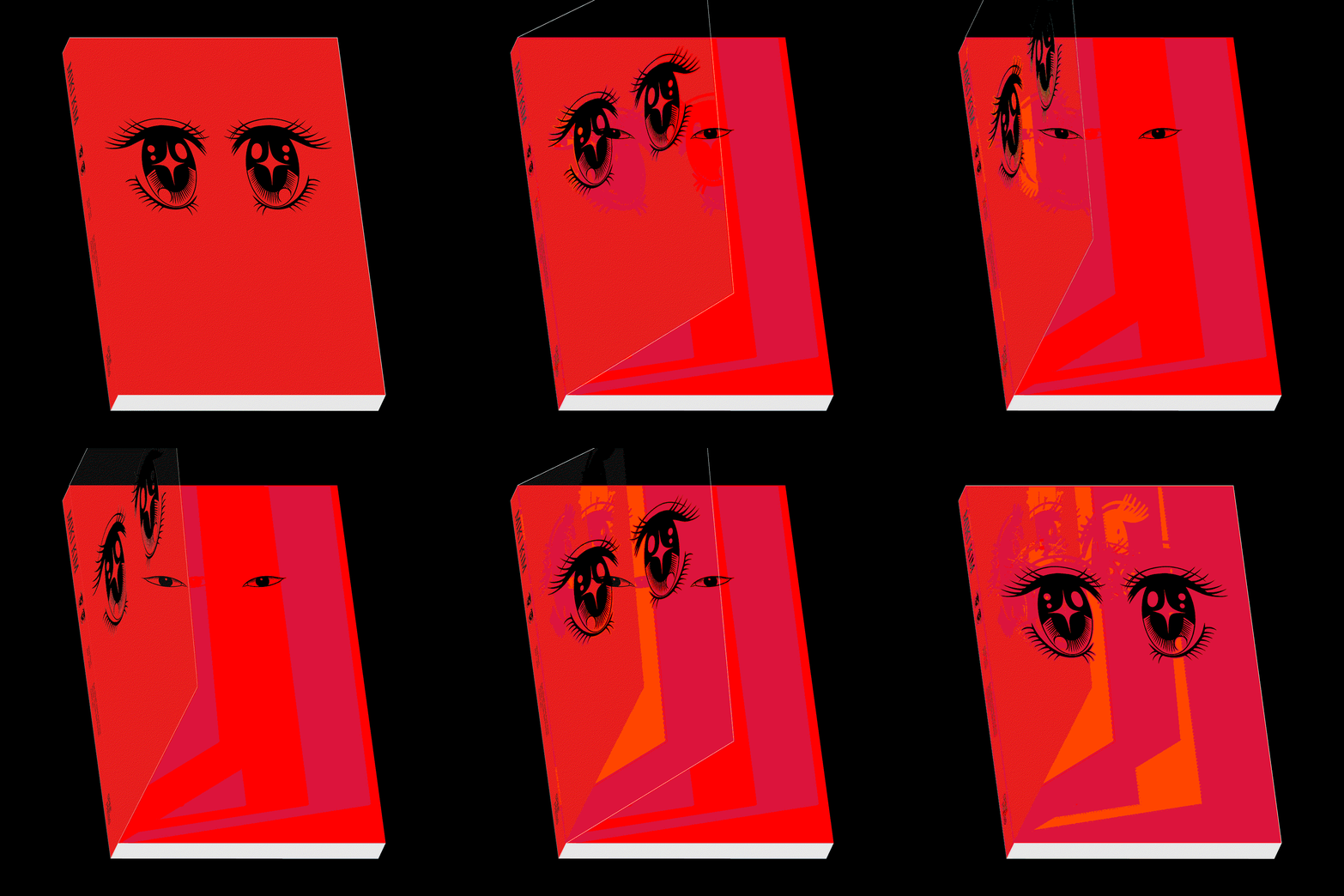
Marvin Kim: Spine Press. Miki Kim art book, front cover (Copyright © Marvin Kim, 2021)
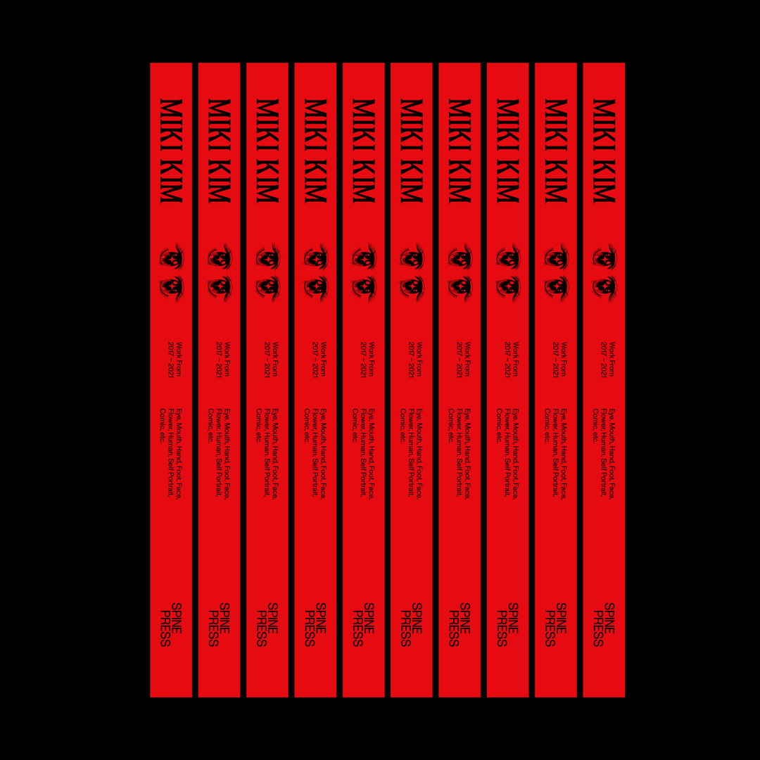
Marvin Kim: Spine Press. Miki Kim art book, spine (Copyright © Marvin Kim, 2021)
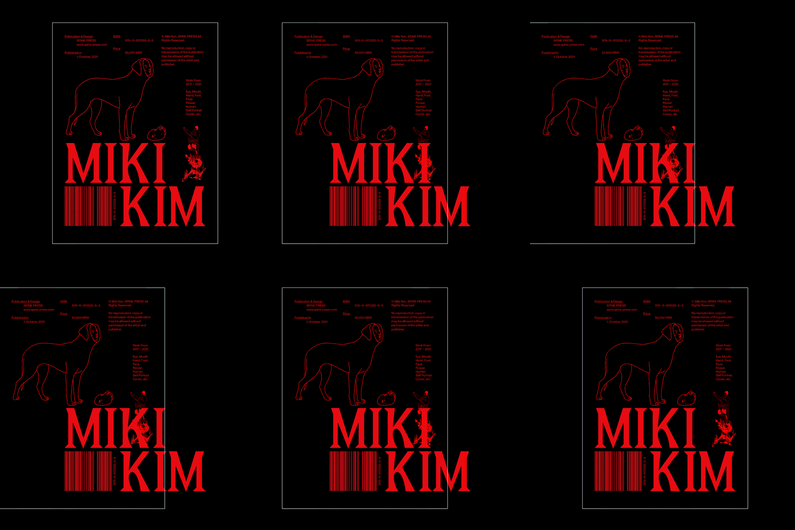
Marvin Kim: Spine Press. Miki Kim art book, back cover (Copyright © Marvin Kim, 2021)
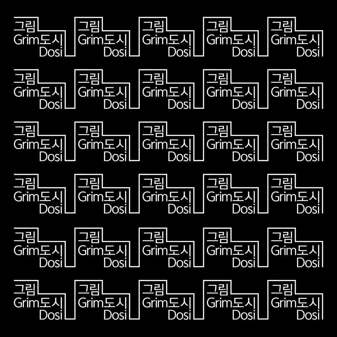
Marvin Kim: Spine Press. Exhibition Identity Design For Grimdosi S#5 Waypoint (Copyright © Marvin Kim, 2021)
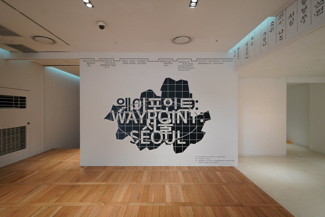
Marvin Kim: Spine Press. Exhibition photography of Grimdosi S#5 Waypoint (Copyright © Marvin Kim, 2021)
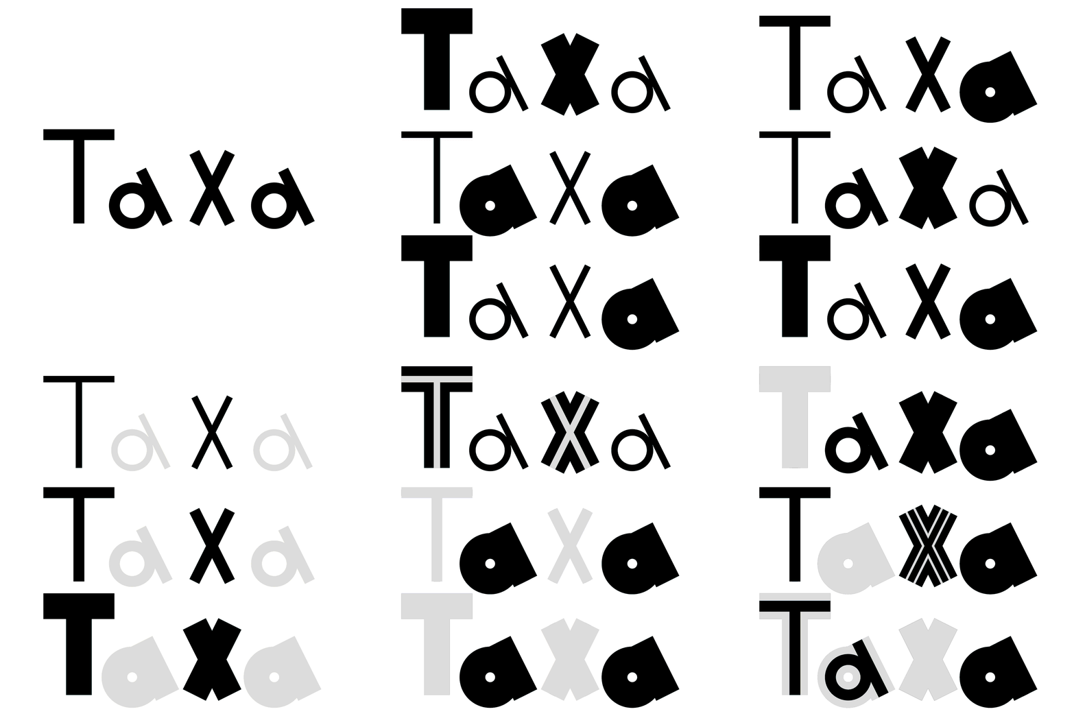
Marvin Kim: Spine Press. Branding design for selected made furniture brand Taxa (Logo play) (Copyright © Marvin Kim, 2021)
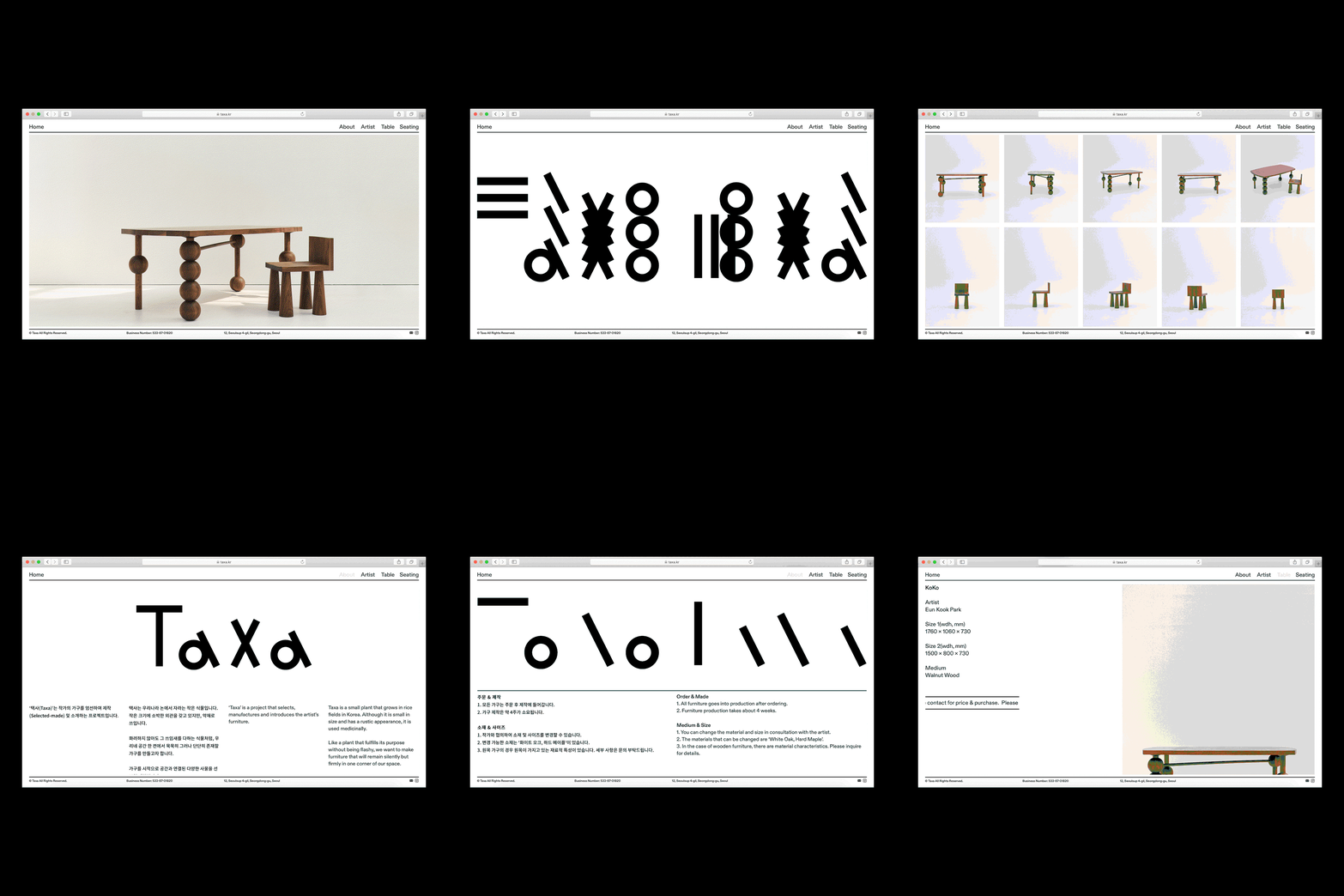
Marvin Kim: Branding design for selected made furniture brand Taxa (Website) (Copyright © Marvin Kim, 2021)
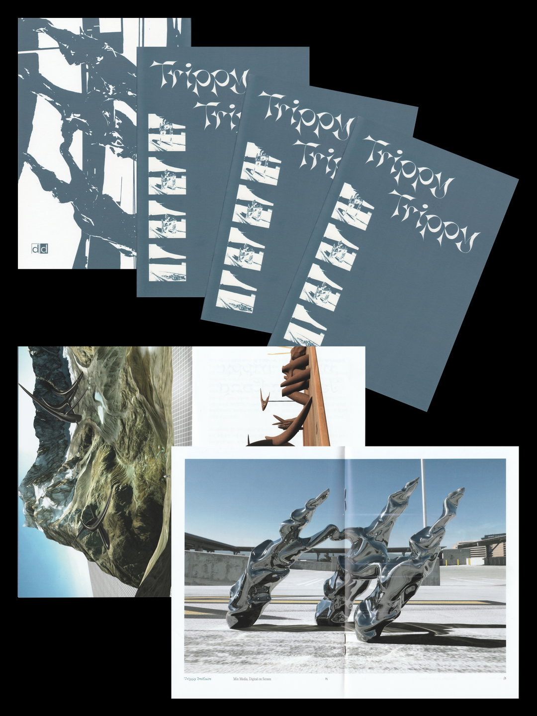
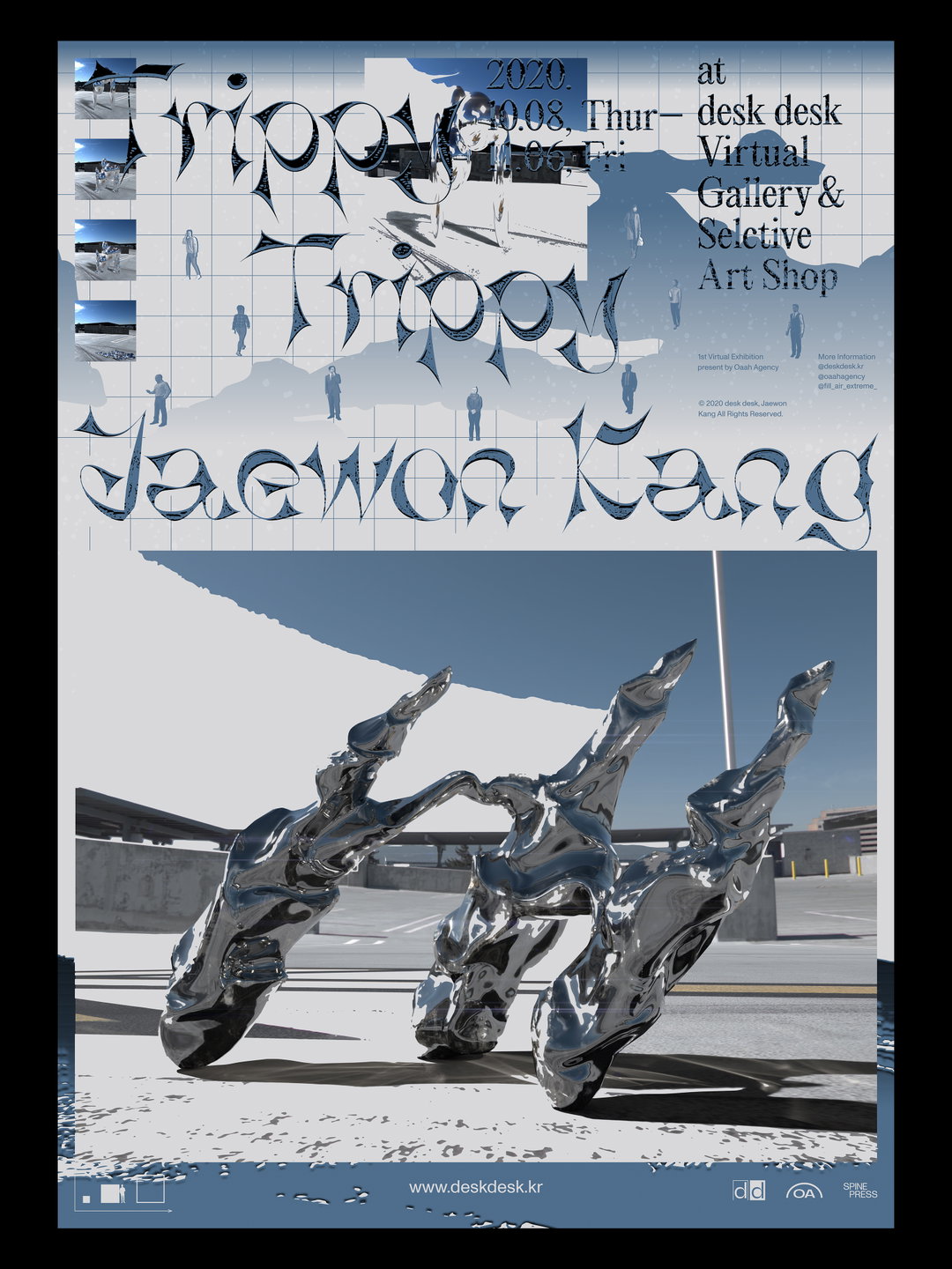
Marvin Kim: Small booklet design for Jaewon Kang virtual exhibition, Trippy Trippy (Copyright © Marvin Kim, 2021)
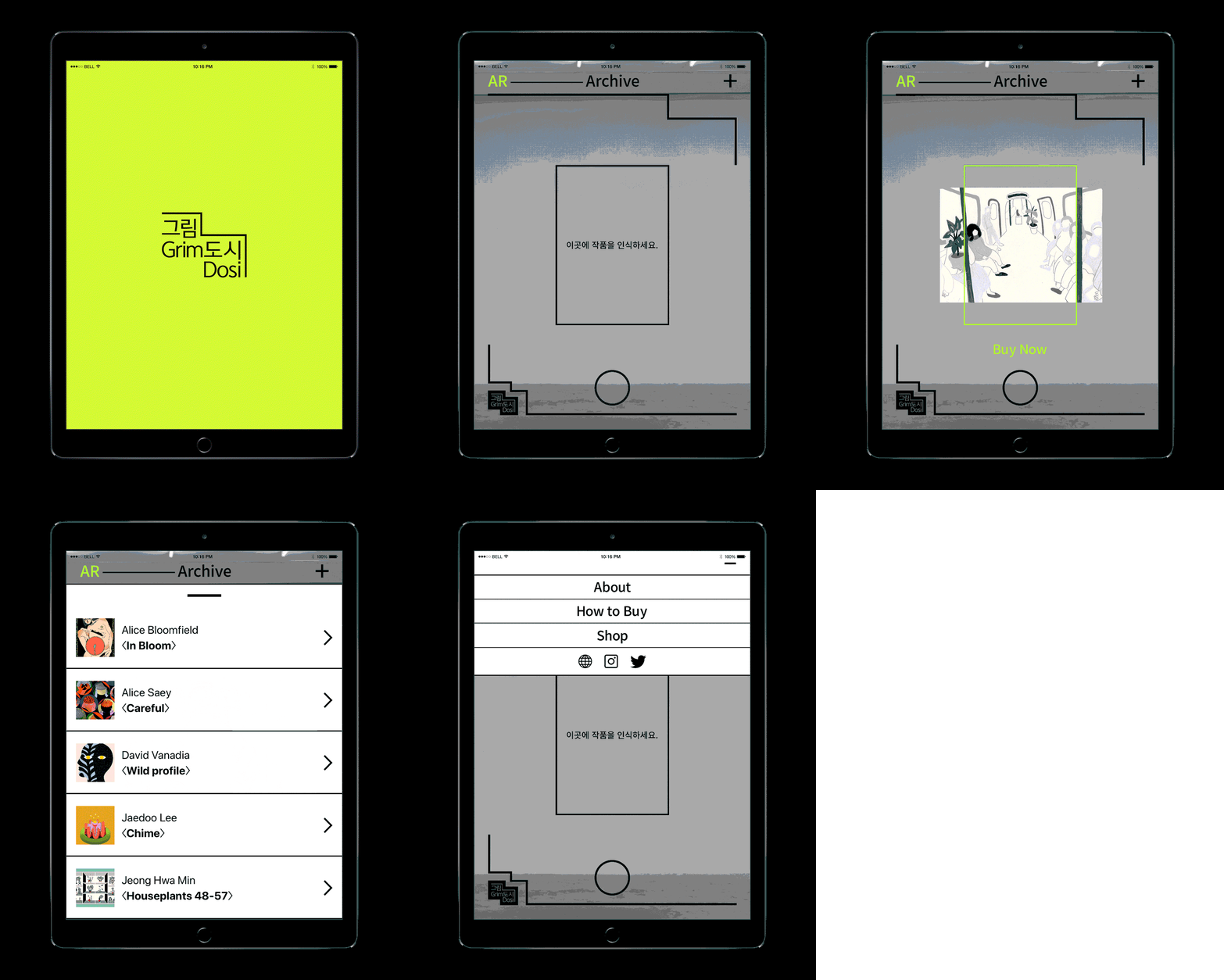
Marvin Kim: Exhibition AR app design for Grimdosi S#5 Waypoint (Copyright © Marvin Kim, 2021)
Hero Header
Marvin Kim: Poster design for Jaewon Kang virtual exhibition, Trippy Trippy (Copyright © Marvin Kim, 2021)
Share Article
About the Author
—
Ayla is a London-based freelance writer, editor and consultant specialising in art, photography, design and culture. After joining It’s Nice That in 2017 as editorial assistant, she was interim online editor in 2022/2023 and continues to work with us on a freelance basis. She has written for i-D, Dazed, AnOther, WePresent, Port, Elephant and more, and she is also the managing editor of design magazine Anima.