




Helsinki studio designs Moomin typeface inspired by Tove Jansson
Tove Jansson was a one-woman phenomenon. Last year Finland celebrated the centenary of the much-loved Moomin creator and children’s uberauthor and illustrator, and you might remember we spoke to C-G Hagström for the Autumn issue of Printed Pages about photographing her throughout her life.
The Finnish native’s ugly little family of world-famous trolls were inspired by an argument with her brothers, after which she famously said she drew the ugliest creature she could think of on the bathroom wall. This impassioned sketch was the seed that went on to earn her the Hans Christian Andersen Award and become one of the most successful children’s writers ever.
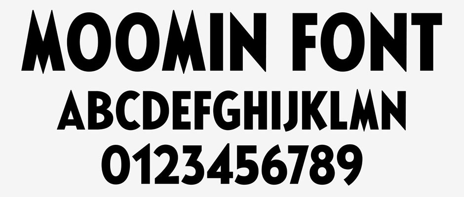
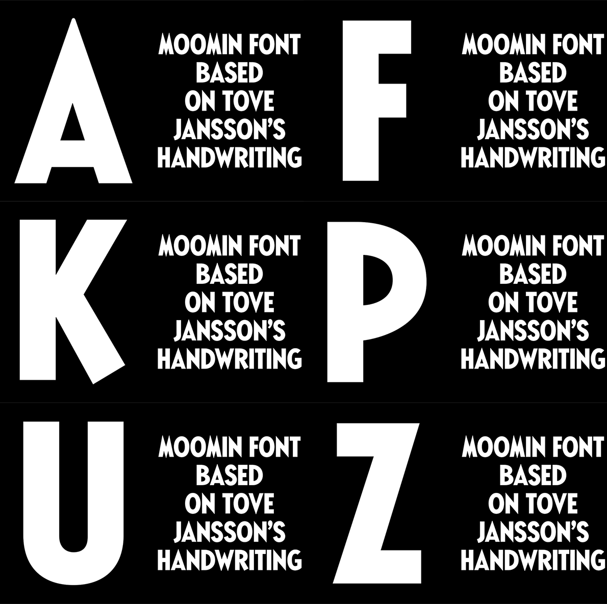
Now Helsinki studio Bond Agency has designed a custom typeface for the Moomin brand based on original typography used in Jansson’s early comic strips. Recreating Jansson’s bold lettering, Bond Agency have given a new lease of life to a familiar type, making it feel modern whilst still keeping that much needed touch of nostalgia.
Bond Agency: Moomin Characters

Bond Agency: Moomin Characters



