




Noah Beckwith on developing his own authorship in graphic design
Currently in the process of finishing his degree at Rhode Island School of Design, graphic designer Noah Beckwith is in the dooming stage of his final degree project. It’s a part of creative education many It’s Nice That readers will know well, working towards creating something that sums up what you’ve learned, combined with the nerve-wracking prospect that this is the work you’ll present to the world in hope that studios will sweep you off your feet come graduation.
Currently, at the early stage of this project, Noah is testing out what form this final project will take. “I’m working on a book right now, although I’m not sure if that will be the final form,” he tells It’s Nice That. “It’s essentially an artist book or book of poetry, drawn and written with the tools of graphic design. I’m just trying to make stuff now, and worry about finding meaning later.”
As a student, testing is a process we’ve come to associate with Noah. Since last writing about him, we’ve seen him chop and change his graphic design style, figuring out who he is and what style he should develop. “Last year I was doing super playful, loud, colourful things,” the designer says of his portfolio. “This fall, I got sick of those moves, and started making sparse, black and white work.” But, ever developing, colour is now creeping its way back in at the last minute, alongside “employing clunky or rugged elements imbued with a playfulness or humour.” This experimentation also sees the designer tap into other disciplines to combine with his practice, particularly photography, while trying to hone in and expand the “tactility or figurative quality,” that is regularly applied to his work.
Noah’s current portfolio is a visual representation of the designer’s mind. It jumps from poster designs for Yale Architecture, Elizabeth Hilfiger’s NYFW presentation, or booklets based on an essay on International Art English followed by International Disco Latin. The most direct representation of Noah’s design thought processes is Degree Projects Can Be Fun, a project dealing with his own practice “reckoning with my role as a designer — or what graphic design means to me.” Putting himself under a large amount of scrutiny, the project sees Noah looking inward to develop a style.
The designer’s ongoing self-discovery practice has also been spurred on by a recent internship with revered designer Hassan Rahim. Chucked into helping out “with a bunch of exciting projects,” the experience was wealthy. “One of the most valuable things I took away from my time with Hassan was the idea of authorship,” Noah explains. “Rather than only looking at the stylistic choices or even concepts within a piece, it’s about seeing the ideas that permeate a practice as a whole.” Working closely with the designer, “through talking with him and seeing his process,” has clearly had a thoughtful impact on Noah. “I began to understand this other level of thinking about art and design. In my own practice, I’m trying to think about the connections I make and connections throughout my work, and focus a bit less on aesthetics. I’m putting more of an emphasis on research and where I go for inspiration.”
With the aim to make his work “communicate more authentically and concisely,” we look forward to seeing what forms Noah’s looming final project will take, and what studios will undoubtedly nab him once he leaves university.
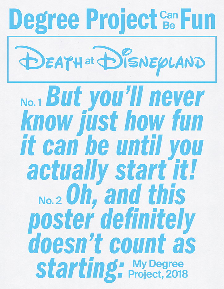
Noah Beckwith: Degree Project Can Be Fun
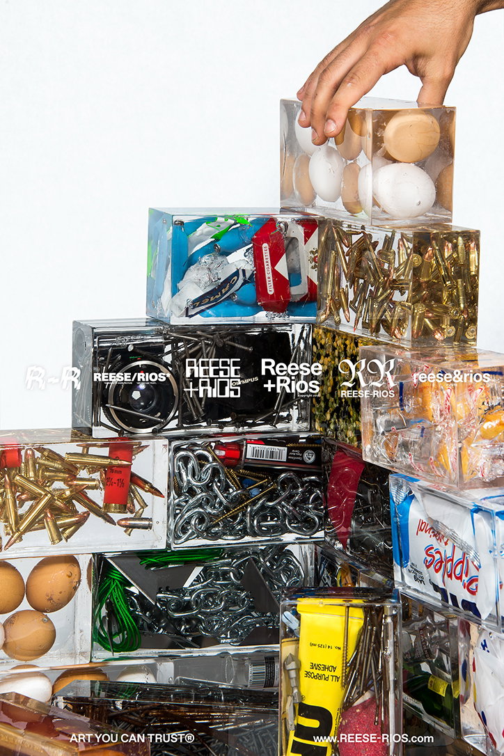
Noah Beckwith: Art You Can Trust
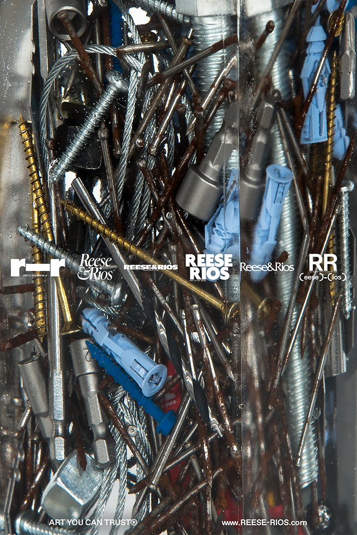
Noah Beckwith: Art You Can Trust
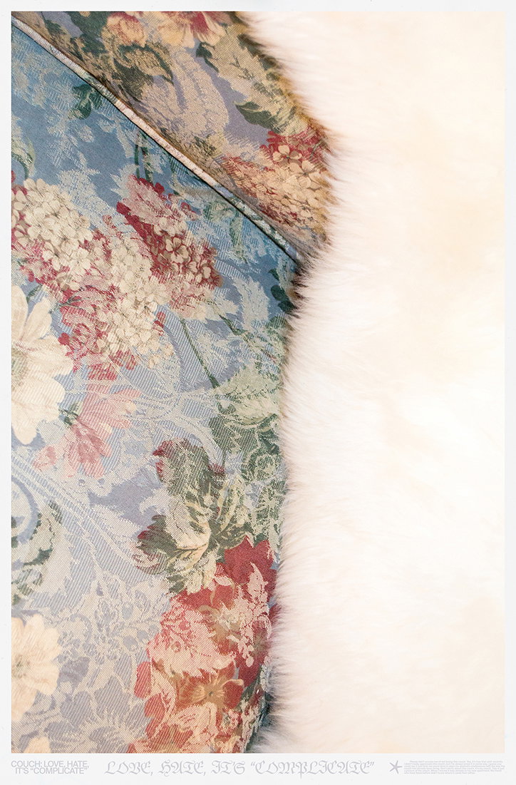
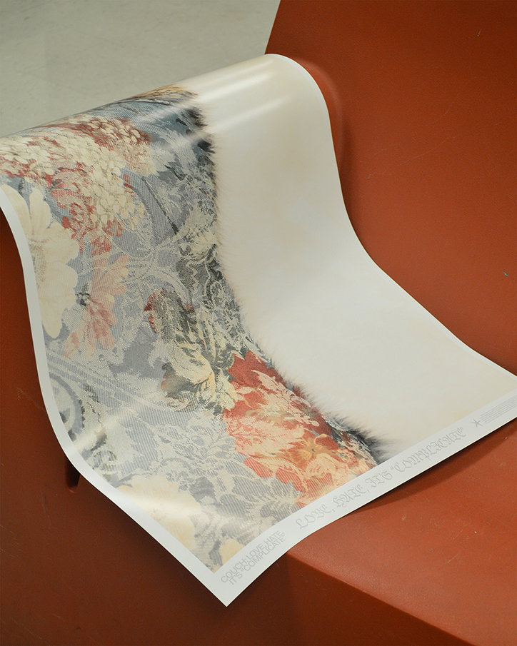
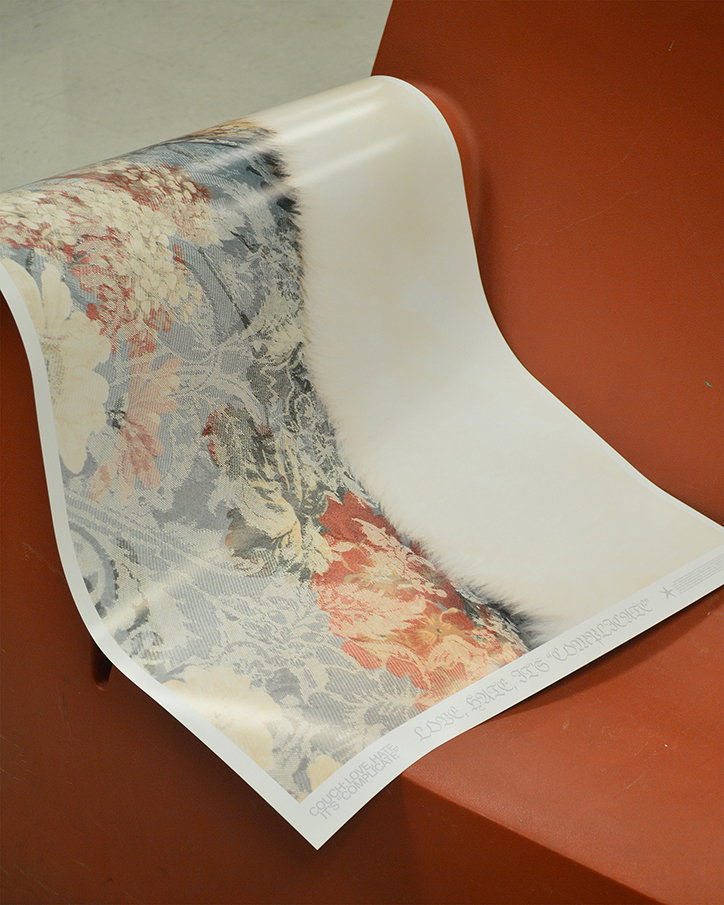
Noah Beckwith: Couch Poster
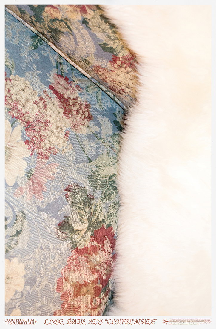
Noah Beckwith: Couch Poster
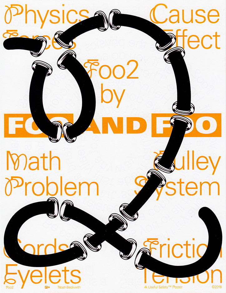
Noah Beckwith: Useful Safety Poster
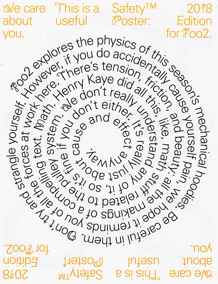
Noah Beckwith: Useful Safety Poster
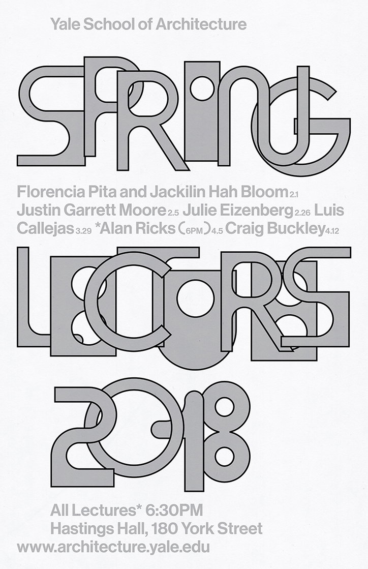
Noah Beckwith: Yale Architecture
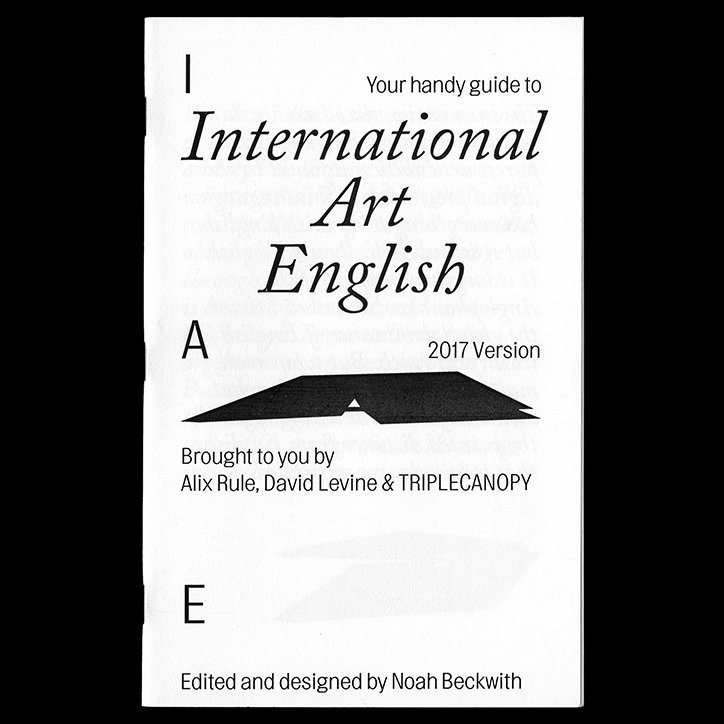
Noah Beckwith: International Art English
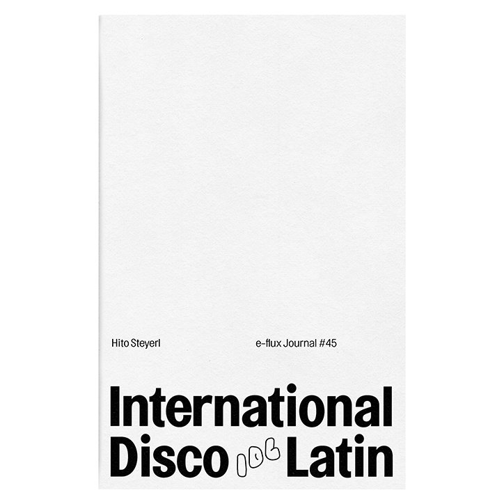
Noah Beckwith: International Disco Latin
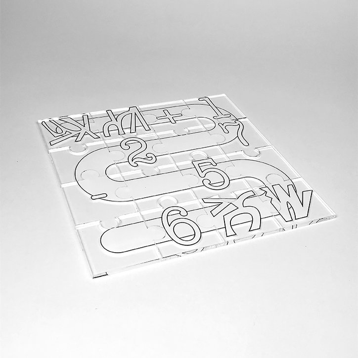
Noah Beckwith: Puzzle
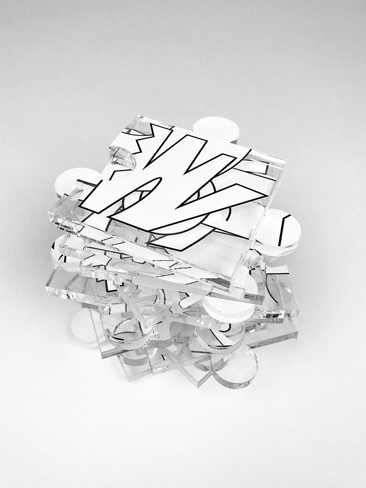
Noah Beckwith: Puzzle
Share Article
Further Info
About the Author
—
Lucy (she/her) was part of the It’s Nice That team from 2016–2025, first joining as a staff writer after graduating from Chelsea College of Art with a degree in Graphic Design Communication, eventually becoming a senior editor on our editorial team, and most recently at Insights, a research-driven department with It’s Nice That.



