Launch Recite Me assistive technology
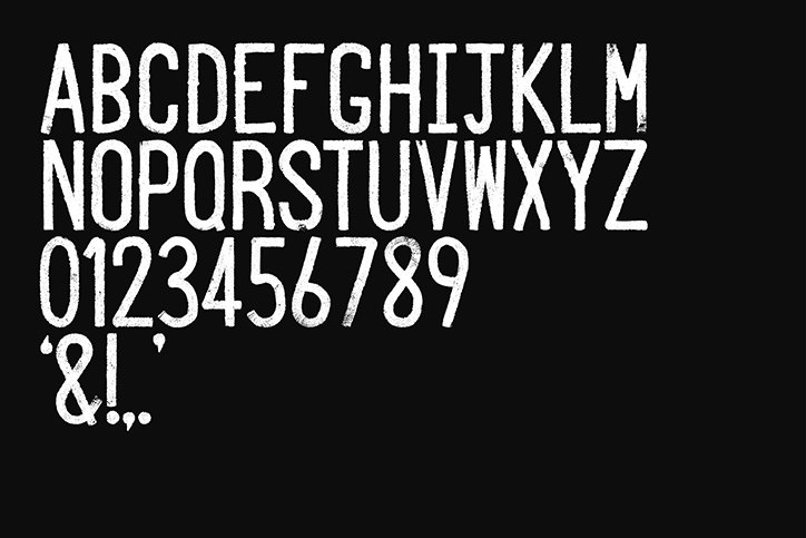
A white, distressed sans-serif typeface set against a black background. The image displays the full alphabet in uppercase, the numbers zero to nine, and a few punctuation marks.

Glasgow-based O Street works with road painters to rebrand its studio

—
Date
18 April 2016

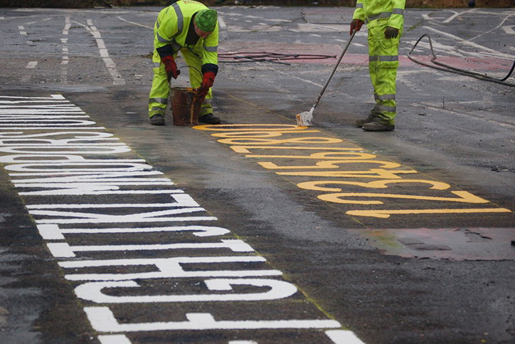
Glasgow-based design studio O Street recently decided to rebrand themselves in a way that focused on “authenticity, collaboration and getting our hands dirty.” A new logo and brand typeface was needed and the team unusually decided to work with a local roadlining crew to achieve this. 

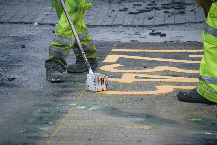
Roadliners are the unnoticed tradespeople who paint the yellow lines, arrows and type on our streets. As a typographic team that reflected O Streets values, they worked together to make an alphabet, numerals, punctuation and the O Street marque. Molten-thermoplastic and freehand strokes were used to create the thick, tacky lettering that feels bold and recognisable. Applied to the studio’s branding the texture from the tarmac has been kept and the white pops against the yellow, grey and black colour palette. 

Keen to celebrate the craft of roadlining the studio has worked with production company Pretend Lovers to create a lovely short film to accompany its new branding. There’s beautiful and hypnotic shots of the steaming paint being manipulated across the concrete as Thomas ‘Tam’ Lilley, a roadliner, talks about how he got into the trade of roadside typography.  
Two people in high-visibility yellow trousers paint a yellow symbol onto a dark grey road. One person uses a long-handled brush to fill in the curved lines of the design.
Above

O Street: New paint job

Two people in high-visibility yellow clothing paint large letters and numbers onto a dark asphalt road. One person holds a bucket while the other uses a long-handled brush to paint yellow numerals.
Above

O Street: New paint job

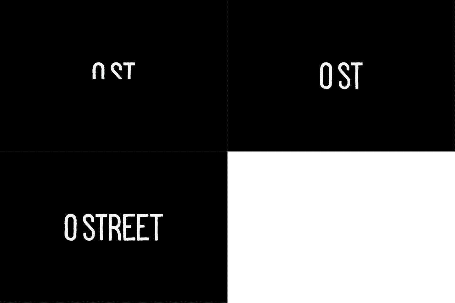
An animation in which white text appears against a black background. The letters morph and expand to spell out “O STREET”.
Above

O Street: New paint job

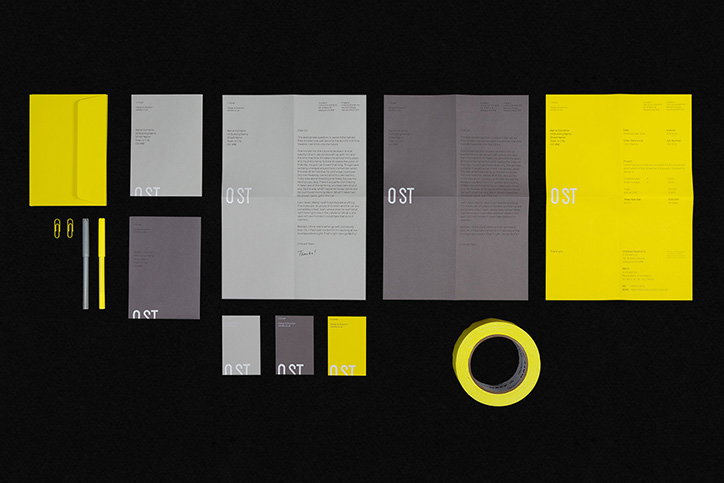
A stationery set in bright yellow and grey laid out against a black background. The collection includes envelopes, letterheads, business cards and a roll of tape, all featuring the “OST” logo.
Above

O Street: New paint job

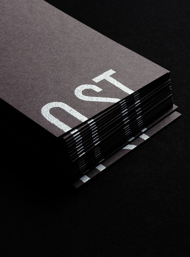
A stack of dark grey textured cards on a black background. The top card features the word “OST” in bold, white, sans-serif lettering.
Above
Left

O Street: New paint job

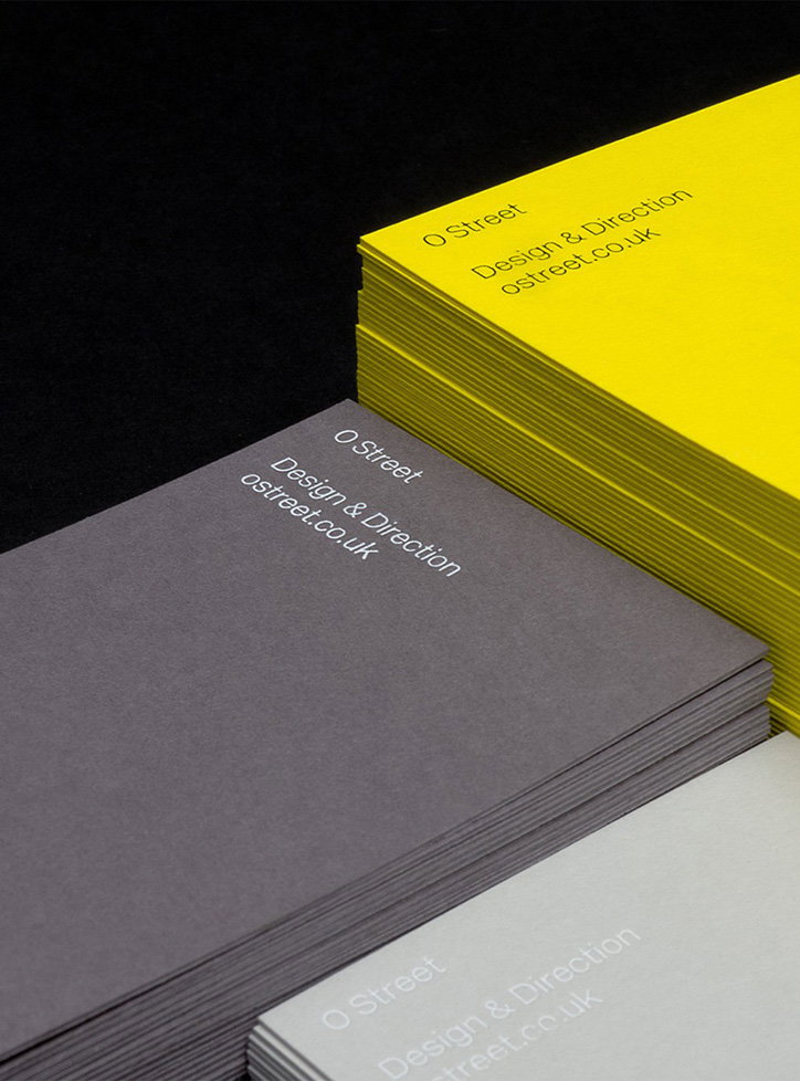
Three stacks of business cards in yellow, purple and light grey. Each card features the text “O Street”, “Design & Direction” and “ostreet.co.uk”.
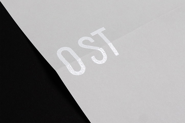
A close-up of a piece of translucent white paper resting on a black surface. The letters “OST” are printed in a white, textured ink.
Above

O Street: New paint job

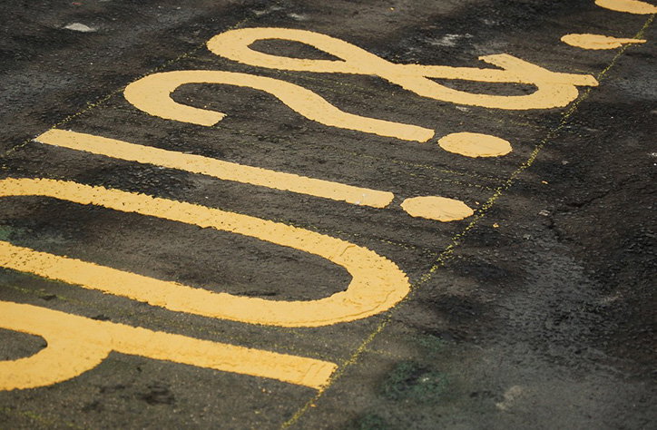
Yellow paint on a dark, textured asphalt surface forms large, stylised characters and punctuation. The markings include a question mark and an exclamation mark.
Above

O Street: New paint job

Share Article

Further Info

About the Author

Rebecca Fulleylove

—

Rebecca Fulleylove is a freelance writer and editor specialising in art, design and culture. She is also senior writer at Creative Review, having previously worked at Elephant, Google Arts & Culture, and It’s Nice That.


It's Nice That Newsletters

Fancy a bit of It's Nice That in your inbox? Sign up to our newsletters and we'll keep you in the loop with everything good going on in the creative world.