With its handmade details, Meantime is an ambitious celebration of the magazine form
The Singapore-based team spends a full year coming up with the concept, finding stories and designing a publication that has to be held to be fully understood.
Share
There is nothing quite like that moment when you first open a new magazine, when you feel its weight, catch that inky smell coming off its pages, and run your fingertips over the paper. Yet even seasoned magazine-lovers will find Meantime special, for the care and consideration that has gone into its creation and design.
The annual publication is put together by a team based in Singapore and is all about life in the city state and its history. It was set up by a group of university friends. “We were in our final year and were feeling a little disillusioned about having to start getting jobs,” says Pang Xue Qiang, the founding editor of Meantime. “I vividly remember the idea of creating our own magazine was conceived over a conversation we had in a computer lab on campus.”
Pang and his friends found it hard to get their work published in the more established platforms in Singapore: “For one thing, there were few such outlets in Singapore, so it was hard to get our work noticed. Secondly, we were young and hadn't established a name for ourselves yet.” Essentially, they got bored of waiting. “We got tired of knocking on doors and waiting for them to open, so we created our own door.”
The magazine tackles a new topic each year, told through Singaporeans’ personal stories of the past, rediscovering stories lost to time. The first issue launched last year, focused on love stories, and was commended at the 2019 Stack Awards for Launch of the Year. In 2020, the team has returned, and this time has decided to focus on ghosts and ghost stories.
“We were fascinated with the idea of ghosts, because it was a topic that allowed us to dig deep into our psyche to uncover our fears and vulnerabilities, and discover the things that haunt us,” says Pang Xue Qiang, the founder and editor of Meantime. “On one hand, it could be literal ghosts – scary spirits and haunted places. On the other hand, the ghosts could be metaphorical – i.e. things that happened in the past that still affects us today.”
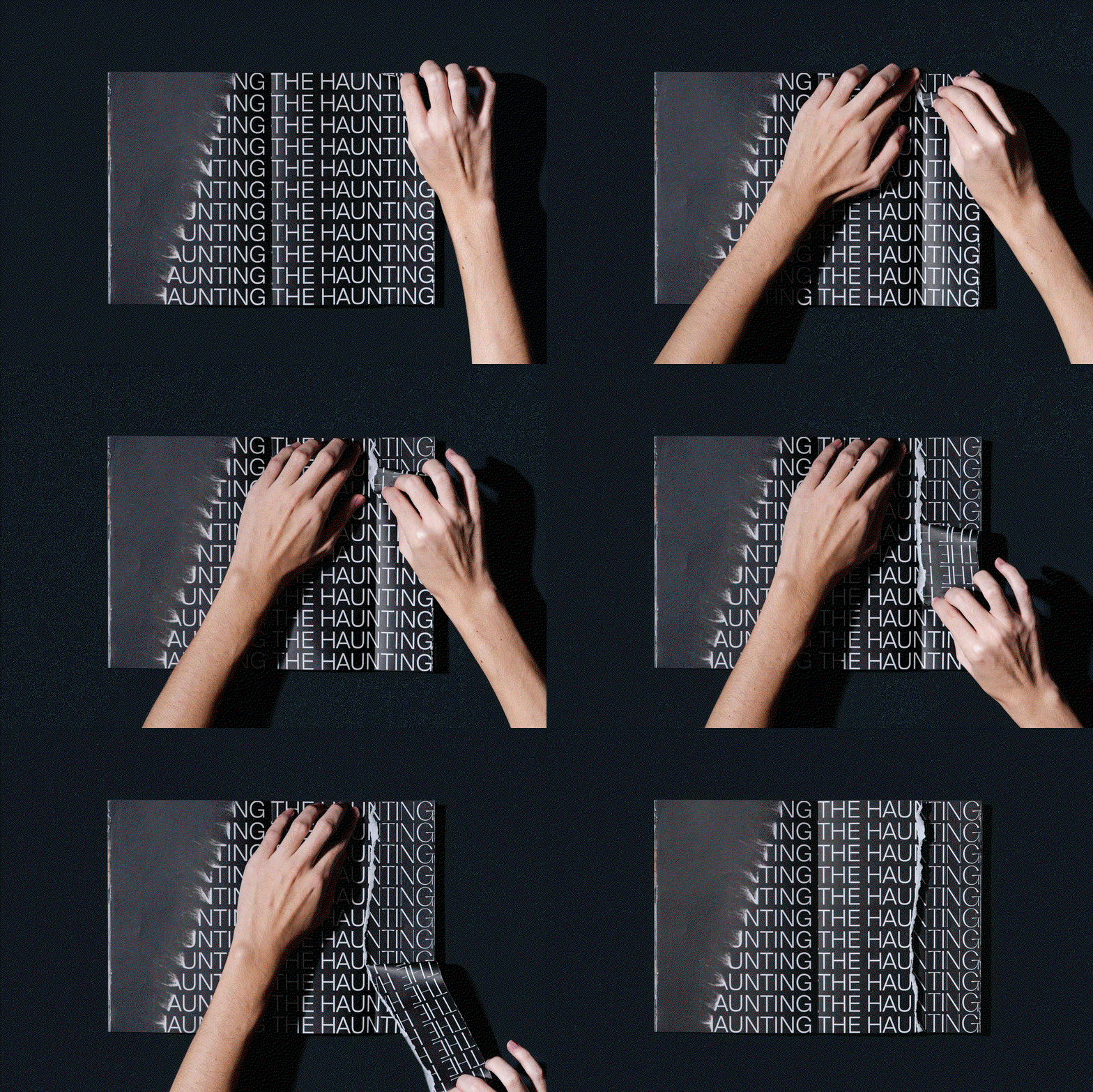
Meantime: Issue 2 (Copyright © Meantime magazine, 2020)
Pang and his team have honed the process for creating the magazine. Once the concept for the next issue is decided upon, the editorial and creative teams get together to discuss interpretations of the theme. Then comes an intense research phase, “where we trawl through archives in our national collection (photographs, old newspaper clippings, etc.) to look for potential stories”.
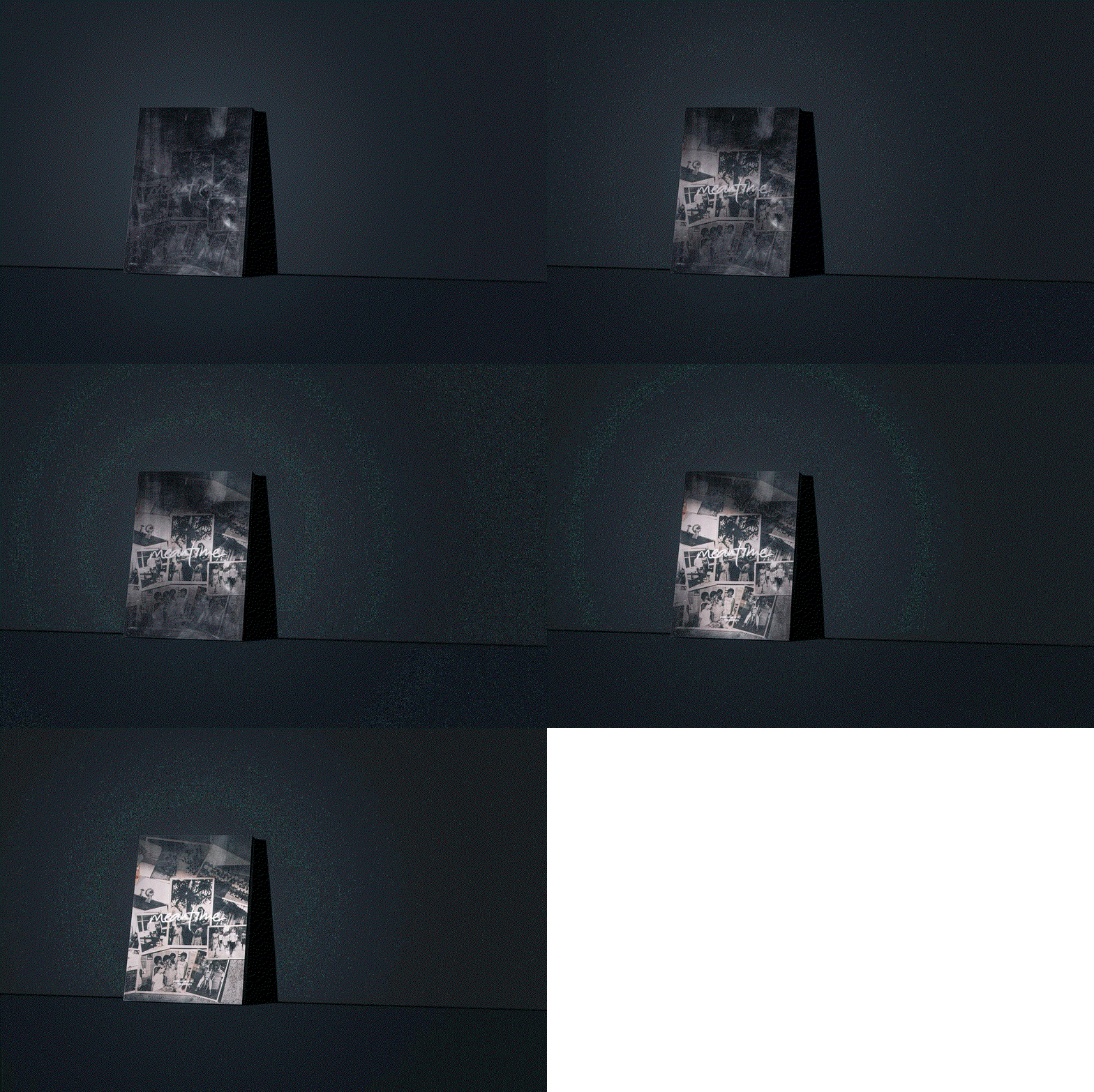
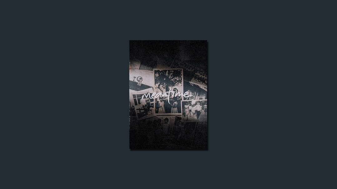
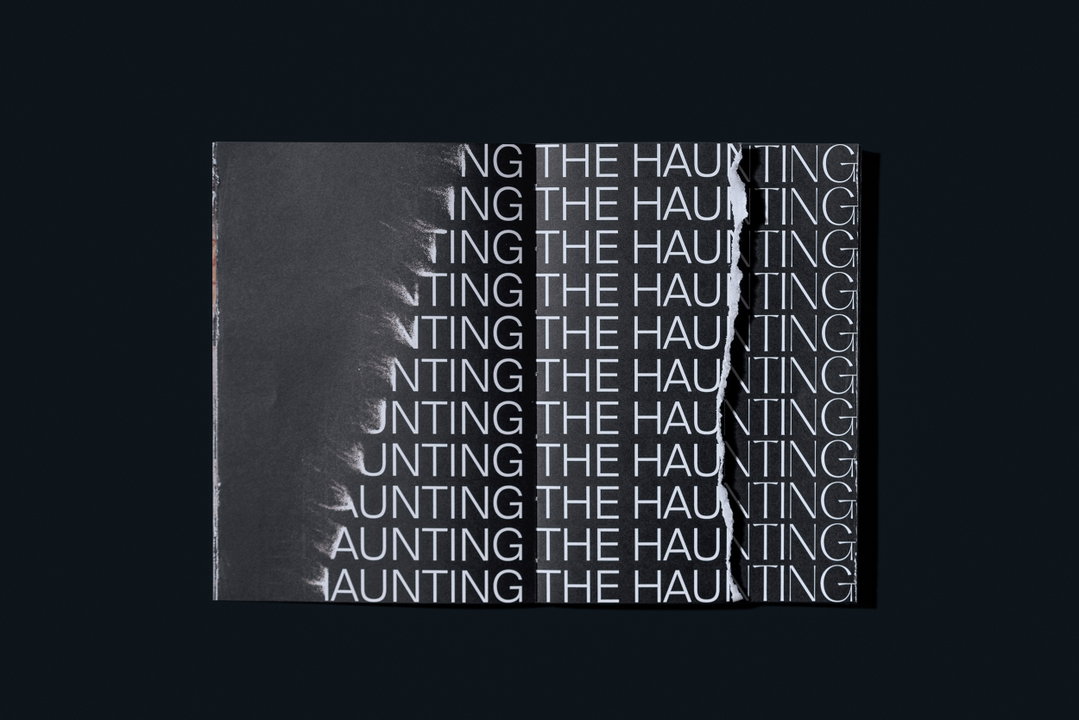
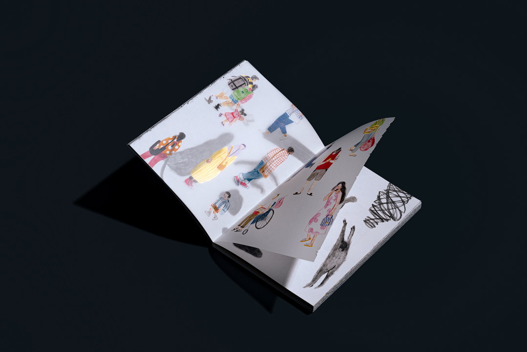
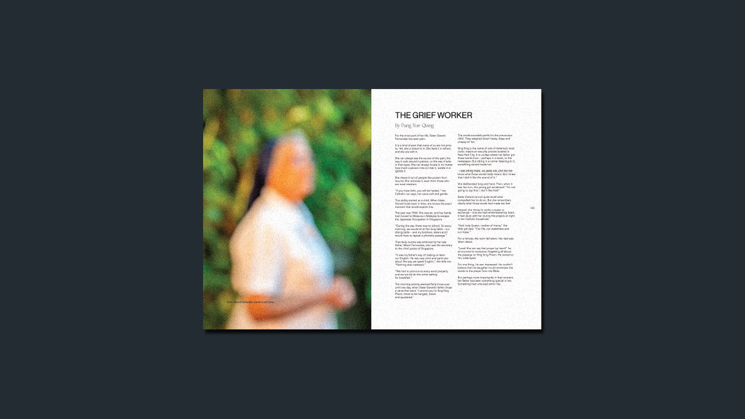
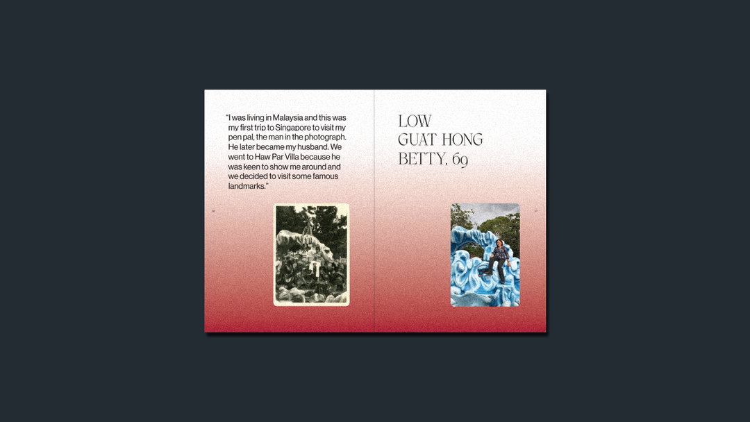
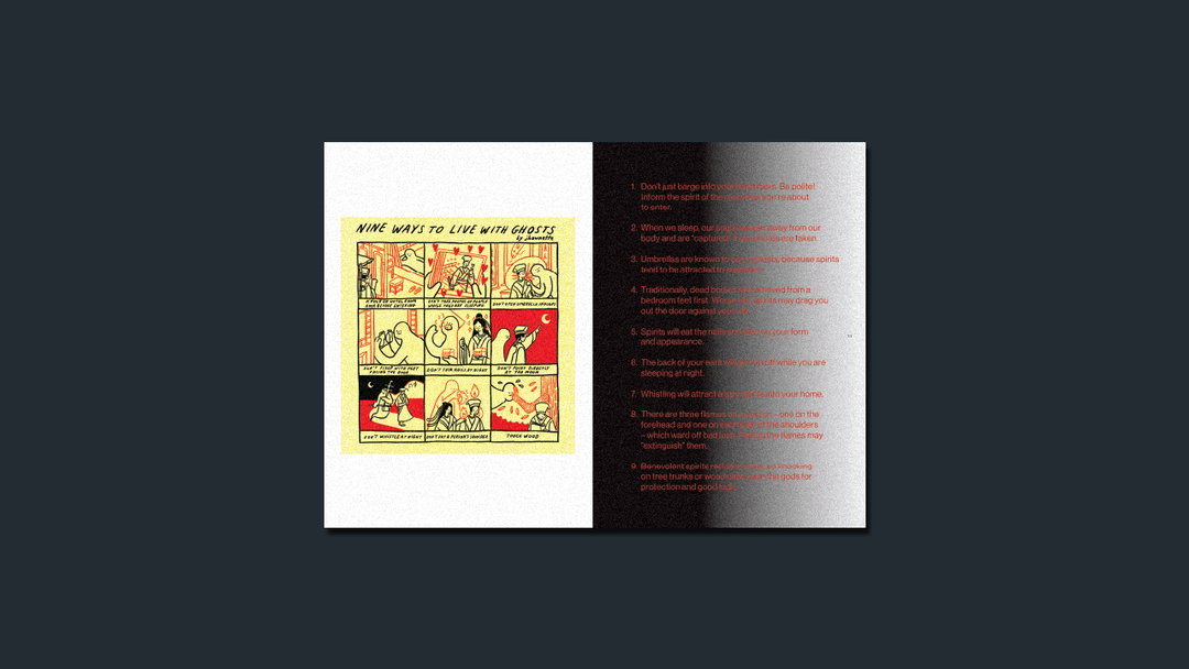
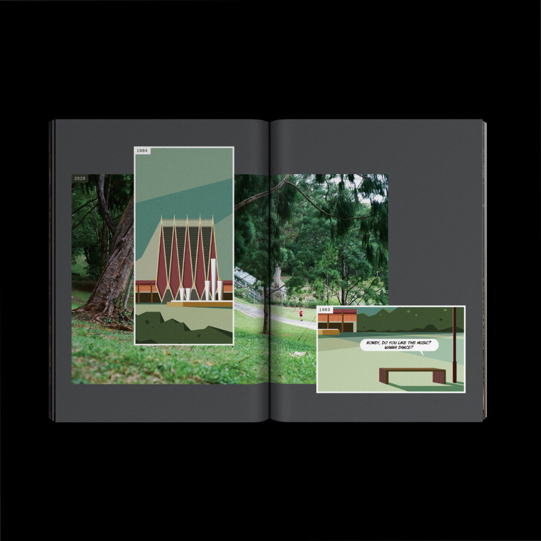
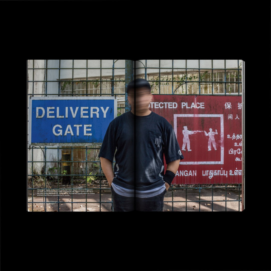
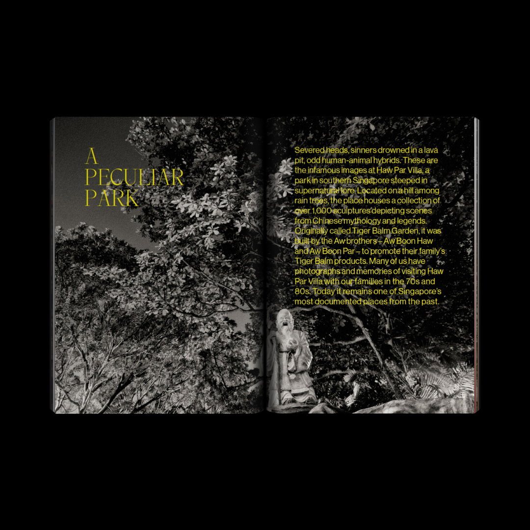
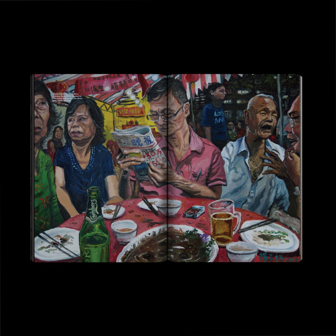
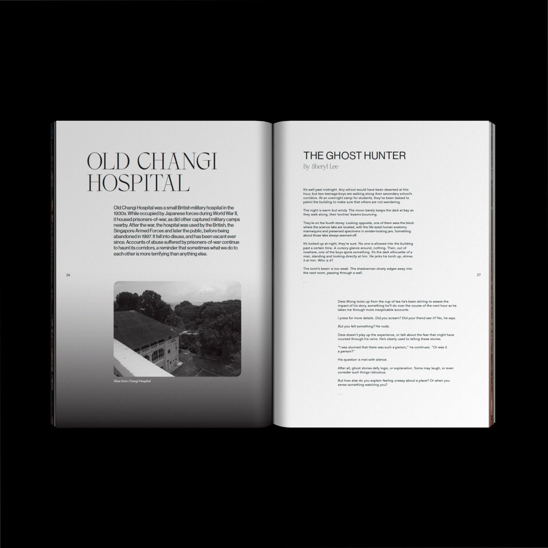
Once the stories are agreed upon and fixed, the design process begins. Issue 1 contained loads of beautiful, subtle and handmade elements, such as pressed flowers, a pull-out love letter and old photographs pinned in by hand. “In our second issue, we have torn pages, jagged edges (trimmed by hand with a knife), mixed paper stocks (including translucent paper), as well as a cover treated with a layer of heat-sensitive ink that changes colour and leaves an imprint of your hands as you hold the magazine,” says Pang. “The design elements seek to elevate the stories and content in the magazine.” It’s a joy to flick through and read.
There are more clever processes at work here, too. The issue presents a collection of nine ghost stories, and the spreads subtly go from dark to light – “a reflection of the stories becoming more illuminating,” as Pang explains. “The stories are also sequenced in a way where the ghosts start from more literal interpretations, and then become more abstract.” The photography throughout the issue plays with blur and soft focus.
As this suggests, each issue is completely designed from scratch around the theme. “There is no rule book and I think that makes Meantime exciting,” says Pang. “We do not have a standard style guide, so every new issue brings along new surprises and challenges for us.”
One of the biggest challenges with this issue was the cover, which is coated in a thermochromic ink that reacts to changes in temperature. “At first, we were uncomfortable with the unpredictability and lack of control. That is, every cover will look different depending on its environment and owner. But we realised that it’s precisely this mercurial quality that makes Meantime special.” The result is a magazine that perfectly balances content and form, creating a publication that speaks to various interpretations of its theme, with a design to match.
GalleryMeantime: Issue 2 (Copyright © Meantime magazine, 2020)
Hero Header
Meantime: Issue 2 (Copyright © Meantime magazine, 2020)
Share Article
Further Info
About the Author
—
Matt joined It’s Nice That as editor in October 2018 and was editor-in-chief in September 2020–2024. He was previously executive editor at Monocle magazine. He is now a freelance writer and editor.