




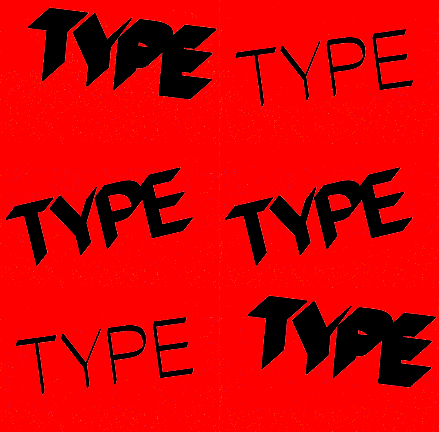
Gravient's adaptive typographic identity changes depending on where you look at it from
“When working, we’re always orbiting an idea. The concept has to ride everything,” explains Barcelona and New York-based design studio Pràctica. Founded by Albert Porta, Anna Berbiela, Carlos Bermúdez, Guillem Casasús and Javier Arizu, the studio recently collaborated with graphic and motion designer David Galar and coder Thomas Hoek to demonstrate its concept-first process.
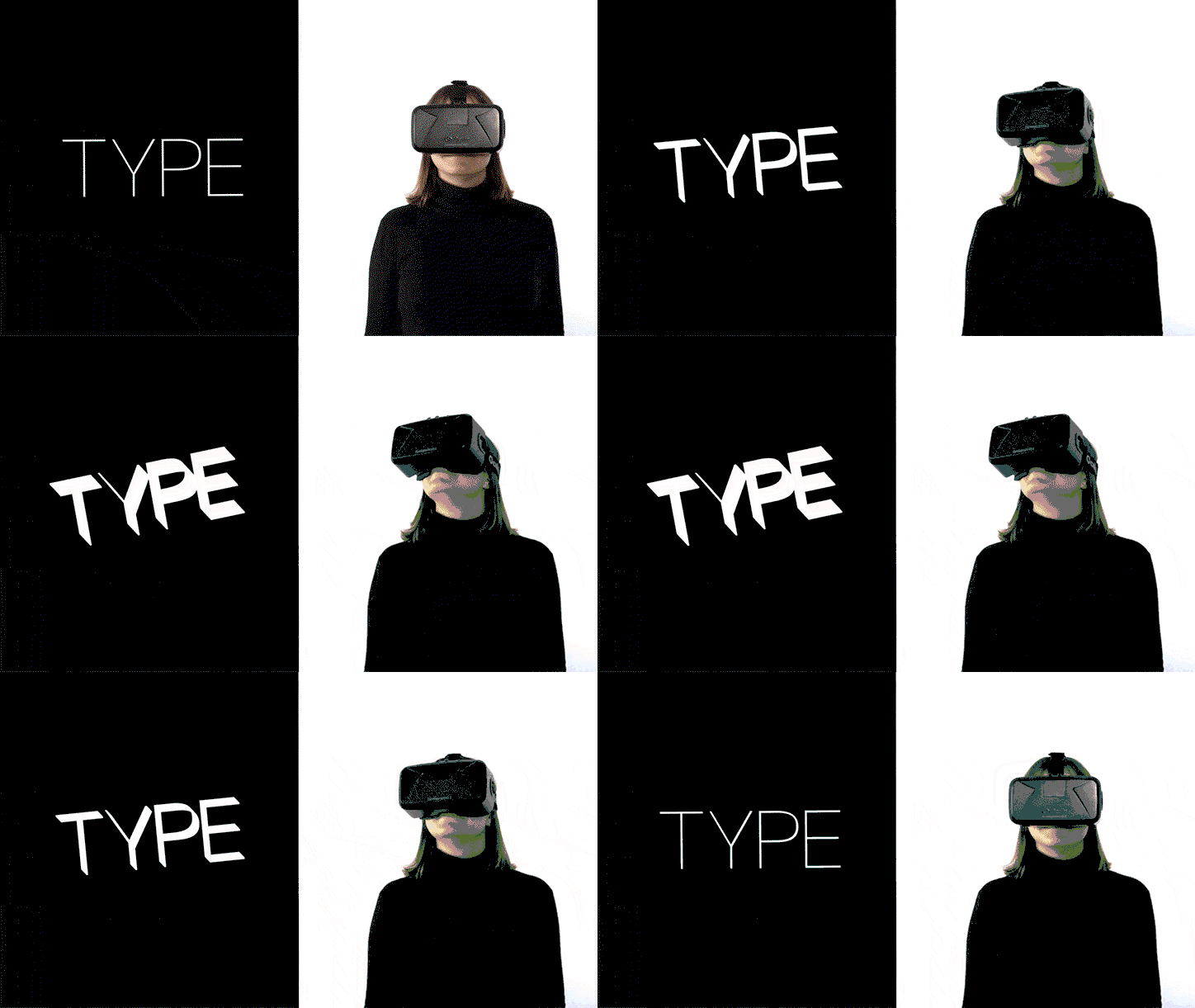
Pràctica was approached by virtual reality (VR) and augmented reality (AR) company Gravient to develop its identity. “By analysing the company’s characteristics we soon realised the obvious, which is that VR and AR have a very strong component that has to do with the point of view of the user experiencing it,” Pràctica tells It’s Nice That. Using this notion of angles, the studio developed The Next Point of View; an interactive typographic system.
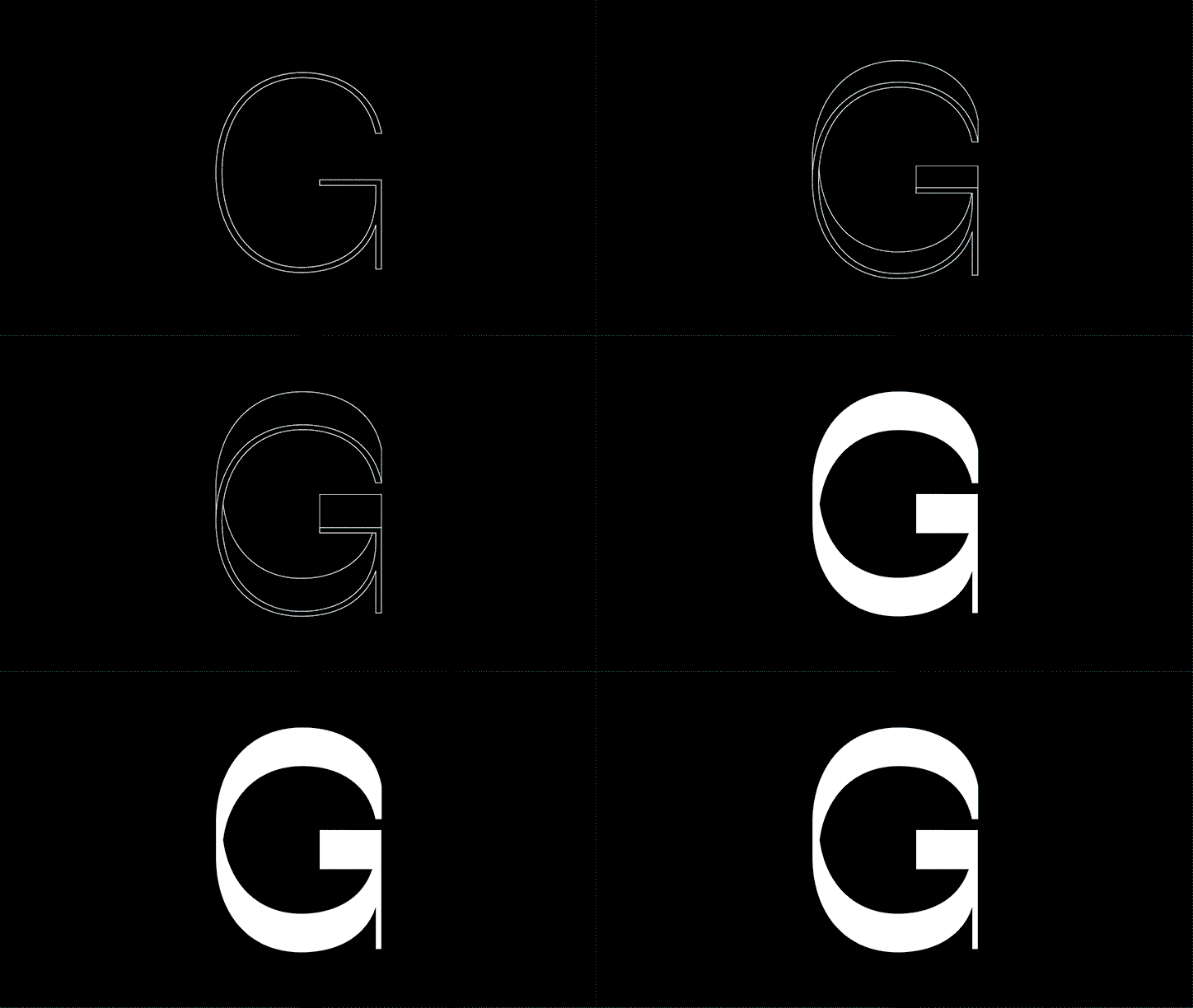
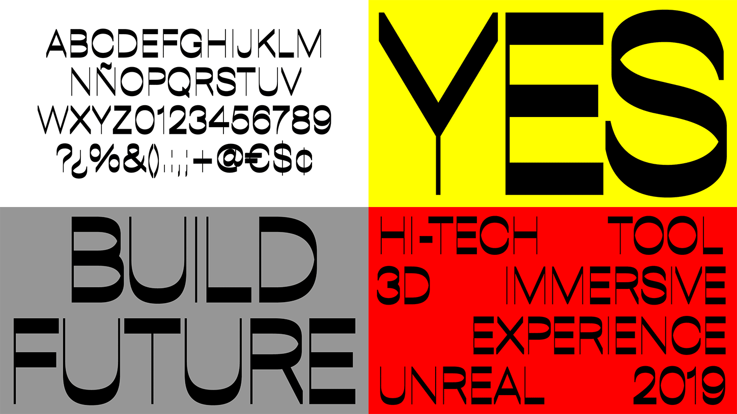
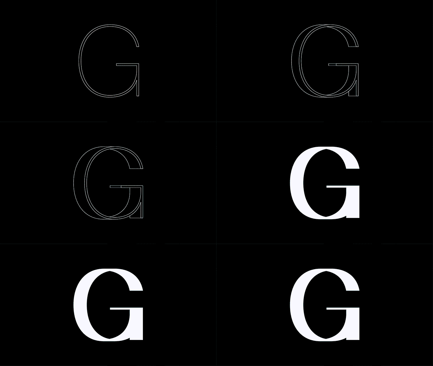
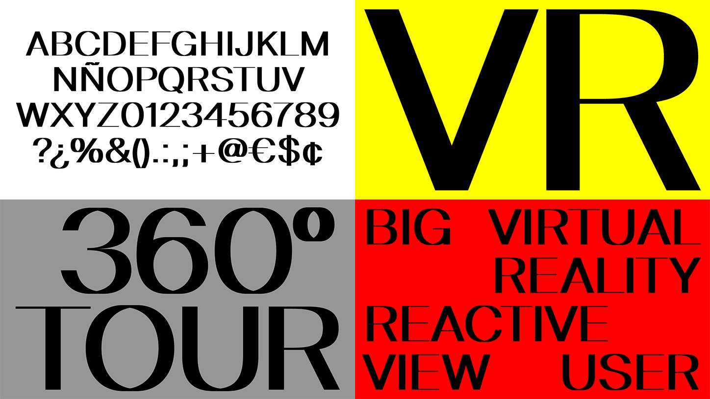
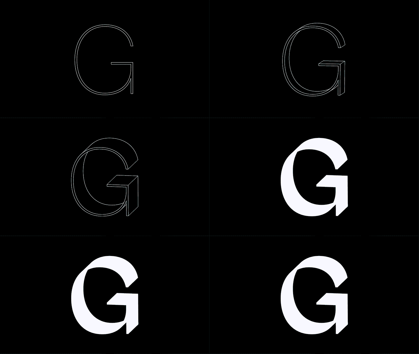
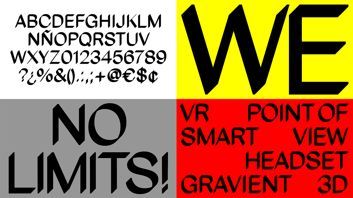
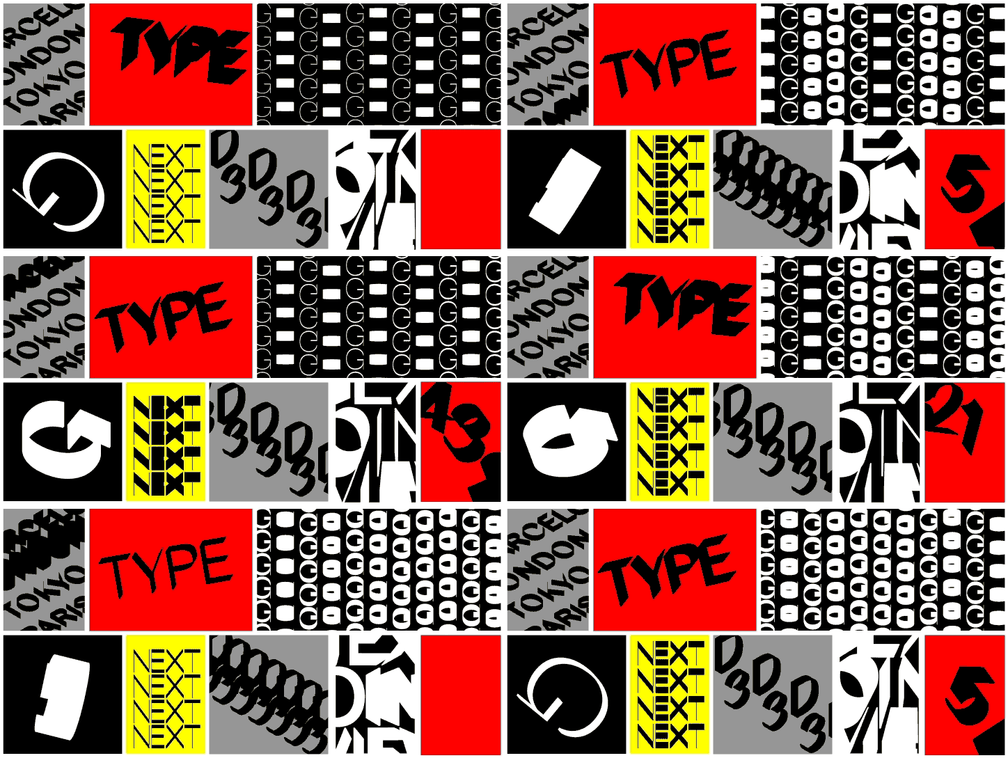
Built from a standard typeface, it uses interaction and three-dimensionality to serve as Gravient’s identity. Based on the angle that users view them, letters change their shape and move, creating a family of three typefaces born solely from interaction. “We had other ideas in mind but, in the end, we realised that developing an interactive typeface fitted perfectly into the project’s vision,” the studio explains, “it was the simplest move, yet the effective and innovative.”
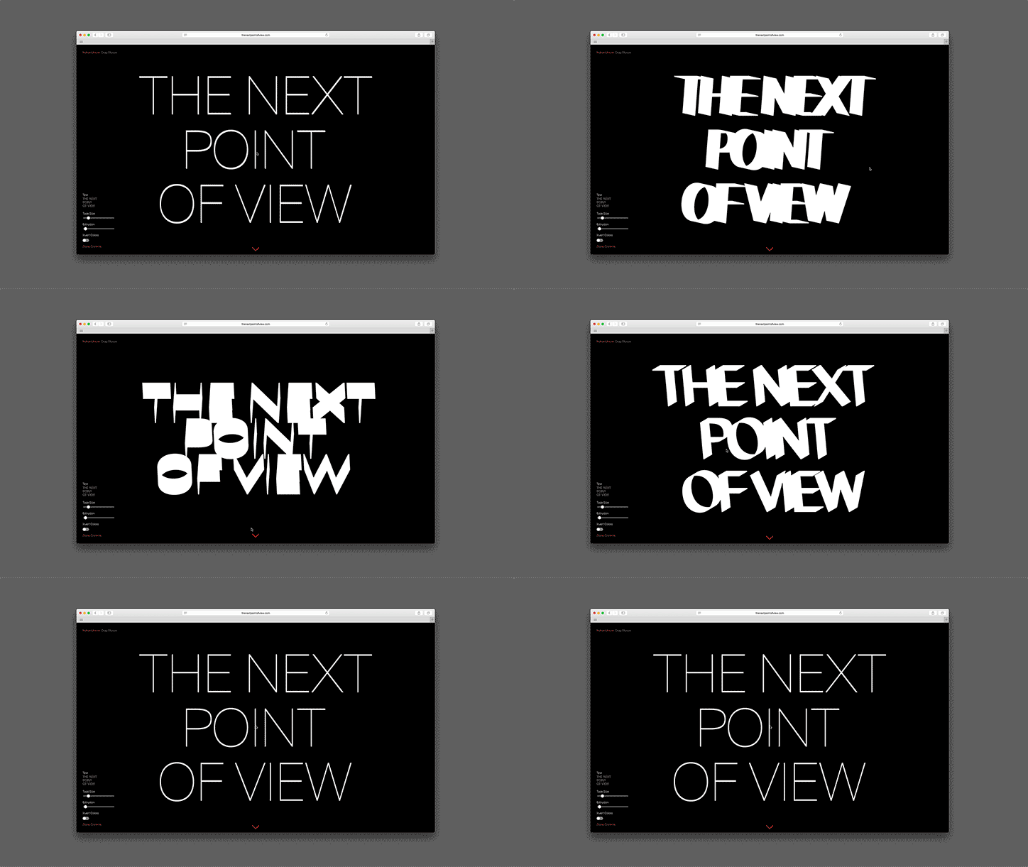
The result works across AR and VR but also online: the identity’s mini-site proving to be a particular highlight of the project. Upon landing, The Next Point of View displays on screen in block capitals and proceeds to adapt and move depending on the position of the mouse, mirroring the experience of using a VR headset.
By truly understanding what elements were at the core of its brief, Pràctica, alongside David and Thomas, have developed an identity which is not only intriguing but makes sense. “Because the nature of the company was in the interactive field,” the studio continues, “we saw an opportunity to have a living identity inside their virtual world.”
Pràctica, David Galar and Thomas Hoek
Pràctica, David Galar and Thomas Hoek
Pràctica, David Galar and Thomas Hoek
Pràctica, David Galar and Thomas Hoek
Pràctica, David Galar and Thomas Hoek
Pràctica, David Galar and Thomas Hoek
Pràctica, David Galar and Thomas Hoek
Pràctica, David Galar and Thomas Hoek
Pràctica, David Galar and Thomas Hoek
Share Article
Further Info
About the Author
—
Ruby is Senior Creative at It's Nice That, overseeing our visual output across platforms and projects. Before that, she was associate editor on the editorial team, after joining in September 2017 following graduation from Central Saint Martins.