




Designer Raoul Gottschling on branding shape-shifting spaces and happy accidents
Raoul Gottschling is a creative through and through. As a child, the German-born, Brooklyn-based designer spent sports classes sketching football pitches rather than fulfilling his duties as goalkeeper. “At one point during my early teenage years my dad introduced me to Photoshop. I used it to design a logo and a bunch of (extremely sick!) graphics for my skate crew. I did my first internship in a design studio in Cologne at 14 years old. I must have made my career choice around my 15th birthday and haven’t looked back since,” Raoul tells It’s Nice That.
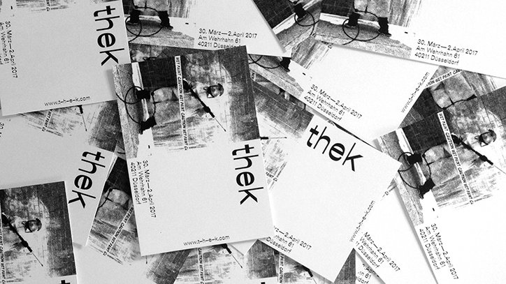
Raoul’s repertoire consists of a broad range of projects from publications to visual identities. _thek, for example, is a collective of designers, illustrators, photographers and journalists, which was founded by Deniz Weber, that occupy an abandoned space in Düsseldorf. Raoul got involved in 2016 and has been designing the space’s identity ever since. The collective hosts events that vary from skateboarding competitions to more obscure shows like battlethek; a dance battle inside the vacant store space in the city centre. “The crowd,” Raoul says, “was was made up of dance-crazy teens from the projects to settled forty-something dads from the suburbs. It was amazing to see the dynamics between these demographics and how they interacted.”
_thek’s visual identity is tweaked and altered according to the venue’s ever-changing purpose. “In German “thek” is found at the ends of words like Bibliothek (library), Videothek (video store) or Diskothek (discotheque). We wanted to reference these through our name, as they are places that inspire us through literature, film or music. Countless neologisms can be formed by adding “thek” to the end of existing words thanks to the flexibility of our language. Coffeethek, Graffithek, Kickflipthek became the names of our events. You won’t find them in a dictionary but they still make sense,” Raoul explains. _thek is a shape-shifting space. This hybridity is reflected in the name’s underscore, which Raoul explains leaves a gap that the designers and artists can fill in as they please.
“The design is rooted in DIY aesthetics. It is also driven by a playful use of Dinamo’s Oilof Reuab typeface combined with rough bitmap graphics. I think the fact that the identity feels raw and appears noticeably casual makes it accessible to a wider audience. It mirrors the handcrafted approach skaters take when building their own ramps, dancers when hosting their own shows or DJs when setting up their own radio stations.” Raoul hopes that _thek’s clean and simple visual language might enable the venue’s logo to be reproduced and plastered around Düsseldorf. The design’s clarity makes _thek’s brand both comprehensible and easily recognisable.
Raoul has also worked on numerous publications. Die Farben des Farblosen, for example, is a compilation of the designer’s various random discoveries – or happy accidents – that have then been curated according to colour. “When I got my first digital camera back in the day, I would take photos through the plane windows with a polarisation filter attached to the lens. When I looked through the viewfinder I discovered a multi-coloured gradient overlaying the image I saw. It was invisible to the naked eye and could be manipulated by twisting the filter. So I did some research to find out what evoked this effect,” Raoul says. These images are laid out side-by-side with interesting articles about astrophysics or space missions.
“The common denominator of the book is the universality of colours. From the colours of tension – better known as photo-elasticity, which is also the plane photo phenomenon – to the colour of lightyears.”
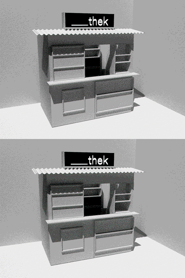
_thek identity design by Raoul Gottschling. GIF by Pixelgesicht
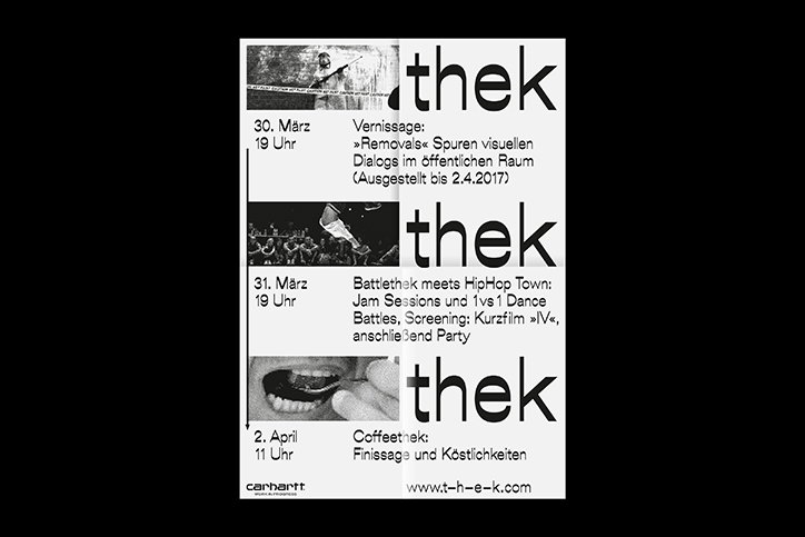
_thek identity design by Raoul Gottschling
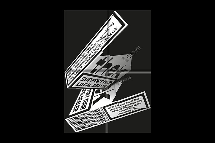
_thek identity design by Raoul Gottschling
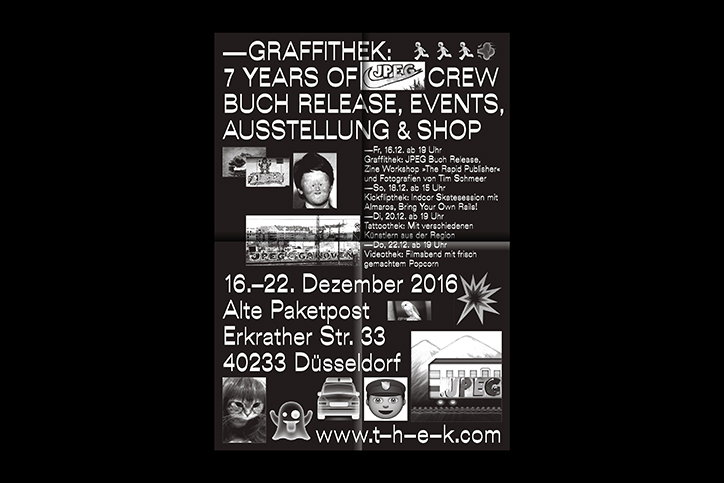
_thek identity design by Raoul Gottschling
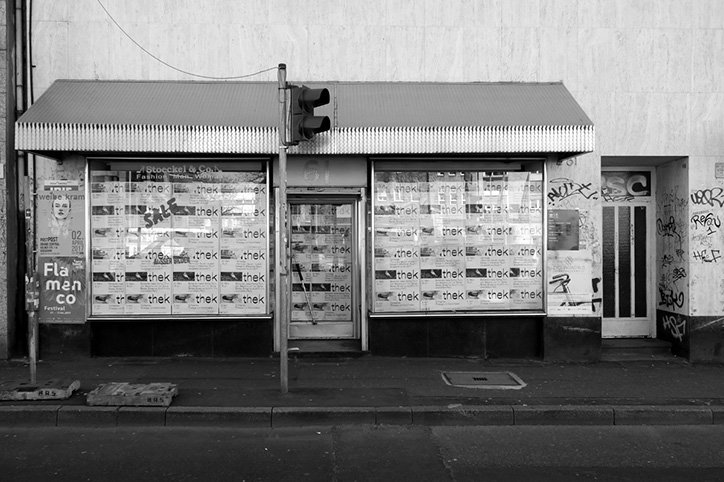
_thek identity design by Raoul Gottschling. Photographed by Ludovic Schuld
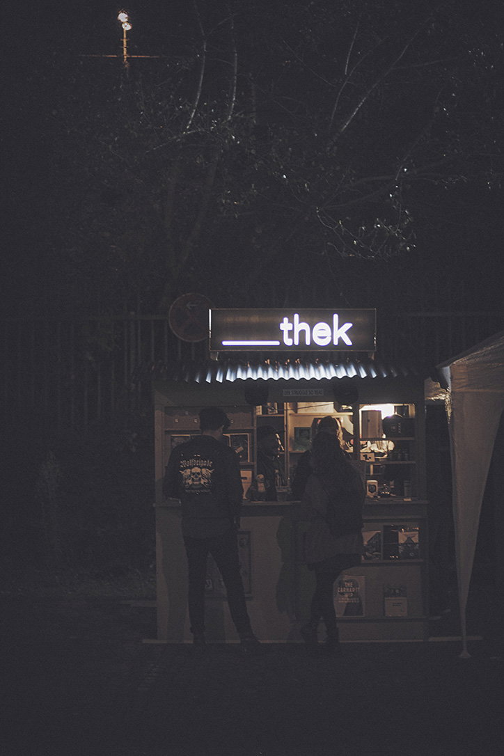
_thek identity design by Raoul Gottschling
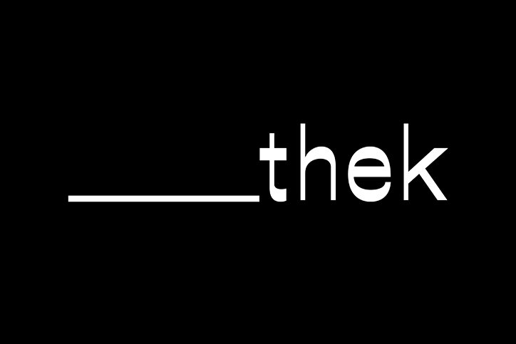
_thek identity design by Raoul Gottschling
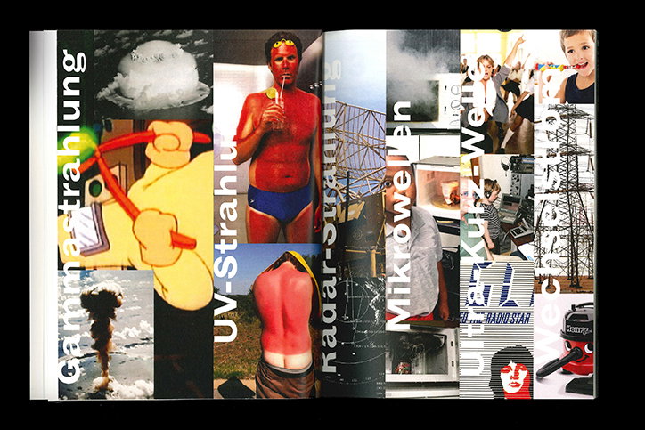
Die Farben des Farblosen by Raoul Gottschling
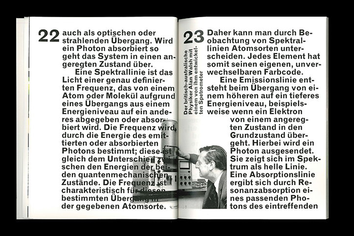
Die Farben des Farblosen by Raoul Gottschling
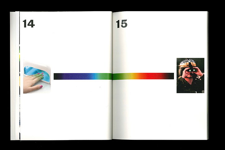
Die Farben des Farblosen by Raoul Gottschling
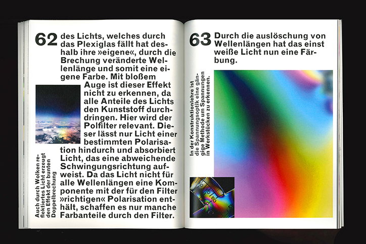
Die Farben des Farblosen by Raoul Gottschling
Share Article
Further Info
About the Author
—
Daphne has worked for us for a few years now as a freelance writer. She covers everything from photography and graphic design to the ways in which artists are using AI.

