




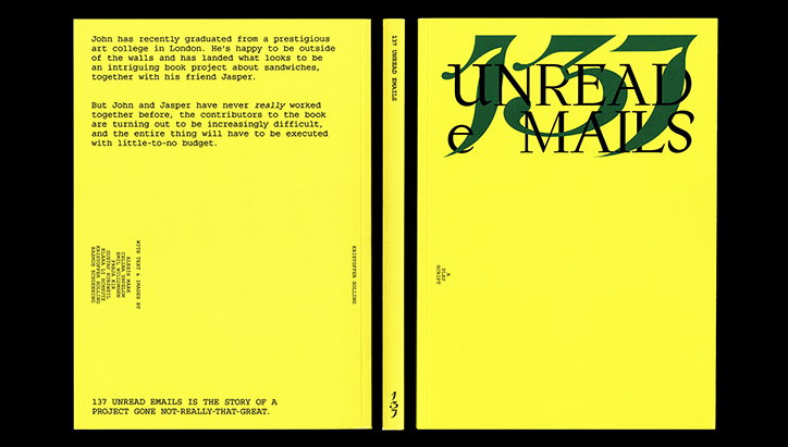
RCA graphic design graduates launch collaborative studio, Regular Practice
“We first met in the queue for registration at the Royal College of Art in London,” says Tom Finn and Kritoffer Soelling, the founding members of Regular Practice who launched their studio today.
Studying at a university that offers a wide range of courses across the arts meant that Tom and Kristoffer regularly collaborated as a duo, but also with a number of artists and designers across disciplines. “Organically, we began to make work internally in the college, starting with small jobs designing posters or flyers, which grew to larger more collaborative works with other students and tutors at the school such as websites, books, exhibitions, identities and so on.”
The result is a practice that the pair define as multifaceted: “We like to be involved as much as (reasonably) possible in all aspects of a project, as we’ve found that technical and logistical aspects, such as coding or printing, can be major influences in the planning of a project, and ultimately affect how it will sit in the world.” This operational approach to designing means the studio “seeks to turn limitations into features, to discover a design rather than wrestle it into existence,” they tell It’s Nice That. “A similar thing is true for our typographic attitude – by focusing on the smallest building blocks of a design, we try to make minute, but important decisions that ultimately end up permeating the project.” Typography is also a key strength of Regular Practice, following Kristoffer’s involvement with type foundry, Bold Decisions.
Despite having just launched, Tom and Kristoffer already have a breadth of projects to showcase, culminated from years of studying together. One project in particular, Type Singularity plays on the design duo’s strengths, displaying “design and curation for an exhibition showcasing recent typographic experiments at the RCA,” they explain. “The composition is literally a cut and paste job, as we decided to forgo the computer and collaboratively compose with the cut outs of type, enabling a more organic collaboration.”
Another project from Regular Practice is a piece of editorial design for RCA Critical Writing graduate, Zach Soudan. “Zach’s book deals with the eery world of techno-religious-futurism. To further a theme of creepiness, as well as combat low resolution material, we rasterised all images throughout the book,” they explain. The pair also display in-depth consideration towards this project, designing the book to be printed at an economical scale, and with an on demand service.
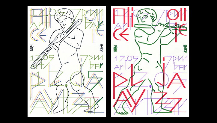
Regular Practice: Jazz Posters
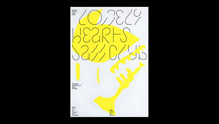
Regular Practice: Jazz Posters
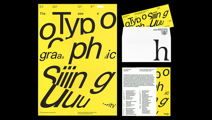
Regular Practice: Typographic Singularity
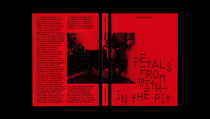
Regular Practice: Zach Soudan, Petals from Within the Pit
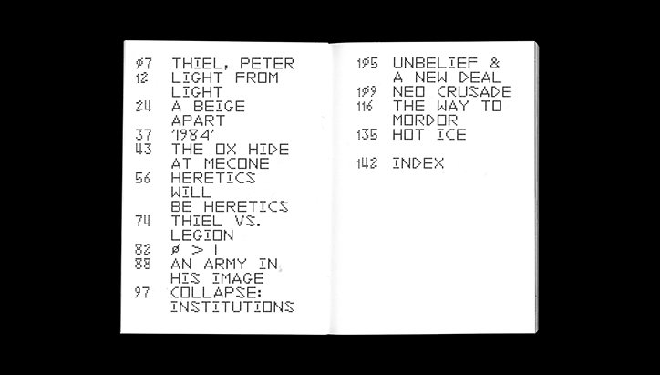
Regular Practice: Zach Soudan, Petals from Within the Pit
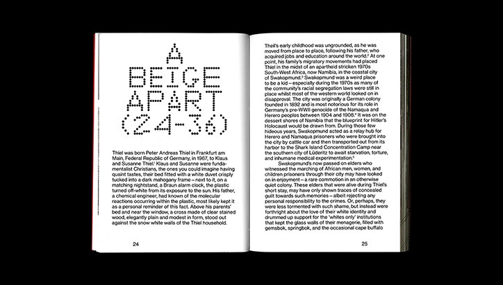
Regular Practice: Zach Soudan, Petals from Within the Pit
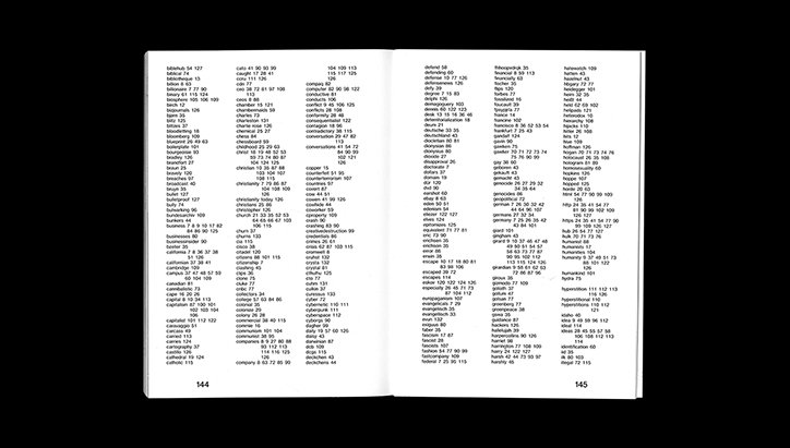
Regular Practice: Zach Soudan, Petals from Within the Pit
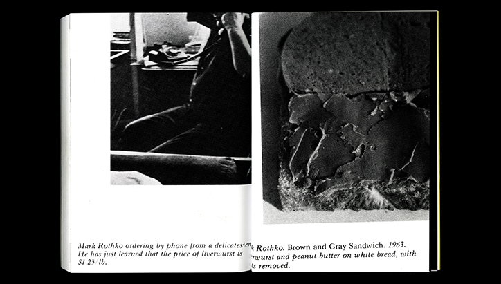
Regular Practice: Zach Soudan, Petals from Within the Pit
Share Article
Further Info
About the Author
—
Lucy (she/her) was part of the It’s Nice That team from 2016–2025, first joining as a staff writer after graduating from Chelsea College of Art with a degree in Graphic Design Communication, eventually becoming a senior editor on our editorial team, and most recently at Insights, a research-driven department with It’s Nice That.


