Launch Recite Me assistive technology
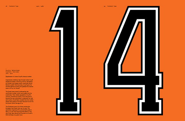
A bold black number “14” with a white outline is set against a bright orange background. To the left, small blocks of text describe the digitalisation of Johan Cruyff’s famous football shirt number.

Graphic Design: Rick Banks' new book looks at fonts and football together as one

—
Date
24 September 2013

Few things in life inspire as much obsession as typography and football. So surely designer Rick Banks’ decision to bring them together in his new book Football Type makes perfect sense. It’s a limited edition title which explores some of the weird and wonderful ways in which fonts and footy have intersected down the decades; from Gaudi’s influence on Barcelona’s shirt numbers to Maradona’s famous “10” (and all that it evokes in any still-bitter Englishman.) And with all the proceeds going to The Football Foundation charity, there’s simply no excuse not to make this the next addition to your bookshelf, in whichever of the five different covers you can get your mitts on. Football!
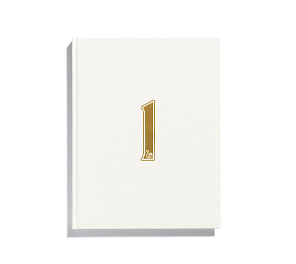
A white hardcover book with a textured finish. A gold foil numeral “1” is centred on the cover.
Above

Rick Banks: Football Type

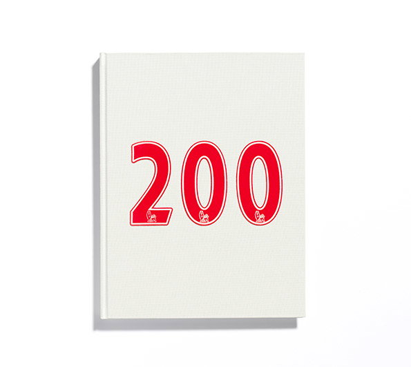
A white hardcover book with the number “200” printed in large red numerals on the front cover. Small, white illustrative figures are visible inside the base of each digit.
Above

Rick Banks: Football Type

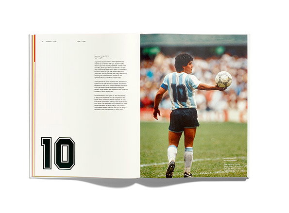
An open book shows a photograph of Diego Maradona from behind, wearing an Argentina football shirt with the number “10”. He stands on a pitch, holding a football in one hand. The opposite page features a large number “10” and a block of descriptive text.
Above

Rick Banks: Football Type

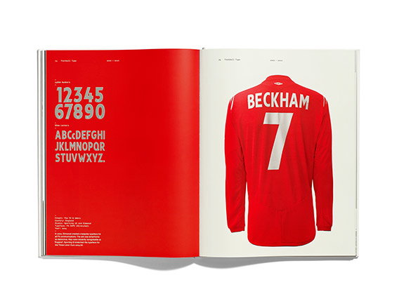
An open book shows a red page and a white page. The red page displays a bold, white sans-serif typeface featuring numbers and the alphabet. The white page shows the back of a red blazer with “BECKHAM” and the number “7” printed in white.
Above

Rick Banks: Football Type

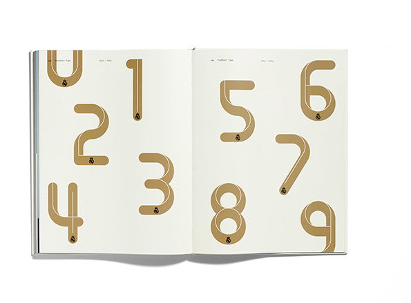
An open book displays a series of numbers from 0 to 9. The digits are rendered as thick, gold-coloured ribbons that loop and curve against a plain white background.
Above

Rick Banks: Football Type

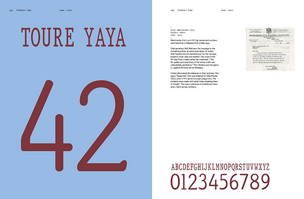
A two-page spread from a book titled “Football Type”. The left page features the name “TOURE YAYA” above a large number “42” in a deep red serif typeface against a light blue background. The right page contains descriptive text about Manchester City, a scanned telegram, and a full alphabet and number set in the same red typeface.
Above

Rick Banks: Football Type

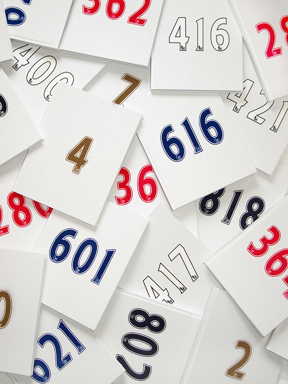
A pile of white cards, each printed with a different three-digit number in red, blue, or gold. The numbers are styled like sports jersey typography, with a bold “616” and “601” prominent in the centre.
Above

Rick Banks: Football Type

Share Article

About the Author

Rob Alderson

—

Rob Alderson is a freelance writer, editor and strategist. He was previously editor-in-chief of It’s Nice That and WePresent, and editor of Design Week. He publishes the newsletter Undo, which tries to make sense of how AI is changing design work, the design process and the design industry.
It's Nice That Newsletters

Fancy a bit of It's Nice That in your inbox? Sign up to our newsletters and we'll keep you in the loop with everything good going on in the creative world.