




Meet Rob en Robin, the Dutch studio that finds humour in often lifeless topics
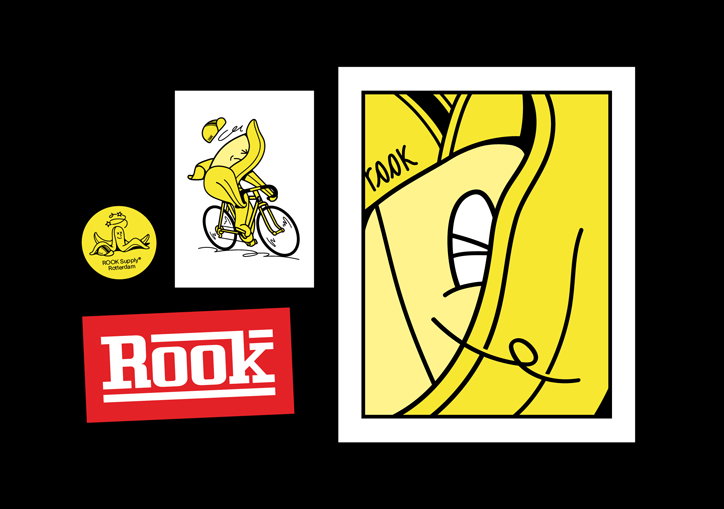
In any sort of discipline, it’s always refreshing to meet people who manage to keep a good sense of humour while still being prolific and ambitious. Rob en Robin, the creative studio based in Breda, the Netherlands, is run by two such creatives. Rob van den Belt and Robin van Gurp, a self-proclaimed inseparable duo, founded the studio after doing their graduation project collaboratively in art school on the visual language of local shop front signs “even though rules and the head-shaking teachers told us not to.”
The two, who know each other from growing up in a village near Breda, got reacquainted in art school where they slowly became inseparable. “There was no Rob without Robin,” Robin tells It’s Nice That. “Our first job together was at the village supermarket. Our first collaboration: stocking shelves,” Robin jokes. Coming from a village that’s not really known for having much of a graphic design culture, where “posters for events and get-togethers are drawn up on a beermat at the local pub,” the attention and encouragement they received for their final project pushed them to start their own studio.
What this also means is that the studio gets to choose a wide variety of work that fits its interests – city guides, skate parks, record covers and hip-hop dance classes. “The past two years were spent working on assignments that we never would have expected to cross our path,” Robin says. “Being able to switch between styles and media is very refreshing, and it stops the work from becoming a routine.” The studio likens its process to playing table tennis, a non-hierarchical process where the two “keeps going till someone hits a smash.” It is in this back-and-forth that Rob and Robin really find their strength, but they also complement each other in a different way: Rob has to work with his colour blindness and Robin his dyslexia.
Rob en Robin: Graphic Matters
The unpredictability of what kind of work might come in, the same unpredictability that is at the core of all things humorous, is what draws the two towards graphic design. “One moment we’re sorting out a business-like job, the next we find ourselves clipping two dildos to a mousetrap,” Rob says, referring to the Rube Goldberg-like video the studio did for the Vieze Anita festival this year. “It’s a fantastic feeling never knowing what we will be up to tomorrow, in a week, in a month. Pretty much our entire careers,” he continues. “We are super serious when it comes to our profession, yet at the same time, we are very self-deprecating,” Robin says.
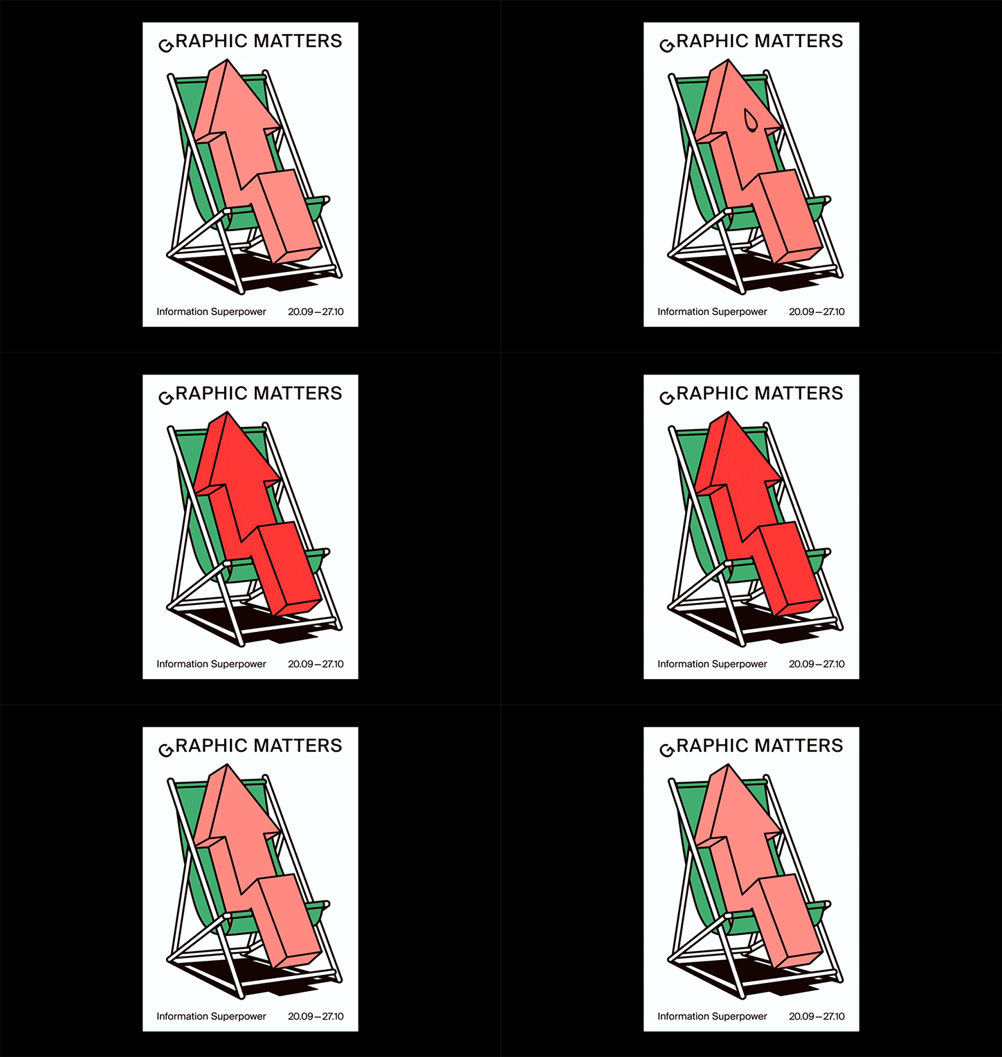
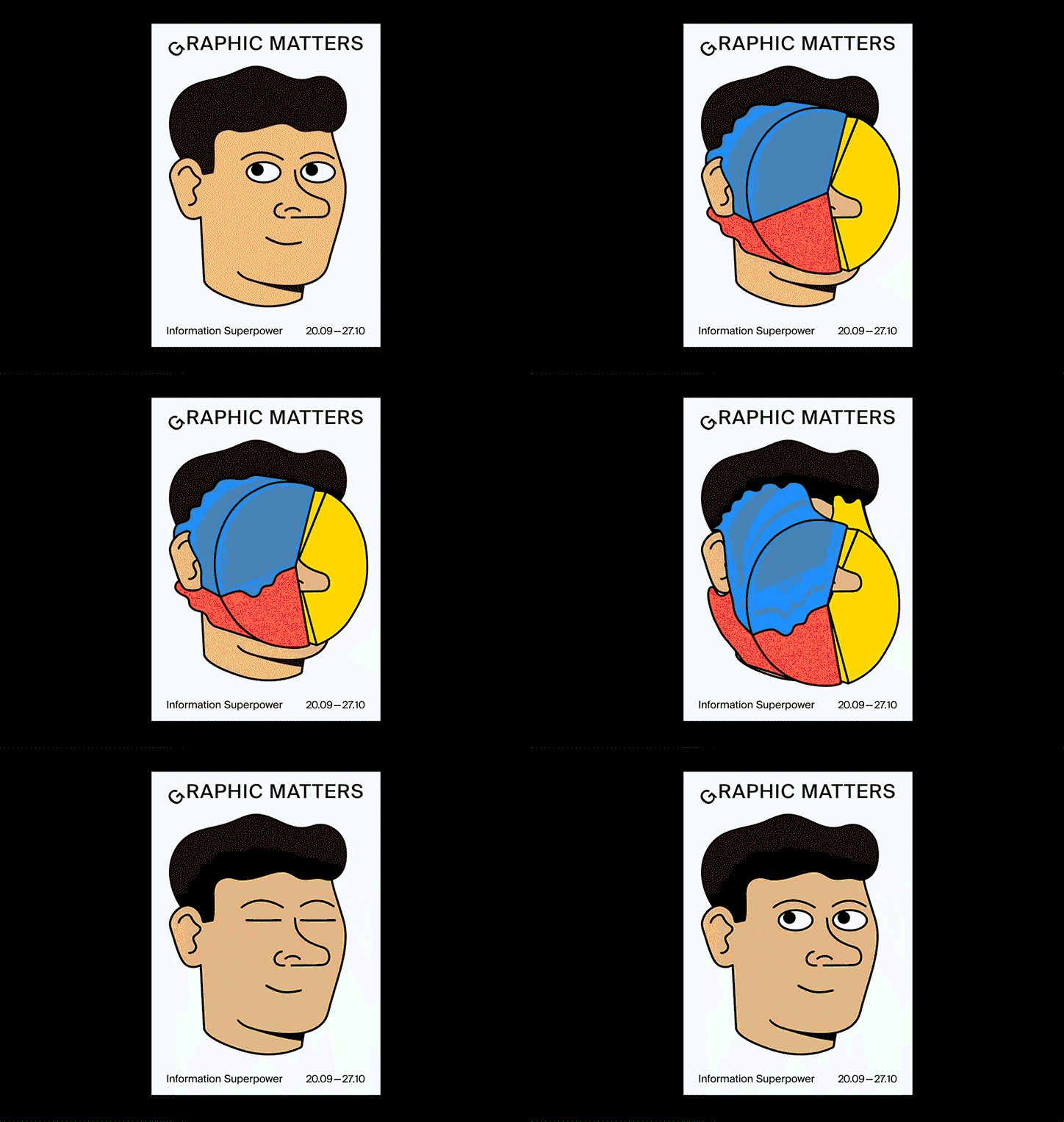
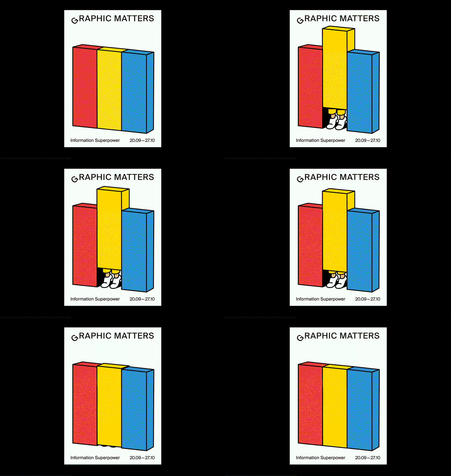
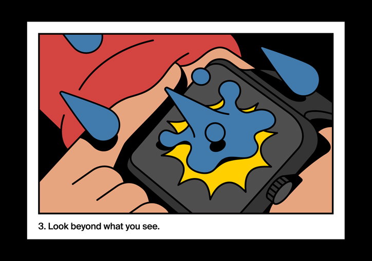
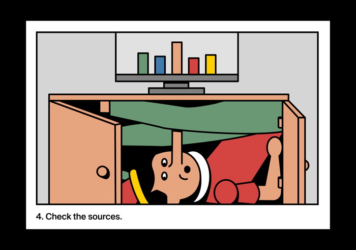
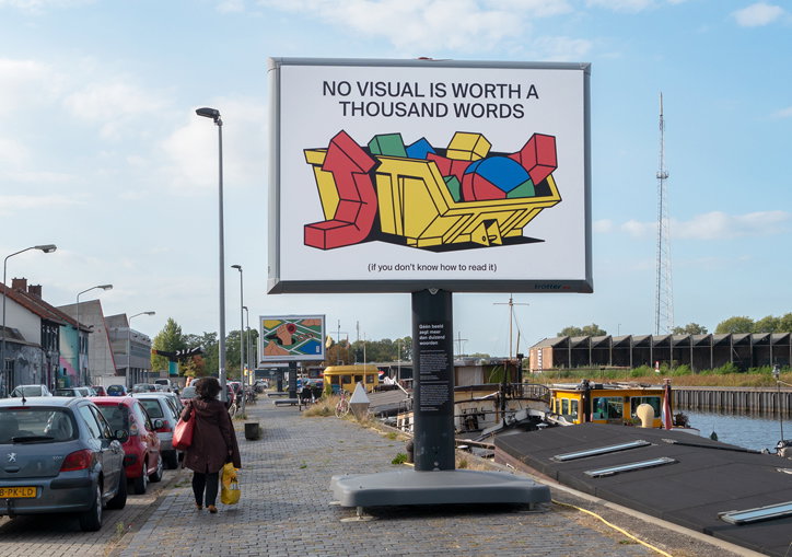
Their lighthearted approach is evident in their work for the seventh edition of Graphic Matters, the biennial festival about data visualisation and infographics. Since the focus of the festival was on the cutting edge of information design, the studio initially wanted to avoid the traditional modes of visualisation of bar charts, pie charts and line charts. “Let’s face it, data isn’t the most ‘sexy’ subject,” Rob says. But the studio’s attempt in being too original ended up complicating the process, and so the duo returned to what they do best: finding the humour in otherwise innocuous objects and images. What resulted is a series of playful posters: a pie chart used for a pieing, a line chart lounging on a lawn chair, and an all-too-heavy bar chart being lifted by shaking legs.
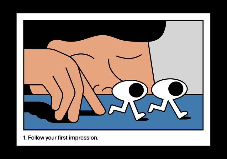
“We searched for a soul in those lifeless graphs,” Rob tells us. Although the studio decided that these ideas “didn’t hit the brief for the street campaign,” the studio turned this into an opportunity to begin doing editorial illustrations, returning to the same character and visual language for articles on how to understand data visualisation. Rob tells us: “Rubbish can be very useful, depending on how you look at it. Our first slice of editorial illustration made us want to order up some more.”
Rob en Robin: Graphic Matters
Rob en Robin: Graphic Matters
Rob en Robin: Graphic Matters
Rob en Robin: Graphic Matters
Rob en Robin: Graphic Matters
Rob en Robin: Rook
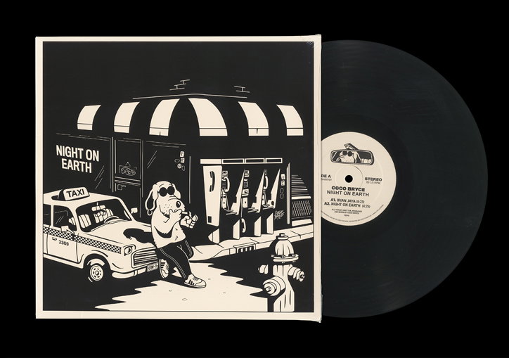
Rob en Robin: Night on Earth
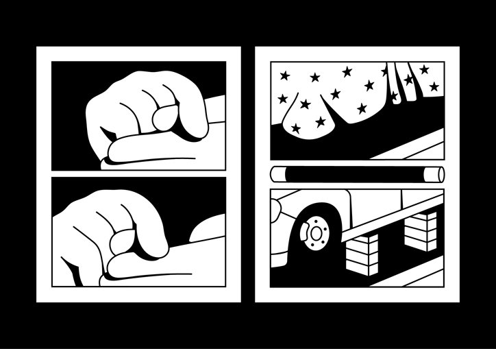
Rob en Robin: How to make a giant elephant disappear
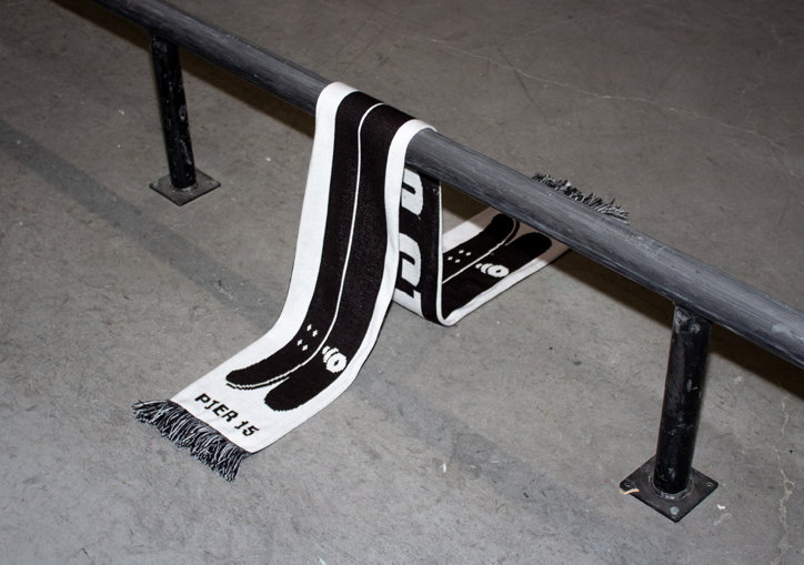
Rob en Robin: Pier 15
Share Article
Further Info
About the Author
—
Alif joined It's Nice That as an editorial assistant from September to December 2019 after completing an MA in Digital Media at Goldsmiths, University of London. His writing often looks at the impact of art and technology on society.