Launch Recite Me assistive technology
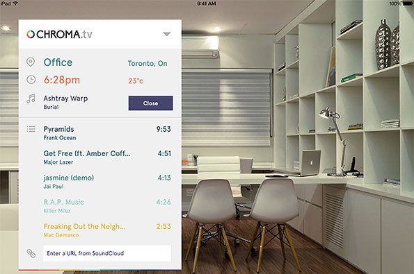
A digital interface for “chroma.tv” is overlaid on a photo of a minimalist white office. The menu displays the location “Office” in “Toronto, On”, the time “6:28pm”, and a music playlist featuring artists such as Burial and Frank Ocean.

Interface design for invisible platforms is no mean feat, Roger Dario proves

—
Date
8 July 2014

Deceptive though it might sound, I think the task of taking something boring sounding and making it engaging is one of the most fascinating elements of design – the craftsmanship involved in showing something to its full potential through a limited set of visuals is not to be sniffed at. Interface design is a prime example of where this skill comes to light, and designer and art director Roger Dario does it brilliantly.

Roger is often charged with illustrating the usefulness, interactivity and practicality of digital experiences and apps through dynamic interface design. One example is the identity he created for Chroma, an invisible tool which takes into account the user’s schedule, the weather report, the lighting conditions and the time of day and creates a reactive sensory experience for the workplace. Sound a bit like something from Spike Jonze’s Her? It is a tricky concept to put your finger on, and the question of how you go about designing the ident for an “invisible” platform would have been enough to put some designers off immediately. Contrastingly, Roger came up with a temperate and easygoing visual based around a series of shoes which slot together to create the logo which suits the program’s function perfectly.

A colourful typographic logo reads “CHROMA”. Each letter is composed of overlapping geometric shapes in shades of orange, red, teal, and navy.
Above

Roger Dario: Chroma

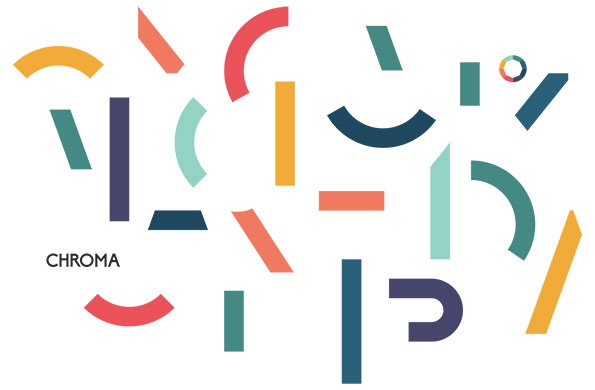
An abstract illustration of colourful geometric shapes, including arcs, lines and rectangles, scattered across a white background. The word “Chroma” appears in a simple black typeface in the lower left.
Above

Roger Dario: Chroma

A graphic featuring four identical circular icons set against a sequence of yellow, orange, red and purple backgrounds. Each icon consists of a thick outer ring with a smaller octagon nested inside.
Above

Roger Dario: Chroma

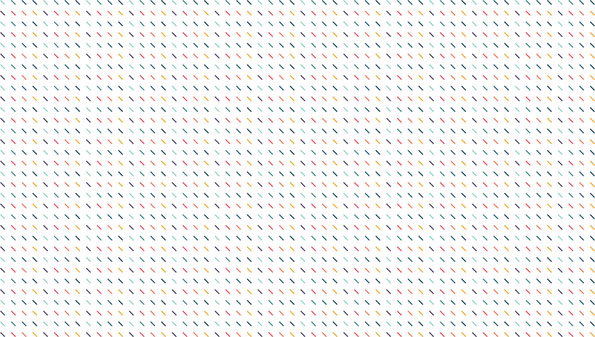
A pattern of small, diagonal dashes in red, blue, yellow and green. The colourful marks are arranged in a precise, repeating grid against a white background.
Above

Roger Dario: Chroma

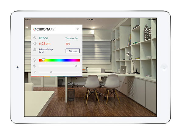
A white tablet displays a bright, modern office with white shelving and wooden floors. A digital overlay from “chroma.tv” shows the location as “Office” in “Toronto, On” and lists a song by Burial.
Above

Roger Dario: Chroma

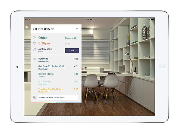
A tablet displays a bright, modern office with white shelving and wooden floors. A digital overlay from “chroma.tv” shows the current location as “Office” in Toronto and lists a music playlist.
Above

Roger Dario: Chroma

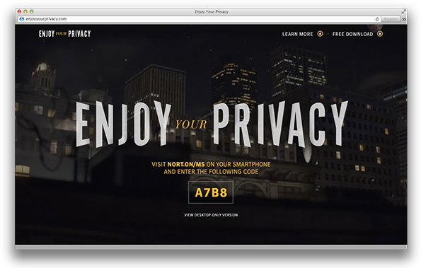
A website landing page shows a dark city skyline at night. Large white text in the centre reads “ENJOY YOUR PRIVACY”, with a gold code “A7B8” displayed below.
Above

Roger Dario: Enjoy Your Privacy

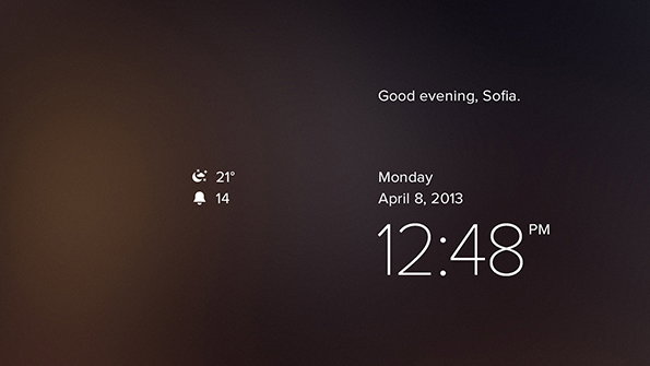
A digital screen with a dark gradient background. White text reads “Good evening, Sofia.” above the date “Monday April 8, 2013” and the time “12:48 PM”.
Above

Roger Dario: Enjoy Your Privacy

Share Article

Further Info

About the Author

Maisie Skidmore

—

Maisie joined It’s Nice That fresh out of university in the summer of 2013 as an intern before joining full time as an Assistant Editor. Maisie left It’s Nice That in July 2015.


It's Nice That Newsletters

Fancy a bit of It's Nice That in your inbox? Sign up to our newsletters and we'll keep you in the loop with everything good going on in the creative world.