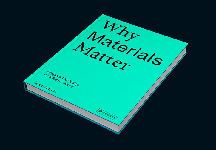
Why Materials Matter: Seetal Solanki's accessible proposal for the future of materials, designed by Our Place
“Materials exist everywhere and make up our world, everything is made of something,” outlines founder and director of Ma-tt-er – and former It’s Nice That One to Watch – Seetal Solanki. A research design studio that explores the past, present and future of materials, last night (20 September) Seetal launched Ma-tt-er’s first book, Why Materials Matter, which questions what it means to live in a material world, and how materials of the past and present hold the keys to our future.
Designed by London-based design studio, Our Place, the publication features a range of materials, “from the experimental ones used in large-scale manufacturing, from handmade to machine-made, from physical to digital, from natural to synthetic and from ephemeral to enduring”. By examining a variety of materials’ potential, Why Materials Matter proposes how we can shape new meaning, creating positive social, environmental, economic and political change.
Seetal began working on the book just over a year ago when approached by her friend, Ali Gitlow, the commissioning editor at Prestel Publishing got in touch. “We wanted to create a book about materials that was a lot more accessible, approachable and inclusive so that it’s not just catering to people within the creative industry, but to the masses, at any age,” Seetal recalls. Resisting the usual scientific focus of material-based books, Seetal set out to prove that “it’s not just about ‘new’ materials but it’s also looking at what materials we have existing to utilise to their full potential.”
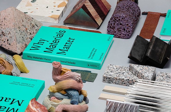
Why Materials Matter by Seetal Solanki. Graphic Design: Our Place. Photography: Dilesh Solanki
With communication and accessibility the focus of Why Materials Matter, Seetal worked with Alex Gross and Ted Heffernan of Our Place to ensure this took precedent. Building upon the identity it had already created for Ma-tt-er, Our Place continued its use of a serif typeface paired with a sans serif one but, in the book, this relationship is developed further. “The key issue with a lot of books in the ‘materials world’ is that they feel a bit too ‘scienc-y’ or academic,” the studio offers, “so a big aspect of the design was to allow everything to breathe, focus on the strong imagery and have a contemporary and artistic outlook,” it explains of its open, unintimidating design choices.
The book’s content is then split into three chapters. The first, Everyday, provides new insights into some of the materials that are prevalent in our daily lives; that are so mundane and ordinary “we rarely, if ever, pay attention to them”. The second, Sciences, focuses on materials whose scientific advancements are challenging some of the processes traditionally associated with the sciences, allowing us to design and make more responsibly. Expansive, the final component, showcases projects that have the potential to expand our concept of what a material is and what it may be able to offer our world.
To coincide with the book’s launch event during LDF 2018, Ma-tt-er created an exhibition designed in the form of a reading room, offering visitors the chance to see how a room might look using responsibility sourced materials. “This is totally possible,” Seetal remarks, “but sometimes this just needs to be demonstrated and brought to life to prove that it is possible.” As well as presenting the book, the exhibition also included a range of bookends especially commissioned for the event. Each is made the designers featured in the book and “just as the book supports material,” Seetal adds, “the material bookends support the book”. This decision, as well as creating a feedback loop whereby one could not exist without the other, prompts open dialogue by bringing the materials in questions off the page and into a physical form.
The exhibition, where the book and bookends are both on sale, will remain open until 23 September.
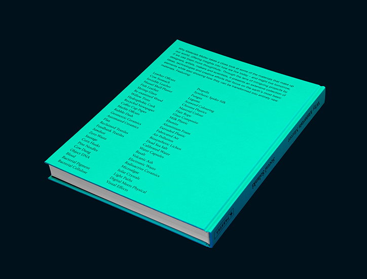
Why Materials Matter by Seetal Solanki. Graphic Design: Our Place. Photography: Dilesh Solanki
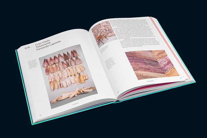
Why Materials Matter by Seetal Solanki. Graphic Design: Our Place. Photography: Dilesh Solanki
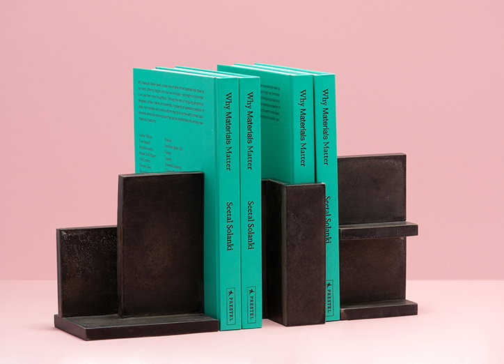
Why Materials Matter by Seetal Solanki. Graphic Design: Our Place. Photography: Dilesh Solanki
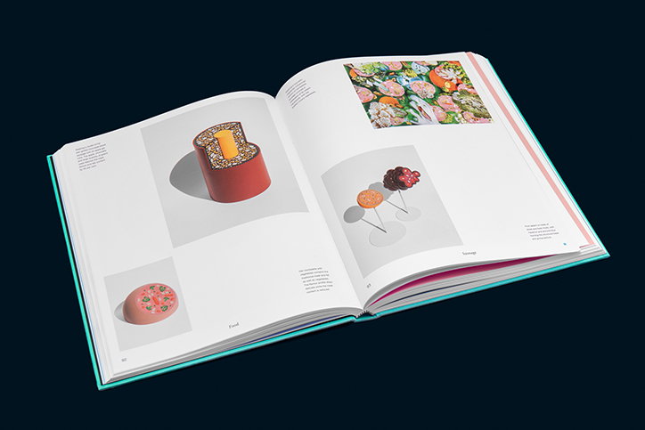
Why Materials Matter by Seetal Solanki. Graphic Design: Our Place. Photography: Dilesh Solanki
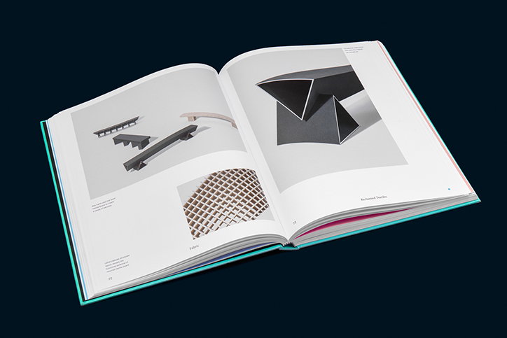
Why Materials Matter by Seetal Solanki. Graphic Design: Our Place. Photography: Dilesh Solanki
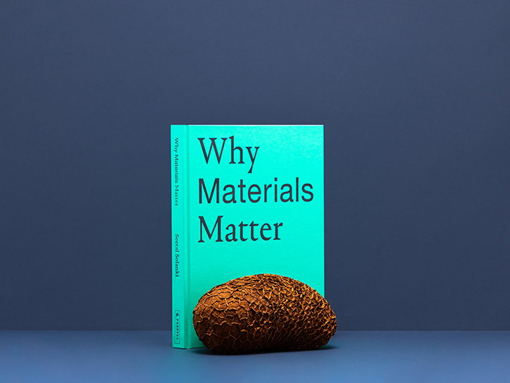
Why Materials Matter by Seetal Solanki. Graphic Design: Our Place. Photography: Dilesh Solanki
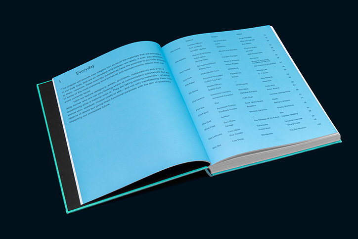
Why Materials Matter by Seetal Solanki. Graphic Design: Our Place. Photography: Dilesh Solanki
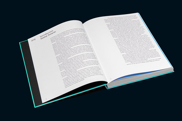
Why Materials Matter by Seetal Solanki. Graphic Design: Our Place. Photography: Dilesh Solanki
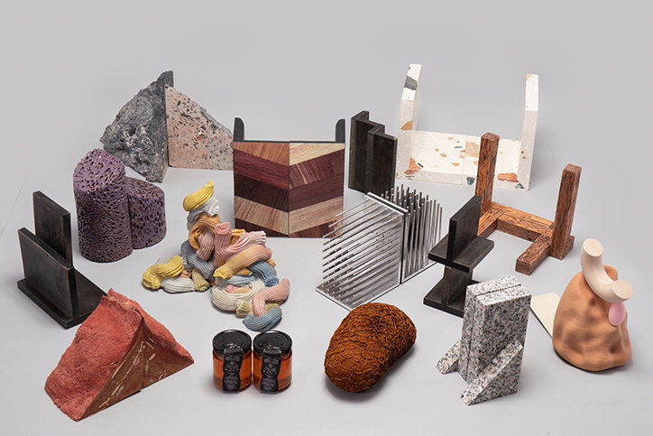
Why Materials Matter by Seetal Solanki. Graphic Design: Our Place. Photography: Dilesh Solanki
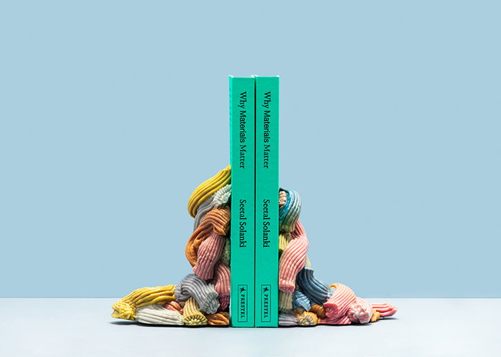
Why Materials Matter by Seetal Solanki. Graphic Design: Our Place. Photography: Dilesh Solanki
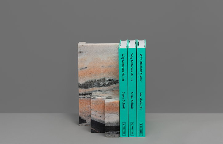
Why Materials Matter by Seetal Solanki. Graphic Design: Our Place. Photography: Dilesh Solanki
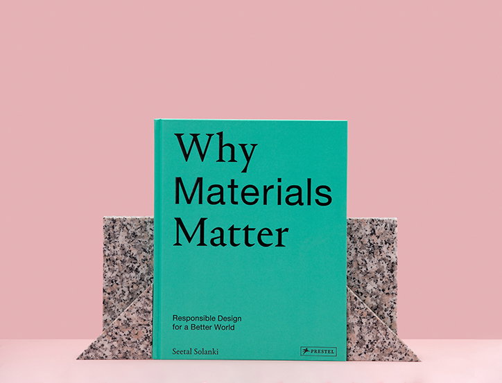
Why Materials Matter by Seetal Solanki. Graphic Design: Our Place. Photography: Dilesh Solanki
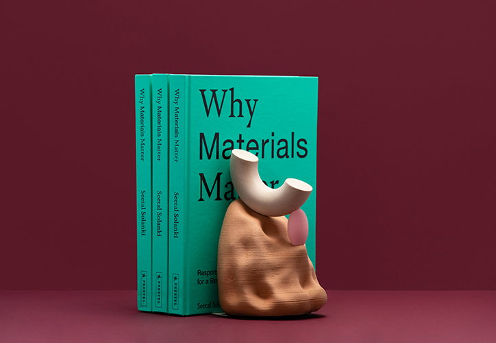
Why Materials Matter by Seetal Solanki. Graphic Design: Our Place. Photography: Dilesh Solanki
Share Article
Further Info
About the Author
—
Ruby is Senior Creative at It's Nice That, overseeing our visual output across platforms and projects. Before that, she was associate editor on the editorial team, after joining in September 2017 following graduation from Central Saint Martins.