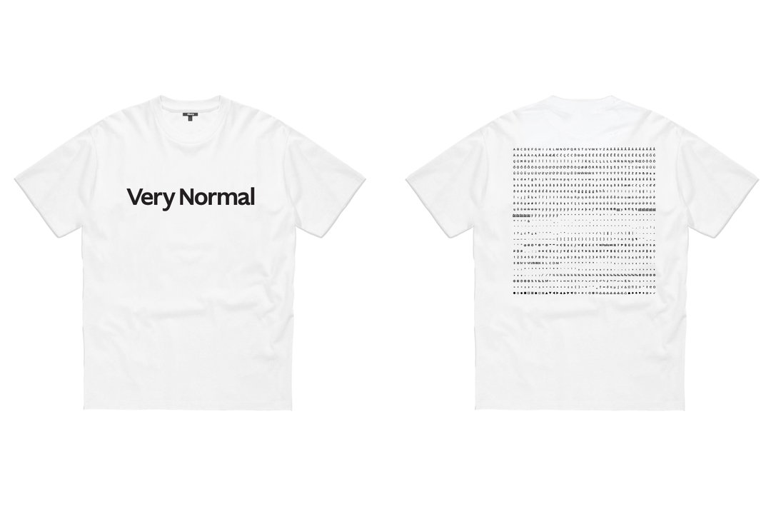
As versatile as the plain white T-shirt, Sharp Type’s new font is perfectly ordinary
Basic and adaptable, Ghost is a critical albeit humorous adaptation of the previously “stale” humanist sans.
Share
If something was described as ‘normal’ you probably wouldn’t think much of it. But then, what with the arrival of normcore a few years back and the increasing thirst for approachability and adaptability, being ‘normal' has become quite the thing. In fact, there’s a new normal in town – one that’s nuanced, complex and led by It’s Nice That regulars Sharp Type and its newest typeface Ghost.
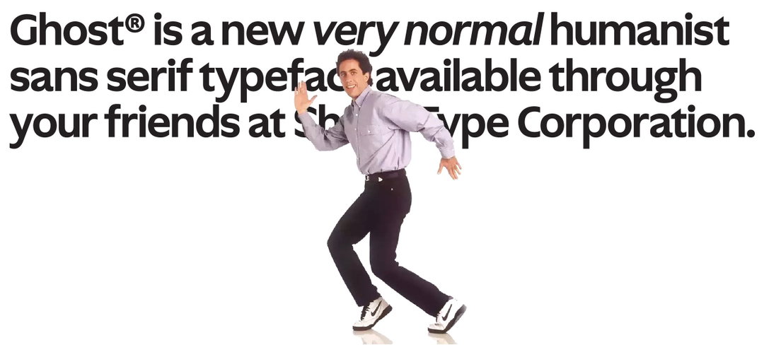
Designed by Lucas Sharp and displayed with humorous art direction conceived by Justin Sloane, Ghost is a critical and considered take on the humanist sans genre and the concept of normalcy. “Ghost is a back-to-the-roots take on the humanist sans genre and a meditation on the ephemeral nature of normalcy,” says Lucas. “We all felt strongly that so much of the driving force of this process was about nostalgia and, subsequently, a reaction against it.” Design director Lucas co-founded the foundry alongside CEO Chantra Malee in 2015, with their first full-time employee, technical director Connor Davenport, joining in the summer of 2017. The team comprises eight full-time members, including the two most recent: Theodore Jahng and Zyanya Rodriguez. All of whom are located across the globe from New York City to LA, Marin County to Madrid and Nantes to Hong Kong, operating remotely ever since the pandemic.
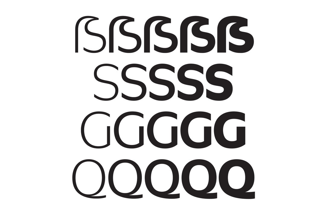
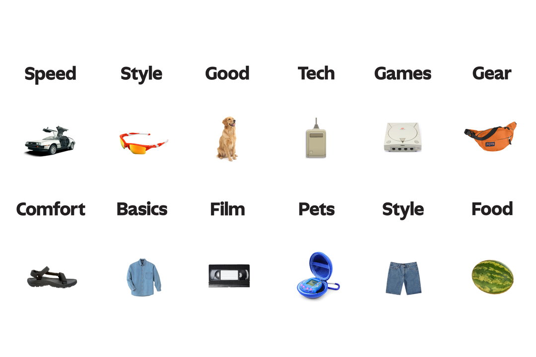
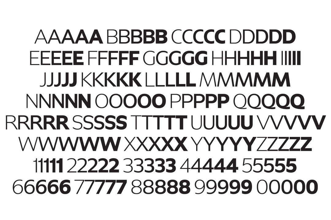
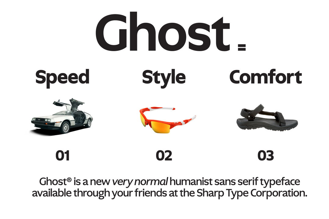
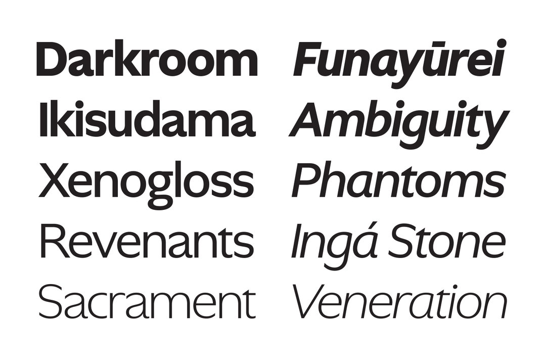
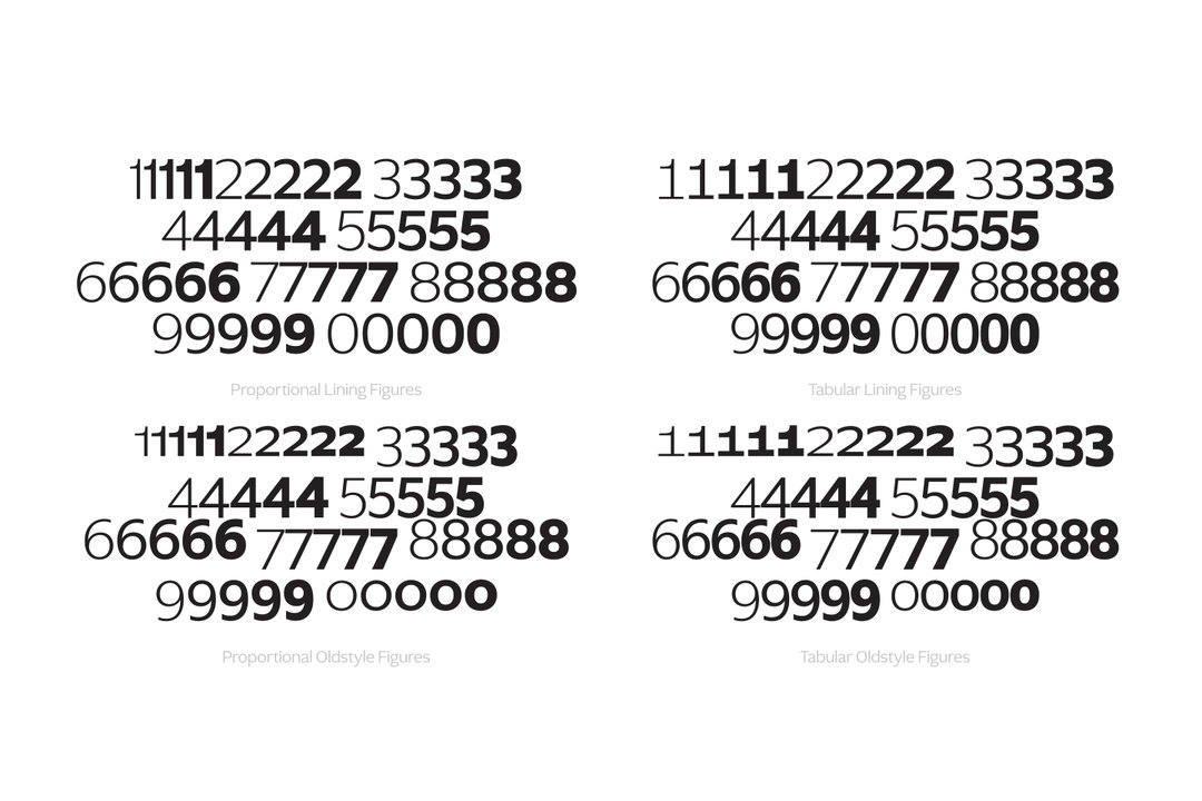
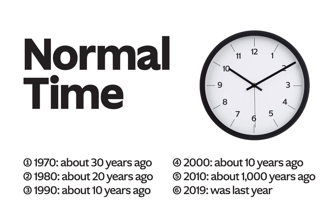
When designing Ghost, the team decided to address the humanist sans genre because, in their words, it "is sort of a mess” due to it not having any set design standards. Theodore adds: “We likened it to a floating signifier, wherein everyone sees something different.” This led the foundry to design Ghost as a form of critical engagement. Sharp Type's plans to mix up the typeface involved pulling from a range of models and eras, “codifying them for the current moment”. The type design takes a deep view through typographic history from a technical standpoint, from Roman inscriptional lettering, Edward Johnston’s eponymous typeface (1916) to Optima (1958) by Hermann Zapf. This is how Ghost was formed. In the art direction, the viewer will spot all sorts of cultural reference points: from a Dreamcast to the DeLorean – which references the time machine in Back to the Future – to Tevas, a 90s American norm core staple that every dad and style-conscious person has in their wardrobe. Ghost also touches on Web 1.0 aesthetics and "the critical engagement represented by normcore”, explains Theodore.
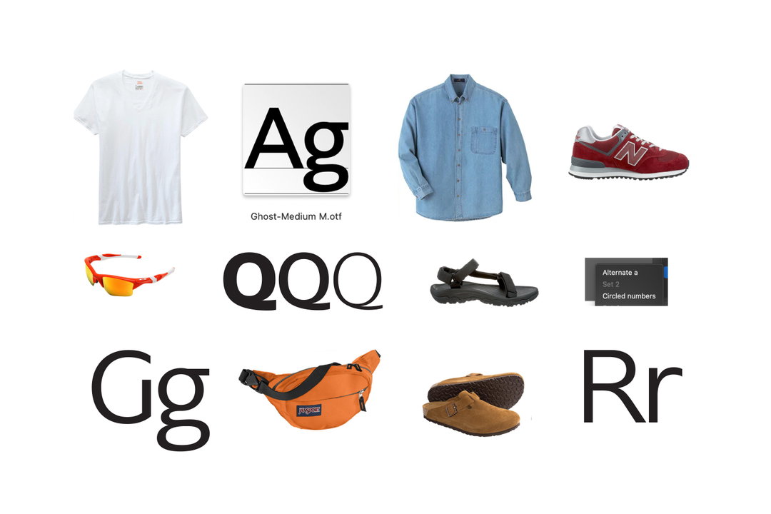
Sharp Type: Ghost (Copyright © Sharp Type, 2022)
The key element that makes Ghost so successfully normal is its adaptability. “Its DNA is neutrality and so it can function in any context,” explains Lucas. “It’s utilitarian but it has a warm and striking personality, so it will blend seamlessly within different types of content while elevating the overall application by virtue of its design.” Much like the versatility of the T-shirt, Ghost can be paired with pretty much anything: long skirts, shorts, chaps. The only difference – sort of – is that Ghost will “beautifully” appear on the web, just as much as it will on printed matter and on signage. “That said,” continues Lucas, “it’s hard to be prescriptive about how a font gets used. At the end of the day, we hope to be inspired!”
Not only has the arrival of Ghost given the previously “stale and stagnant” humanist sans genre a refreshing update, it’s also set a new standard for it. It’s given the humanist sans a new lease of life "by conveying the spirit of the human hand in the letterforms through representation," despite its long history entrenched in the familiar. And, in the very near future, the foundry plans to release Ghost Text – an expansion of the Ghost family with all the genetic idiosyncrasies, designed by My-Lan Thuong. “We hope people will simply look at Ghost and immediately recognise its potential in just about any context,” Lucas says. “But for those who take the extra step to read about our process, we’re hopeful that Ghost functions as a window into a more critical and investigative view of the craft as a whole.”
GallerySharp Type: Ghost (Copyright © Sharp Type, 2022)
Hero Header
Sharp Type: Ghost (Copyright © Sharp Type, 2022)
Share Article
Further Info
About the Author
—
Ayla is a London-based freelance writer, editor and consultant specialising in art, photography, design and culture. After joining It’s Nice That in 2017 as editorial assistant, she was interim online editor in 2022/2023 and continues to work with us on a freelance basis. She has written for i-D, Dazed, AnOther, WePresent, Port, Elephant and more, and she is also the managing editor of design magazine Anima.