




“I always strive for something that I’ve never tried before”: Sthuthi Ramesh on instinctive design
Discussing the impact of her South Asian roots and learning new skills, we speak to Sthuthi about becoming an independent design studio and her identity for Jhaveri Contemporary.
Share
Priding herself on the thoughtful and personally immersive expressions of type and form, London-based graphic designer Sthuthi Ramesh has an eye for a brief over a brand; championing remarkable projects no matter the scale. Primarily working within the cultural sector, collaborating with the likes of The Design Museum and Cambridge University Press, Sthuthi notes that they’re increasingly taking clients outside of this niche – clients like the NHS. “I mainly work with collaborators that have a strong understanding of the design approach that I believe in,” Sthuthi tells us.
Laying the groundwork of Sthuthi’s work is instinct and trust in the “true form” of the design process. “I always strive for something that I’ve never tried before,” she remarks. “What interests me most is projects that let me use existing skills and memories,” allowing her to solve complex problems whilst also developing a new skill.
GallerySthuthi Ramesh: Kolam Light Exhibition – White City Place (Copyright © Sthuthi Ramesh, 2021)

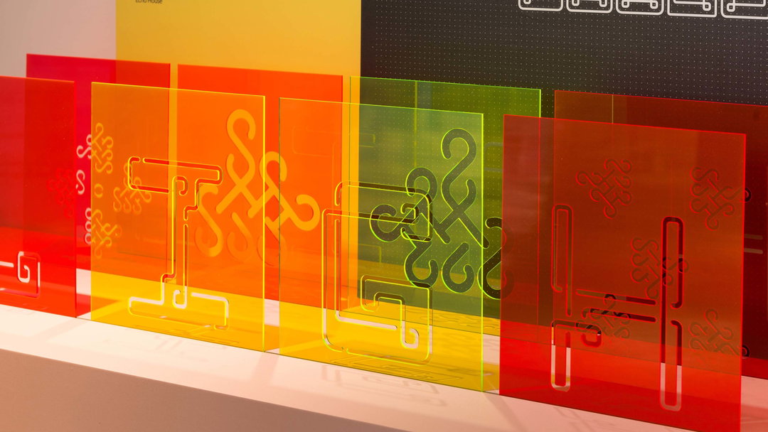
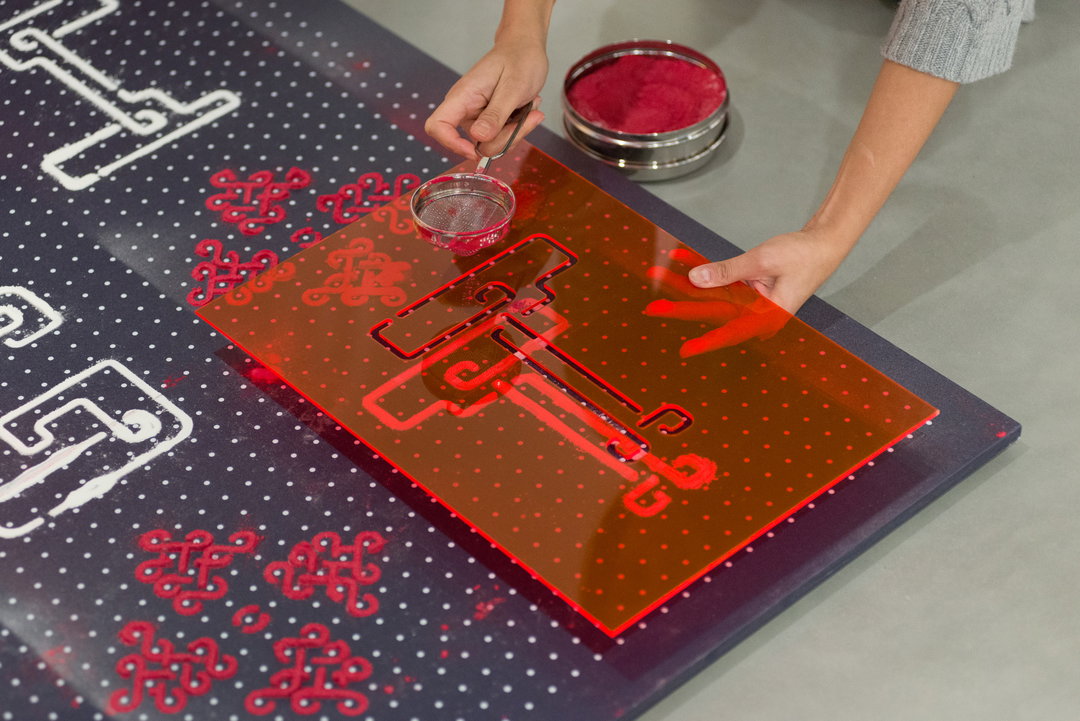
“That’s the sweet spot for me,” she adds, having the confidence to step outside of her comfort zone. “The ultimate reward then is not only a design solution that makes the client and myself happy,” Sthuthi explains, “but it also helps me develop myself further.” To this end, Sthuthi’s signature style is more of a work in progress, driven by her rigorous pursuit of typography rather than a set aesthetic. “In India, we have a comfort dish called ‘Kichdi,’ which means ‘Mish Mash,’” she says. “My visual language is currently most definitely still ‘Khichdi’.”
This reference is also indicative of her continual interest in her South Asian roots – a sentiment she actively researched recently following the setup her independent studio. “My critics and friends tell me that my use of colour is very much unique,” Sthuthi recalls, a skill that comes – once again – instinctively to her. “I hold on to this a lot,” she adds.
GallerySthuthi Ramesh: Jhaveri Contemporary (Copyright © Sthuthi Ramesh, 2021)
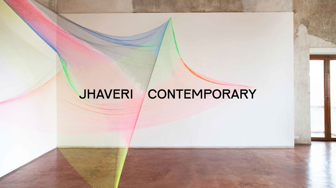

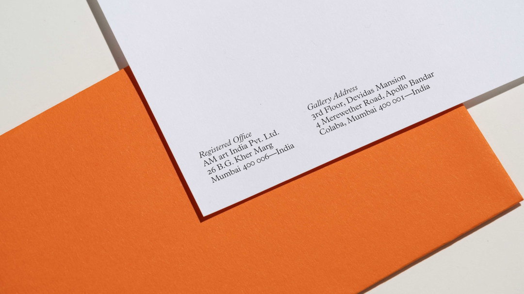
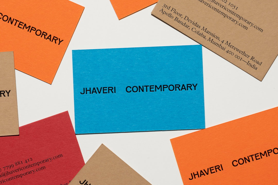
A project that encapsulates Sthuthi’s instinctive design practice and masterful command of colour is her comprehensive identity for Mumbai-based art gallery Jhaveri Contemporary – taking cues from South Asian traditions, and finding influence in the unique physical space the gallery occupies. “The typeface designed by Karel Martens and Jungmyung Lee has the distinctive motif of unusual high-waisted capitals,” Sthuthi recalls, discussing the use of Pirelli as the brand’s hero typeface of choice, “with touches of wabi-sabi adding a sense of timelessness.” Pirelli is then paired with a remarkable array of pastoral hues taken from the colours seen within the Jhaveri Contemporary. “The blue echoes the galleries rafters, red is of the red-oxide floors, and earth tones reflect the raw walls and reclaimed teak windows,” Sthuthi recalls. “Working on a South Asian cultural project has been my dream,” she tells us. “I have missed working on projects from back home and this was truly a meaningful project.”
Other than trying to find the time to sleep, Sthuthi tells us that she has some interesting commercial projects coming up, in tandem with an exciting exhibition identity. “Alongside my commercial project I allocate a few hours on passion projects,” she adds, “so, I've recently been pondering over working on a graphic design book informed by South Asia,” focusing primarily on India. “It's still at a starting stage,” she caveats.
On top of her independent practice, Sthuthi is also the co-founder of Nicety Materials – a digital library of physical materials – along with her business partner Sebastian Grenzhauser. “Starting a business is always tough and this one has been no exception,” Sthuthi remarks, “but it’s beginning to be real fun with a new release of our platform launching later in 2021. Watch this space!”
Sthuthi Ramesh: Jhaveri Contemporary (Copyright © Sthuthi Ramesh, 2021)
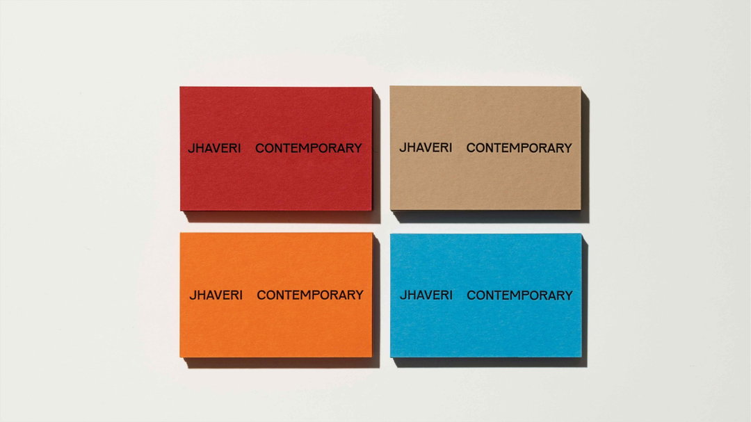
Sthuthi Ramesh: Jhaveri Contemporary (Copyright © Sthuthi Ramesh, 2021)

Sthuthi Ramesh: Blackcurrent (Copyright © Sthuthi Ramesh, 2021)
Sthuthi Ramesh: Blackcurrent (Copyright © Sthuthi Ramesh, 2021)
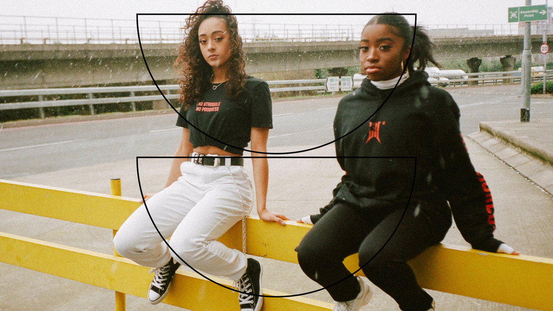
Sthuthi Ramesh: Blackcurrent (Copyright © Sthuthi Ramesh, 2021)
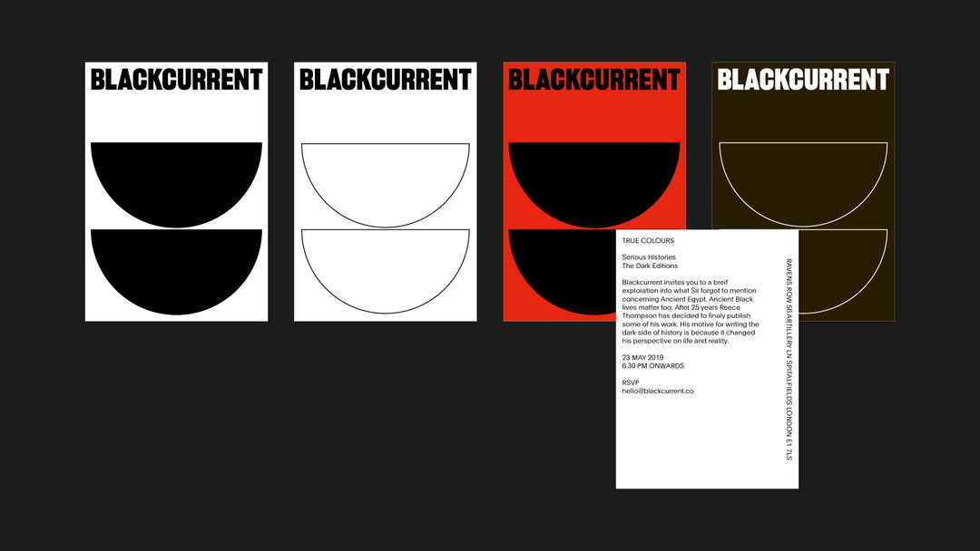
Sthuthi Ramesh: Blackcurrent (Copyright © Sthuthi Ramesh, 2021)
Hero Header
Sthuthi Ramesh: Jhaveri Contemporary (Copyright © Sthuthi Ramesh, 2021)
Share Article
Further Info
About the Author
—
Hailing from the West Midlands, and having originally joined It’s Nice That as an editorial assistant in March 2020, Harry is a freelance writer and designer – running his own independent practice, as well as being one-half of the Studio Ground Floor.

