




“We will fight on the battlefield!”: A day in the office of Studio O.OO
When asked where Taiwan-based design studio O.OO gets its name, co-founder Pip Lu responds explaining that it all comes from the fact that they don’t go into the studio that often. “It represents us often being out of office.”
A usual day for the two-person-strong O.OO team usually starts from two in the afternoon, marking the morning as a time for themselves and for gaining new inspiration. “In the morning, no business can bother us,” Pip tells It’s Nice That. “The morning is our ‘waking up’ time, to drink coffee or eat breakfast, watch soap operas, go out and walk around or sleep in bed.” But when they do finally start their working day, she likens it to a “preparation for war” – “we will fight on the battlefield!” she jests. “I only describe it this way because the studio has only had two designers in four years, so I imagine that every day will be like a war.”
In 2016, we featured the studio for its fantastic guide to Risograph printing – a publication embracing the imperfections and difficulties commonly associated with the process. Since then, the studio has developed in terms of its experimental techniques, using distinctive colour and flexible elements that have now become synonymous for O.OO. “There was a big change,” says Pip. “We found that the design was too far removed from the public, and is an area that everyone does not dare to offend easily. So as of 2016, we have tried to draw closer to design and make it more for the everyday. And of course our style and process has changed with age and experience, but the one thing that will never change is how we like to make things interesting.”
Studio O.OO: One Day Pass Limited Edition for Not Just Library
Studio O.OO: One Day Pass Limited Edition for Not Just Library
Studio O.OO: One Day Pass Limited Edition for Not Just Library
Studio O.OO: One Day Pass Limited Edition for Not Just Library
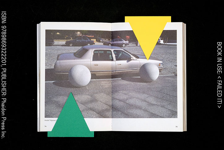
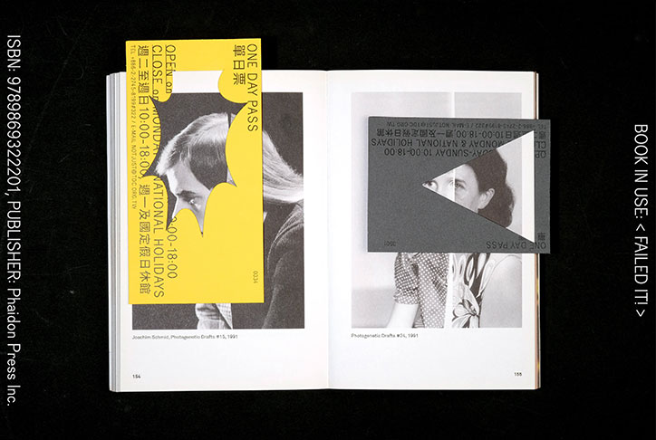
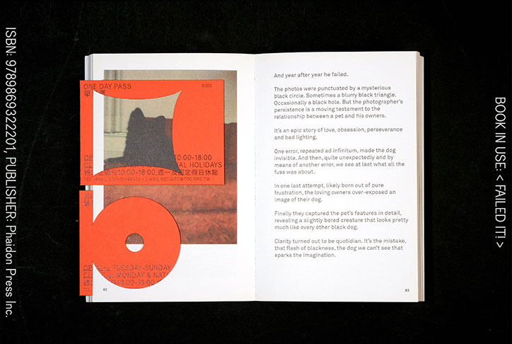
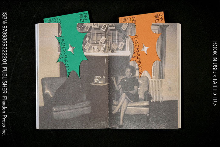
With this in mind, the team has completed various projects over the past couple of years. This includes the One Day Pass Limited Edition ticket and bookmark for Not Just Library – Taiwan’s first design-themed library that has a collection of more than 30,000 design publications and 100 magazine titles from around the world. By commenting on the development of the internet and the decreasing act of reading, the project was devised with an aim to steer people back into the written word by making it a “more relaxed state”. It’s more than just a ticket; the bold and interactive bookmark design enables its readers to view different perspectives of the publication at hand. Pip adds: “Through the process of playing, the bookmark allows the reader to find an interest in a book – whether it’s the typography, interesting pictures, the narrative or the author.”
Elsewhere, No Magic in Riso sees the completion of a two year research and experiment project come to fruition. As the second book published by O.OO, it continues the spirit of “imperfect booklets” – like a sister to the project we featured in 2016 – where, instead of using lengthy descriptions, the team has created a well-executed Risograph printed publication with an aim to inspire its readers. “It took 850 days, 74 tubes of soy ink, 15 colours, 660 masters, 690,000 sheets of paper, three fans, two riso printers and four people to complete the book – it’s a 360-page book that only talks about one thing” explains Pip. And that thing is the beautiful and wonderful world of Risograph.
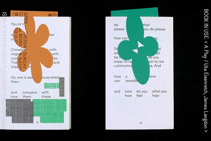
Studio O.OO: One Day Pass Limited Edition for Not Just Library
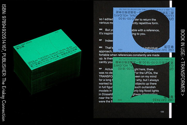
Studio O.OO: One Day Pass Limited Edition for Not Just Library
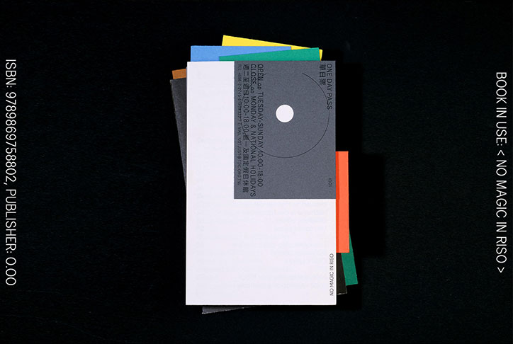
Studio O.OO: One Day Pass Limited Edition for Not Just Library
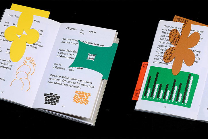
Studio O.OO: One Day Pass Limited Edition for Not Just Library
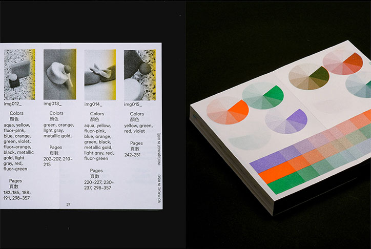
Studio O.OO: No Magic In Riso
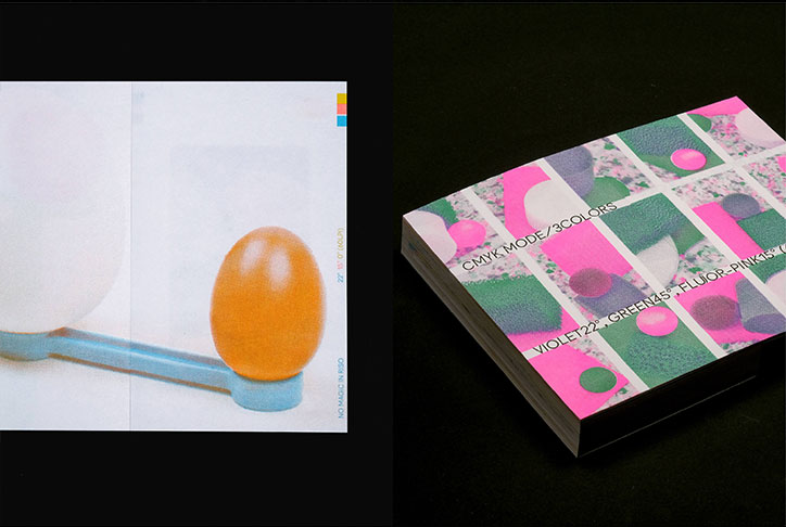
Studio O.OO: No Magic In Riso
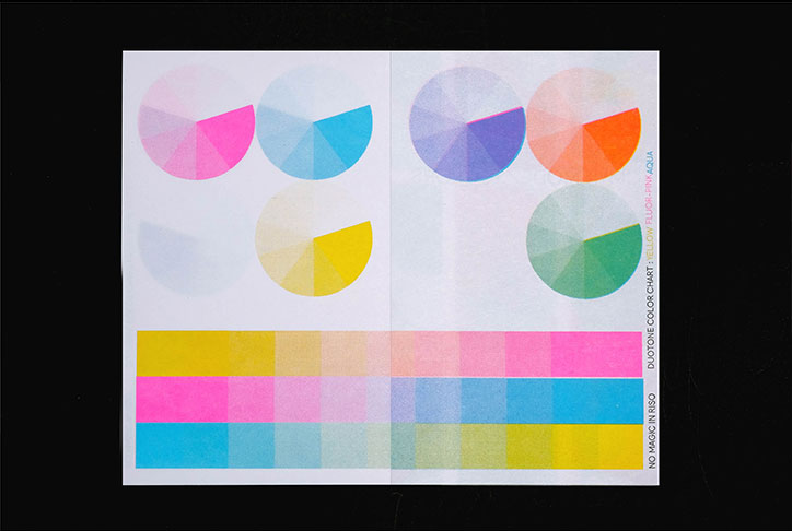
Studio O.OO: No Magic In Riso
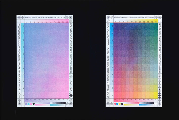
Studio O.OO: No Magic In Riso
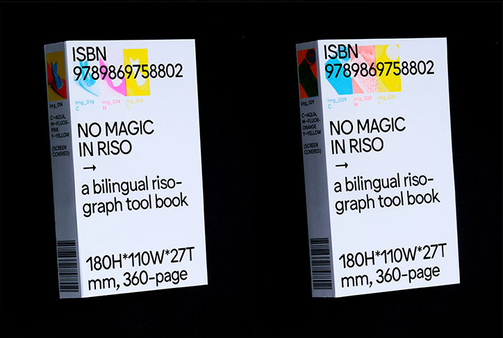
Studio O.OO: No Magic In Riso
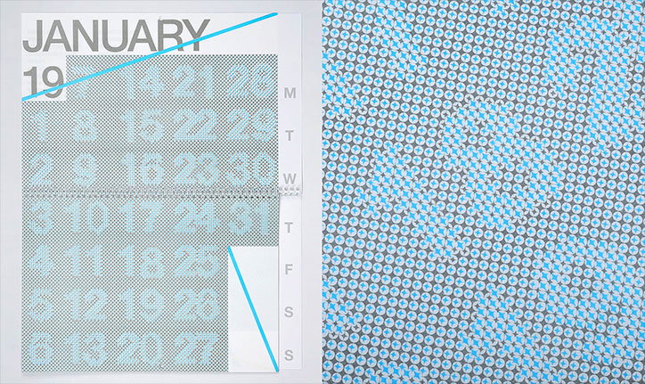
Studio O.OO: 2016 Calendar
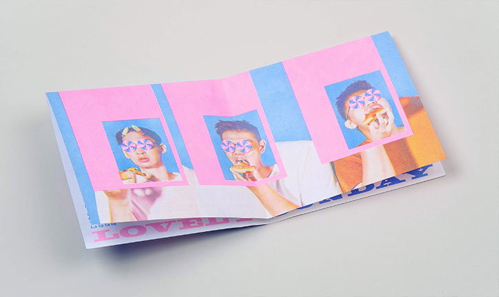
Studio O.OO: Lovely Sunday by The Chairs
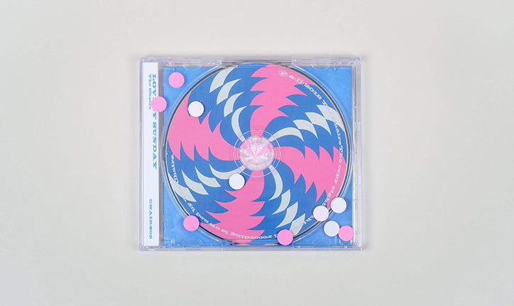
Studio O.OO: Lovely Sunday by The Chairs
Share Article
Further Info
About the Author
—
Ayla is a London-based freelance writer, editor and consultant specialising in art, photography, design and culture. After joining It’s Nice That in 2017 as editorial assistant, she was interim online editor in 2022/2023 and continues to work with us on a freelance basis. She has written for i-D, Dazed, AnOther, WePresent, Port, Elephant and more, and she is also the managing editor of design magazine Anima.