Design disasters or creative solutions? The self-made paper signs replacing wayfinding in Singapore’s railway stations
As the Southeast Asian nation plans to expand its rail network to about 360 km by the early 2030s – matching cities such as Hong Kong, London, Tokyo and New York – station managers have designed their own signs to help passengers navigate the growing maze.
Share
One of the best ways of getting around Singapore is to ride its Mass Rapid Transit (MRT) system. The rail network covers most of the island with over 140 stations across six lines. The trains are air-conditioned, punctual, reliable – and the fares are generally affordable too. (Especially when Singapore is one of the most expensive places in the world to own a car!) Most train stations even have artworks by some of Singapore’s best creatives. But there is one thing that stops me from declaring it world class: those paper signs that litter almost every station along the MRT network.
Next to the escalator. In front of a payment gantry. Along a passageway. Where there are passengers, there are almost sure to be paper signs. They typically offer directions in and around the mainly underground stations and sit alongside an official MRT signage system. While the latter provided by the state is designed by professionals with standardised icons, maps and directories that are framed and hung or mounted around the station, the paper signs mostly come in A4 sheets held up by portable sign holders or even simply pasted on its walls. These makeshift designs are the works of station managers from the private operators that manage each train line – and it shows. They usually consist of stock graphics and texts assembled using word processing and presentation programmes and printed on an office inkjet printer. Messages are often rendered in all caps, bold, underlines, and colour. Sometimes they’re even squashed to fit the page. Despite most paper signs looking ad hoc and even downright ugly, they are a regular sight of the daily MRT commute.
“They usually consist of stock graphics and texts assembled using word processing and presentation programmes and printed on an office inkjet printer.”
Justin Zhuang
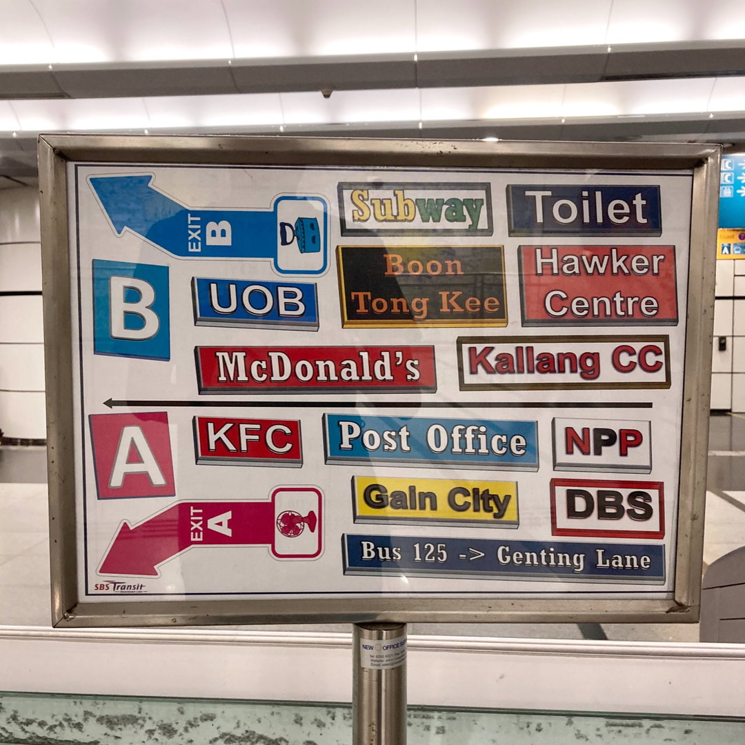
Photo courtesy of Justin Zhuang
The problem is more than an aesthetic one, however. The paper signs signal a broken wayfinding system. It’s unclear when they first appeared, but they’ve grown alongside the expansion of Singapore’s MRT network. What started almost 40 years ago as just a six kilometre stretch with two lines is set to increase to about 360 kilometres with eight lines by the early 2030s as part of the government’s efforts to encourage more public transport use. This result is an increasingly complex MRT network to navigate, which the state tried to address by redesigning the official MRT wayfinding system.
The first such effort launched in 2001 was by then British design agency Citigate Lloyd Northover. It streamlined the original system by Australian designer Harry Williamson and even introduced elements to better brand the system, including a ‘Rainforest Green’ background, a typeface designed by Hubert Jocham and a new public transport symbol. By 2015, however, paper signs had become so prevalent in the MRT network that it even inspired a design student to tackle them. Samuel Lim saw them as signs that the network had outgrown the existing wayfinding system and proposed a redesign for his final-year project. It got him hired to lead what became the second revamp of the MRT wayfinding system that was unveiled to the public in 2020.
Six years on, however, the paper signs persist. One reason is because the new system has been rolled out primarily in Singapore’s sixth and newest Thomson-East Coast Line (TEL). The older lines still rely on the 2001 design, or have adopted the new one in piecemeal fashion, and still rely on paper signs to offer directions to passengers. A common example are designs that list the destinations that the different exits of the underground stations lead to. These are commonly found near the fare gantries for passengers to check before tapping out.
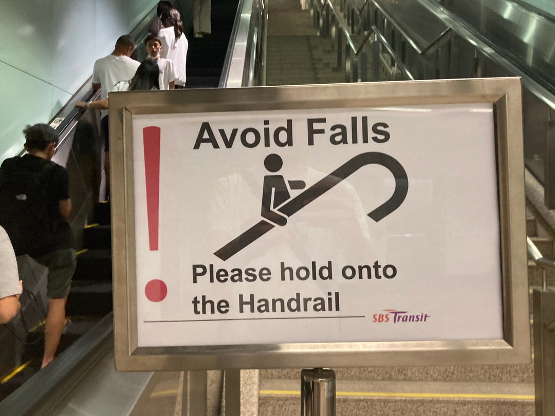
Photo courtesy of Justin Zhuang
“Besides filling the information gap for passengers, many paper signs help guide them through confusing station architecture that could qualify as a film set of Backrooms.“
Justin Zhuang
Although such information was provided in the 2001 design, they’re confined to the public areas of the station to encourage passengers to exit areas quickly, explains Samuel. His 2020 redesign addresses this with information points along the gantry areas that feature a map of what is above the station as well as key destinations and the respective exits. However, he regrets not pushing harder to install similar information points at the train platform too. Paper signs have since popped up at TEL train platforms alongside his wayfinding system.
Besides filling the information gap for passengers, many paper signs help guide them through confusing station architecture that could qualify as a film set of Backrooms. For instance, entering and exiting Bencoolen MRT Station, the deepest underground station in Singapore at 43 metres deep, requires navigating at least six escalators organised like a M.C. Escher-style drawing to get from the platform to the exit. Paper signs have been placed at the ends of each escalator to assure passengers that they are on the right track despite the many twists and turns.
Another example is Stevens MRT Station, an interchange of two different rail lines. The platforms of each are stacked one on top of another instead of the usual side-by-side design due to site constraints, and many passengers have accidentally tapped out of the fare gantry in search of a connection. In response, station managers have lined the corridor of the paid area with a series of ‘Do Not Tap Out’ signs capitalised and rendered bold, red and underlined. In case a passenger somehow missed all that, there is even an extra-large version of the sign right in front of the gantry.
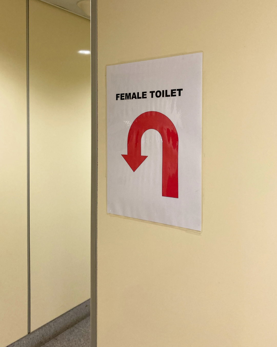
Photo courtesy of Justin Zhuang
“Despite how much of an eyesore paper signs are, some do inject a human touch to train stations that can at times look clinical and feel overwhelming.”
Justin Zhuang
Paper signs are clearly ground-up solutions from station managers to common problems faced by lost passengers. This is also acknowledged by Samuel who concedes that no official wayfinding system can anticipate all scenarios. “I understand there are operational emergencies and challenges or extremes where paper signs will help fill in the gap, but let’s do it to a certain standard,” he says. It’s why he created templates and guides for paper signs to standardise their designs too. However, operators saw it as a tacit approval of such signs and have since used them for more than just giving directions. Similar paper signs also exist in rail networks around the world, including Japan which Samuel regards as the gold standard. “To me, it really reflects a lot more on accumulated legacy problems and a culture that refuses to evolve with a new system,” adds Samuel who has since started his own wayfinding consultancy.
Today, paper signs urge passengers to hold on to the handrails while riding the escalators; watch out for changes in travelator directions; queue up; use the lift if carrying bulk items; and to avoid crowding around a doorway. In short, a temporary solution has become the default medium for station managers to communicate with passengers. While the messages may be helpful, they collectively border on nannying. It’s as if passengers turn into lemmings in a MRT station and need to be guided every step of the way lest they get lost, or even worse, fall on the rails! What’s more, they’ve become a convenient way for station staff to avoid interacting with passengers. Step up to any passenger service office at a MRT station and the first thing you will see are paper signs with responses to what must be frequently asked questions. While they’re probably an efficient solution for station managers whose primary job is to ensure trains run smoothly, the (over)reliance on paper signs gets in the way of passengers learning how to use the official wayfinding system, says Samuel. Instead, they end up looking for a paper sign or asking station staff.
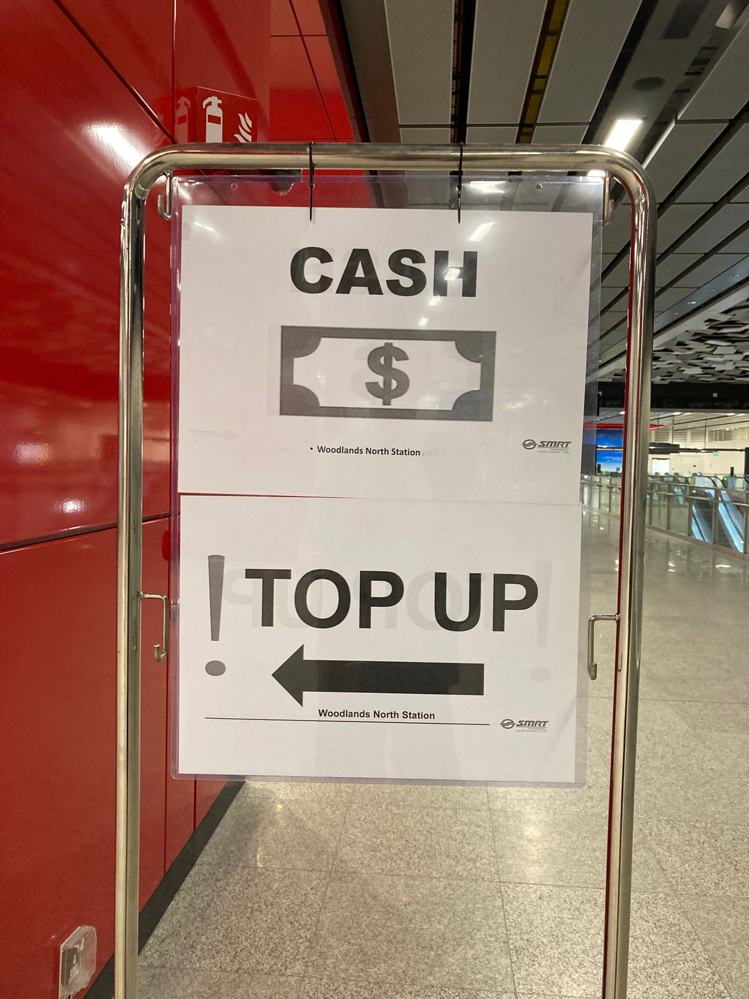
Photo courtesy of Justin Zhuang
Photo courtesy of Justin Zhuang
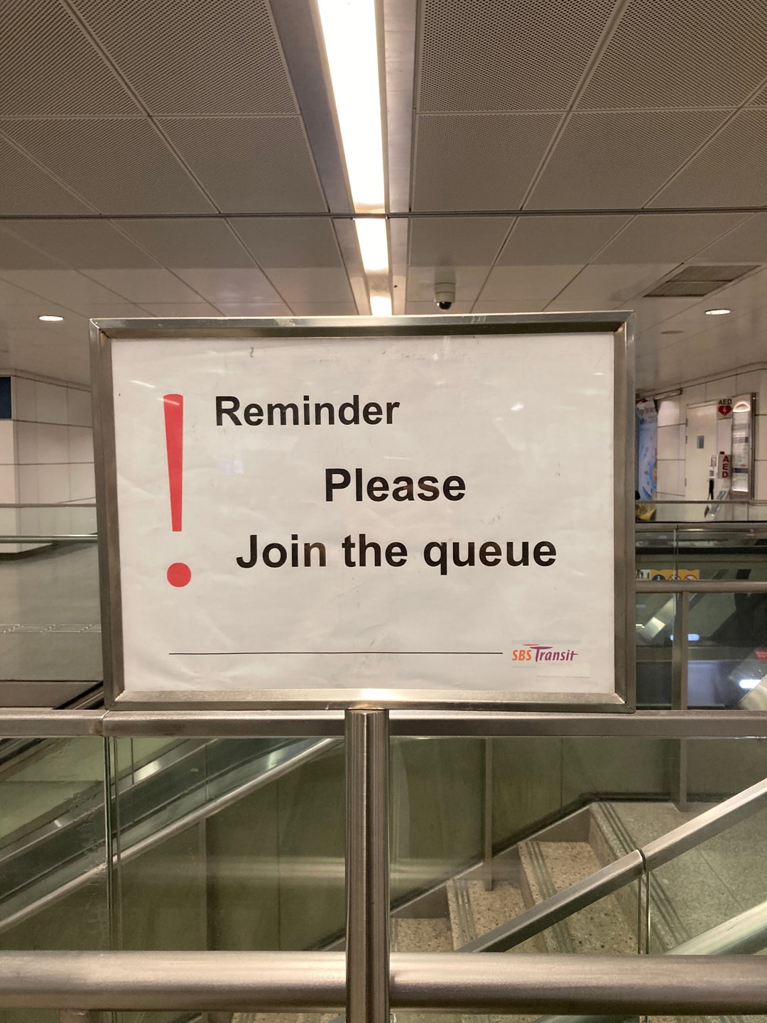
Photo courtesy of Justin Zhuang
“This paper sign is instructive of why wayfinding exists: not just to help passengers find their way but also to give them a sense of place.”
Justin Zhuang
Despite how much of an eyesore paper signs are, some do inject a human touch to train stations that can at times look clinical and feel overwhelming. At Boon Keng MRT Station, for instance, a paper sign lists nearby destinations and their respective exits in different colours and typefaces. It lacks the assurance of clear information hierarchy and consistency in style, and is no doubt kitsch. Yet, the colourful design captures the fun the station manager must have had creating it! A closer analysis also reveals an intimate knowledge of the neighbourhood. It lists long-established landmarks and even a popular bus route – which are not listed on the official maps.
This paper sign is instructive of why wayfinding exists: not just to help passengers find their way but also to give them a sense of place. Like so many wayfinding systems around the world, the one for Singapore’s MRT network sets out to create a standardised design across all its stations. Yes, this communicates clarity and even a sense of reliability of the rail network, but the persistence of paper signs perhaps echoes similar debates in the design history of wayfinding systems. Recall the initial rejections of the 1930s London Tube map by Harry Beck and the 1972 New York City subway map by Massimo Vignelli. At the heart of the debates was a sense that neither designs reflected the lived realities of passengers. What if we saw Singapore’s MRT paper signs as calling for more space for the communities of each station – including its station managers – to direct visitors through their station and neighbourhood in their own distinctive ways?
I put it to Samuel that paper signs are ultimately the simplest ways for individuals to respond to a wayfinding system that has not met their needs. In a sense, they will never fully disappear because no design can fully capture the diversity of people’s needs. “Although I hate how it looks, I can appreciate that some are quite cute and nuanced,” he says. “I just wish we had a more elegant way of doing it.”
Closer Look
Justin shares other everyday designs in Singapore that capture its distinctive cultures and have even inspired its creatives:
- Learn more about the2020 MRT wayfinding redesign by Samuel Lim.
- Check out the stories and styles behind Singapore school uniforms.
- Discover the rich typographic culture of traditional shopfront signage across Singapore that has even inspired a new typeface design, Majulah!
- Read this Science of the Secondary series by Singapore-based Atelier Hoko that uncovers the implicit conditions that exist in our experience of everyday objects.
- Design your own dementia-friendly home with Hack Care, a guide that brings together tips and tricks from caregivers of persons with dementia who have transformed everyday objects into care solutions.
Hero Header
Photo courtesy of Justin Zhuang
Share Article
Further Info
About the Author
—
Justin Zhuang is an observer of the designed world and its impact on everyday life. Since 2009, the journalism graduate has written about architecture and design for publications in Singapore and around the world, mainly focusing on its relationship with culture and society. Together with his partner Sheere Ng, they run the Singapore-based writing studio In Plain Words where they publish books using food and design as a lens to examine our world.