The Weekender: We're back, we're fat, and we're raring to go. It's time for The Weekender
Wilkommen to the new year! We’re back! We’ve actually been back for a few days now, bleary eyed and full of gravy we waddled to our desks and began tapping away, firing up the internet for another year of content. Are you excited? You should be. More importantly, this is the first of a whopping 48 Weekenders to come. Not as excited? Fair enough, it is a bit of a weird weekly tradition. We like it though.

Spectacular Tampax advert
4. A Twitter feed to celebrate the best ads ever made? Sure.
Because we like adverts, and we like to be spoon-fed. I know, I know, it’s not commendable but the new year is not about lies, it’s about honesty. And we are big, content hungry babies. open wide.
3. Pottery zoetrope, anyone?
This really is fantastic. An animated ceramic zoetrope. Nothing like a bit of craft to start the year.
2. An animation celebrating shit nights out
That’s right, it’s called Wallflowers and even has a Keith Haring cameo! Not that he’d make a night out shit, quite the opposite in fact. Enjoy!
1. Japanese illustration at its very best from Studio Takeuma
Wow. Just wow. Fantastically unique illustration combined with japanese graphic design makes for some very impressive work indeed, meet Kyoto’s Studio Takeuma.
Yep, you’re back to work. You’re poor, wet and cold and with a long expanse of grey ahead of you…But cheer up! It might never happen! We’ve put together 12 songs all with underlying themes of “new” or “return” or “back”. Apologies about the Take That, but you know what? We do want you back, and we want you for good. Put it on the office stereo and watch those frowns turn upside down.
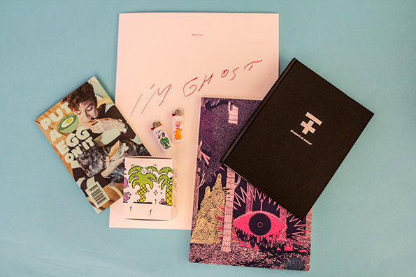
Fortunately as we were waddling bleary eyed back to our desks yesterday we were met by the postman, also waddling, albeit the fact that his strain was caused by the weight of a giant sackful of post and not by the sheer amount of food he had consumed over Christmas. Although I imagine it was a lot. We’re the winners in this situation though, because would you just look at all the stuff we’ve got for you?
Blink Magazine: Issue #30
Blink Magazine: Issue #30
Blink Magazine: Issue #30
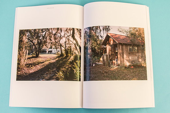
Blink Magazine: Issue #30
Blink Magazine: Issue #30
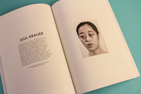
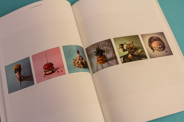
Where many other photography magazines are a bit cluttered Blink is simply designed to showcase exciting contemporary photography in its very best light. What’s more, it contains many lensmiths who’ve already graced the pages of It’s Nice That and who we’re only too happy to see again, so it can only be excellent, right?
www.blinkreflex.com
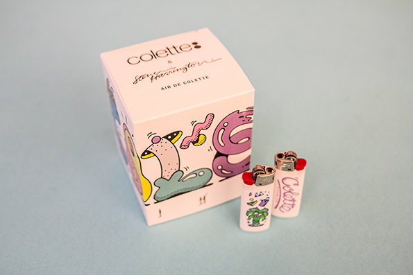
Steve Harrington for Colette: Candle and Lighters
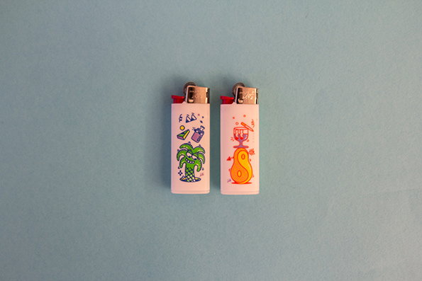
Steve Harrington for Colette: Candle and Lighters
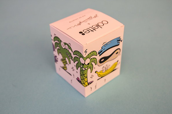
Steve Harrington for Colette: Candle and Lighters
Steve Harrington for Colette: Candle and Lighters
Steve Harrington for Colette: Candle and Lighters
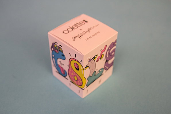
We’re longstanding fans of Steve Harrington (who isn’t?) so we were obviously chuffed this week to receive the candle and lighters he has designed for Paris’ super trendy store Colette. His trademark palm trees and wiggly shapes all all over the place, as expected, and it’s nothing short of excellent.
www.steveharrington.com
Students of Design: Collective
Students of Design: Collective
Students of Design: Collective
Students of Design: Collective
Students of Design: Collective
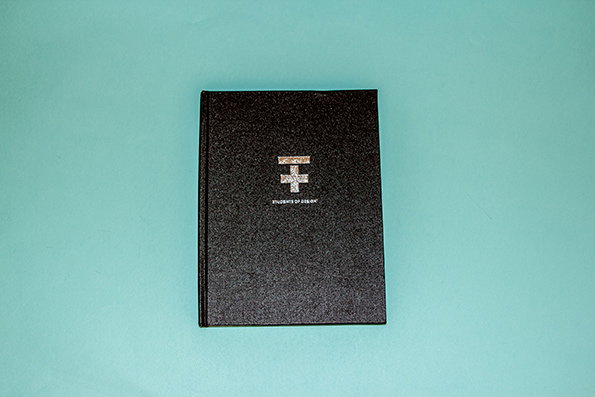
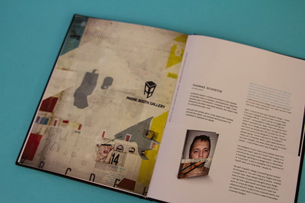
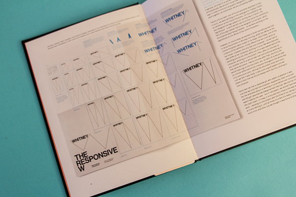
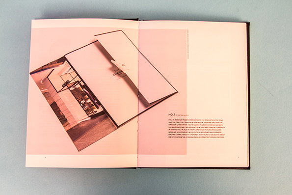
The aim is simple: to remind graduate designers and practising designers that “to forget, ignore or fail to embrace continuous learning is to misunderstand what it means to be a designer”, and in doing so, to reconnect designers with the young designers who are eager to hear their advice. What could be better than that?
www.collectivemagazine.com.au
Merijn Hos: _ I’m Ghost_
Merijn Hos: I’m Ghost
Merijn Hos: I’m Ghost
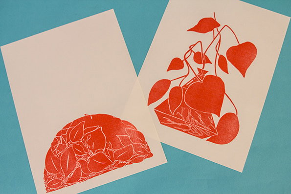
Merijn Hos: I’m Ghost
Merijn Hos: I’m Ghost
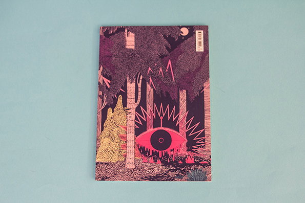
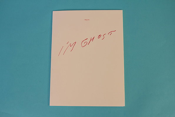
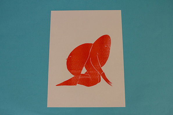
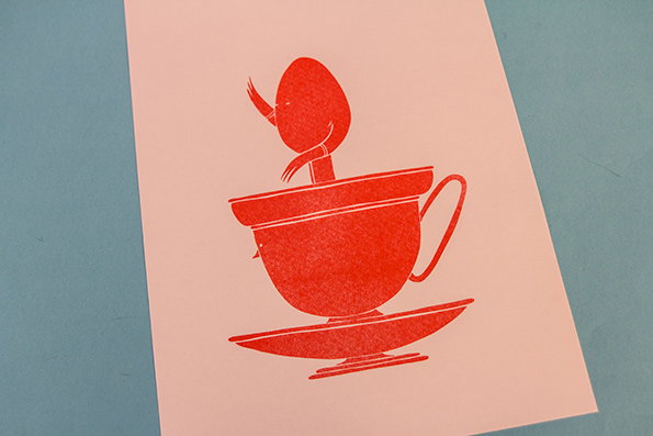
Illustrator extraordinaire Merijn Hos sent us this beautiful portfolio of riso prints entitled I’m Ghost, last week. Populated with ambiguous looking faces and strange creatures concealed in teacups and behind plants, they’re really lovely.
www.merijnhos.com
Tweet of the Week
I'd be lost without my wife. Sorry, I meant my wifi.
— James Martin (@Pundamentalism) January 1, 2014
Dogs doing selfies of the week

Scathing new year’s resolutions article of the week
It’s by Stuart Heritage (who we love) and it’s hilarious. here we are.
Tears for Fears covering Animal Collective song of the week
How is this possible? And how is it so good?
Reporter passing out mid-way through an interview of the week
Ouch!
Old David Blaine clip of the week
It’s that time he went on GMTV and showed his creepy eye hand to a bemused Eamonn Holmes. CLASSIC.
Beyonce winning all over the place AGAIN of the week
And people say she’s just a singer, this speech is INCREDIBLE
Horses taking a selfie of the week

Byeeeeeee!
Share Article
Further Info
About the Author
—
This article was written by the It’s Nice That team. To find our editors and writers, please head over to our Contact page.