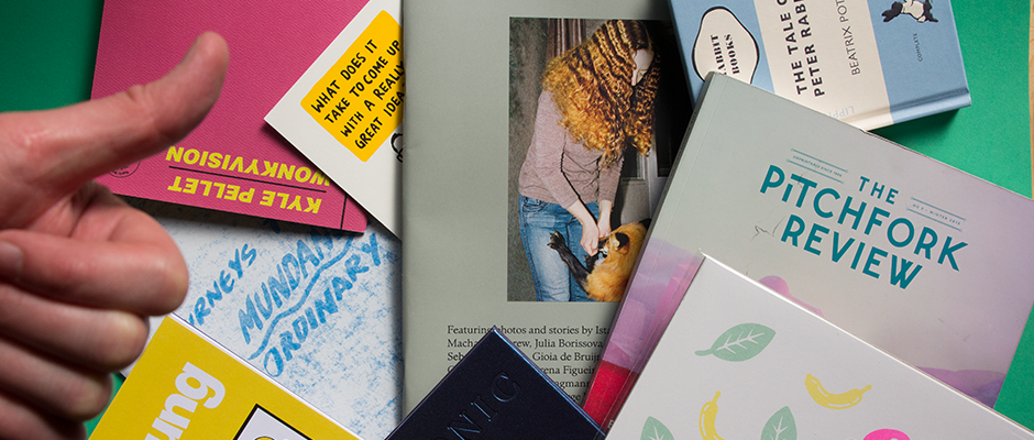
The ten best things that have arrived in the It's Nice That studio this month!
It’s been a very, very long time since I wrote a Things post, and what fun it is to delve into the box once again and pick out the best bits and bobs from the last month. This list is very publication-heavy and I apologise for that, but that’s kind of the majority of what we get sent anyway, so until people start sending us crates of cheese and wine or frisbees (anyone?) that’s just the way it is. So, without further ado here are the best gems the postman has delivered to the It’s Nice That studio this month. Enjoy!
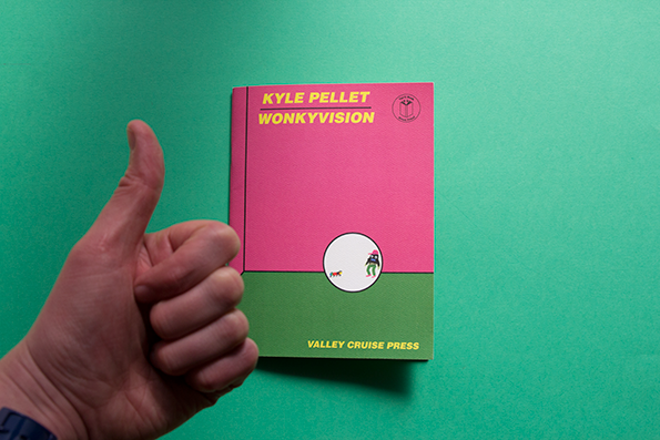
Kyle Pellet: Wonkyvision
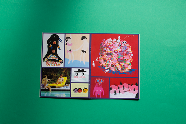
Kyle Pellet: Wonkyvision
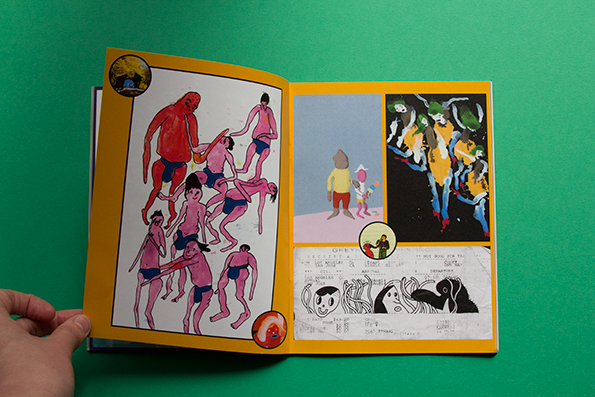
Kyle Pellet: Wonkyvision
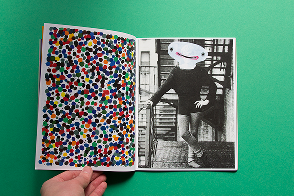
Kyle Pellet: Wonkyvision
Kyle Pellet – Wonkyvision
I love Kyle sooo much. He’s like, the only person I have not unfollowed on Facebook because he makes me laugh so much with his updates. Here’s one he posted recently: “If I were to remake the Good, the Bad and the Ugly, I’d have Tuco make Blondie eat a Doritos Loaded 4-pack in the desert torture/revenge scene. I’ve never tasted anything so salty. Jesus Christ.” Anyway, this new zine of his is spectacular. Innocence, toilet humour, colours, fun, all the stuff a good life is built from.
www.pelletfactory.com
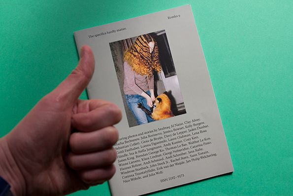
Romka 9
Romka 9
Romka 9
Romka 9
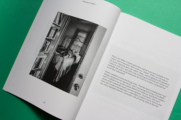
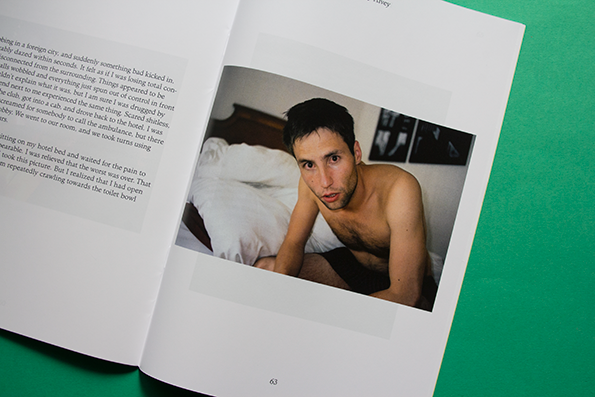
I didn’t know what this was actually, and the title suggests it’s on its ninth issue. If that is true, congratulations! The content inside is simplistic, no frills, un-soppy photographs taken by some truly impressive and up and coming photographers, with personal stories accompanying them. I love the image on the front of the girl with insanely good hair fighting with (or feeding?) a fox indoors. Anyone can ask a bunch of photographers to submit their favourite photos, but I don’t think many zines of that ilk are as good as this one.
www.romkamagazine.com
George Heaven print
George Heaven print
George Heaven print
George Heaven
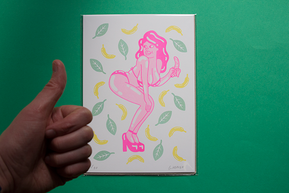
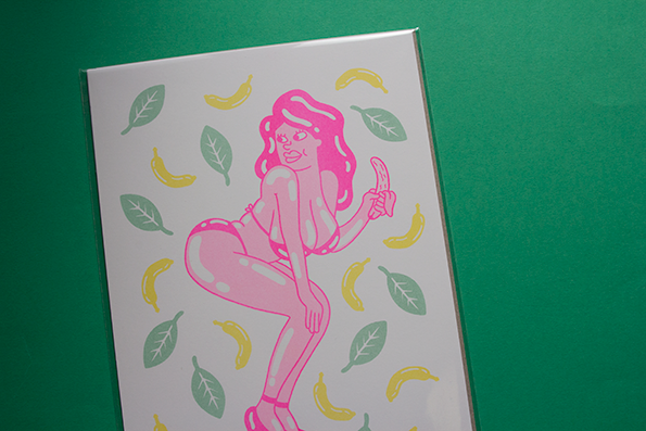
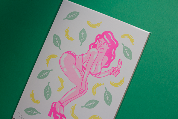
If that is his REAL name. Sorry if it is George, I’m just jealous. Are you gonna call your son Evan? I hope so. George sent in this cool print of a nice lady eating a banana. From the way she’s standing, I suppose perhaps she could have unfortunately dropped the unpeeled banana on the floor, and was just about to dust it off and bite it when someone called her name from out the back. It’s a mighty sexy cartoon, and one that I will ensure goes straight to the hands of the teenage cousin of someone in the It’s Nice That office.
www.georgeheavenillustration.blogspot.co.uk
Rebecca Storm and Scott Parsons: Specific Rim
Rebecca Storm and Scott Parsons: Specific Rim
Rebecca Storm and Scott Parsons: Specific Rim
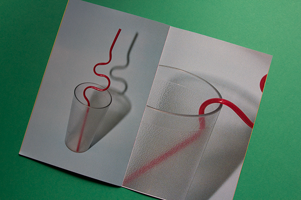
Rebecca Storm and Scott Parsons: Specific Rim
Specific Rim
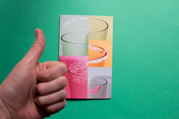
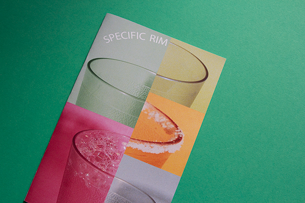
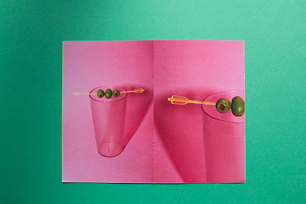
Now when I first saw this little photography zine I did have a little teeny weeny hunch that perhaps it might be something a little bit rude, but it turns out the rims they are talking about are actually just the rims on a bunch of glasses and cups! PHEW! And what lovely glasses and cups feature in this zine. Nicely shot photographs studying something that could very easily be otherwise overlooked.
www.rebecca-storm.com
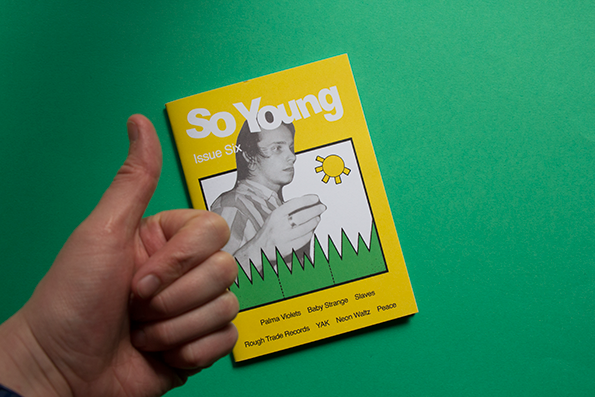
So Young Issue 6
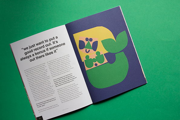
So Young Issue 6
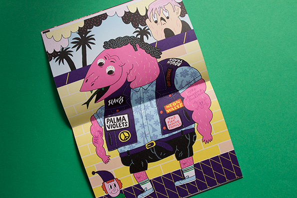
So Young Issue 6
So Young Issue 6
So Young Issue Six
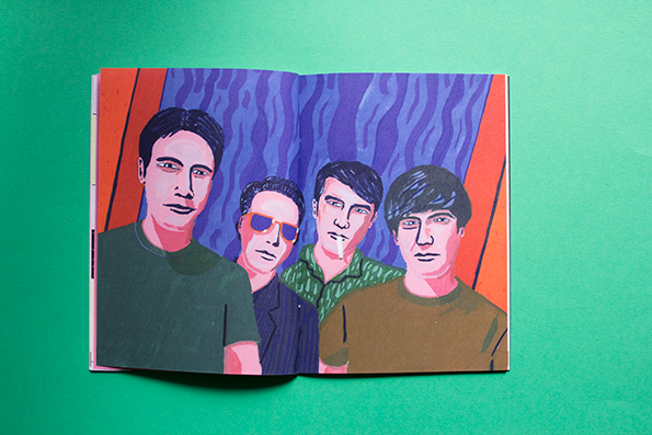
I wish I had started So Young. It’s like a super cheap and cool music zine that bands actually want to be a part of, and people (like me) genuinely look forward to seeing. This issue is full of great bands and artists like Palma Violets, Slaves and Peace and also features an interview with Rough Trade Records. It’s also got some mega good illustration from people like Adam Higton and Sac Magique. SO YOUNG, SO GOOD.
www.soyoungmagazine.com
Raj Dhunna: Journeys Through the Mundane and Ordinary
Raj Dhunna: Journeys Through the Mundane and Ordinary
Raj Dhunna: Journeys Through the Mundane and Ordinary
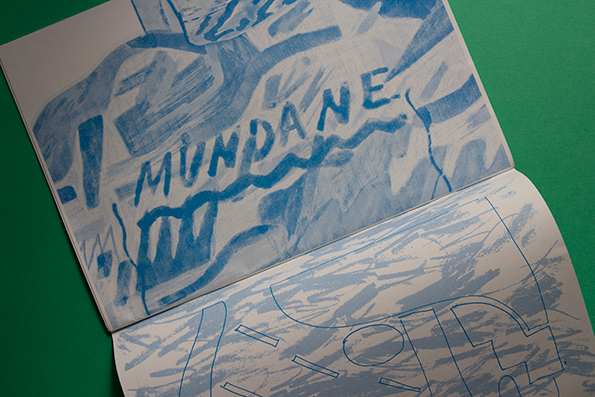
Raj Dhunna: Journeys Through the Mundane and Ordinary
Raj Dhunna: Journeys Through the Mundane and Ordinary
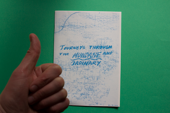
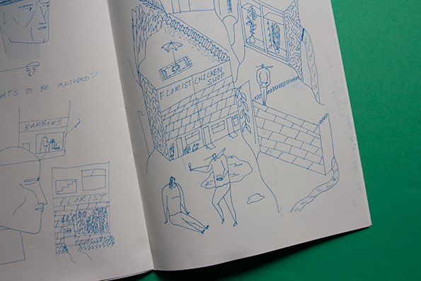
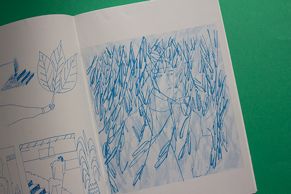
We get a lot of zines full of Riso-printed cacti through the door at It’s Nice That, sure. This zine is one of them, but totally stood out to me for some reason. I really like the title Journeys Through the Mundane and Ordinary as I can totally imagine that being the title to my autobiography. Also I really like how Raj has clearly spent a lot of time on this, and has, most importantly, really enjoyed it! I like the idea of him crouched in a shopping centre or a public park just sketching away like a weirdo.
www.rajdhunna.co.uk
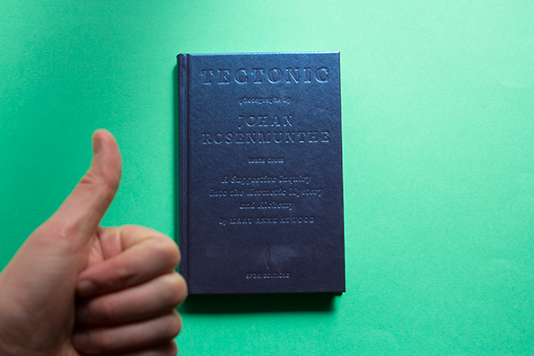
Johan Rosenmunthe: Tectonic
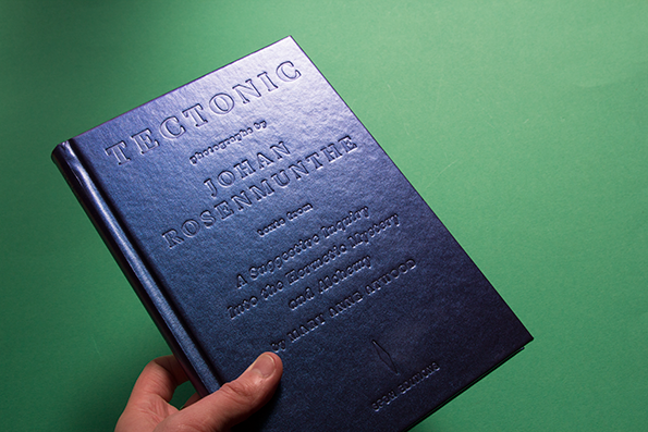
Johan Rosenmunthe: Tectonic
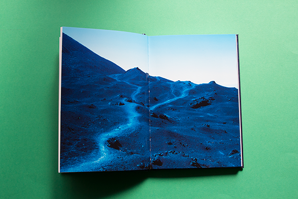
Johan Rosenmunthe: Tectonic
Johan Rosenmunthe: Tectonic
Johan Rosenmunthe: Tectonic
Johan Rosenmunthe: Tectonic
Johan Rosenmunthe: Tectonic
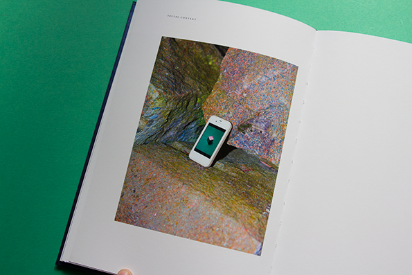
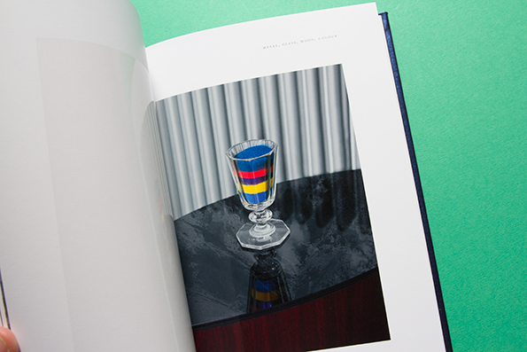
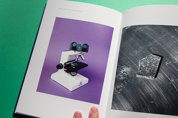
Anyone who has seen this book will understand what I say when I tell you that it is the exact same colour as the large majority of nail varnishes on offer in Claire’s Accessories during the early parts of the noughties, right? This sturdy, embossed beauty is a collection of photographs by rock-lover Johan Rosenmunthe and is a must-see for anyone who is into science and/or jaw-droppingly crisp photography. The change in paper stocks halfway through is nothing short of orgasmic. So glossy Johan, so glossy!
www.rosenmunthe.com
Beatrix Potter: The Tale of Peter Rabbit
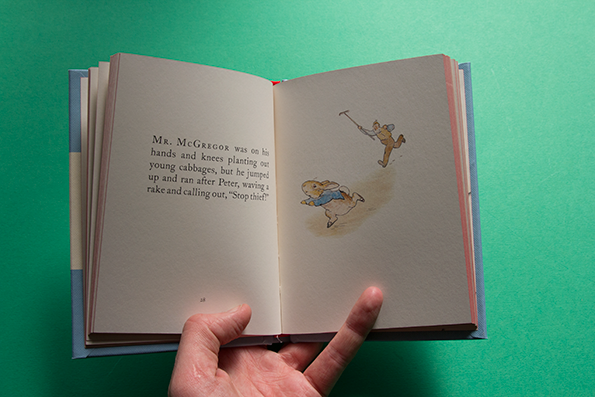
Beatrix Potter: The Tale of Peter Rabbit
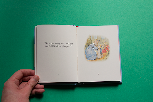
Beatrix Potter: The Tale of Peter Rabbit
Beatrix Potter: The Tale of Peter Rabbit
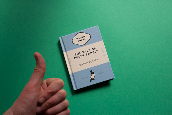
In amongst the lo-fi zines full of cartoons of people puking and swearing, this cute little book was just sitting in the Things box hoping to get picked. Well congratulations Peter, you made the cut. The reason is that this is a new edition of the Beatrix Potter shelf-staple that I hope, I pray encourages people to keep reading these books to their kids. “Once upon a time there were four little rabbits, and their names were Flopsy, Mopsy, Cotton-Tail and Peter. They lived with their mother in a sand-bank, underneath the root of a very big fig tree.” How nice is that?
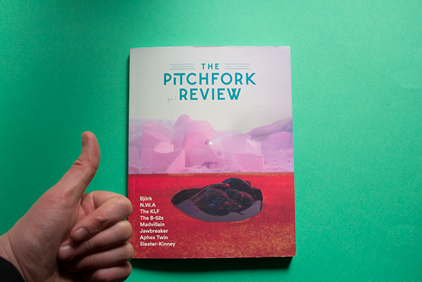
The Pitchfork Review No.5
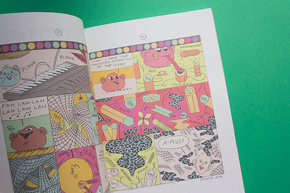
The Pitchfork Review No.5
The Pitchfork Review No.5
The Pitchfork Review No.5
The Pitchfork Review No.5
The Pitchfork Review No.5
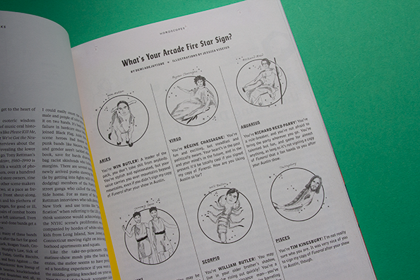
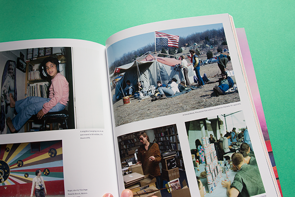
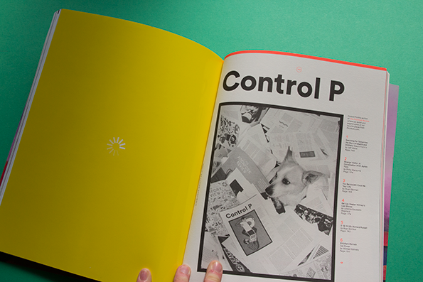
Have you ever read this magazine? If not, why? It’s one of the only publications out there on the racks that is genuinely funny, and I’d go as far as saying that it’s the best music magazine in the world. Rather than dwelling on news like a lot of other mags, The Pitchfork Review delves into the past, present and future to tell the most fascinating stories about music-makers and cultural history. The illustrators they commission to bring these articles to life, and the time they spend on getting the cover just right is phenomenal. Also there’s a whole section of their online articles printed towards the back called “Control P," and they’ve printed a loading wheel on the spine. Basically the visual equivalent of a dark nod to the internet as they canter off on a horse into the desert.
www.thepitchforkreview.com
Christoph Niemann
Christoph Niemann postcard
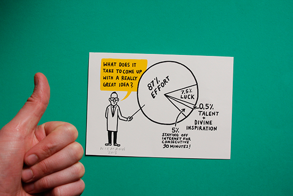
This didn’t really get sent in as such, but Christoph gave it to me last week and I thought other people might enjoy it too. Christoph is always deliberating over the creative process and the more philosophical side of cartoon-making and illustration. When he found himself being bombarded with emails from people asking him to explain what he does, and give some sage advice, he decided to draw his response. This is it.
www.christophniemann.com
Share Article
Further Info
About the Author
—
Liv joined It’s Nice That as an intern in 2011 and worked across online, print and events, and was latterly Features Editor before leaving in May 2015.