Launch Recite Me assistive technology
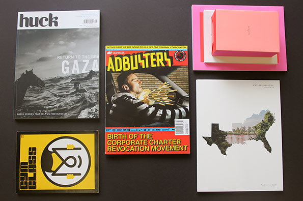
A collection of magazines and a pink box laid out on a dark surface. The covers include Huck with the headline “RETURN TO THE SEA GAZA” and Adbusters featuring the text “BIRTH OF THE CORPORATE CHARTER REVOCATION MOVEMENT”.

A Things almost entirely dedicated to scintillating magazines

—
Date
19 September 2014

Quite frankly, I’ve gone mad for mags this week. Once you delve into the world of independent magazines, you realise there are more on offer than your commute could ever possibly be long enough give you time to read them all. Those cherry-picked by yours truly this week explore documentary photography and the photo-essay, (Huck and Aint-Bad ), cruel corporations (Adbusters ) and independent magazines themselves (Gym Class). For a dash of variation and because it was simply too lovely to leave out, a box of charming notebooks printed by French studio L’imprimerie du Marais for your visual delectation.
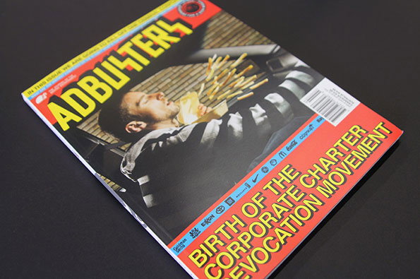
The cover of Adbusters magazine features a person lying back with a box of chips spilling over their chest. Bold yellow text reads “Adbusters” at the top and “Birth of the Corporate Charter Revocation Movement” at the bottom.
Above

Adbuster: Issue #114

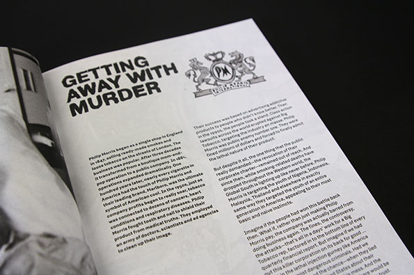
An open book shows a page with the bold headline “GETTING AWAY WITH MURDER”. Below the text is a crest featuring two lions and the Philip Morris logo.
Above

Adbuster: Issue #114

An open book shows a vintage-style double-page spread. On the left, a person in a white bikini smiles as a hand offers them a bottle of Coca-Cola under the word “Yes”. The right page features a red car and a large Coca-Cola logo beside a block of text.
Above

Adbuster: Issue #114

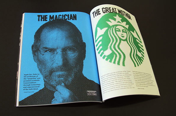
An open book shows two facing pages. The left page features a blue-toned portrait of Steve Jobs under the heading “THE MAGICIAN”, while the right page shows the Starbucks logo under the heading “THE GREAT MOTHER”.
Above

Adbuster: Issue #114

Adbuster: Issue #114
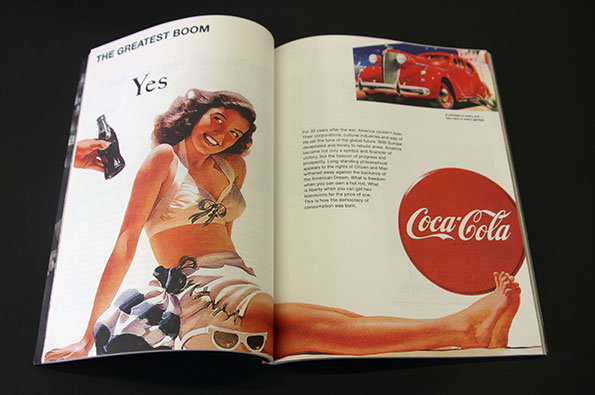
For this issue of the iconic activist magazine, team Adbuster have taken on the big bad boys: the corporations. Titled Birth of the Corporate Charter Revocation Movement, it’s a history lesson in how corporations came into being, from the East India Company to Standard Oil, Coca Cola to Apple, a survey of the dirtiest companies of them all and a deconstruction of their charters. Self-consciously anarchist and informative, it also features some good old “subvertisements” and is a joyous rallying call for those of us who are about as likely to choose to work for (or be wilfully employed by) General Motors or Goldman Sachs as the panda in Edinburgh zoo is to give birth.
www.adbusters.org
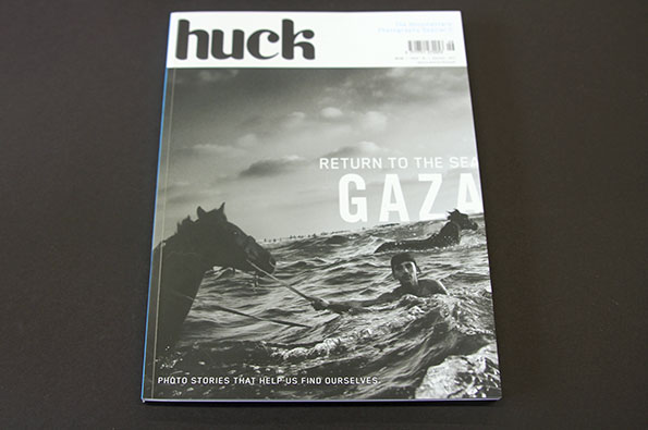
The cover of Huck magazine features a black and white photograph of a person swimming in the sea with two horses. Bold text reads “RETURN TO THE SEA” above the word “GAZA”.
Above

Huck: Issue #46

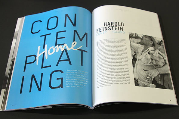
An open magazine shows a bright blue page with the word “CONTEMPLATING” in large, black block capitals. The word “Home” is written across the centre in a white, cursive script. The opposite page features a profile of Harold Feinstein and a black and white photograph of a person.
Above

Huck: Issue #46

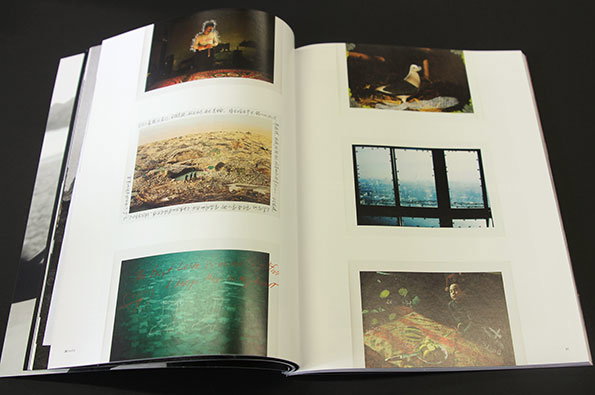
An open book displays a series of photographs across two white pages. The images include a person in a dark room, a rocky landscape, a bird, a view through a window, and a still life.
Above

Huck: Issue #46

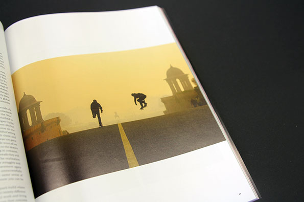
An open book shows a photograph of two people skateboarding across a wide, paved area. They are silhouetted against a hazy yellow sky, with traditional domed architecture in the background.
Above

Huck: Issue #46

Huck: Issue #46

As for team Huck, they’ve put on a documentary photography special for this edition. In an age in which photographs whiz about the internet with dizzying speed and media agencies scrabble to post the most eye-catching, clickable images, Huck wonders whether we’re really “getting the full picture”. A series of visual essays follow, exploring British subculture and small towns, Australian social work and skateboarding, voyaging from Ukraine to Swaziland. Objectivity is weighed up against subjectivity and the photographer’s story is given its own space alongside the pictures.
www.huckmagazine.com
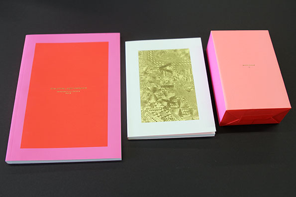
A pink and red book sits beside a white booklet and a matching red box. The booklet features a gold foil abstract pattern, while the book has a red central panel with small, illegible gold text.
Above

L’imprimerie du Marais: Notebook II

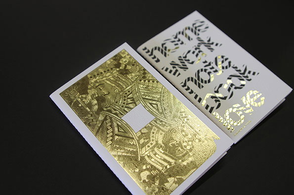
An open booklet on a black background. One page features a gold foil illustration of a figure in ornate dress, while the opposite page shows the word “love” repeated in a stylised, gold foil typeface.
Above

L’imprimerie du Marais: Notebook II

Two white booklets lie side by side on a black surface. One features a gold foil illustration of a mechanical engine, while the other shows a geometric composition of red, black and gold shapes.
Above

L’imprimerie du Marais: Notebook II

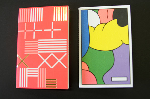
Two notebooks lie side by side on a black surface. One has a red cover with white and gold geometric patterns, while the other features a colourful abstract illustration.
Above

L’imprimerie du Marais: Notebook II

L’imprimerie du Marais: Notebook II
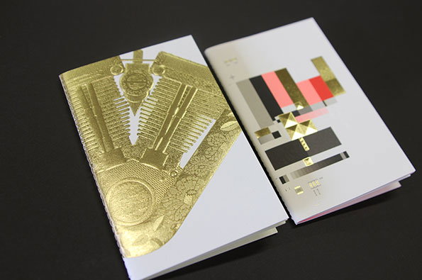
Taking a break from magazines, we have some divine notebooks produced and printed by French studio L’imprimerie du Marais. Working with eight design studios – including Anagrama, Homework and Partel Oliva – they’ve created a beautiful box full of amazingly textured, tiny notebooks. A delight to run your hands over, some are intricately embossed in gold, whilst others have a brighter palette complementing the pink and purple of the box itself. Inside the stitched cover, the delicate geometric designs continue. A true indulgence in stationery fetishism.
www.imprimeriedumarais.fr
www.thenotebook2project.com
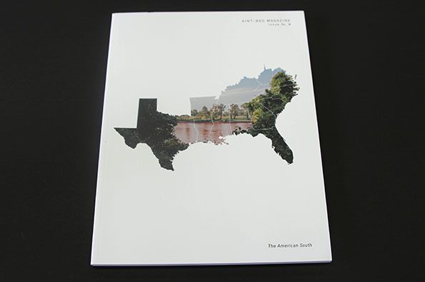
The white cover of a magazine features a map of the southern US. The map is filled with a landscape photo of a river and green trees. Small text at the top reads “Aint-Bad Magazine Issue No. 8” and the bottom reads “The American South”.
Above

Aint-Bad Magazine: Issue #8

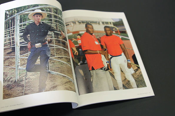
An open book shows two photographs. On the left, a person in a cowboy hat and denim leans against a metal fence. On the right, two people in bright orange T-shirts stand together outdoors.
Above

Aint-Bad Magazine: Issue #8

An open book shows a photograph of a grassy yard with orange and white caution tape strung between trees and buildings. Below the image, a block of text provides a biography of artist Sophie Luvoff.
Above

Aint-Bad Magazine: Issue #8

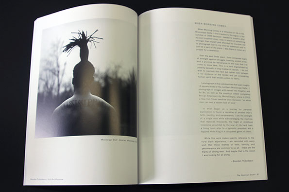
An open book shows a black and white photograph of a person from behind, wearing a tall, spiky headpiece. The opposite page contains a column of text under the heading “WHEN MORNING COMES”.
Above

Aint-Bad Magazine: Issue #8

Aint-Bad Magazine: Issue #8
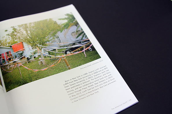
We’ve raved about how Aint-Bad is, in fact, rather great, before. For this issue, it sticks close to home, looking at the changing face of the American South from its base in Savannah, Georgia. How do images of the South define it? And how close are they to the truth? Focusing on large spreads of glossy photographs, the magazine showcases the work of several local photographers as they document areas of American life which seem so iconic as to be cemented in an unalterable identity; cowboys, football, rodeos, Elvis memorabilia.
www.aintbadmagazine.com
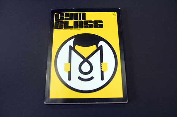
A yellow zine cover features a bold black logo and the title “Gym Class”. Below the title, smaller text reads “A zine for the guys chosen last”.
Above

Gym Class: Issue #11

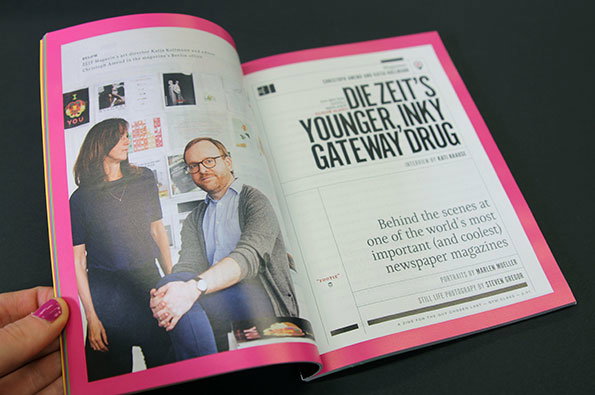
An open magazine shows a double-page spread with a bright pink border. On the right, a bold headline reads “Die Zeit’s younger, inky gateway drug”. On the left, two people sit in an office in front of a wall covered in sketches and references.
Above

Gym Class: Issue #11

An open book with bright pink edges shows a page of text and a photograph of a magazine cover. The cover is for “The New Yorker” and features an illustration of a house and garden.
Above

Gym Class: Issue #11

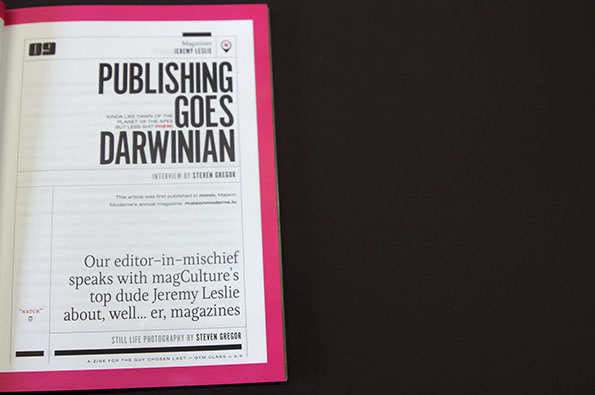
An open magazine page with a bold headline that reads “PUBLISHING GOES DARWINIAN”. Below, a short introductory paragraph mentions an interview with Jeremy Leslie about magazines.
Above

Gym Class: Issue #11

Gym Class: Issue #11
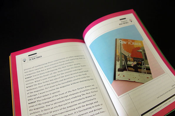
“Editor-in-mischief” Steven Gregor has collated interviews written for a variety of other publications with influential names in the magazine world – like Jeremy Leslie and Gert Jonkers and Jop Van Bonnekom – with equally fascinating articles produced for this zine. The editors of Zeit Magazin talk through the ethos and the evolution of one of the world’s most successful newspaper mags, the New Yorker‘s creative director explains how he went about the delicate issue of redesigning such a well-loved cultural cornerstone, and Steven looks back on 70 issues of Monocle. “A zine for the guy chosen last”, it’s also a zine for the lover of all things magazine.
www.gymclassmag.bigcartel.com

Share Article

Further Info

About the Author

Amy Lewin

—

It's Nice That Newsletters

Fancy a bit of It's Nice That in your inbox? Sign up to our newsletters and we'll keep you in the loop with everything good going on in the creative world.