Launch Recite Me assistive technology
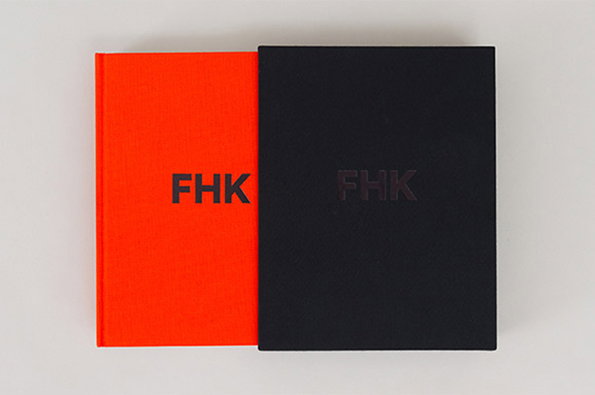
Two hardcover books lie side by side on a plain white surface. One is bright orange and the other is black, both featuring the letters “FHK” on the cover.

Publication: Next Unit Editions book celebrates unique brilliance of FHK Henrion

—
Date
1 October 2013

It seems fitting that graphic designer FHK Henrion was born in 1914, the same year that war broke out between the two countries that would come to define his life. The German born creative moved to the UK in 1936 after a stint as a textile designer in Paris and initially found commercial success as a poster artist, but he also excelled in product, exhibition, publication, jewellery and interior design.

Not only did he design two pavilions for the Festival of Britain, but from the 1960s onwards he became one of the foremost corporate identity designers working for clients like the National Theatre, the Post Office and KLM airways.

It’s not surprising then that Unit Editions are dedicating their next publication to celebrating the man who as they put it, " has no equal in British graphic design history. No UK designer – then or now – can match his sheer depth of accomplishments and range of abilities."

It’s no surprise to see that Adrian Shaughnessy and Tony Brook have done a predictably brilliant job with the design, showcasing Henrion’s brilliance but stamping their own unerring aesthetic sensibilities on the title too. We need this in our lives, roll on November.
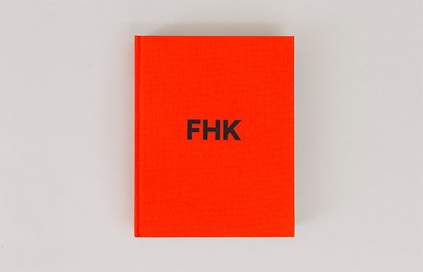
A bright orange book lies flat against a plain white background. The letters “FHK” are printed in bold black type in the centre of the cover.
Above

Unit Editions: FHK Henrion

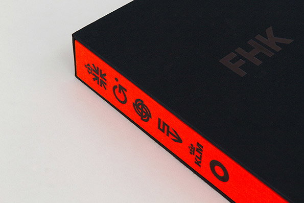
A black book with a bright red spine. The cover features the letters “FHK” in a subtle dark gloss, while the spine displays a row of black graphic symbols and the “Klm” logo.
Above

Unit Editions: FHK Henrion

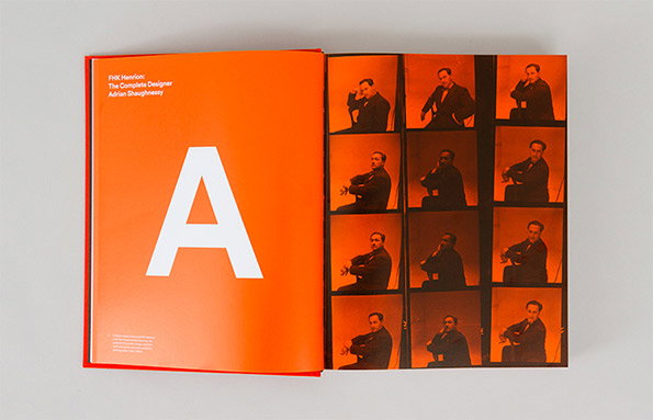
An open book with a bright orange double-page spread. The left page features a large white “A” and the text “FHK Henrion: The Complete Designer Adrian Shaughnessy”. The right page shows a grid of 12 photographs of a person in a dark suit against an orange background.
Above

Unit Editions: FHK Henrion

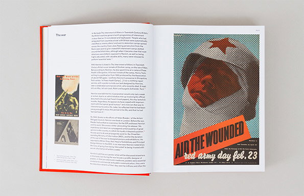
An open book shows a double-page spread. The right page features a large, halftone portrait of a person wearing a red star hat, above a bold red and blue graphic that reads “AID THE WOUNDED” and “red army day feb. 23”.
Above

Unit Editions: FHK Henrion

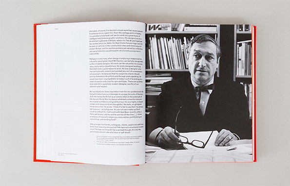
An open book featuring a black and white portrait of a person wearing a bowtie and glasses. The opposite page contains several paragraphs of printed text.
Above

Unit Editions: FHK Henrion

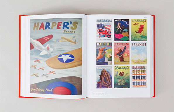
An open book shows a collection of Harper’s Bazaar covers. The left page features a large cover illustration of planes in flight, with the title “HARPER’S Bazaar” at the top. The right page displays a grid of nine smaller, varied cover designs.
Above

Unit Editions: FHK Henrion

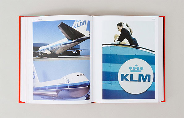
An open book shows a series of photographs for the airline Klm. One page features two views of a plane, while the opposite page shows a person standing behind a blue barrier with the “KLM” logo.
Above

Unit Editions: FHK Henrion

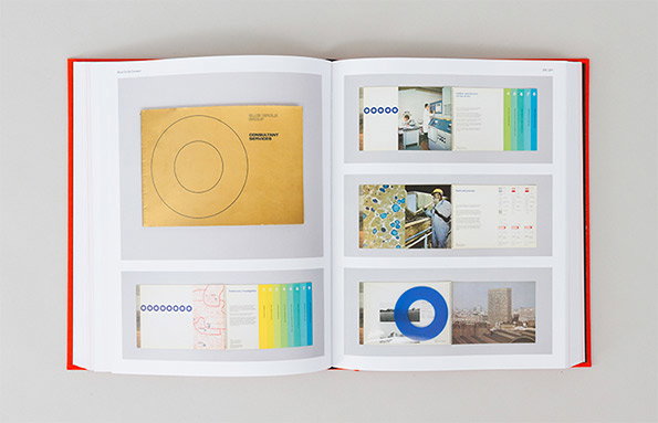
An open book displays a collection of graphic design work. The pages show various layouts featuring gold foil, blue circular motifs and a gradient of colours.
Above

Unit Editions: FHK Henrion

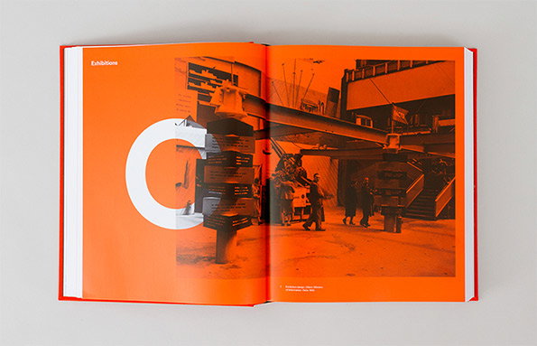
An open book with bright orange pages. A large white letter “C” is laid over a photograph of people walking beneath a heavy industrial structure.
Above

Unit Editions: FHK Henrion

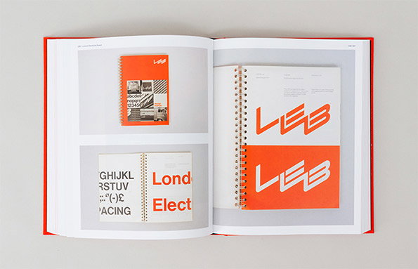
An open book displays a series of orange and white brand guidelines. The pages show spiral-bound notebooks featuring a bold, slanted logotype that reads “LEB” and samples of a sans-serif typeface.
Above

Unit Editions: FHK Henrion

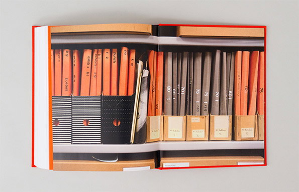
An open book shows a photograph of an archive of orange and grey folders. The folders are stored in rows on a shelf, some held in black and white striped boxes.
Above

Unit Editions: FHK Henrion

Share Article

About the Author

Rob Alderson

—

Rob Alderson is a freelance writer, editor and strategist. He was previously editor-in-chief of It’s Nice That and WePresent, and editor of Design Week. He publishes the newsletter Undo, which tries to make sense of how AI is changing design work, the design process and the design industry.
It's Nice That Newsletters

Fancy a bit of It's Nice That in your inbox? Sign up to our newsletters and we'll keep you in the loop with everything good going on in the creative world.