Launch Recite Me assistive technology
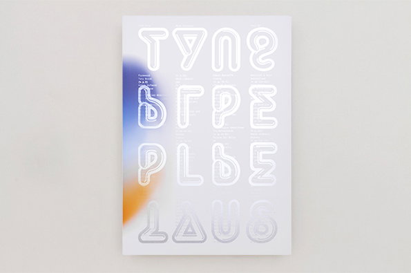
A typographic poster featuring large, rounded white letters arranged in a grid. A soft, blurred gradient of blue and orange glows behind the left side of the composition.

New Unit Editions offering explores combined power of text and imagery

—
Date
22 July 2014

One day news might reach us of a Unit Editions publication that doesn’t knock our socks off but to paraphrase Gladiator “not yet…not yet.” Type Plus is the latest title from Adrian Shaughnessy and Tony Brook’s imprint and it sets out “to investigate the practice of combining typography with images to increase effectiveness, potency and visual impact.”

The editors believe this practice of partnering type and graphic elements – which is particularly prevalent in the contemporary design climate – can “turbo-charge meaning and impact…The era of type as a passive, semi-invisible holder of meaning is long gone.”

As ever Unit’s team draws on its unparalleled breadth of reference to support the book’s thesis, and there’s work to enjoy from the likes of Kevin Chao and Paula Scher plus studios like Hoax and Ilg/Trüb Grafik. There’s also interviews with Non-Format, TwoPoints.Net and Erik Brandt as well as an introductory essay from leading design critic Yves Peters.

While we’re here it would be remiss not to mention that Spin – Tony Brook’s studio and designers of all the Unit Editions oeuvre – have just unveiled a tremendous new website, a sleek black affair which showcases their work brilliantly.
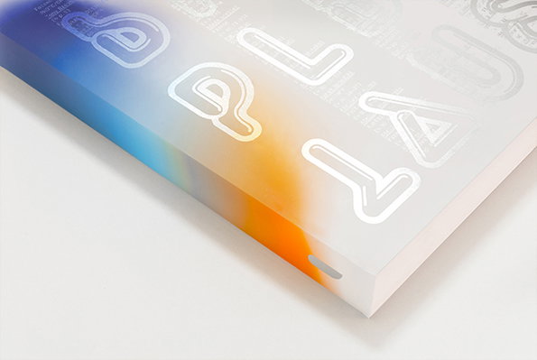
A close-up, angled view of a printed publication. The cover features a soft blue and orange gradient with glossy, 3D-style white lettering and small blocks of text.
Above

Unit Editions: Type Plus

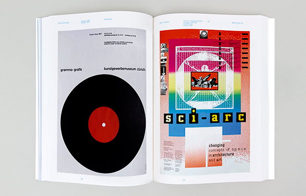
An open book showing two pages of graphic design. The left page features a black vinyl record with a red centre on a grey background, titled “grammo-grafik”. The right page is a colourful poster for “sci-arc” with a geometric illustration and the text “changing concepts of space in architecture and art”.
Above

Unit Editions: Type Plus (Gottlieb Soland: Grammo-grafik Poster, 1957, and April Greiman: SCI-Arc, Changing Concepts of Space in Art and Architecture Poster, 1986)
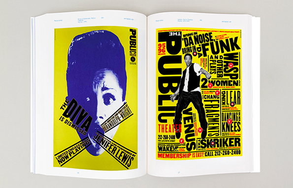
An open book displays two bold, yellow posters. The left page shows a high-contrast purple portrait of a person with a beehive hairstyle and the text “The Diva is Dismissed” and “Jennifer Lewis”. The right page features a person standing amidst a collage of fragmented, black typographic elements that read “The Public Theater”.
Above

Unit Editions: Type Plus (Paula Scher: Diva is Dismissed Public Theatre Poster, 1994, and Season Public Theatre Poster, 1994–1995)
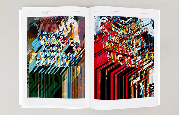
An open book displays two pages of abstract, layered digital collage. The left page features fragmented text including “WAKE UP” and “YOUR FAMILY”, while the right page shows a red and black composition with the words “MOTHERFUCKER”.
Above

Unit Editions: Type Plus (Kevin Chao: Steven Soderbergh’s Traffic Movie Posters, 2013)
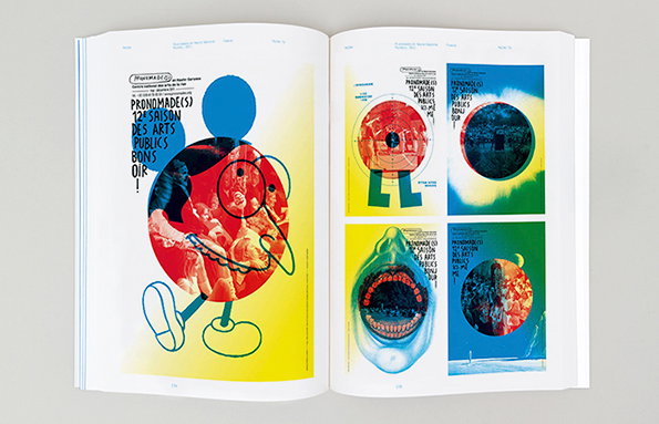
An open book shows a series of colourful, experimental posters. The left page features a large, abstract character with a red face and blue shoes, alongside the text “Pronmade(s) 12e saison des arts publics bons soir!”.
Above

Unit Editions: Type Plus (Helmo: Pronomades en Haute-Garonne Posters, 2011)
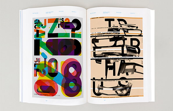
An open book displays two pages of bold, experimental graphic design. The left page features overlapping, colourful typographic shapes, while the right page combines black lettering with fragmented images of a car.
Above

Unit Editions: Type Plus (Ilg/Trüb Grafik: Langnau Jazz Nights Poster, 2008, and Treibhaus Luzern Poster, 2013)
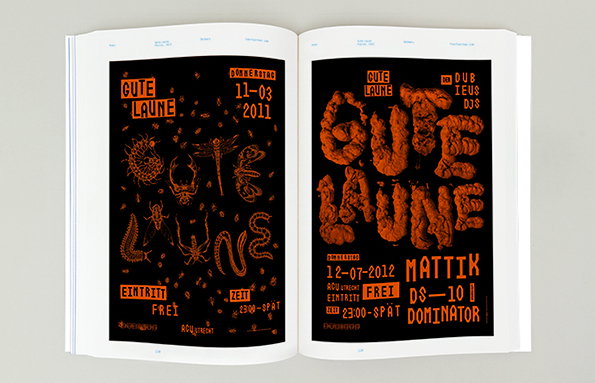
An open book shows two black and orange event posters. Both feature the words “Gute Laune” in a distorted, organic style, alongside dates and event details.
Above

Unit Editions: Type Plus (Hoax: Gute Laune Poster, 2011, and Gute Laune Poster, 2012)
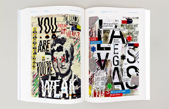
An open book showing two pages of mixed-media collage. The left page features a black and white portrait of a person with the words “YOU ARE WEAK” layered over the image. The right page is a typographic composition with the words “LAS VEGAS” and “Sweet Dreams” repeated in various styles.
Above

Unit Editions: Type Plus (Marcos Faunner: The Closer Poster, 2013, and Las Vegas, Show Us Your Type Poster, 2014)
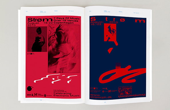
An open book shows two red and blue posters for a music festival. The left page reads “Strøm August 2010” and “Celebrating Electronic Music”, while the right page features a red abstract shape on a dark blue background.
Above

Unit Editions: Type Plus (Hort: Strøm Posters, 2010)
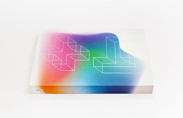
A white rectangular box features a blurred gradient of pink, orange, green and blue. Two white 3D wireframe shapes, resembling a plus sign and a letter “T”, are laid over the colours.
Above

Unit Editions: Type Plus

Share Article

About the Author

Rob Alderson

—

Rob Alderson is a freelance writer, editor and strategist. He was previously editor-in-chief of It’s Nice That and WePresent, and editor of Design Week. He publishes the newsletter Undo, which tries to make sense of how AI is changing design work, the design process and the design industry.

It's Nice That Newsletters

Fancy a bit of It's Nice That in your inbox? Sign up to our newsletters and we'll keep you in the loop with everything good going on in the creative world.