Launch Recite Me assistive technology
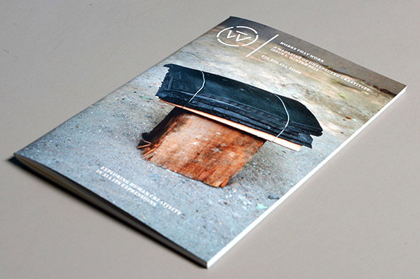
A magazine lies flat on a grey surface. The cover features a photo of a weathered wooden plank and a black object tied with string, with the text “Works that work” and “Exploring human creativity in all its expressions”.

New magazine Works That Work aims to demonstrate that creativity is all around us

—
Date
18 February 2013

It’s always exciting to see a new magazine, particularly one whose mission is so closely aligned to our own cherished creativity championing mantra. Peter Biľak of the Typotheque type foundry secured an amazing €30,000 via crowd funding for Works That Work, a new title “dedicated to exploring various manifestations of human creativity.” Peter explains: “One of the fundamental assertions of Works That Work is that creativity is not the exclusive domain of artists or designers, but something that surrounds us in our daily lives, something so embedded in our everyday experience that it often escapes our attention.”

And staying true to those ideals the first issue of the bi-annual includes pieces on refugee camp gardens, army chefs and improvised furniture plus essays on design and a one act play from David Ives. It’s a great looking thing as well so kudos all round and welcome to the world Works That Work – it’s great to have you here.
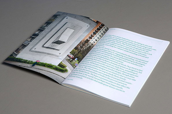
An open magazine shows a photograph of a light switch on a grey wall. The opposite page contains a block of introductory text.
Above

Peter Biľak: Works That Work – Issue One
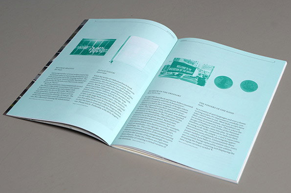
An open book with light blue pages. The spread features a mix of images and columns of text under headings including “Museum of the Ordinary” and “The Fingers of One Hand”.
Above

Peter Biľak: Works That Work – Issue One
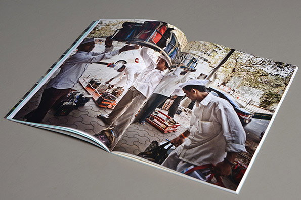
An open book displays a photograph of several people in white uniforms and caps working outdoors. They are moving crates and equipment across a paved area next to a street.
Above

Peter Biľak: Works That Work – Issue One
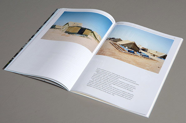
An open book displays two photographs of a desert camp with beige tents and blue tarpaulins. A block of text on the right page describes the camp’s history and the people living there.
Above

Peter Biľak: Works That Work – Issue One
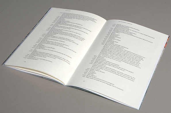
An open book lies flat on a grey surface, showing two pages of dense text. The layout resembles a script or a dialogue, with short lines of text preceded by names.
Above

Peter Biľak: Works That Work – Issue One
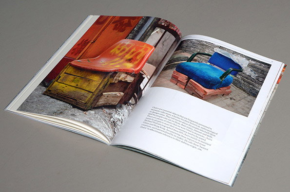
An open book displays two photographs of improvised seating. On the left, a red plastic seat rests on a weathered yellow wooden crate, while the right shows a blue cushioned seat on a brick base.
Above

Peter Biľak: Works That Work – Issue One
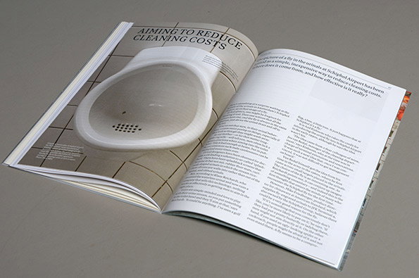
An open magazine displays a large photograph of a white urinal with a fly etched into the ceramic. The headline reads “AIMING TO REDUCE CLEANING COSTS”, followed by an article about Schiphol Airport.
Above

Peter Biľak: Works That Work – Issue One
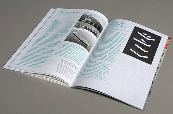
An open book displays a spread titled “British Respect”. The pages feature columns of text alongside black and white photographs and a bold graphic of white abstract shapes on a black background.
Above

Peter Biľak: Works That Work – Issue One
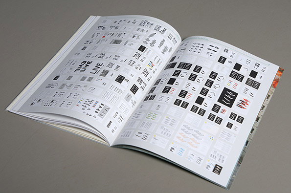
An open book displays pages filled with grids of small, black typographic symbols and abstract shapes. Some sections feature repeated words, including “LIVE” and “EVIL”, arranged in various experimental layouts.
Above

Peter Biľak: Works That Work – Issue One

Share Article

About the Author

Rob Alderson

—

Rob Alderson is a freelance writer, editor and strategist. He was previously editor-in-chief of It’s Nice That and WePresent, and editor of Design Week. He publishes the newsletter Undo, which tries to make sense of how AI is changing design work, the design process and the design industry.
It's Nice That Newsletters

Fancy a bit of It's Nice That in your inbox? Sign up to our newsletters and we'll keep you in the loop with everything good going on in the creative world.