Xiaoyuan Gao sources inspiration for her typefaces from expiration dates, clock faces and stamps on eggs
The Chinese designer started notyourtype foundry when she realised “it’s much more interesting when I set my own rules instead of following others”.
At the beginning of her graphic design journey, Xiaoyuan Gao wasn’t too interested in type design. What eventually sparked her interest was the realisation that “it’s much more interesting when I set my own rules instead of following others”. From this point onward, Xiaoyuan began to uncover the “joy” of immersing herself in the “countless possibilities” that experimenting with letters presented. Xiaoyuan was born and raised in a small village in northeast China, and after completing her BA in visual communication design, moved to the Netherlands to study graphic design at ArtEZ Arnhem. In 2021 she started notyourtype foundry, and for the past two years Xiaoyuan has been embarking on the slow, yet fulfilling process of involving other people’s designs in her platform.
Despite working predominantly with the Latin language, Xiaoyuan brings elements of Chinese language into her type designs, such as specific writing and thinking patterns. She also likes to enhance the experimental element of her designs, seeking out the type and numbers we see everyday and take for granted, like those on the expiration dates of food, and clock faces and even stamps on eggshells. As a basis for inspiration, Xiaoyuan also keeps a massive library of images, those which she sources by searching the object keywords that randomly come into her head in Google or Pinterest. This process of magpie-like collection of imagery and inspiration has resulted in a type foundry fit to burst with typefaces full of spirit and offbeat charm, like commonSans, which looks like if Comic Sans and an edgy, experimental typeface had a baby.
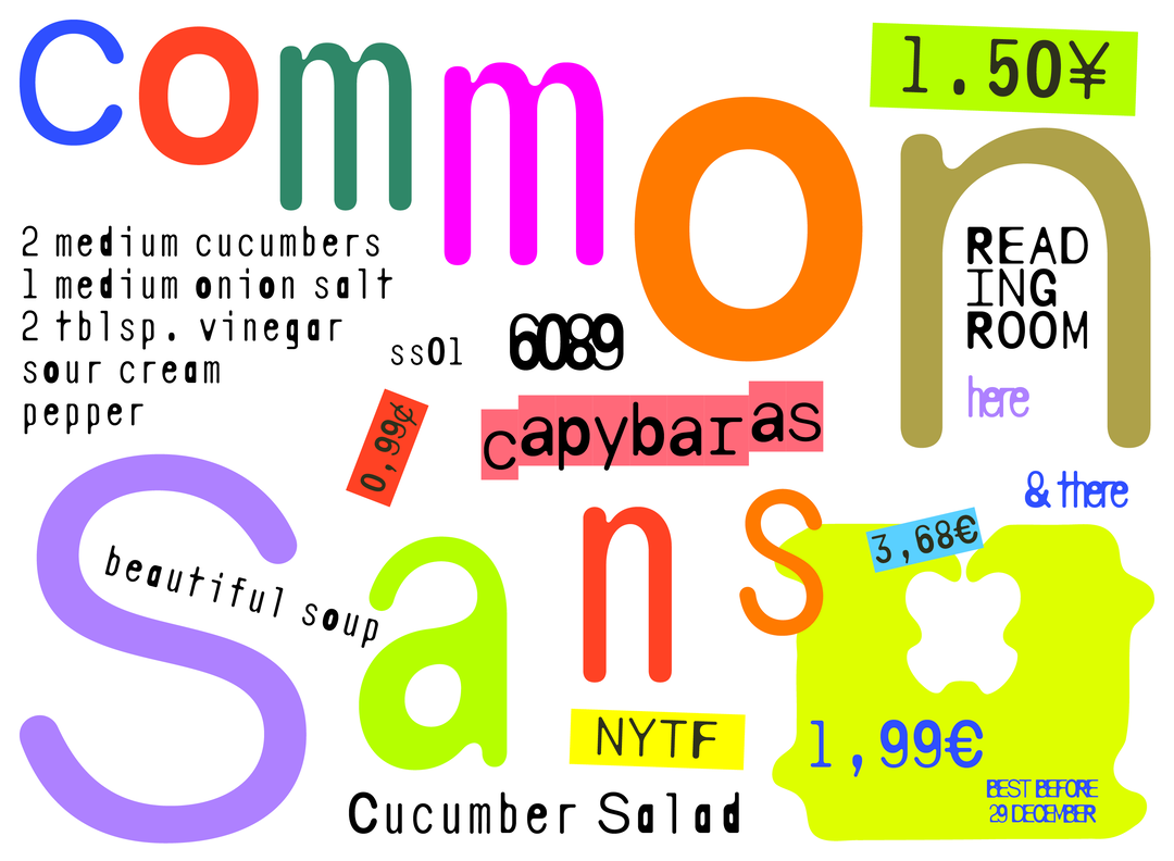
notyourtypefoundry: commonSans (Copyright © Xiaoyuan Gao / notyourtype foundry, 2024)
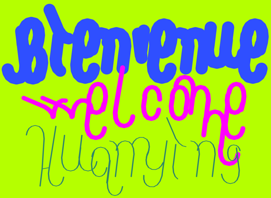
notyourtypefoundry: CAPTCHA - unreleased (Copyright © Xiaoyuan Gao / notyourtype foundry, 2022 - 2023)
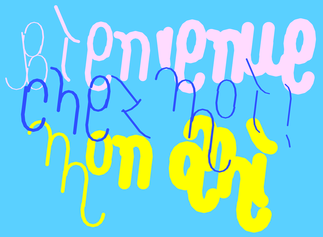
notyourtypefoundry: CAPTCHA - unreleased (Copyright © Xiaoyuan Gao / notyourtype foundry, 2022 - 2023)
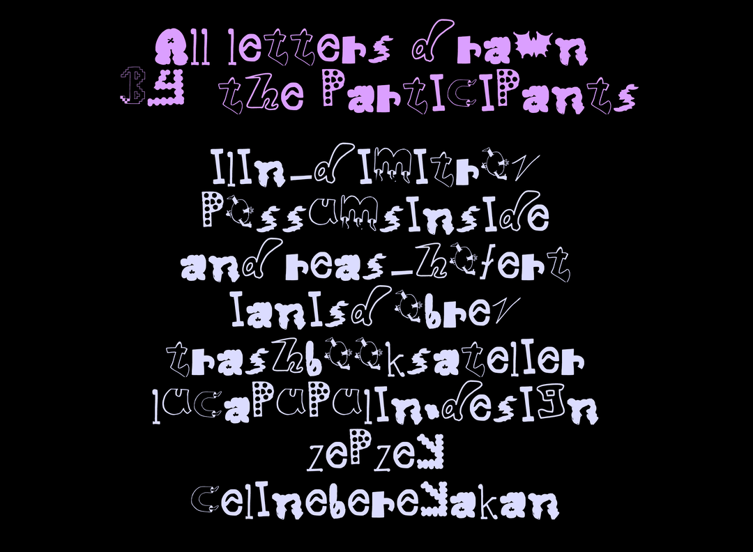
Xiaoyuan Gao: A type design workshop at Graphic Design Far, Nieuwe Instituut, Rotterdam (Copyright © Xiaoyuan Gao, 2024)
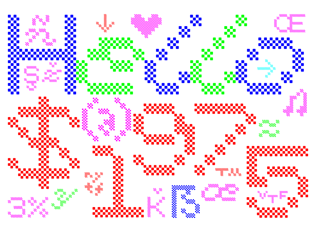
notyourtypefoundry: bianzhidai 2.0 (Copyright © Xiaoyuan Gao / notyourtype foundry, 2022 - 2023)
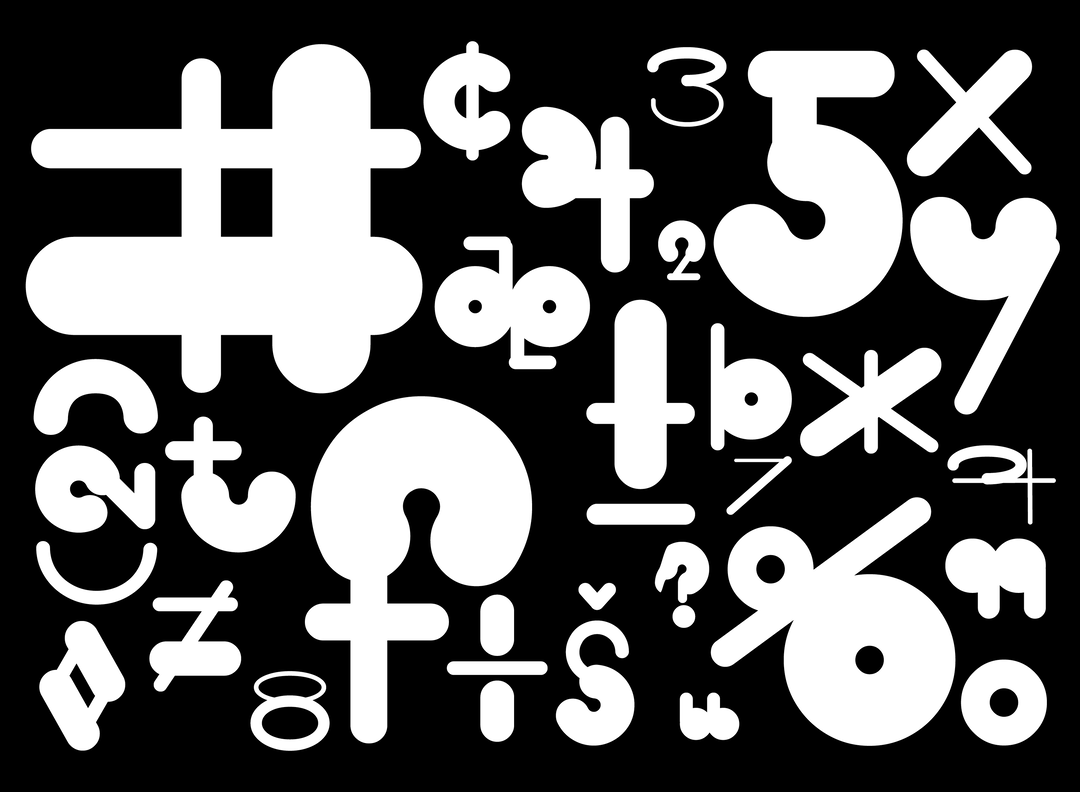
notyourtypefoundry: CLOCK (Copyright © Xiaoyuan Gao / notyourtype foundry, 2021 -2022)
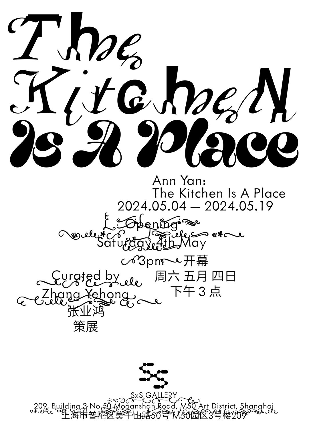
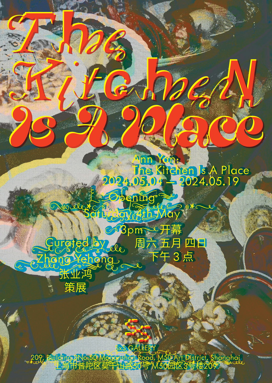
Xiayuan Gao: The Kitchen is Place, graphic design for Ann Yan (Copyright © Xiaoyuan Gao / notyourtype foundry, 2024)
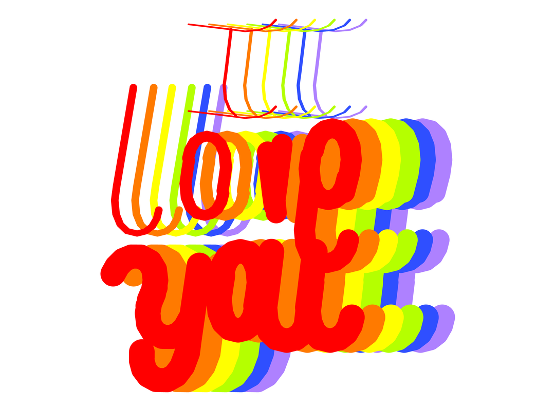
notyourtypefoundry: CAPTCHA - unreleased (Copyright © Xiaoyuan Gao / notyourtype foundry, 2022 - 2023)

Xiaoyuan Gao: Custom Type Design for artist Zhang Yehong's Solo Exhibition: 天空签名(Sky-Writing), (Copyright © Xiaoyuan Gao, 2021)
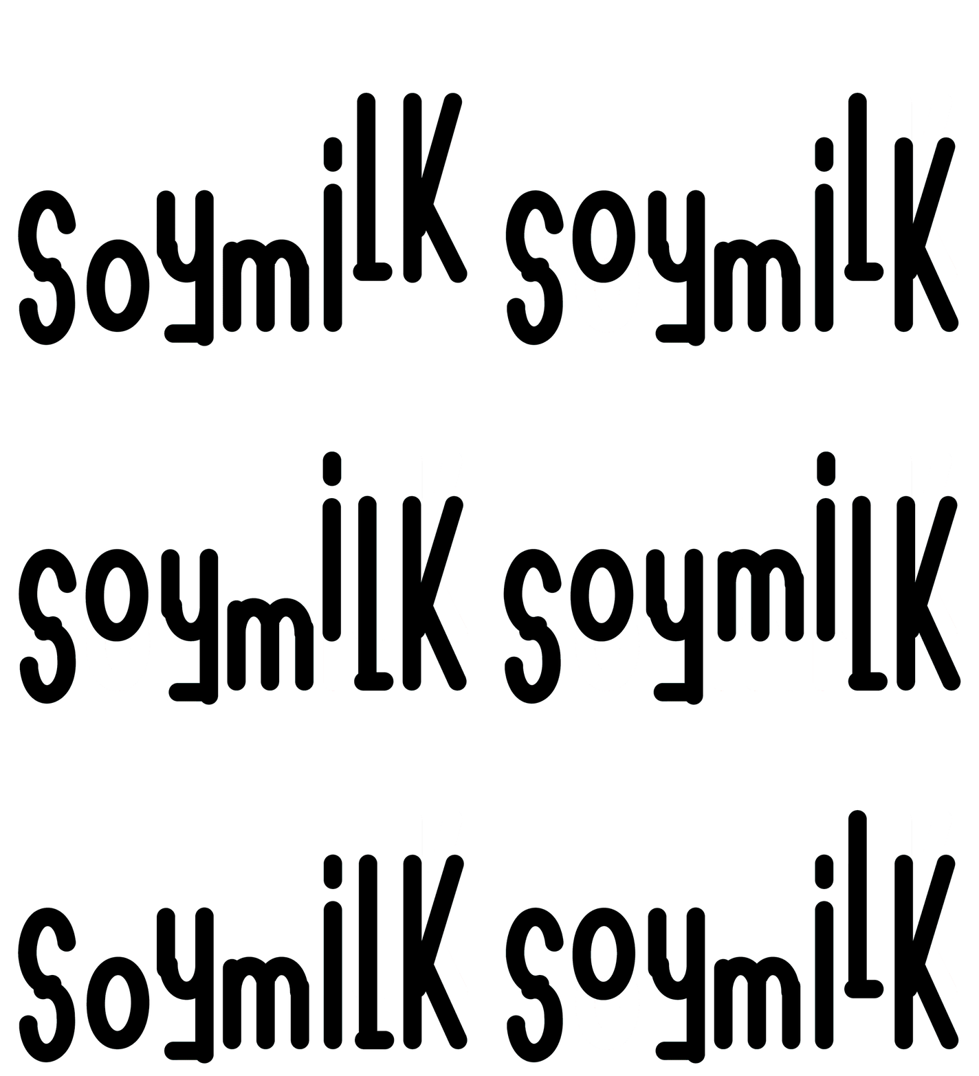
notyourtypefoundry: barbecue - Typeface. (Copyright Xiaoyuan Gao / notyourtype foundry, 2022)
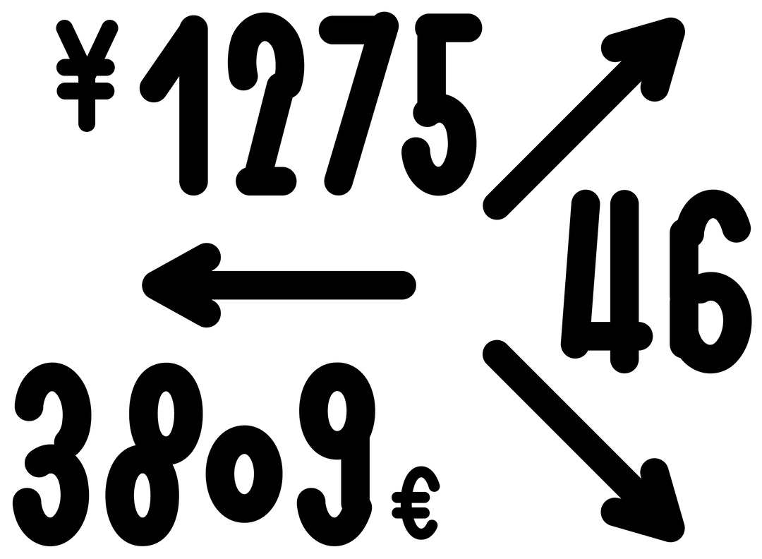
notyourtypefoundry: barbecue - Typeface. (Copyright Xiaoyuan Gao / notyourtype foundry, 2022)
Hero Header
Xiayuan Gao: The Kitchen is Place, graphic design for Ann Yan (Copyright © Xiaoyuan Gao / notyourtype foundry, 2024)
Share Article
Further Info
About the Author
—
Olivia (she/her) is associate editor of the website, overseeing the day-to-day editorial projects as well as Nicer Tuesdays events. She joined the It’s Nice That team in 2021. ofh@itsnicethat.com
To submit your work to be featured on the site, see our Submissions Guide.