- Words
- It's Nice That
- —
- Date
- 13 August 2026
- Tags
“Instagram has evolved”: the process and craft behind Instagram’s first major refresh in over ten years
It’s Nice That sits down with creative director Christy Silva and director of brand design Cynthia Pratomo to discover the inspiration behind Instagram’s latest brand system, and an exciting new wordmark.
Share
Share
In partnership with

Meta builds technologies that help people connect, find communities, and grow businesses. When Facebook launched in 2004, it changed the way people connect. Apps like Messenger, Instagram and WhatsApp further empowered billions around the world.
Picture this: you’re at a festival with friends and your favourite band starts playing that song you all know and love – cue hugs, shouty singing and hands in the air. You instinctively reach for your phone, unlock it and tap Instagram wanting to remember the joy of the moment. Before the app has even opened, you can picture the icon in your mind: a camera glyph set against a sunset-coloured gradient. Then, the familiar script wordmark at the top of the feed: typography that would feel just as at home on a vintage camera as a hand-painted sign outside your favourite neighbourhood ice cream shop. You post and get back to dancing away; mission accomplished. But if something about the app felt subtly different this time, you’re not imagining it. It’s because Instagram has just unveiled its first major brand refresh in over ten years.
“Growing up means acknowledging there are more sides to Instagram now. We grapple with many different tones and messages: sometimes serious, sometimes encouraging, sometimes edgy. We needed a system that could handle all of that.”
Cynthia Pratomo, director, brand design
With a brand this well known, change can be hard. For those of us who remember Instagram’s original identity – the skeuomorphic camera icon with a rainbow stripe and the omnipresent white photo borders – it’s not the first time we’ve been greeted by a different Instagram. But as with the platform’s 2016 rebrand, the latest refresh isn’t just change for change’s sake. If the last redesign reflected Instagram’s evolution from a straightforward photo-sharing app into a global social platform, this one reflects how much broader still the brand and the Instagram community has become over the past decade.
When Instagram first launched, its brand had to do a lot of explaining. “When you’re a new brand, you have to over-communicate,” says Christy Silva, Instagram’s creative director of brand design and creative marketing. “You’re constantly selling the utility, explaining the features, and trying to show everything at once.” Over time, that responsibility fell to just two visual elements: Instagram’s camera glyph and sunset gradient. Today, Instagram is familiar to billions of people. Instead of explaining what Instagram is, the identity can now focus on expressing who Instagram has become.
Director of brand design Cynthia Pratomo describes the redesign as Instagram “growing up”. That doesn’t mean becoming more serious. It just means recognising that Instagram no longer always speaks with a singular, unified voice. Scroll through the app and you’ll see carefully art-directed campaigns sitting beside blurry concert photos, vacation photo dumps and memes. The tone is “sometimes serious, sometimes encouraging, sometimes edgy,” as Cynthia puts it. The refreshed identity shifts away from one specific mood to a world where all expressions are welcome; the platform has to accommodate an enormous range of people, emotions, and cultural moments.
Instagram: Copyright © Meta, 2026
“The whole goal with this new system is to actively champion everyday creativity and make imperfection feel totally normal.”
Christy Silva, creative director, design and creative marketing
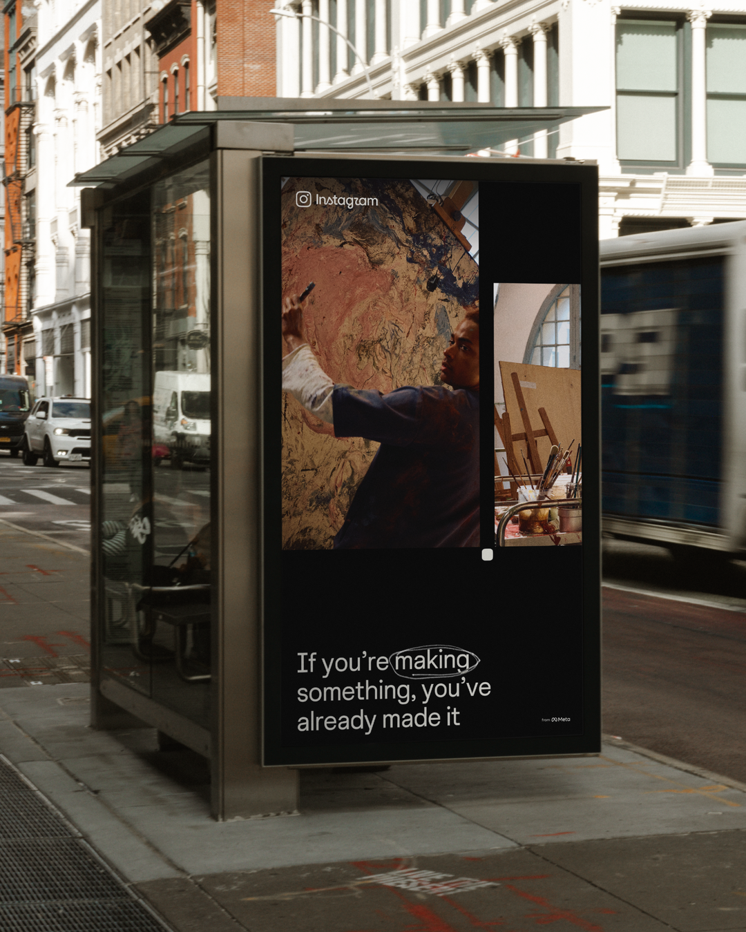
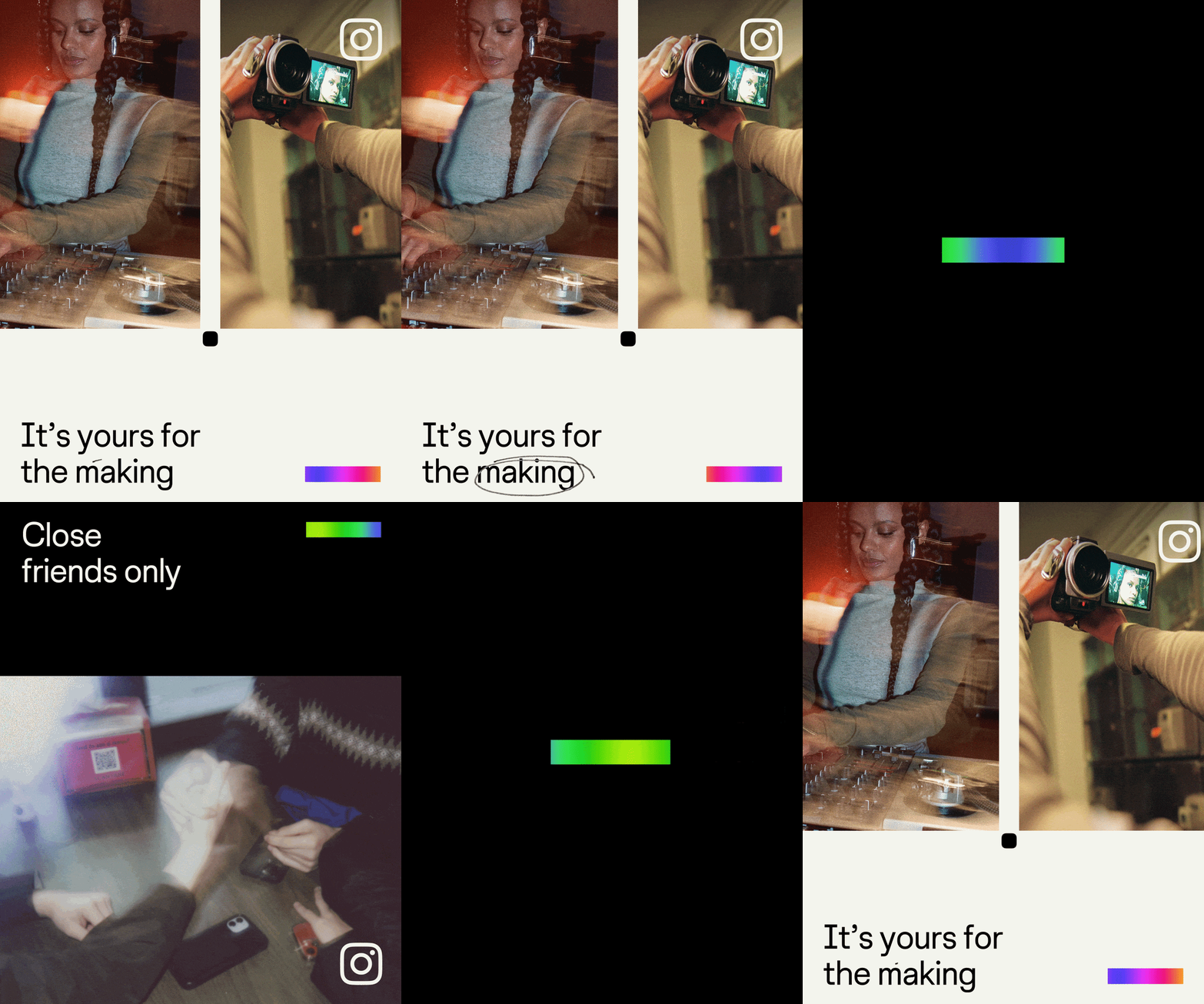
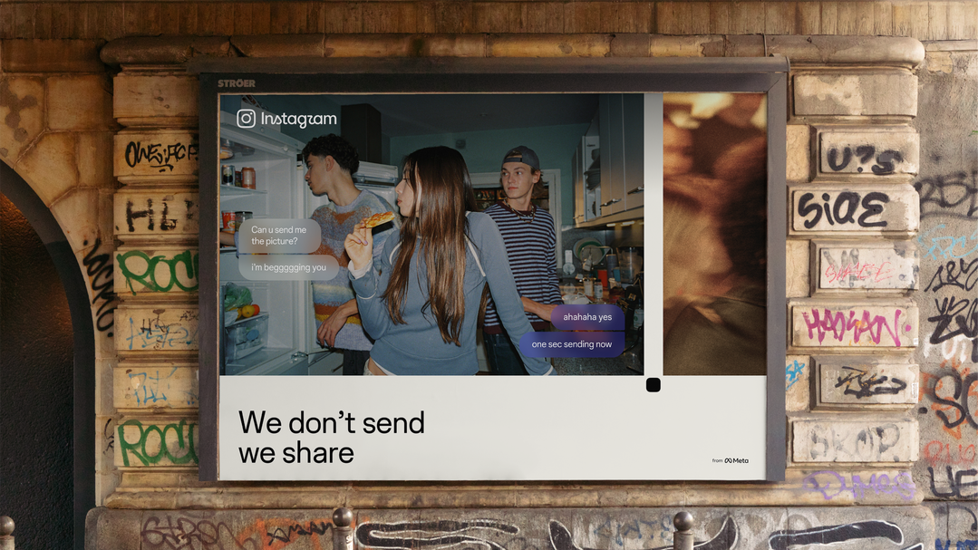
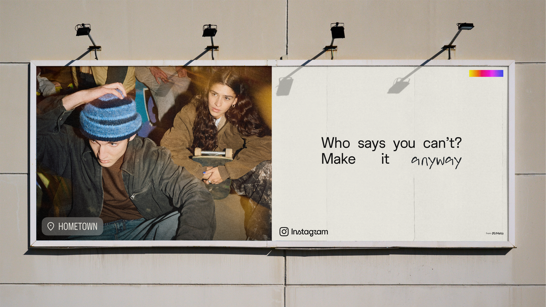
Instagram exists to showcase the work of its community, not the other way around. “We don’t like to talk about ourselves much,” says Cynthia. “Our storytelling focuses on the creators and content we’re celebrating.” This point of view was crystallised in the new identity. In this same spirit of realness, the refreshed identity consistently celebrates the act of making, not polished outcomes or perfect moments. In other words, it values the act of making, not only the act of posting. Christy describes this model as “a really well-designed sketchbook”. Something just structured enough to hold together while still remaining flexible enough to encourage weirdness and unexpected experimentation.
At a moment when many brands are looking to all things analogue as shorthand for humanity (not AI), Instagram’s team was all too aware of avoiding trend-chasing. But, they felt they had an authentic claim to much of the tactile visual language that’s percolating in the design world at the moment. In lieu of referencing creativity as an abstract concept, the new identity is rooted in the actual tools and rituals of photographic image-making – like contact sheets, registration marks and annotations. “That’s not a borrowed aesthetic,” Cynthia says. “That’s literally what happens on our platform every day.” Christy describes Instagram as, at its core, “the modern photo album”. In her mind, the redesign then is less a response to a trend than a return to something Instagram has always believed: that the platform exists to give anyone the tools to make an image and share it with the world. The tactile cues woven throughout the identity simply point back to the long-standing history of the camera and the darkroom, or even the family gathering around a slide projector to look at vacation snaps.
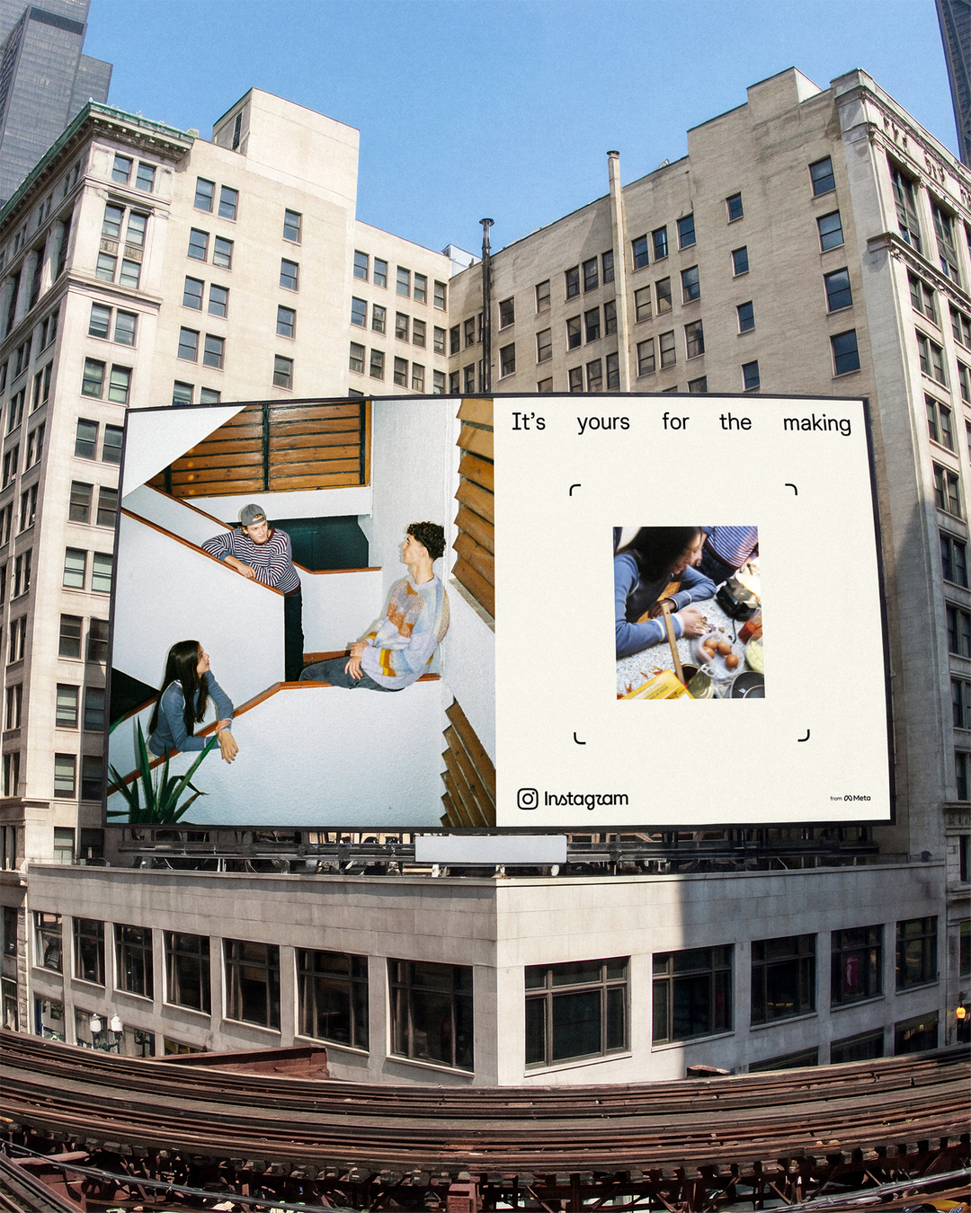
One of the most distinctive additions to the identity that speaks to this photographic history is the new viewfinder device. The form, derived from the camera glyph, frames imagery throughout the system and subtly “breaks the fourth wall” by drawing attention back to the act of taking the picture and, as Cynthia explains, “hopefully indicating the maker behind it”. The viewfinder is meant to remind the casual scroller that all the images they are seeing actually began in a real place: someone framing a shot, making a decision and choosing to share it with the world (and in a way, them specifically.)The team hopes the viewfinder framing in the design system can help make the act of taking a picture and putting it into the world feel “more accessible, more fun, and something we all can imagine ourselves doing”.
Instagram: Copyright © Meta, 2026
Instagram: Copyright © Meta, 2026
Instagram: Copyright © Meta, 2026
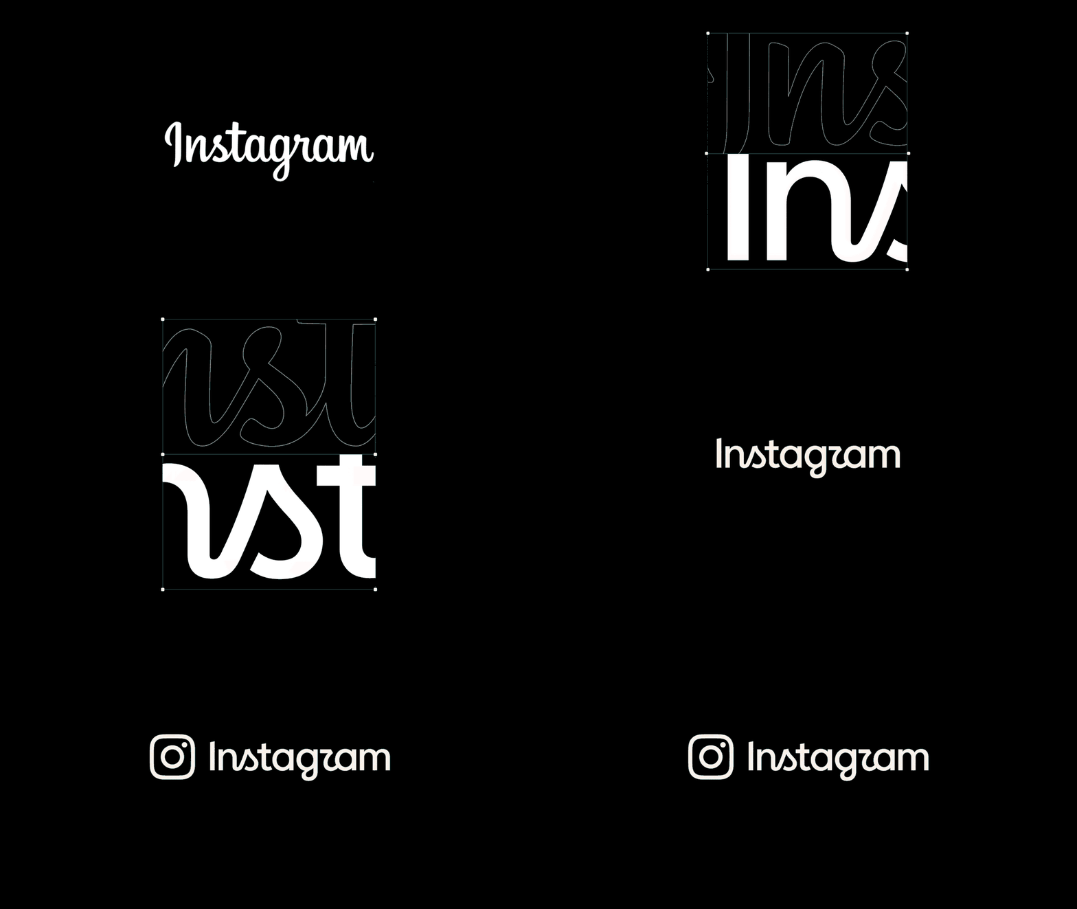
For most people, the most recognisable element of Instagram’s long-standing identity is its script wordmark. Of course, this made it one of the biggest question marks when the organisation decided to undergo a refresh. When considering what would be done to the wordmark, at first, the team explored starting fresh, and getting rid of script entirely. Easier said than done. After many iterations of non-script logos, everyone found the results left the brand feeling too unrecognisable. After more than 15 years, the script had ultimately become more or less inseparable from the public’s broader understanding of Instagram itself – the logo was something that has been present for most users’ “entire digital lifetimes,” as Cynthia describes it. The team ultimately decided that rather than pursuing simplicity for its own sake, they should think about what had made the wordmark so iconic in the first place. For Cynthia, the answer comes down to a balance between visual simplicity and what she calls “some authentic truth”: a singular shape language that remains recognisable at a glance. The script represents the brand’s focus on spontaneity and the human touch—qualities that were present at Instagram’s beginning, and are even more core to the brand today. As such, the new logo tries to keep these same themes, but refine them within a broader identity system that is more confident and restrained. Christy adds that in a landscape increasingly overpowered by corporate sans-serifs (the oft-referenced “blanding”) retaining the script was another way to show Instagram’s commitment to “real, unfiltered expression”.
“Every time we stripped out the script, we became unrecognisable to ourselves. Walking away from it entirely felt like walking away from the unique qualities of who we are.”
Cynthia Pratomo, director, brand design
One of the more human additions to the new brand is an upcoming typeface called Instagram Pen, a custom handwriting typeface that’s currently being developed by the internal team. In recent years, typography has played a much more central role in how people express themselves on Instagram. As Instagram shifted from photos only to a full creative platform, how and when people layer text into their work using native tools has shaped how they feel about what type should be. To meet this demand, the platform has regularly introduced new fonts that speak to different moods and desires. This includes recent collaborations with artists like Rosalía and Olivia Rodrigo, who have worked with the Instagram team to turn their handwriting into custom typefaces that can be used on Stories and Reels. In a way, Instagram Pen is an evolution of this process; the typeface was created by testing everything from soft pencil to bold ink pens in a variety of different writing styles before arriving at what the company describes as a “warm, collective signature”. The handwriting is something intimate – perfectly imperfect – like much of the creativity the app champions. Instagram sees this as something ever more important in a time when we rarely communicate by hand; and, for a time when Instagram messages are the way most of us reach out to our friends.
Instagram: Copyright © Meta, 2026
Instead of fighting for attention with heavy colours or overly complex elements, we built a beautifully simplistic, foundational canvas. Every design choice is intentionally calibrated to elevate the creator's story.
Christy Silva, creative director, design and creative marketing
Not all the typographic changes Instagram is unveiling are quite so obvious. As part of the new changes, the team has also refined its existing typeface, Instagram Sans, as well as introduced a whole new face, Instagram Sans Mono. The changes to Instagram Sans are, admittedly, pretty subtle. But, “good typography is often felt, not noticed”, Christy says. The updated fonts have proportions that are wider, with smoothed out curves and flatter terminals to boot. This makes the typeface feel more stable and grounded while preserving the personality that made it distinctive (which originated with forms that match the camera “squircle”).
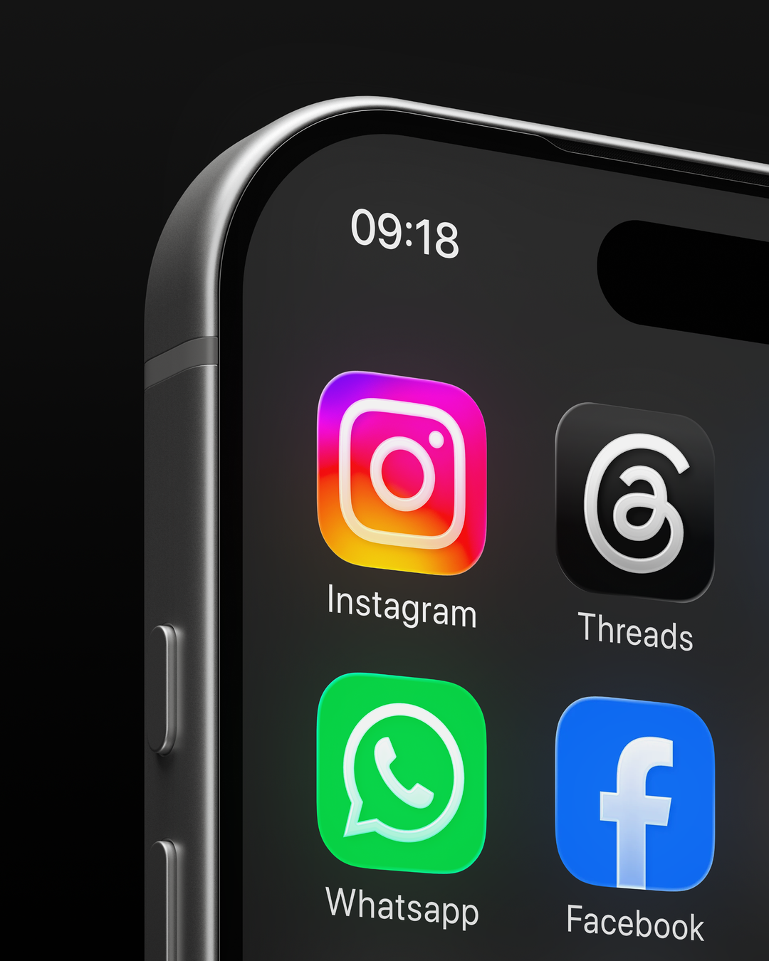
Instagram’s newfound focus on a kind of expressive restraint can be seen in its changing approach to colour. Though it was previously the most dominant brand motif, the sunset gradient now appears much more selectively. Like the annotations and contact sheets, the gradient now speaks to photographic past by showing up as a light leak instead of just a digital gradient. The team has also introduced an inverted gradient, green and blue on black for deeper feature layers. This new gradient allows the brand colour to be more variable and adaptable in more spaces as well.
Instagram: Copyright © Meta, 2026
“Our storytelling focuses on the creators and content we're celebrating, rather than us. We're a place for people to share, and that means our system needs to get out of the way.”
Cynthia Pratomo, director, brand design
The next time you open Instagram, you might find yourself scrolling before you even notice what exactly has changed. That just means the rebrand is doing its job. Rather than asking to be noticed, the refreshed look of Instagram is designed to be a background actor, or maybe a wingman; something that creates more space for the people making, sharing, and documenting their lives on the platform. It’s a surprisingly restrained approach for one of the world’s most recognisable brands. Maybe that’s what confidence can look like after ten years: being secure enough to celebrate the creativity of its community rather than compete with it. The brand doesn’t want to be the main character. It wants you to be.
Instagram: Copyright © Meta, 2026
Hero Header
Instagram: Copyright © Meta, 2026
Share Article
Further Info
About the Author
—
This article was written by the It’s Nice That team. To find our editors and writers, please head over to our Contact page.