- Words
- It's Nice That
- —
- Date
- 29 November 2018
- Tags
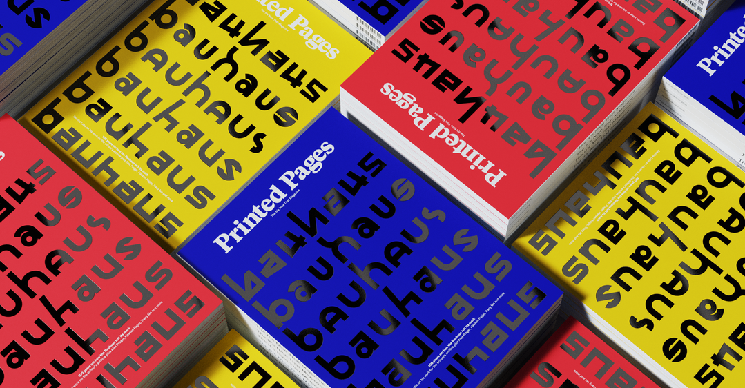
Celebrating 100 years of the Bauhaus, Printed Pages AW18 is available to order now
Share
- Tags
Share
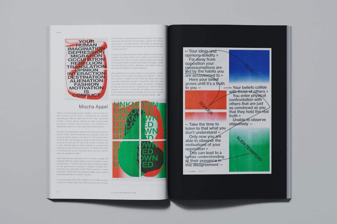
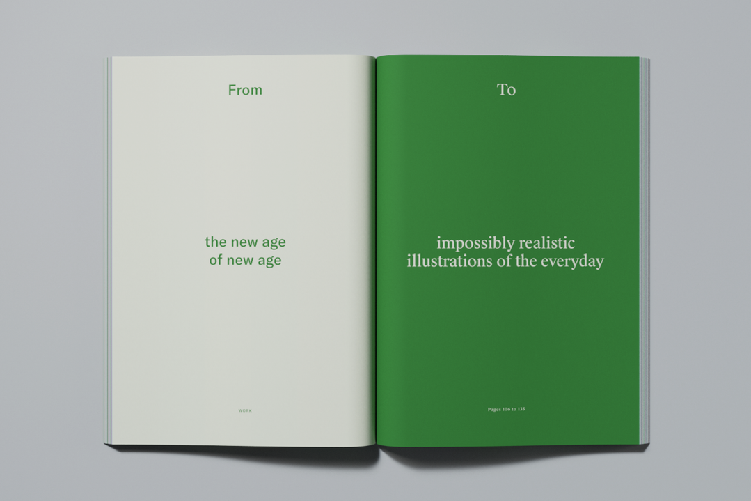
Six months have passed by in a flash, meaning it’s time for another instalment of Printed Pages. Available to order right now, the AW18 issue is our curated view of the best creative work we’ve seen in the past six months. Written and designed by the team here at It’s Nice That, Printed Pages AW18 also includes a variety of feature interviews with a host of names who continue to keep us excited about creativity.
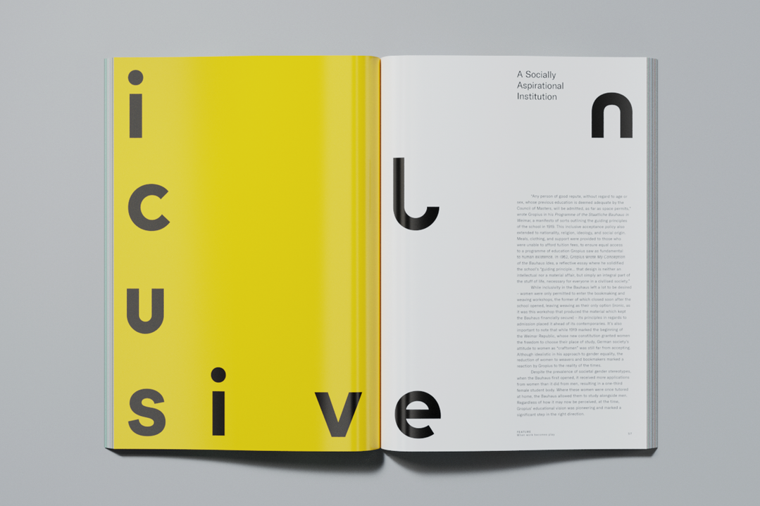
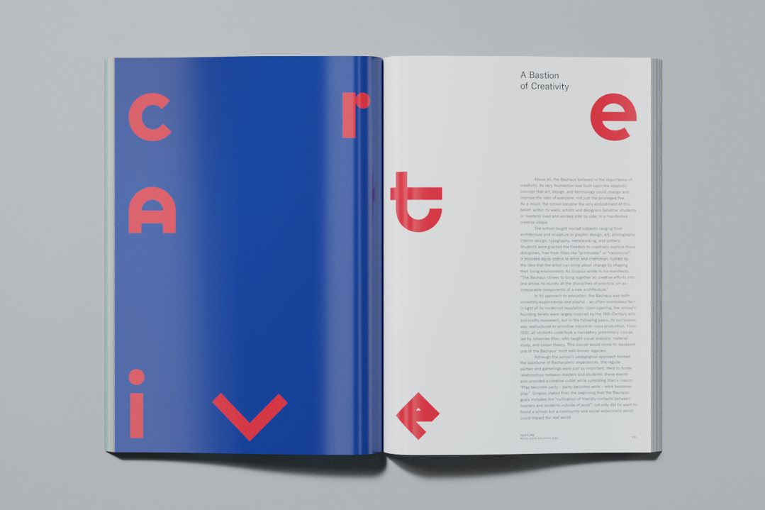
In this issue, we delve deep into both the Bauhaus archives and its long-lasting legacy with Pentagram partner Sascha Lobe, 100 years after the school first opened its doors. Together, we look at how in only 14 years, the Bauhaus pioneered a spirit which still rings true today, a spirit which Sascha has channelled into Printed Pages AW18’s cover and accompanying poster. Available in three colours which update the iconic Bauhaus colours for contemporary times, the cover displays a mere 42 of the nearly 600 glyphs Sascha and his team have created so far while designing their new identity for the Bauhaus Archiv. “We took heritage and adapted it to today without losing the history,” the German designer told us.
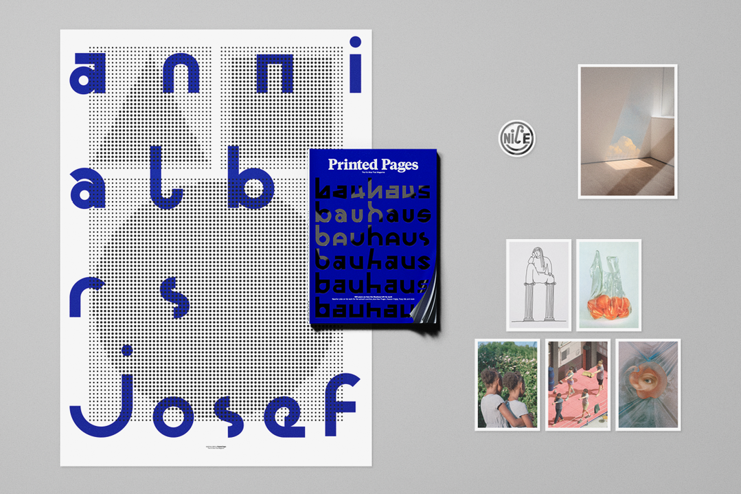
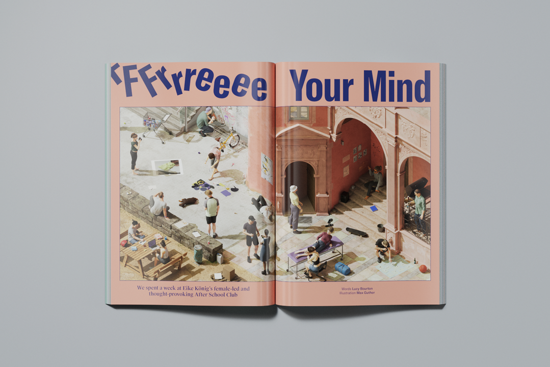
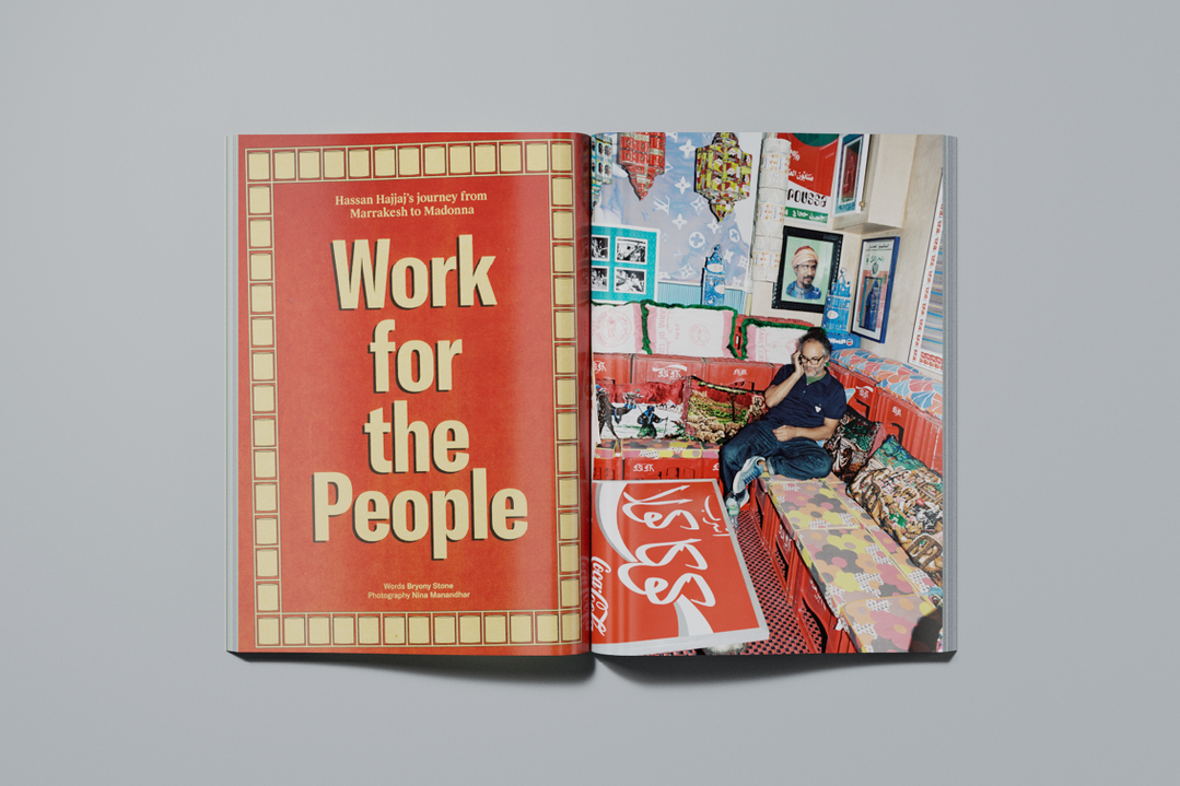
As creativity is global, so is this issue of Printed Pages. In the UK, in his shop-cum-souk in Shoreditch, Moroccan-born artist Hassan Hajjaj told us that “influences from different parts of the globe” have played a crucial role in his work. In the pages that follow, we take a closer look at Eike König’s revered After School Club, a free week-long boot camp held in Offenbach for design students which, this year, featured an all-female line-up of teachers.
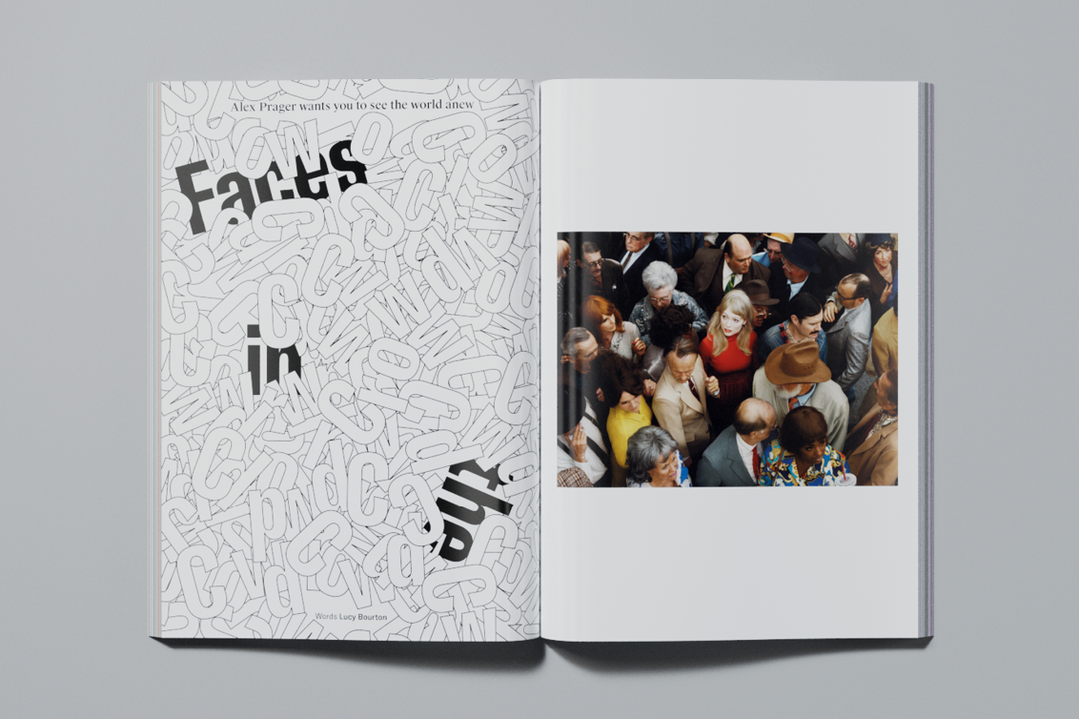
We also headed to Nigeria where we met Lemi Ghariokwu, the designer behind 26 of Fela Kuti’s 56 iconic albums. Over four years, the duo worked in divine collaboration, both artistically and ideologically, before their partnership came to an end. Then there was a (virtual) trip to Los Angeles to chat to photographer Alex Prager about her cinematic images, taken on film sets in her hometown and on the opposite side of the Atlantic, with the Paris Opera Ballet.
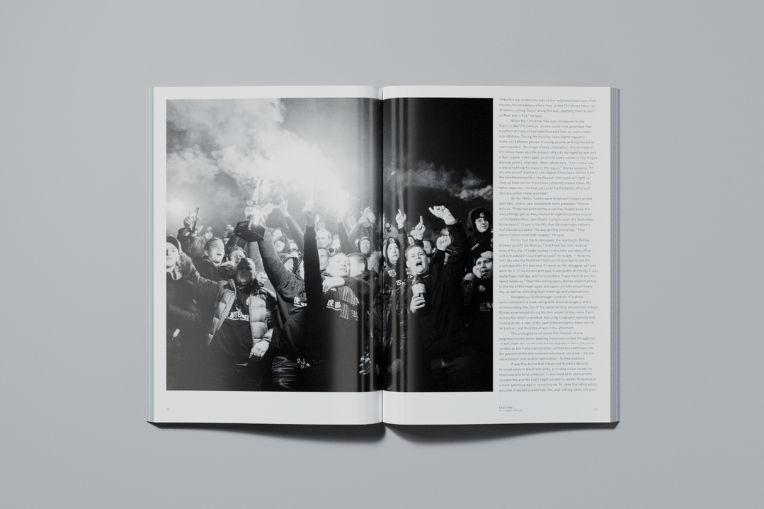
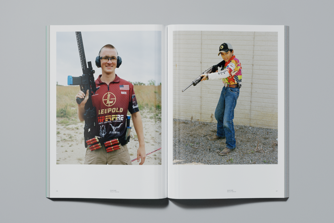
In New York, we laughed (over Skype) at graphic design caricatures with the visual editor of The New York Times’ style section, Tracy Ma, and even handed over some spreads for her to design herself. A discussion with another New Yorker took place when we caught up with British-born photographer Sharif Hamza about Young Americans, his portraits of American youths and their firearms. Closer to home, we trace the decades-long tradition of New Year’s Eve in The Hague with Romke Hoogwaerts, a photographer who captured the staggering annual custom of building “controlled” fires from wooden pallets stacked 30-metres high.
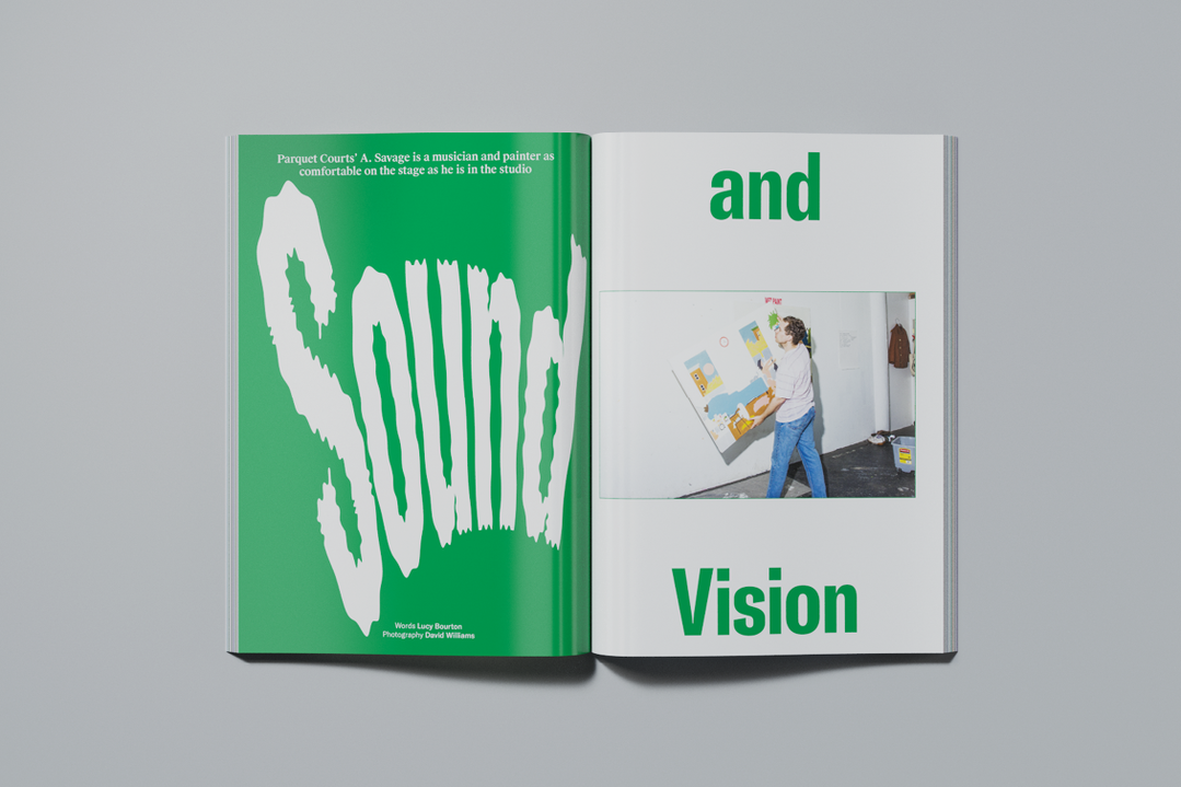
Accompanying all of these features is a plethora of illustration and photography by Max Guther, Sophie Koko Gate, David Williams and Nina Manandhar. Each of their contributions has been specially commissioned by It’s Nice That’s in-house creative team and amplifies the voices of interviewees including A. Savage, Jerry Saltz and Hans Ulrich Obrist. The issue also shines a light on our 2018 Graduates, the first global class, in a celebration of the best emerging talent across the creative industries.
Printed Pages AW18 also includes a print by photographer KangHee Kim, a series of five postcards featuring work by a batch of top-notch creatives we’ve covered in the issue and an It’s Nice That sticker.
Buy a copy of the magazine and goodies all for £10 + P&P on Company of Parrots.
Share Article
Further Info
About the Author
—
This article was written by the It’s Nice That team. To find our editors and writers, please head over to our Contact page.