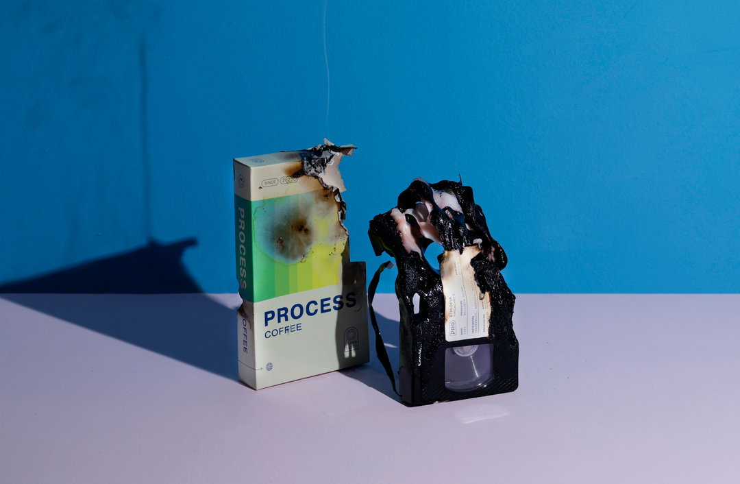
Angel & Anchor rewinds to the days of VHS with its latest coffee packaging
Designed for Process roastery, the Belfast-based branding studio is taking it all the way back to Blockbuster, Fuji and someone accidentally recording over your copy of Titanic.
Share
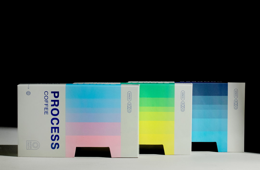
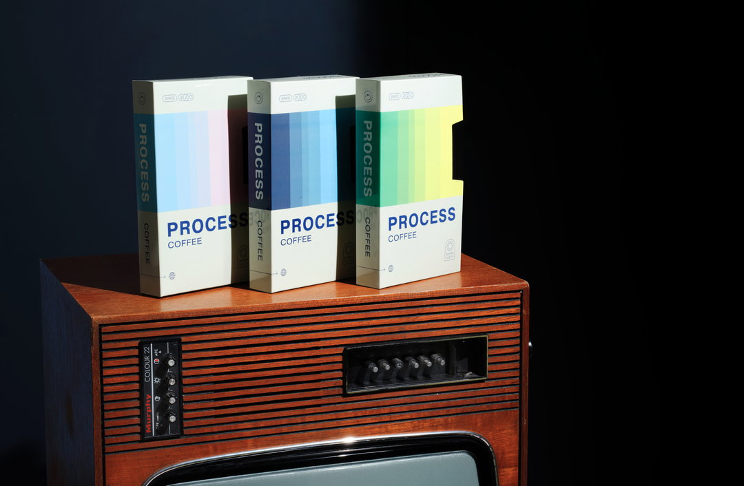
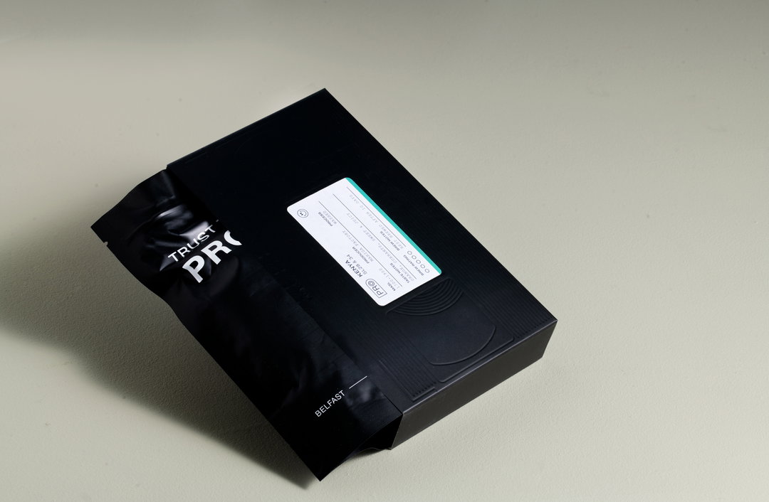
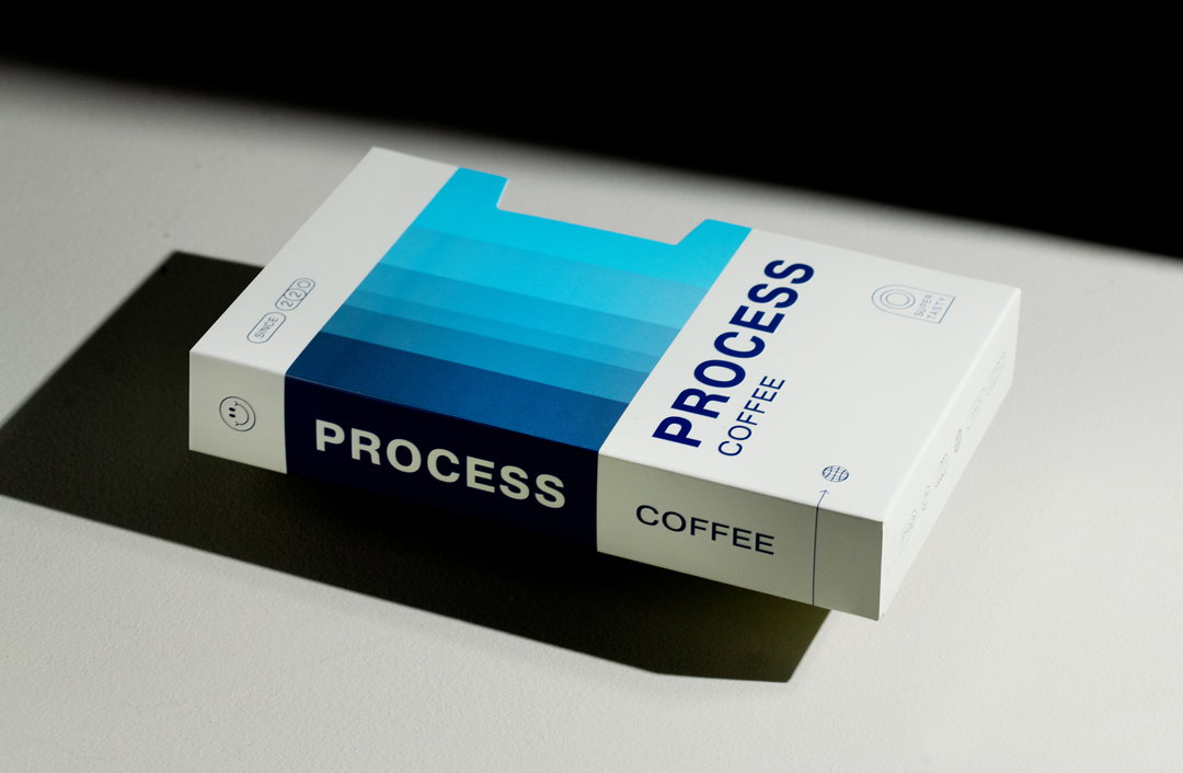
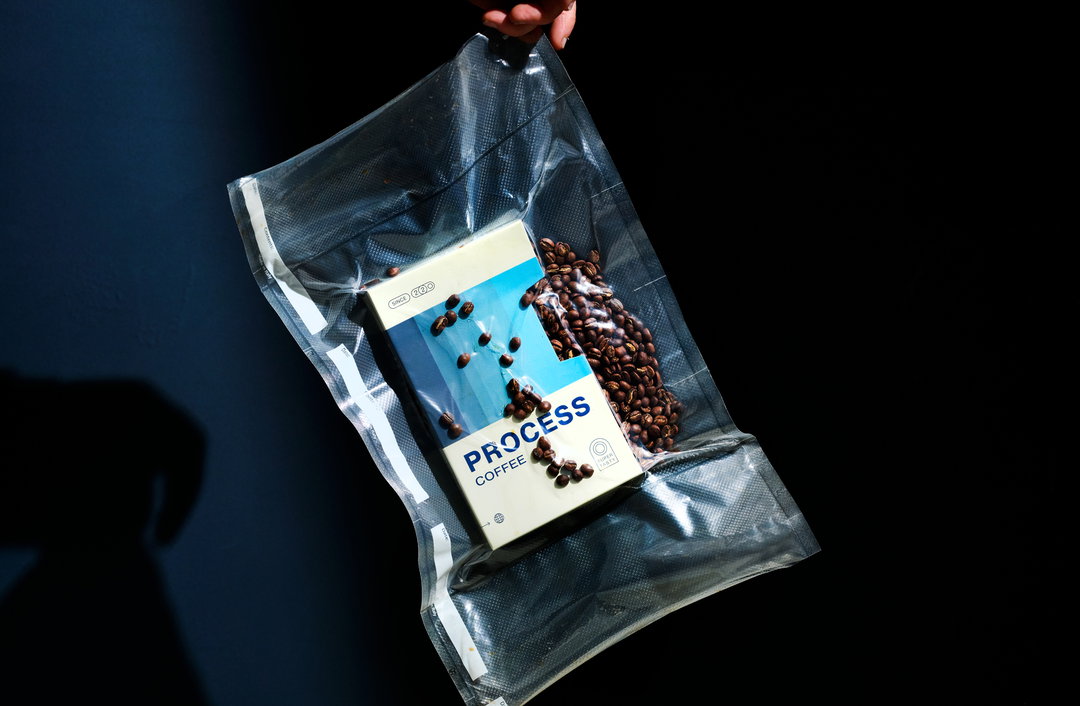
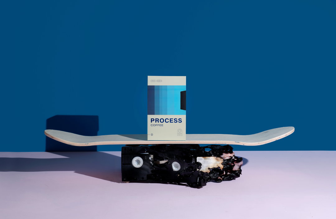
A new niche trend seems to be emerging in the creative world. Plucked from the world of vintage television, please welcome packaging in the shape of VHS tapes. Just when we thought we’d seen all there was to see in the arena with Love’s Andy Warhol TV-inspired skincare packaging, Belfast-based branding studio Angel & Anchor has knocked it out of the park with an entirely different take on the concept. Designed for coffee roastery Process, Angel & Anchor has leaned into the energising gradients associated with VHS tapes for the work. Taking things a step further, it has also produced ‘cassette tapes’ that hide bags of coffee inside.
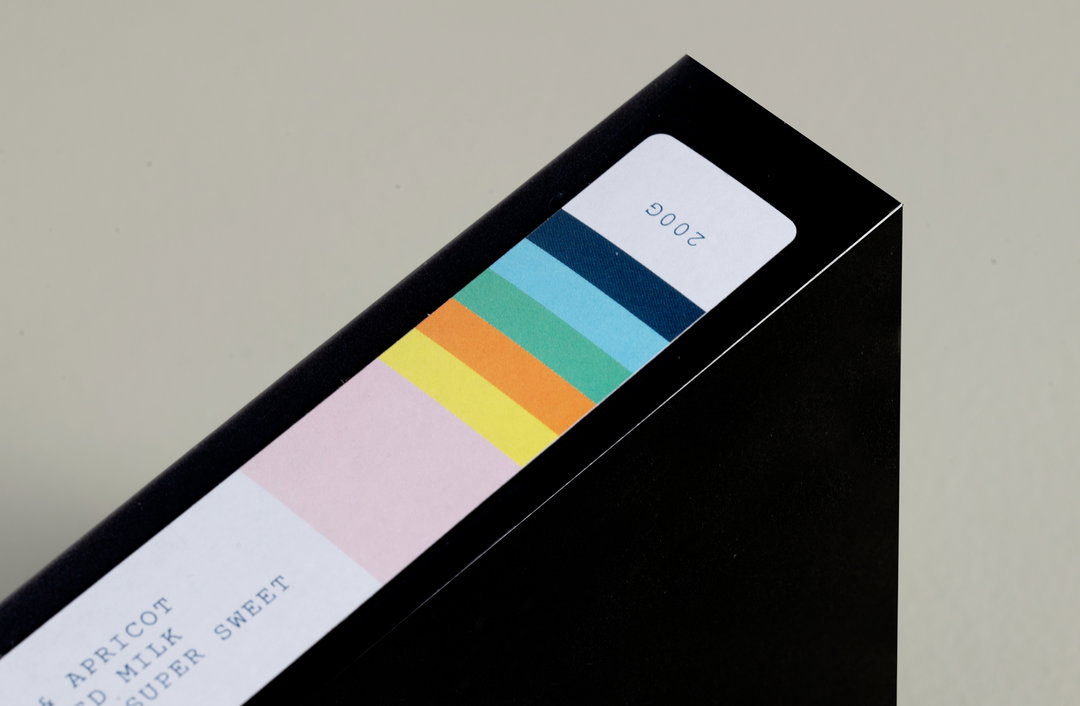
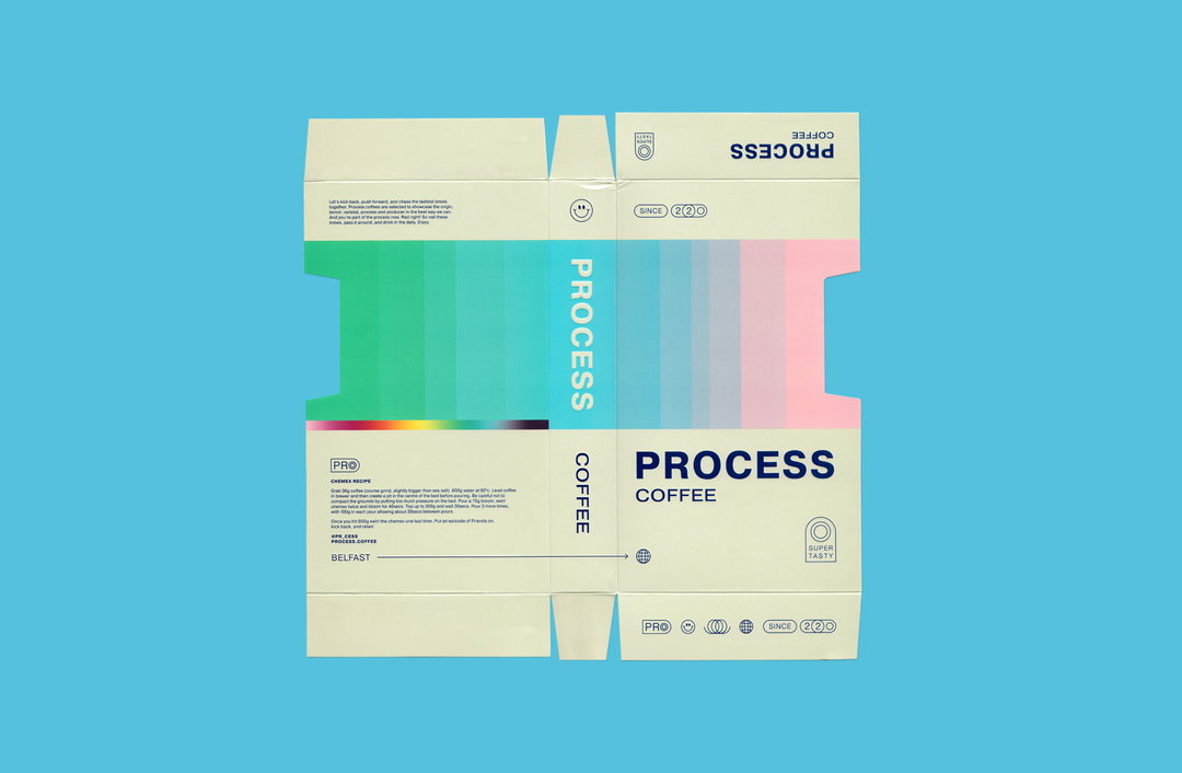
“From the ground up, design is created with interactivity in mind,” explains the studio in a release. For example, the glossy VHS tray container slides away from an inner tape revealing deboss details and a matt finish. Even the coffee bags themselves seem to mirror tape peeking out of the cassette. The studio states the packaging features three layers of opening, sliding and revealing, proving that “more is more” when it comes to interactive product design. Three colourways have also been developed to distinguish each product and help them stand out on the shelf, bringing those nostalgic gradients into play once more.
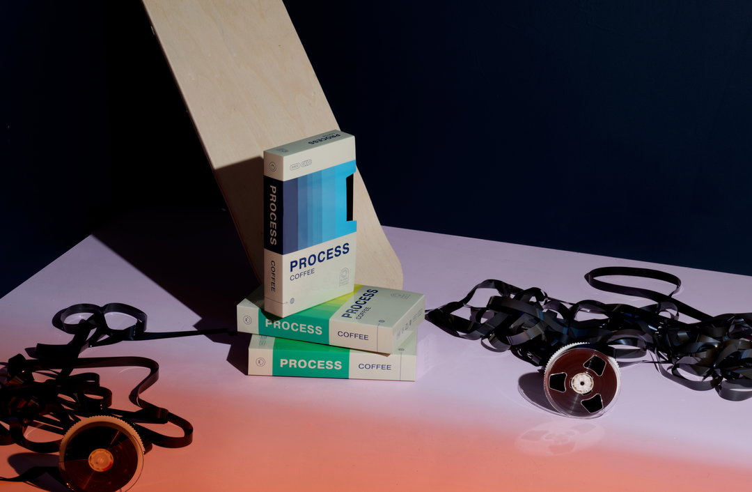
Angel & Anchor: Process (Copyright © Angel & Anchor, 2022)
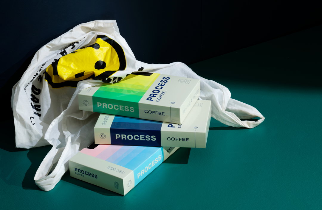
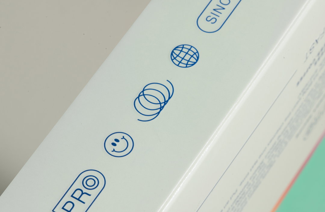
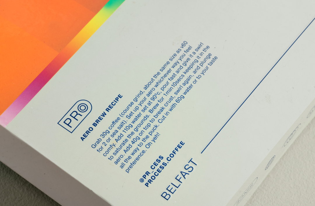
Elsewhere, memorable VHS touchpoints appear in other unique areas. Playful icons and smiley faces line the tapes, which “replace what would typically be a Kodak or Fuji logo on VHS tapes”, says the studio. Meanwhile, the Pragmatica typeface provides a “default feel” to complete the VHS illusion. Attention to detail is clearly a focal point for Angel & Anchor; “Labels that would usually identify ‘Jeffersons Christmas 94’ are now used for the coffee region and varietal info”, it states. Finally, on the back of the box, which includes different brew methods with step-by-step instructions, simple, debossed icons suggest the VHS story while expressing brand values.
Also inspired by the lo-fi aesthetics of skateboarding – and its link to VHS through the recording of 90s skateboarding footage – Angel & Anchor hope to translate the anti-exclusive, DIY ethos of Process, while creating something “super different to any other coffee packaging”, Ben Connolly, founder and creative director of the studio tells us. This ethos seems to be refreshingly present in the process behind the project too. Ben explains that, when the founder of Process came up with the idea of VHS box packaging, “he came to our studio with a Frankenstein box he had built from cereal boxes and masking paper". Ben adds: “The A&A team got to work then on turning the idea into reality.”
GalleryAngel & Anchor: Process (Copyright © Angel & Anchor, 2022)
Hero Header
Angel & Anchor: Process (Copyright © Angel & Anchor, 2022)
Share Article
Further Info
About the Author
—
Liz (she/they) is the senior editor at Insights, a research-driven department within It’s Nice That. They previously ran the news section of the website. Get in contact with them for potential Insights collaborations or to discuss Insights’ public-facing reports.