Launch Recite Me assistive technology
A blurred landscape of green hills and trees is framed within a semi-circular shape. The white Le Shuttle logo is centred across the middle of the image.

The new Eurotunnel LeShuttle logo represents an efficient journey

Landor & Fitch has ushered LeShuttle into a sleeker era, using ligatures and motion design to highlight the speed of the service.

—
Date
12 May 2023

It’s the largest refresh in 30 years for LeShuttle, the Channel Tunnel service that carries passengers by rail, as well as conveying road vehicles, like cars and campervans. If you didn’t know that you could travel through the Channel Tunnel by car, you’re not alone. In fact, the rebrand hinges on consumer data highlighting the confusion that exists around the service, particularly for Gen-Z and millennials. “There are generations of travellers born after the Channel Tunnel’s opening who are more familiar with flying than self-drive,” explains a release from Landor & Fitch, the agency behind the work.

The operator of the Channel Tunnel, Getlink, initiated the redesign ahead of the 30-year anniversary of Eurotunnel Le Shuttle – now just, LeShuttle. The aim was to re-establish the brand as a relevant and unique form of low-carbon transport. But Landor & Fitch also wanted to remove the hassle that many people associate with travelling.

A white typographic logo on a black background reads “LeSh”. The letters are formed from a single, continuous flowing line.
Above

Landor & Fitch: LeShuttle (Copyright © Getlink, 2023)

It’s an understated look, but that’s the goal. Landor & Fitch removes all extraneous details from the previous logo, embracing futuristic simplicity. A series of ligatures reflect the ease of connections, while the eyes of both ‘E’s represent point A and B of travel (entering and leaving the Channel Tunnel). Rounded bowls have been introduced to represent care and sharp corners to emphasise speed.

Meanwhile, the wider identity attempts to separate itself from traditional train services, using brand photography which appears user-generated and details which centre on “evoking emotion”. The colour palette has also been shifted away from the “nationalistic identity to predominantly black and white with hints of purple”.

The new design is part of a strategy to rethink the Channel Tunnel experience over the next decade.

GalleryLandor & Fitch: LeShuttle (Copyright © Getlink, 2023)
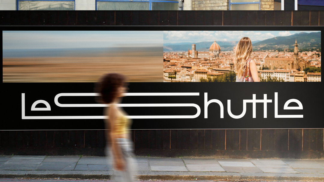
A wide billboard on a black wall reads “Less Shuttle” in a white, continuous-line typeface. Above the text, a split image shows a blurred landscape on the left and a person looking over the Florence skyline on the right.
A minimalist graphic of two white semi-circles on a black background. The shapes resemble a pair of closed, smiling eyes.
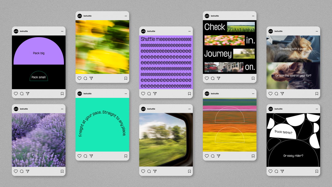
A grid of nine Instagram posts for the brand Leshuttle. The posts feature a mix of bold colours, blurred landscapes, and playful text such as “Pack big” and “Truck tetris?”.
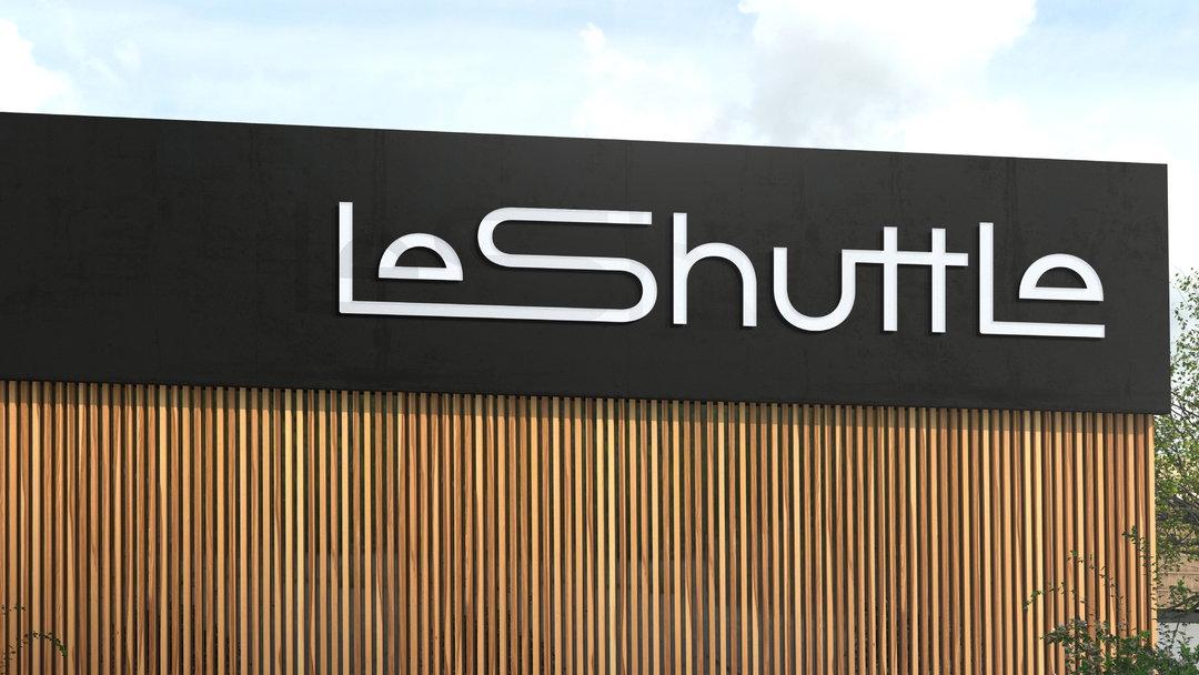
A black sign on a building features the white wordmark “LeShuttle”. Below the sign, the wall is covered in vertical wooden slats.
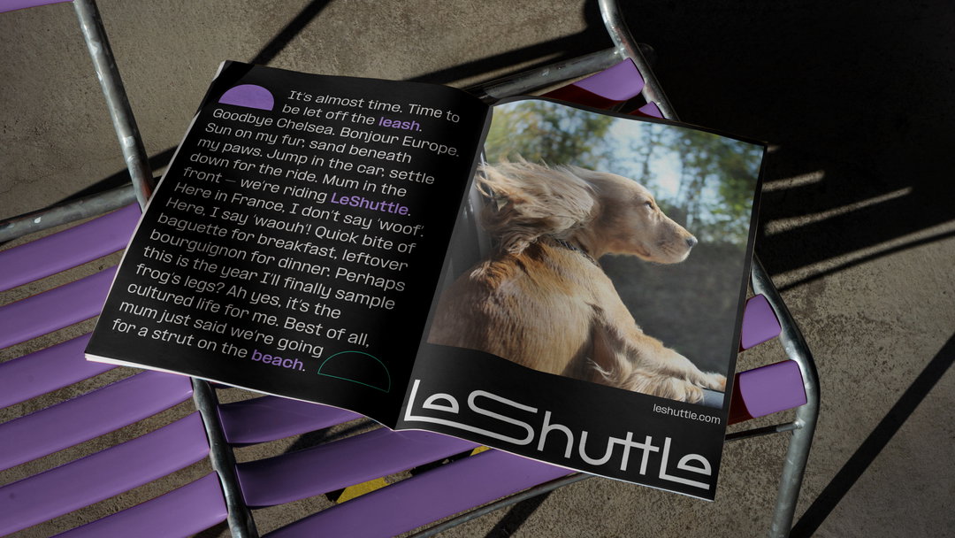
An open magazine rests on a purple slatted bench. One page features a close-up of a golden dog, while the opposite page contains text about travelling to France. The bottom of the page displays the “LeShuttle” logo and website.
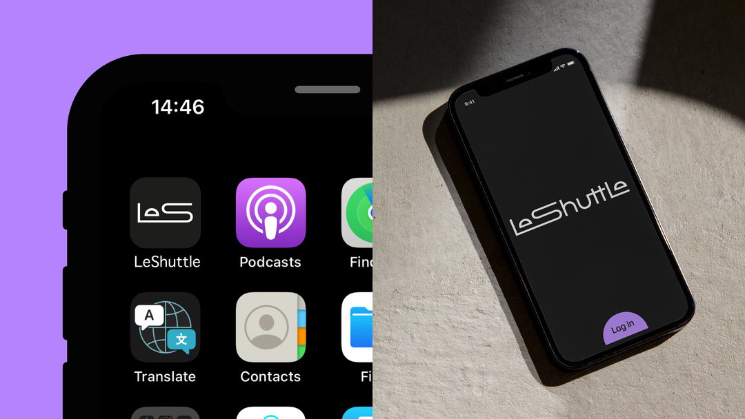
A split image showing the LeShuttle app on a smartphone. On the left, the app icon appears on a home screen alongside other apps; on the right, the app's splash screen displays the “LeShuttle” logo and a “Log in” button.
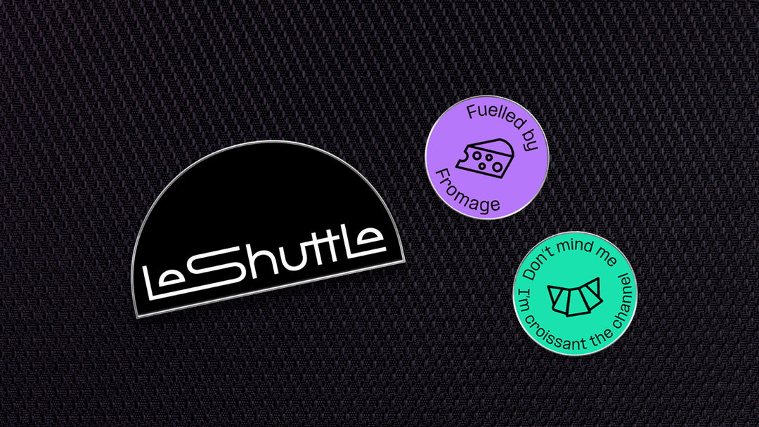
Three stickers on a dark, textured background. A black semi-circle reads “Le Shuttle” in white, while two smaller circles feature illustrations of cheese and a croissant with the phrases “Fuelled by Fromage” and “Don’t mind me I’m croissant the channel”.
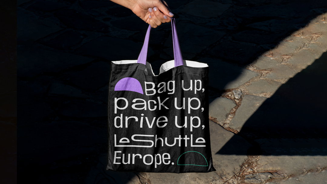
A person holds a black tote bag with purple handles against a dark stone ground. White text on the bag reads “Bag up, pack up, drive up, Le Shuttle Europe.”
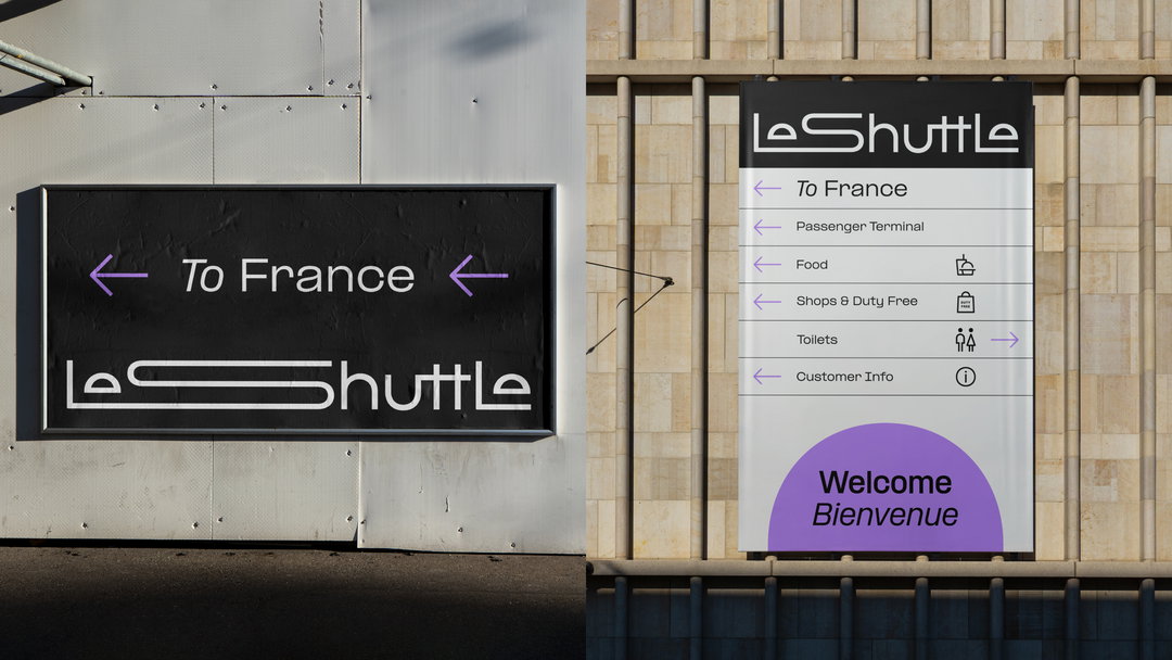
Two examples of signage for Le Shuttle. One is a dark horizontal board reading “To France” with arrows pointing left, while the other is a vertical directory listing terminal facilities and a purple “Welcome Bienvenue” greeting.

Hero Header

Landor & Fitch: LeShuttle (Copyright © Getlink, 2023)

Share Article

Further Info

About the Author

Liz Gorny

—

Liz (she/they) is the senior editor at Insights, a research-driven department within It’s Nice That. They previously ran the news section of the website. Get in contact with them for potential Insights collaborations or to discuss Insights’ public-facing reports.
It's Nice That Newsletters

Fancy a bit of It's Nice That in your inbox? Sign up to our newsletters and we'll keep you in the loop with everything good going on in the creative world.