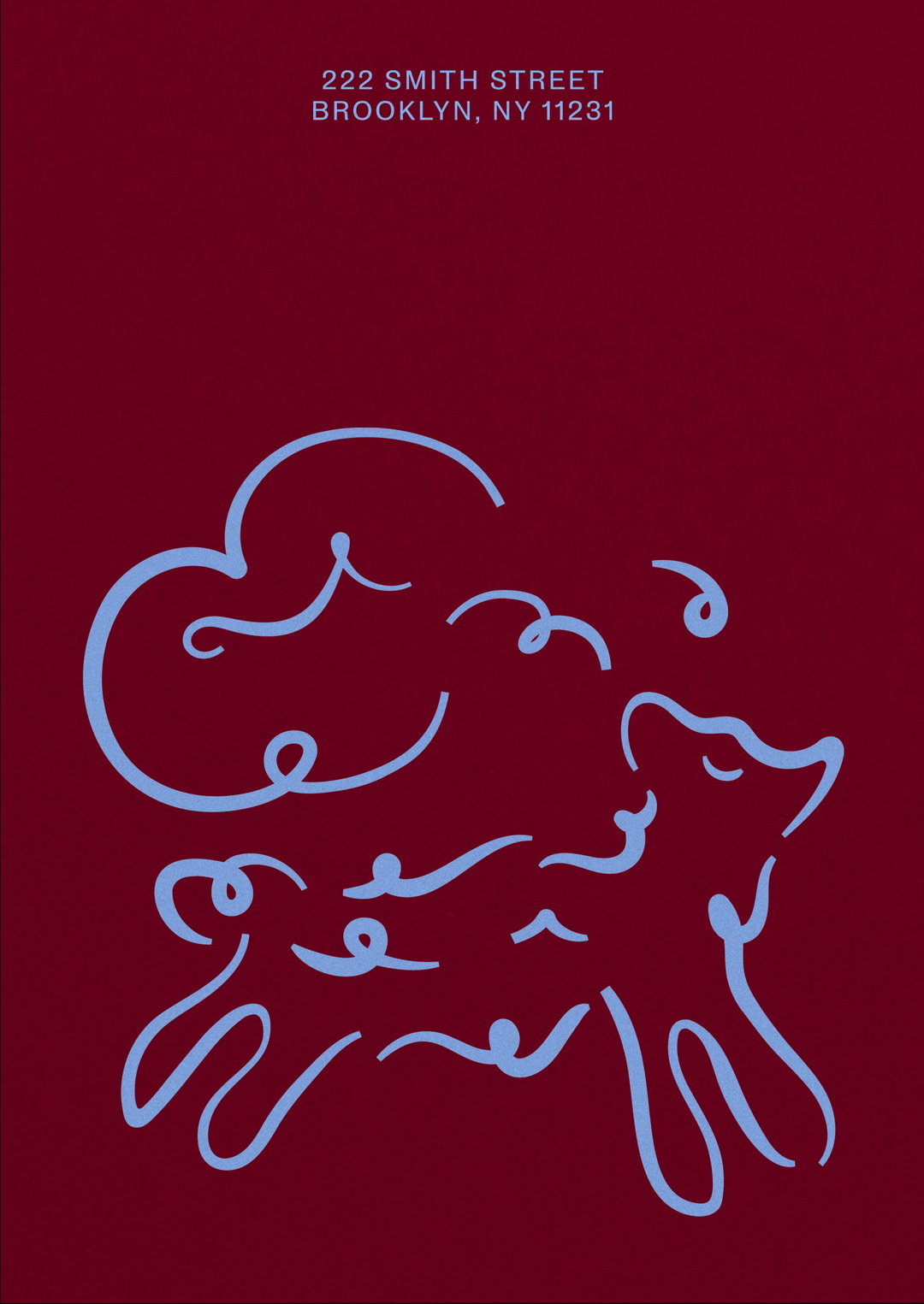
Mob Kitchen initially only wanted a brand refresh; Studio Nari gave it a whole new identity
The design studio wanted accessibility and playfulness to be at the core of the foodie business’ new identity.
Share
Food! Everyone loves it, but not everyone is very good at making it. Mob Kitchen has always been on a mission to democratise cooking by creating recipes it says we’ll “actually cook.” As the design team worked across the strategy and tone of voice for Mob, Caterina Bianchini, founder of Studio Nari, tells It’s Nice That: “it became clear that we needed to create a visual identity that felt accessible, that talked to Mob’s core audience and values, showcased its playful personality whilst also allowing the brand to expand in the future.”
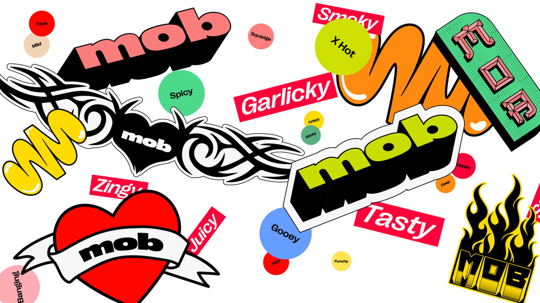
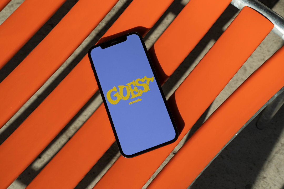
London-based Studio Nari completed a full brand overhaul for Mob. It began with the logo, which was meant to feel “bold, cheeky and youthful.” And taking the food motif into the type, the characters within the logo were drawn to feel as though they were “full,” with the addition of “small inconsistencies in the rounding of some of the letterforms and their counters.” These small graphic motifs, claims Bianchini, aim to refer back to the idea that Mob’s cooking isn’t about fancy looking food, “and whilst you’re cooking it you might make a good bit of mess,” the founder continues. Therefore, the mark was drawn to elaborate on this motif by trying to represent a splodge of sauce that’s hit the kitchen counter.
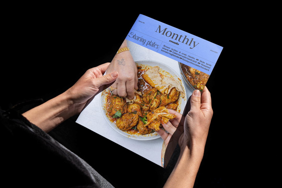
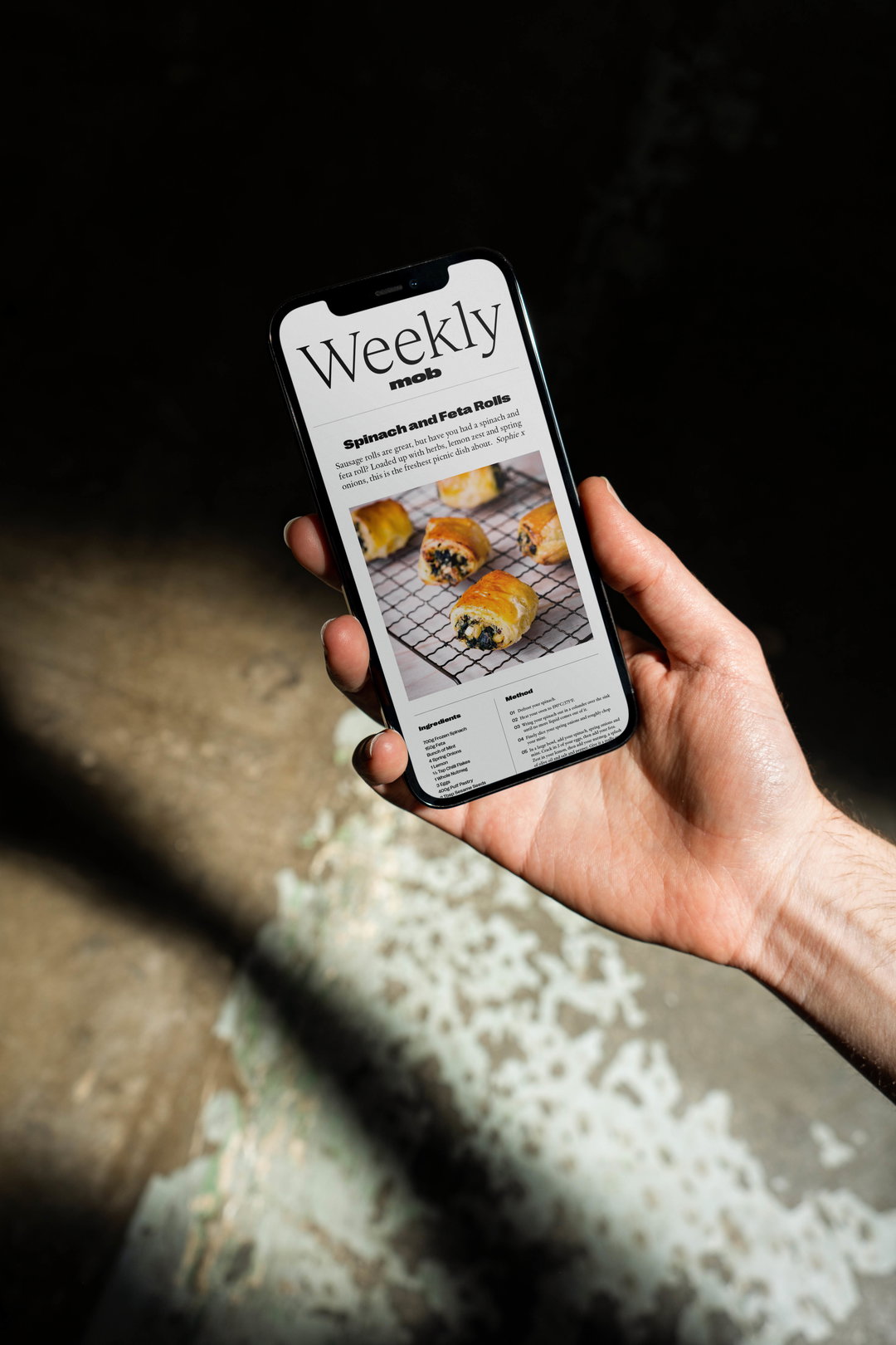
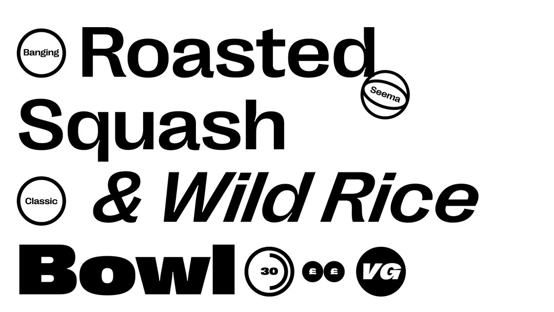
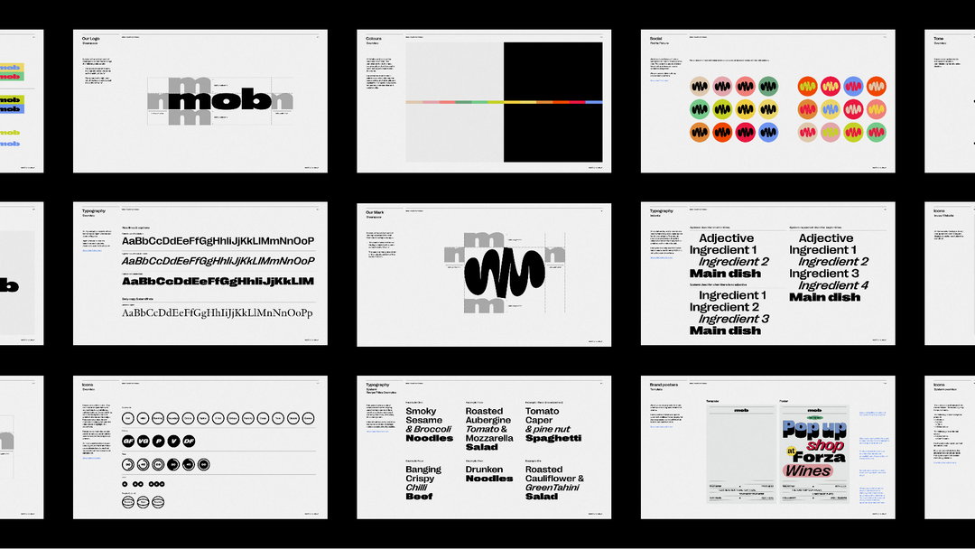
“With these core graphic elements drawn, we began to expand the visual language and develop a new set of brand colours,” says Bianchini. All the colours are references to food flavours, she elaborates, and the team created a flexible type system that uses variables from Right Grotesk with the aim of the identity always looking “full of energy and movement.” This sense of movement was furthered by Connor Campbell Studio, motion designers also based in London. As part of the brand overhaul, Studio Nari was also tasked with the creation of new sub-brand identities for each of Mob’s food series and content, “which allowed each piece of content Mob creates to have its own micro-brand personality depending on the chef cooking or the style of the show.”
While sourcing a lot of graphic inspiration from food, cooking and books, the team at Studio Nari spent a considerable amount of time getting to know the personality of Mob Kitchen, so as to bring it forward into the brand’s new identity. “Our biggest challenge,” Bianchini argues, “was the scale of it. Mob has a lot of different series, personalities and content that are showcased in digital, print, OOH and in physical spaces. We had to create a brand that encapsulated what currently exists whilst also being able to expand and develop alongside Mob.”
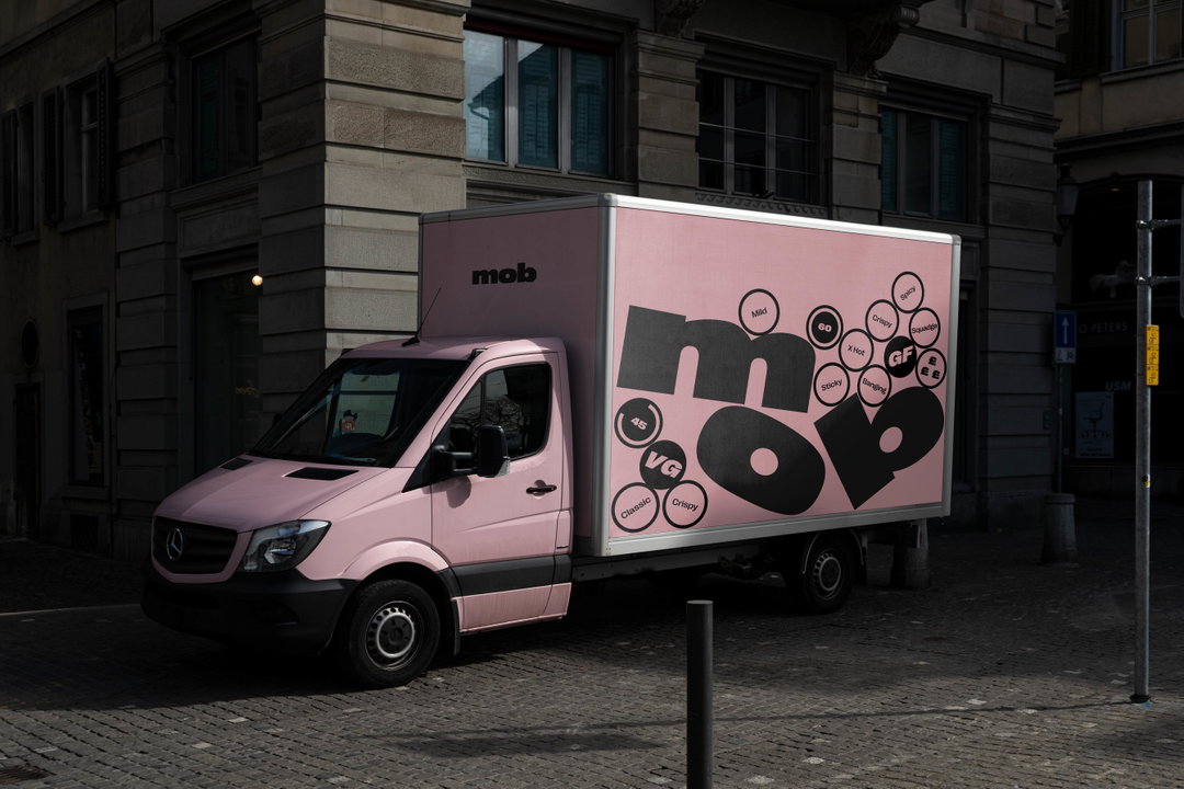
By creating the “master” brand, consisting of minimalistic and accessible black and white assets, the team then created a more flexible secondary system of colours, type and graphics that could be applied to Mob’s content series, sub-brand, merchandise, posters, offices and the truck. Bianchini explains to us that Nari was originally brought in for a refresh rather than a rebrand, but as it began to explore the project more, it became clear that a visual identity needed to be created that could become a benchmark for Mob – “something its audience would love and connect to as well as be accessible for new people discovering the brand. As time goes on you will see the brand evolve and expand, and this is something we are really looking forward to!”
GalleryStudio Nari: Mob Kitchen rebrand (Copyright © Mob Kitchen, 2021)
Hero Header
Studio Nari: Mob Kitchen rebrand (Copyright © Mob Kitchen, 2021)
Share Article
Further Info
About the Author
—
Dalia is a freelance writer, producer and editor based in London. She’s currently the digital editor of Azeema, and the editor-in-chief of The Road to Nowhere Magazine. Previously, she was news writer at It’s Nice That, after graduating in English Literature from The University of Edinburgh.